Categories
Bucknell/Local Interest General GIS GIS in Women's Studies Map Apps Slideshow

Simple tool for creating KML-based thematic maps

As someone who has one foot in the ArcGIS world and another in the GoogleEarth/GoogleMaps world, I’m continually annoyed at how cumbersome it is to shuffle data back and forth between the two product lines.  I’ll skip the diatribe for now and instead just point out a cool new tool that I ran across last week when I was getting ready to talk to a Women’s Studies class that will be using GoogleMaps for a class project.

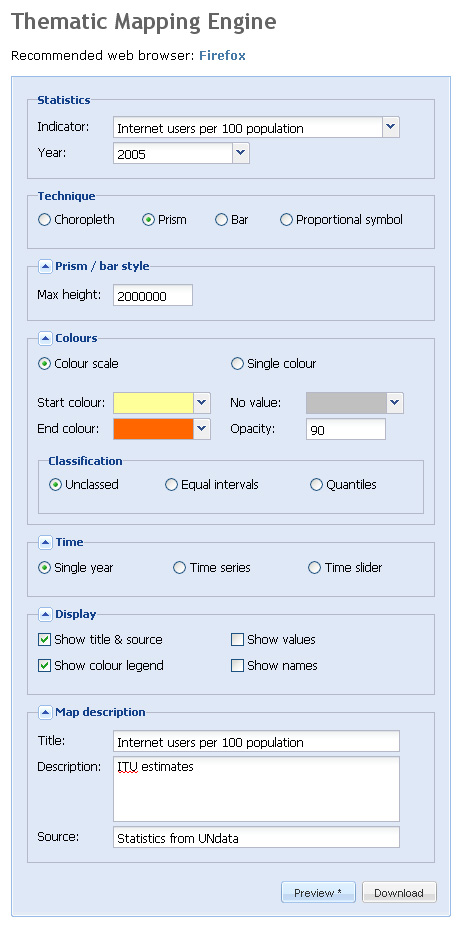
The website, thematicmapping.org, features a blog with tips and tricks for creating KML-based thematic maps. But more importantly, it provides a tool that you can use to create KML-based thematic maps for a variety of global data indicators. Although the selection of indicators is rather limited, thematicmapping.org also makes its API available so that you can create thematic maps from your own data sources.  Now if I just had a programmer at my beck and call…

Below is a screen shot of the Thematic Mapping Engine interface along with a snapshot of the resulting KML file


Categories
Bucknell/Local Interest Environment General GIS GIS in Biology Map Apps Slideshow

Stink bug mapping tool

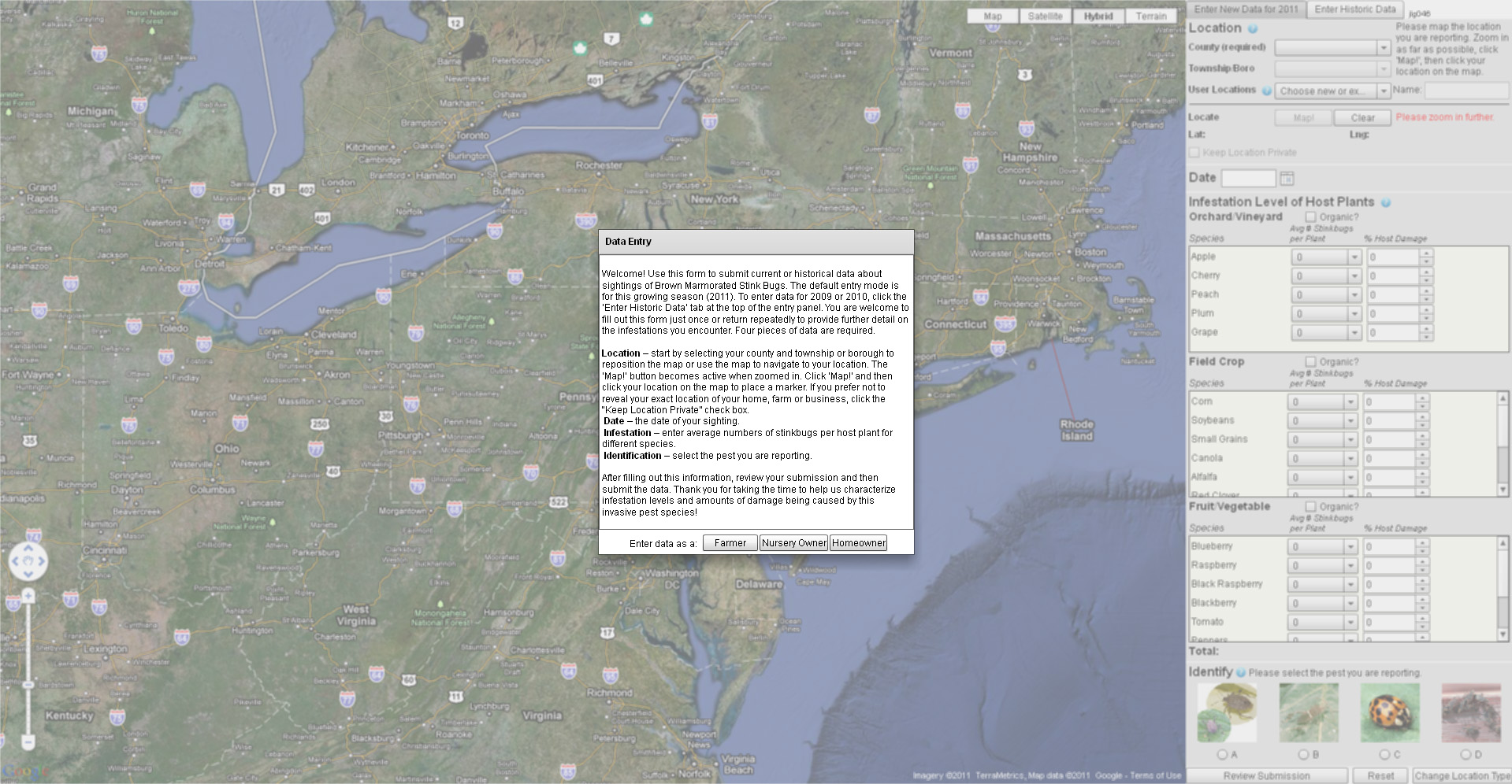
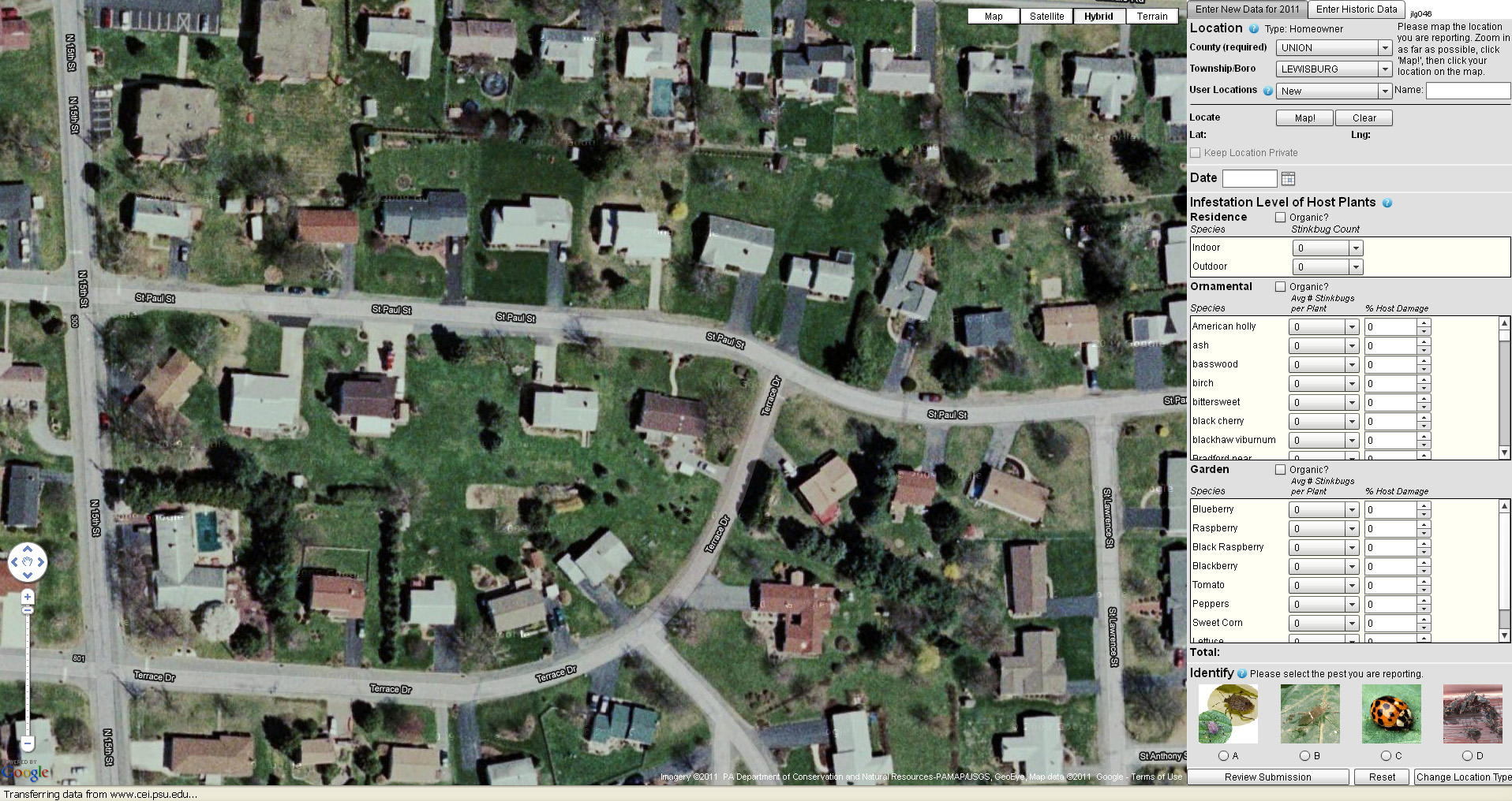
Penn State and the PA Department of Agriculture have just released a new web-based tool for mapping infestations of stink bugs across the state. The mapping tool collects and displays user-submitted data on stink bug sightings. After creating a login ID and passwords, users specify whether they are a farmer, nursery owner or homeowner and then identify their reporting location using either a Google Maps interface and/or a form to specify their county and municipality. Next, the user provides information on the level and type of infestation – including the number of stink bugs per type of tree, plant, and/or crop.

Read a story about the new website here. Click here to visit the Stink Bug website and map app. See below for some screenshots of the website and stink bug reporting interface.


Categories
Environment General GIS GIS in Environmental Studies GIS in Geography GIS in Sociology Map Apps Slideshow Videos

Go Philly! GIS helps improve access to healthy food in the city

Yesterday’s NY Times had an opinion piece praising Philadelphia’s efforts in recent years to improve access to healthy food for its most disadvantaged neighborhoods and citizens.  In ‘Go Philly!’, Mark Bittman describes the collaborative efforts of Philadelphia municipal government, the Commonwealth of PA and a whole host of local non-profits (including my former employer, the newly renamed  Greater Philadelphia Urban Affairs Coalition) in developing programs to bring supermarkets and healthy food options to under-served neighborhoods.

What he doesn’t describe is the critical role that GIS has played in bringing these programs to life.  See below for some background information and resources related to using GIS for improving access to healthy food.

1. Watch this short video (Ch. 3 of Episode 2 from Penn State’s Geospatial Revolution video series) to learn more about the role of GIS in Philadelphia’s ‘healthy food’ success story.

httpv://www.youtube.com/watch?v=RYzHcPHRhWQ

2. Read reports from the Food Trust and The Reinvestment Fund (TRF) describing their work in Philadelphia and other communities. Both organizations are Philadelphia-based non-profits that have been at the center of Philadelphia’s efforts to improve access to healthy food.

“The Grocery Gap: Who Has Access to Healthy Food and Why It Matters” – click here

Food Trust/TRF Report on the Fresh Food Financing Initiatives projects – click here

TRF’s resource page on food access – click here

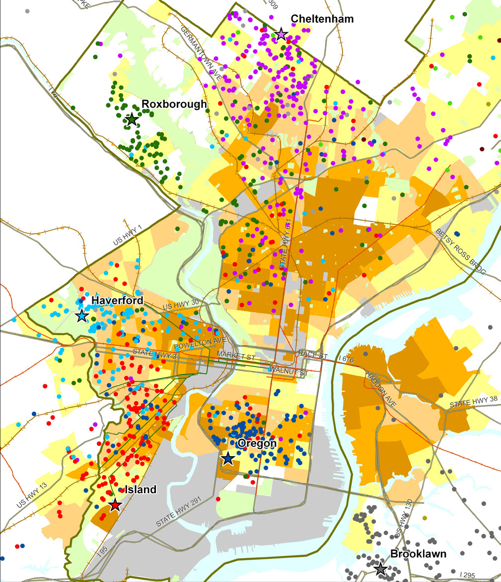
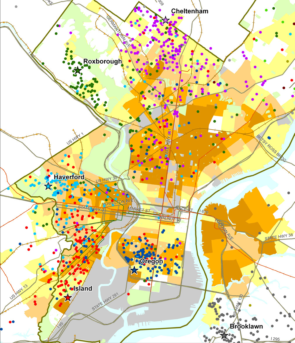
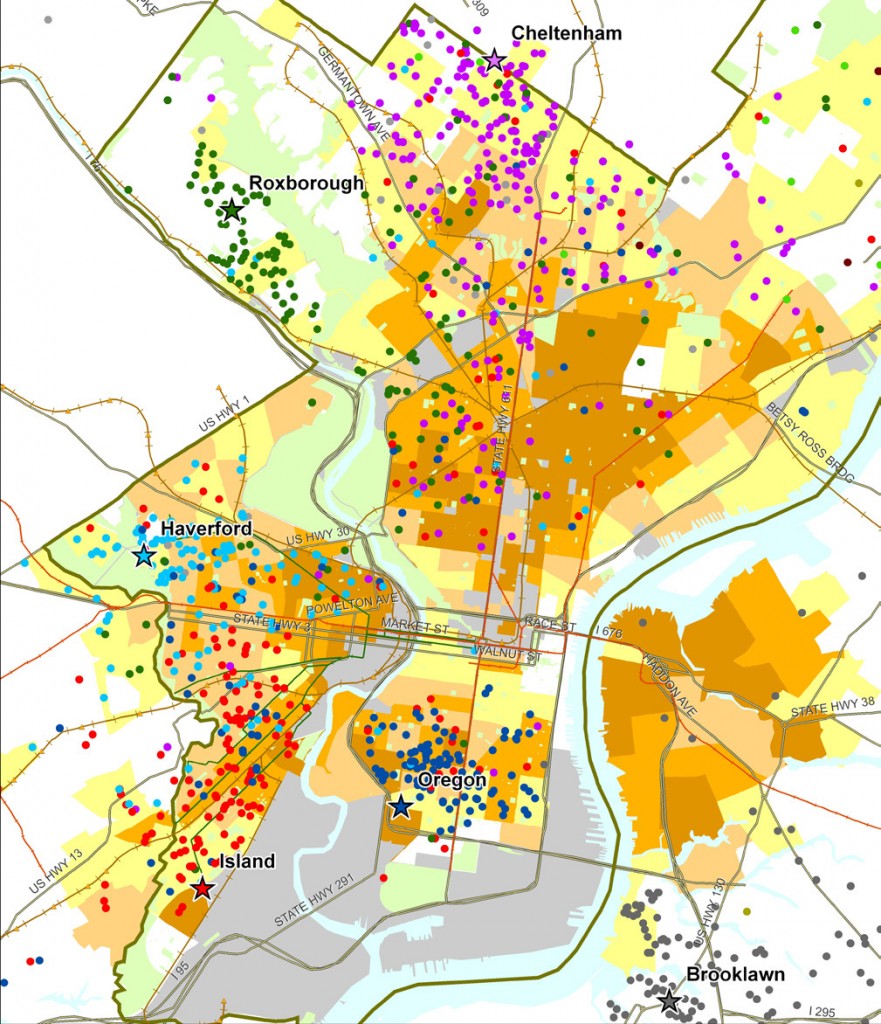
Sample map from Food Trust/TRF report on the Fresh Food Financing Initiative:

“Map 1: Residence of ShopRite Employees by Poverty Rate of Census Tract.  Each star on the map represents a Brown’s ShopRite store, with the location of the store’s employees illustrated by correspondingly colored dots.”
 

3. Watch a video created by TRF in collaboration with the Brookings Foundation to describe their use of GIS and findings in their  “Getting to Market” report on healthy foods initiatives across the U.S.

httpv://www.youtube.com/watch?v=Wp1w9s4kkHU


and/or explore the project website for “Getting to Market” – click here . The project site includes profiles of food access in major U.S. metropolitan areas.


4. Explore interactive web mapping applications featuring data on supermarket access:

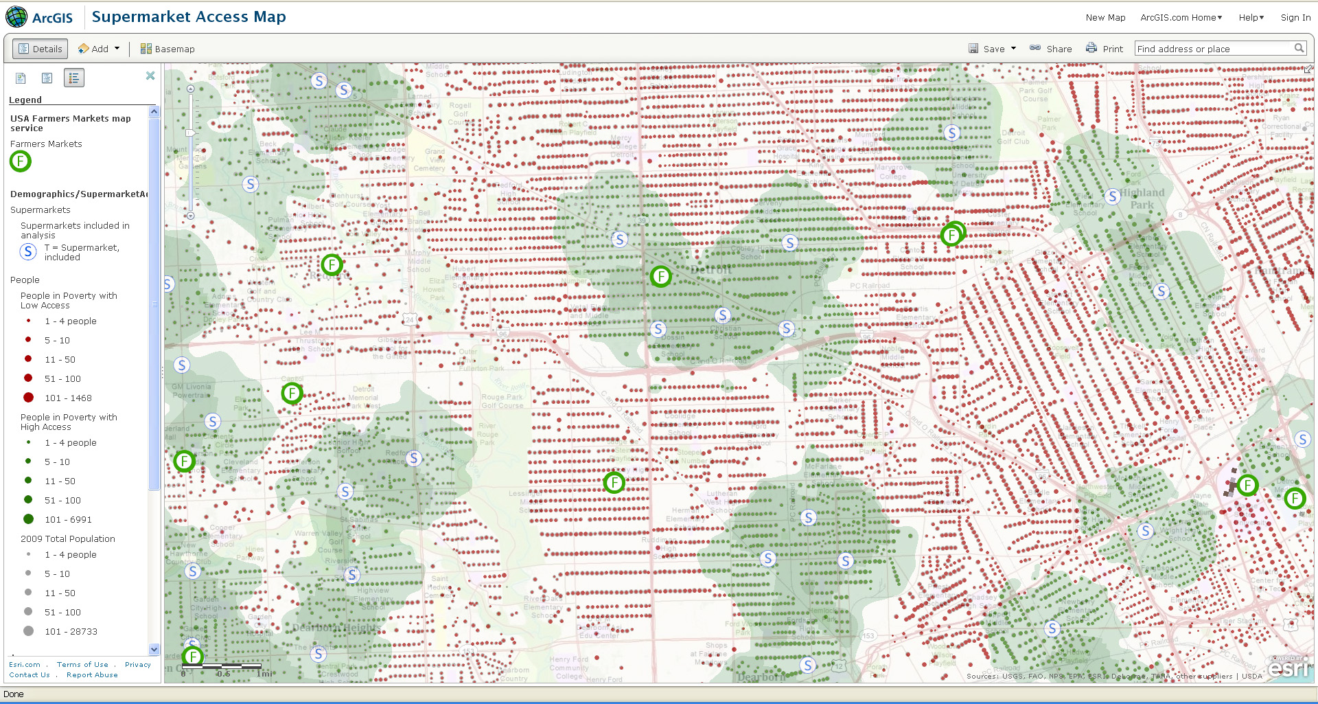
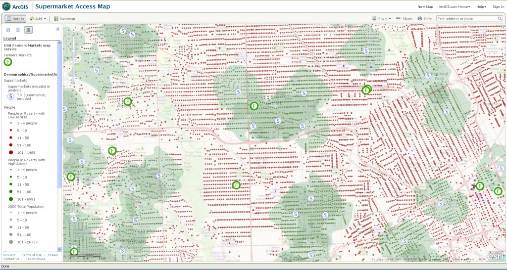
ESRI’s ArcGIS Online Supermarket Access Map – click here

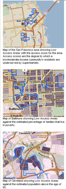
TRF’s PolicyMap Data on Supermarket Access – click here


Sample map from ESRI’s Supermarket Access Map:
 

Sample maps from TRF’s PolicyMap application:
 

Categories
General GIS GIS in Psychology Map Apps Slideshow

Mapping happiness

New social media mapping sites are popping up all over the place these days – whether it’s crisis-mapping sites like Sinsai.info or this new ‘happiness’ map from PhD student Alex Davies.

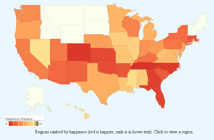
Davies, a PhD student at the University of Cambridge’s Computational and Biological Learning Lab, created a statistical model to analyze the sentiment (happy or sad) of Tweets from around the world.  In Davies’ model, individual words within Tweets were correlated with happiness or sadness, then used to predict the overall sentiment of the Tweet. Tweets were geo-tagged and summarized by area to calculate a composite ‘happiness’ ranking for states within the U.S. and for countries worldwide. The results are presented on Davies’ website in an interactive web map app. Raw data from the Tweets is presented alongside the maps to give viewers a sense of which Tweet words were correlated with happiness or sadness.  See below for maps of US happiness and world happiness – and an image showing some of the worldwide ‘happy’ words.

Happiness map of the United States:


Happiness map of the world:

Happy words for the world:


Categories
Crisis-Mapping General GIS GIS in Political Science Slideshow

Visualizing Japan crisis map inputs

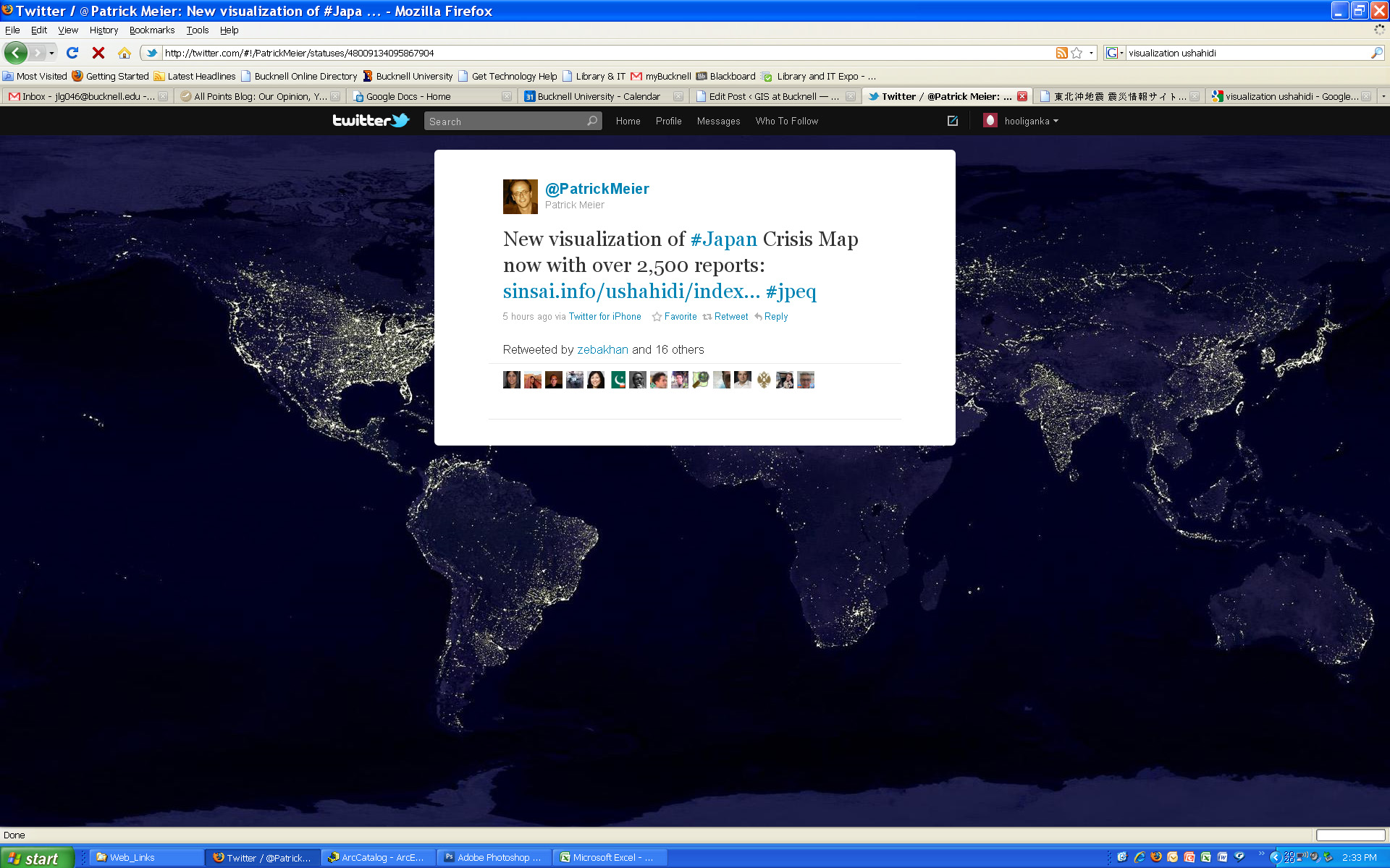
Here’s a new visualization that shows the locations worldwide that are submitting reports to the Ushahidi Japan Crisis Map. Click on the map to see full size image.