Categories
General GIS GIS in Psychology Map Apps Slideshow

Mapping happiness

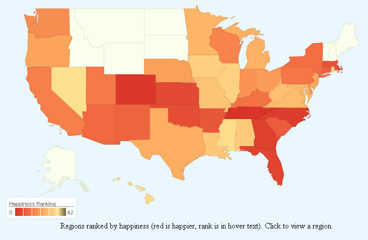
New social media mapping sites are popping up all over the place these days – whether it’s crisis-mapping sites like Sinsai.info or this new ‘happiness’ map from PhD student Alex Davies.

Davies, a PhD student at the University of Cambridge’s Computational and Biological Learning Lab, created a statistical model to analyze the sentiment (happy or sad) of Tweets from around the world.  In Davies’ model, individual words within Tweets were correlated with happiness or sadness, then used to predict the overall sentiment of the Tweet. Tweets were geo-tagged and summarized by area to calculate a composite ‘happiness’ ranking for states within the U.S. and for countries worldwide. The results are presented on Davies’ website in an interactive web map app. Raw data from the Tweets is presented alongside the maps to give viewers a sense of which Tweet words were correlated with happiness or sadness.  See below for maps of US happiness and world happiness – and an image showing some of the worldwide ‘happy’ words.

Happiness map of the United States:


Happiness map of the world:

Happy words for the world:


Categories
Bucknell/Local Interest Digital Humanities General GIS Slideshow

Reading a map

A few weeks ago, Bucknell hosted Kansas State University geographer/cartographer Margaret Pearce for a presentation on map visualization and cartographic design.  Dr. Pearce is a geographer who works on cartographic representation of cultural and historical geographies, especially Indigenous geographies.   Much of her presentation focused on communication between the cartographer and the map reader – particularly on the need for an active/engaged map reader.

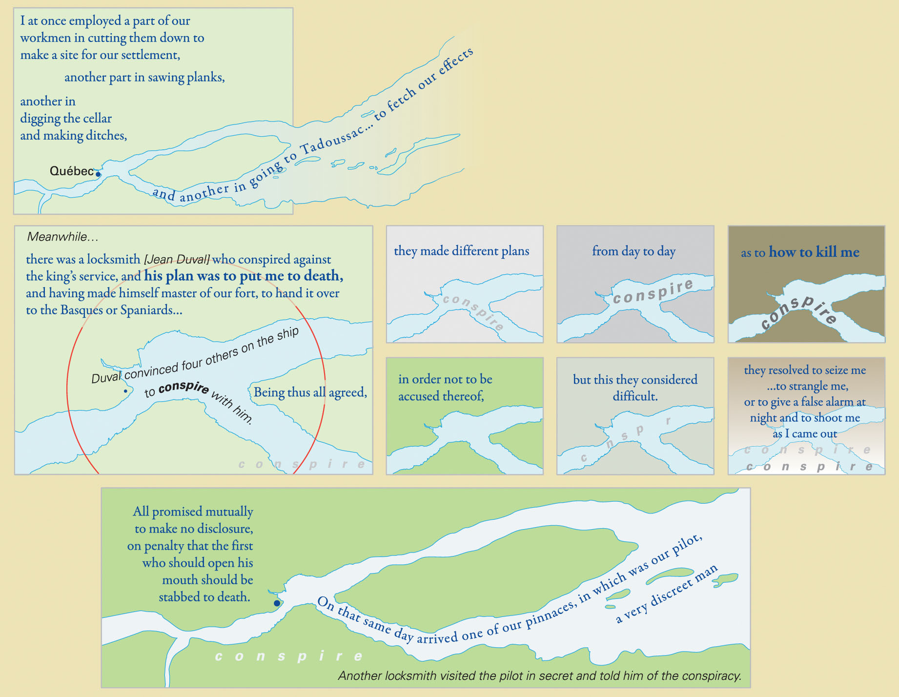
Pearce mentioned that she has had people compliment her on her maps by saying that they really had to “sit down” with the map to read and understand it. As Pearce put it, you probably wouldn’t compliment the author of an article or book that way…. yet often times maps get only a passing glance instead of a full, attentive reading.  During her presentation, Pearce walked the audience through a careful reading of  “They Would Not Take Me There” – a map that she made with co-collaborator Michael Hermann to illustrate the travels of Samuel de Champlain as he explored Canada between 1603 and 1616.  She discussed her use of Native place names, quotes from Champlain’s travel journals, historic fonts and cartographic techniques in shaping the map into a narrative in its own right – one that is a starting point for a discussion rather than a mere summary of Champlain’s travels through Canada.

From Pearce and Hermann’s introduction to the map on the University of Maine’s Canadian-American Center website:

At one level, Champlain’s explorations have been extensively documented and mapped by scholars focusing on the locations and dates of Champlain’s arrivals and departures. But these maps are silent with regard to the Indigenous geographies through which Champlain moved and upon which he relied for the success of his own explorations and mappings. Also, they fail to convey the human experiences which shape the emotional geographies of his journals.

From an article on the map that was published in Cartographic Perspectives, Number 66, Fall 2010:

The project began with a single map of the hydrography from the Gaspe Peninsula to the Georgian Bay, which was the extent of Champlain’s exploration of Canada along the St. Lawrence and Ottawa Rivers. But the cartographic challenge evolved into more than mapping Champlain’s exploration routes; the mapping of his experience became both the design question and quest. Champlain’s own travel narrative
became the primary design element, with his words placed among the geography he described. These quotes were selected to bring the reader into the landscape of the map, including, but not limited to, observations of the physical landscape. His interactions and conflicts with Natives and Europeans also were stories that needed to be mapped. This concept of mapping stories and interactions became the primary focus.


An example of the use of Native place names and historic fonts:
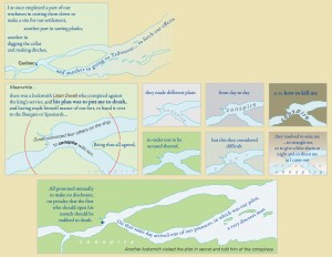
 

An image of the full map – no full-size digital file available (but soon I’ll have one in my office if you want to see it):
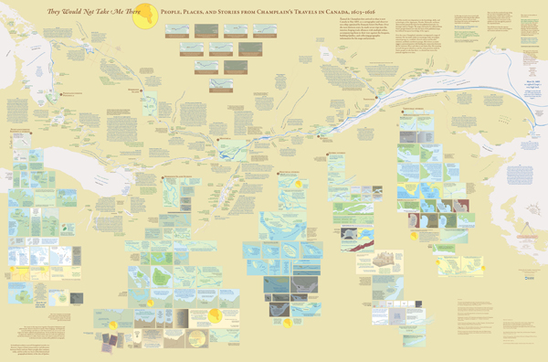
 

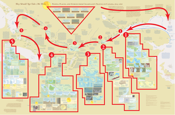
Diagram presenting one way to group information and read the map for the first time:
Categories
Crisis-Mapping General GIS GIS in Political Science Videos

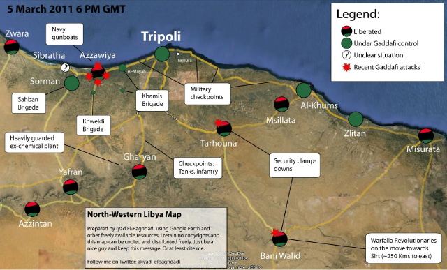
Libyan Revolution – view the map

The NY Times has an interactive map graphic on the crisis in Libya. The series of maps traces the development of the rebellion and unrest from February 16th to present.  The basemap data shown in the NYT interactive map graphic was provided by LeadDog Consulting. Given the unrest in Libya, LeadDog has been updating the street maps daily as they receive updated information. Click here for a detailed street map of Tripoli and here for a detailed street map of Benghazi.

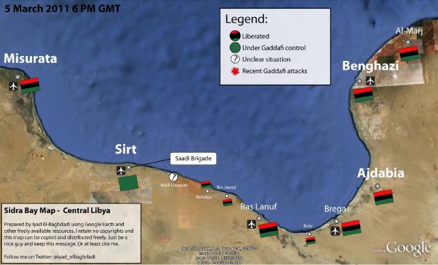
On the same topic, the NY Times 6th floor blog has a post about what may or may not be the Libyan opposition’s new website – which features news, announcements, video and a ‘Map of the Revolution.’ From the 6th Floor blog post:

Libya’s opposition seems to have surfaced online. NTCLibya.org was registered as a domain on March 6 for the Libyan Interim Transitional National Council. Among the tabs across the top of the site’s English-language home page are some you rarely see: Allegiances,  Map of Revolution. A WhoIs search turned up Identity Protect as the administrator. This is a British company that manages domains while concealing the identity of the actual owner. So there has been a fair amount of Twitter chatter (#libya, #feb17) about whether the thing is legit. The council’s Twitter handle is @LibyanTNC. There hasn’t been a Twitter post for hours, and before that there were many to the effect of “hold on, i’m having trouble getting the site up.” And the site is indeed slow and only semifunctional. Which rather suggests it’s the real deal. The domain is registered until 2013. A little pessimistic?

‘Map of the Revolution’ – East Coast of Libya:


‘Map of the Revolution’ -West Coast of Libya:

Categories
Bucknell/Local Interest Data Environment General GIS Map Apps Slideshow

ChesapeakeView

Maurie Kelly and her team at PASDA (part of the Penn State Institute of Energy and the Environment) have just released ChesapeakeView, a website that provides free access to remotely sensed data about the Chesapeake Bay region. The website currently holds 263 datasets related to the Chesapeake Bay region – including remotely sensed data as well as habitat, land use, biodiversity, wildlife distribution, historical aerial photos, agricultural imagery, digital coastline images and other types of environmental data related to the region.

“No simple place existed to find remote sensing information about land use, habitat changes and biodiversity,” said Maurie Caitlin Kelly, director of informatics, Penn State Institutes of Energy and the Environment. “Researchers could spend days searching to find whatever data might be available.”

The data interface for ChesapeakeView will look familiar to anyone who has used PASDA’s website.  There are options for downloading the data via FTP, using an internet based data viewer/map tool or streaming it directly into your ArcMap session. ChesapeakeView is part of the AmericaView initiative.

Categories
Crisis-Mapping General GIS GIS in Political Science Map Apps Slideshow

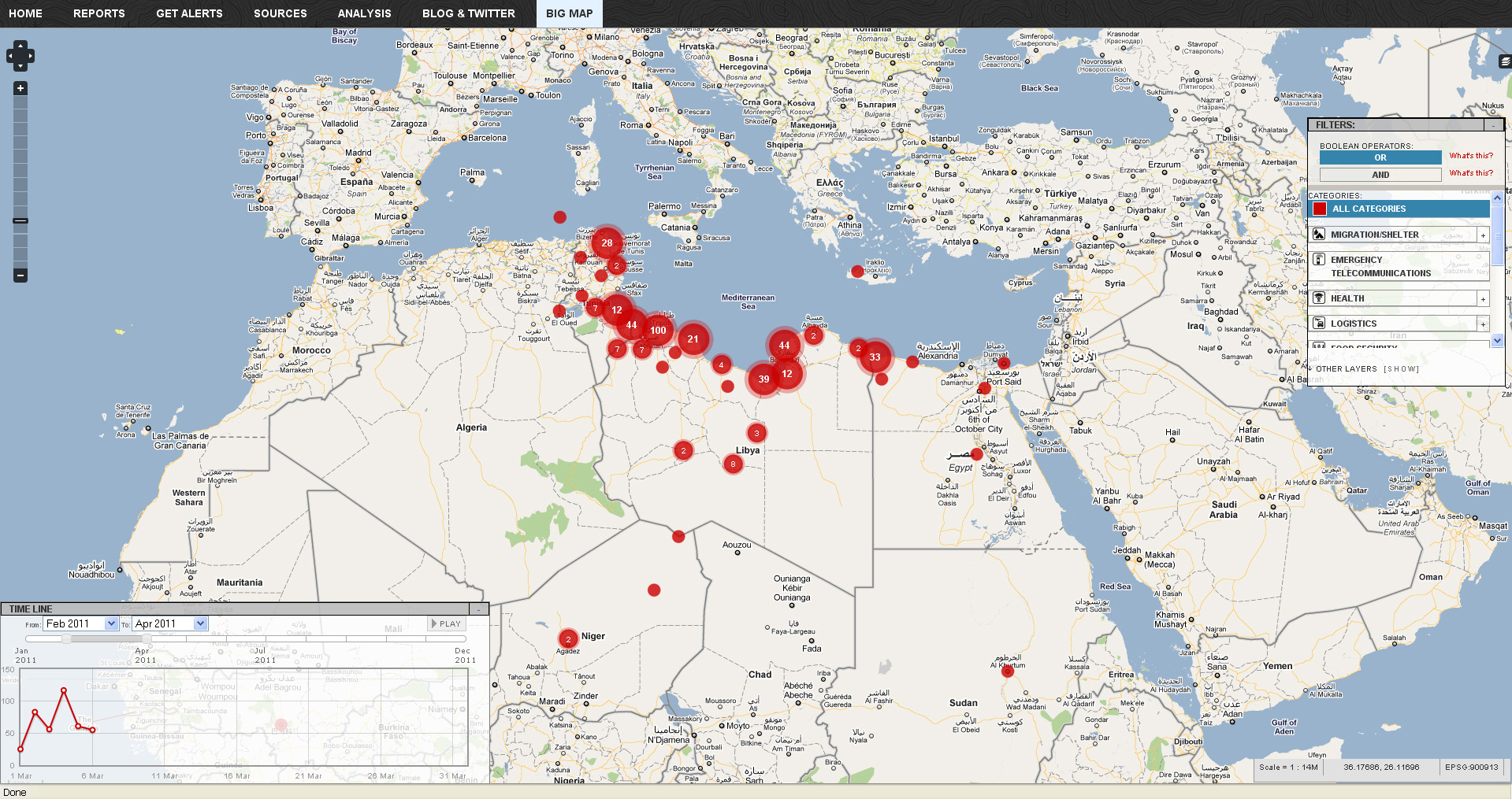
Libya crisis map

Click here to check out the new Libya Crisis Map.  Courtesy of Adena Schutzberg over at AllPointsBlog:

OCHA, UNOSAT and NetHope have been collaborating with the Volunteer Technical Community (VTC) specifically CrisisMappers, Crisis Commons, Open Street Map, and the Google Crisis Response Team over the past week.

The CrisisMappers Standby Task Force has been undertaking a mapping of social media, news reports and official situation reports from within Libya and along the borders at the request of OCHA. The Task Force is also aiding in the collection and mapping of 3W information for the response. UNOSAT is kindly hosting the Common Operational Datasets to be used during the emergency. Interaction with these groups is being coordinated by OCHA’s Information Services Section.

The public version of this map does not include personal identifiers and does not include descriptions for the reports mapped. This restriction is for security reasons. All information included on this map is derived from information that is already publicly available online