Categories
Bucknell/Local Interest Data Digital Humanities Environment Events/Calendar General GIS Slideshow

Details on $520K Mellon grant for environmental studies, GIS integration

I posted a few weeks ago about the $520K grant awarded to Bucknell by the Mellon Foundation. Here are some additional details on how the grant money will be used to strengthen environmental studies and GIS integration across the university. From the Library & IT Matters newsletter:

  • Up to twelve faculty members will receive $400 to participate in either a 4-day (intro) or 2-day (advanced) summer GIS workshop. Click here for more details on the intro and advanced workshops.
  • Faculty members may submit requests to receive up to $1,000 to revise a course to include GIS ($5,000 total)
  • Four student researchers will be provided with summer research funding to conduct research projects involving GIS technology
  • Funds will be available to support consultants and student workers to create new maps or to develop new datasets for use by faculty in integrating GIS for their curriculum and courses
  • Additionally we have support to help with the acquisition of data which can only be obtained through purchasing data sets or through membership in consortia which provide access to proprietary datasets

Contact me by e-mail at janine.glathar@bucknell.edu or by phone at x. 1990 if you are interested in any of the options listed above.
Categories
Crisis-Mapping Environment General GIS GIS in Political Science Slideshow Videos

NOAA visualizations of Japanese earthquake and tsunami

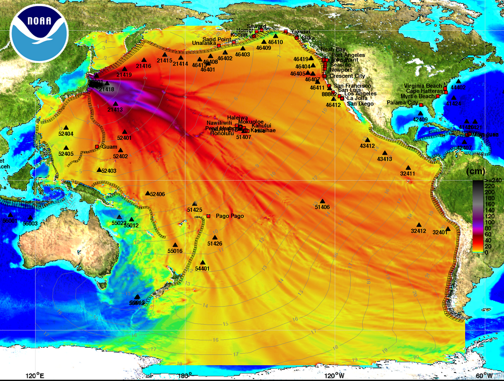
Below is a tsunami wave height model that shows the Pacific-wide impact of the event. The model was created by the NOAA Environmental Visualization Lab:

Description from NOAA:

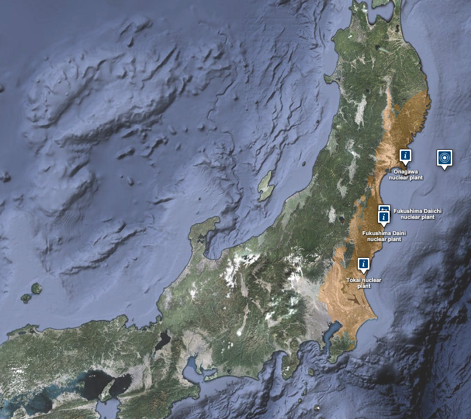
Model runs from the Center for Tsunami Research at the NOAA Pacific Marine Environmental Laboratory show the expected wave heights of the tsunami as it travels across the Pacific basin. The largest wave heights are expected near the earthquake epicenter, off Japan. The wave will decrease in height as it travels across the deep Pacific but grow taller as it nears coastal areas. In general, as the energy of the wave decreases with distance, the near shore heights will also decrease (e.g., coastal Hawaii will not expect heights of that encountered in coastal Japan).The second image shows the depth of the Pacific Ocean floor. Notice the similarity between areas of low wave height and deeper areas of the ocean.

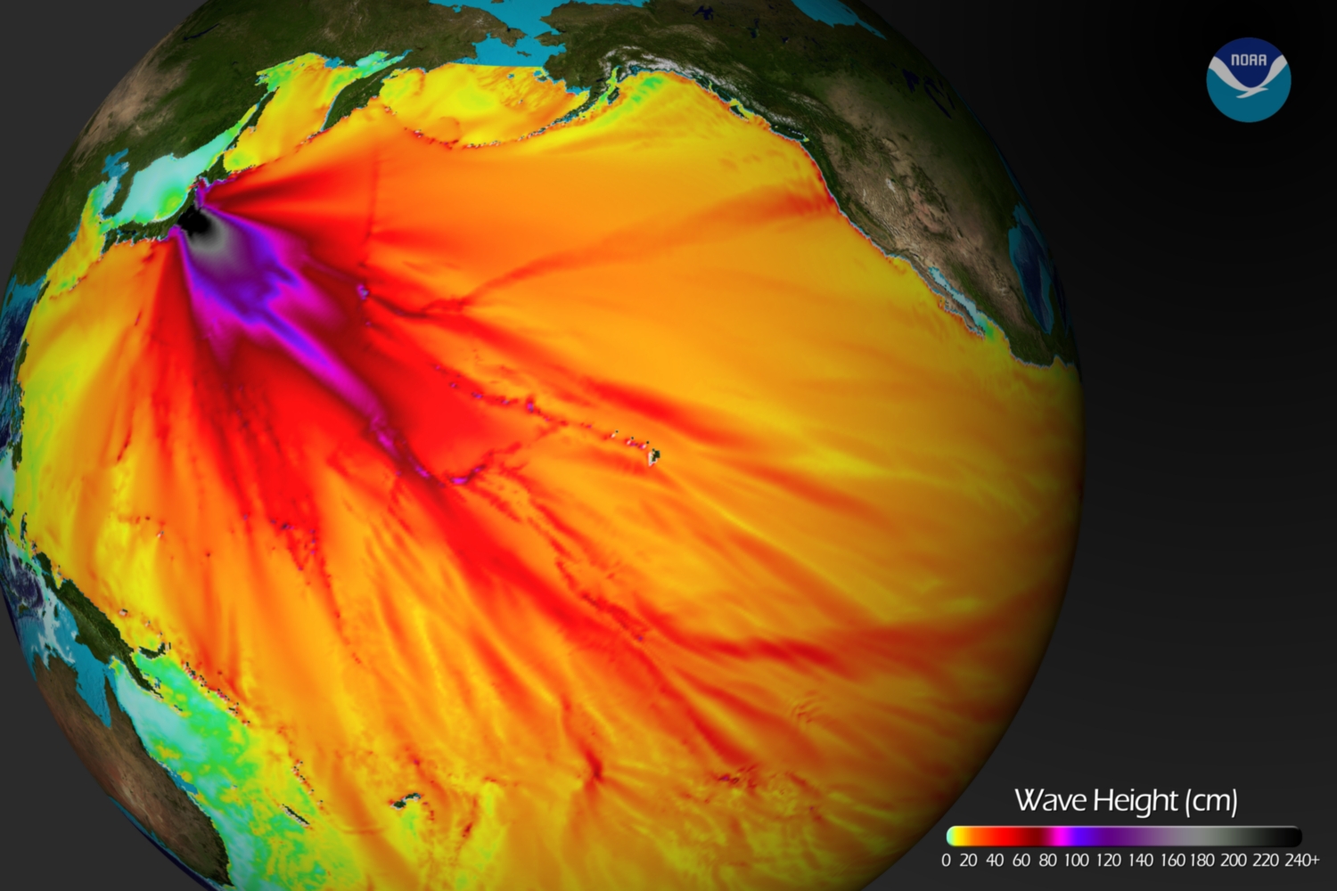
Below is an image visualizing the maximum amplitude plot for the tsunami wave.

Click here on the NOAA Center for Tsunami Research home page to download a Google Earth KMZ file with the maximum amplitude plot data shown in the visualization above.

And finally, a video showing the propagation of the tsunami wave.

httpv://www.youtube.com/watch?v=PBZGH3yieLc

From the NOAA Center for Tsunami Research:

Propagation of the March 11, 2011 Honshu tsunami was computed with the NOAA forecast method using MOST model with the tsunami source inferred from DART® data. From the NOAA Center for Tsunami Research, located at NOAA PMEL in Seattle, WA. See http://nctr.pmel.noaa.gov/honshu20110311


Categories
Bucknell/Local Interest Data GIS in Engineering GIS in Environmental Studies GIS in Geology Slideshow

GIS in education – EPA grant and campus mapping

Notes on two interesting stories about GIS in education. Thanks to Adena Schutzberg’s All Points Blog for the heads up about the stories.

1. Texas State University’s Center for GIScience was recently awarded 500K grant from EPA to use GIS for modelling/mapping air pollution-exposure-health effects:
The U.S. Environmental Protection Agency’s Science to Achieve Results (USEPA-STAR) program has awarded a grant of nearly $500,000 to The Texas Center for Geographic Information Science in the Department of Geography at Texas State.

The grant will support a project entitled “Air Pollution-Exposure-Health Effects Indicators: Mining Massive Geographically Referenced Environmental Health Data to Identify Risk Factors for Birth Defects.”The three-year project will develop air pollution exposure assessment methods, visual geospatial data mining tools, and epidemiological analysis procedures to define new air pollution-exposure-health effect indicators that cover three components of the hazards-exposure-health effects-intervention paradigm.

San Marcos Local News

Click here to see more EPA STAR Research Grant Announcements.  The EPA STAR grants are just one of the types of research grants available through the US EPA National Center for Environmental Research.   Click here for an overview of the Center’s research and fellowship opportunities.  Check the Bucknell GIS Calendar (featured on the main page of the GIS blog) this fall for deadlines for student grant applications for the EPA GRO fellowships – awarded each year to undergraduate students in environmentally related fields of study.  From the EPA Fellowships web page:

Eligible students will receive support for their junior and senior years of undergraduate study and for an internship at an EPA facility during the summer between their junior and senior years. The fellowship provides up to $19,700 per year of academic support and up to $9,500 of internship support for the three-month summer period, for a total of up to $48,900 for the two year period.

2.   Grad students at Utah State University are collecting high resolution imagery of their campus using a small blimp.

Soaring above the Quad on Tuesday afternoon, a white blimp controlled by Utah State University graduate students was almost hard to spot against the Cache Valley’s overcast sky.The only object that was clearly visible was a black digital camera, snapping one picture every five seconds, providing color georeferenced aerial photography of the entire Quad in UTM (metric) coordinates.

The students were conducting a lab by running a blimp survey for Joseph M. Wheaton’s geographic information systems class. The objective: To provide aerial imagery of the entire Quad. The 1,000-plus pictures the blimp provides them with will be used to make an image that can fit “on top of” the images on Google map, said Bryan Watt, a USU graduate student in the class.

Herald Journal

Could we do this at Bucknell? Twice in the last month I’ve had faculty (half-jokingly) suggest that we rent a plane to do a data collection fly-over of Lewisburg. Forget the plane, let’s figure out how to get our hands on a blimp!

Categories
Crisis-Mapping General GIS GIS in Political Science Slideshow

Japanese earthquake – disaster/response maps

Here are some links to maps and map apps related to the Japanese earthquake and tsunami.  I’ll add more as they are released.

  • JapanQuakeMap, an animated, time-lapse visualization of the earthquake and its aftershocks created by Paul Nicholls, developer of the Christchurch Quake Map website.  From the website:
    The Japan Quake Map on this website pesents a time-lapse visualisation of the Sendai earthquake and its aftershocks, primarily to help those outside the affected area understand what the people of Japan are experiencing. It plots earthquake data from USGS on a map using the Google Maps API, with the size of the circle denoting the magnitude (the higher the magnitude, the larger the circle) and the colour showing the focal depth (see the legend below the map).
  • Click here to view the main page for Ushahidi’s Japan crisis mapping tool (in Japanese). Click here to view the Big Map. These pages use the Ushiadi platform to collect and display crowdsourced info (SMS, e-mail, Twitter, Flickr, YouTube, etc.). About the Ushahidi site:

Anyone on the ground can text in the location of a trapped person, and these locations are then collected on a map. You can also text in where to find aid, a pop-up hospital or a precarious building that should be avoided.  Good.is

  • Also from Ushahidi, a Radiation Map that uses the Crowdmap platform.  The radiation map is in both Russian and English and has other language options available.
  • Map of seismic activity in the 7 days leading up to the earthquake – from MapLarge (note: as of Wed. March 16th the MapLarge site is down – too much traffic?)
  • What is crisis mapping and how does it work? Click here to read Patrick Meier’s answer to that. Meier is the Director of Crisis Mapping at Ushahidi and co-founder of the International Network of Crisis Mappers. 
Categories
Bucknell/Local Interest Data Environment General GIS Map Apps Slideshow

ChesapeakeView

Maurie Kelly and her team at PASDA (part of the Penn State Institute of Energy and the Environment) have just released ChesapeakeView, a website that provides free access to remotely sensed data about the Chesapeake Bay region. The website currently holds 263 datasets related to the Chesapeake Bay region – including remotely sensed data as well as habitat, land use, biodiversity, wildlife distribution, historical aerial photos, agricultural imagery, digital coastline images and other types of environmental data related to the region.

“No simple place existed to find remote sensing information about land use, habitat changes and biodiversity,” said Maurie Caitlin Kelly, director of informatics, Penn State Institutes of Energy and the Environment. “Researchers could spend days searching to find whatever data might be available.”

The data interface for ChesapeakeView will look familiar to anyone who has used PASDA’s website.  There are options for downloading the data via FTP, using an internet based data viewer/map tool or streaming it directly into your ArcMap session. ChesapeakeView is part of the AmericaView initiative.