Categories
Bucknell/Local Interest Data General GIS Slideshow

Mapping Santa vs. Satan – Round 1

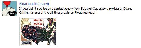
Thanks to Geography Professor Duane Griffin’s spooky ‘Santa vs. Satan’ map submission (deemed one of the ‘all-time greats’ – see below), Bucknell has scored a knock-out in round one of the Floatingsheep blog’s Christmas map contest.
The Floatingsheep blog – a favorite amongst mapping, visualization and social media enthusiasts – was founded two years ago by Dr. Matthew Zook (an Associate Professor at the University of Kentucky, USA) and Dr. Mark Graham (a Research Fellow at the Oxford Internet Institute, UK). The site is dedicated to:

“mapping and analyzing user generated Google Map placemarks… [to] provide a glimpse of what internet users (in the aggregate) think about particular places. Where are people posting placemarks about swine flu? Which places are considered to be “fun” by the collective intelligence of the Internet users?”

FloatingSheep uses a proprietary software program that conducts a worldwide search for Google Maps placemarks containing specific keywords . The software records the number of results generated for each keyword and creates a grid map where each cell indicates the number of hits returned for the Google Maps keyword search in that particular location.

After looking at Santa and reindeer in 2009 and the geography of local names for Santa in 2010, the Floatingsheep team has added a new twist to the Christmastime ‘naughty or nice’ debate by choosing a ‘Santa vs. Satan vs. Zombies’ theme for its 2011 Christmas map contest.  Floatingsheep did a search for 24 keywords related to Santa/Satan/Zombies to see, as Dr. Graham says “whether the places we live in are augmented by more Christmas-related information or more devilish/ghoulish-related information.”

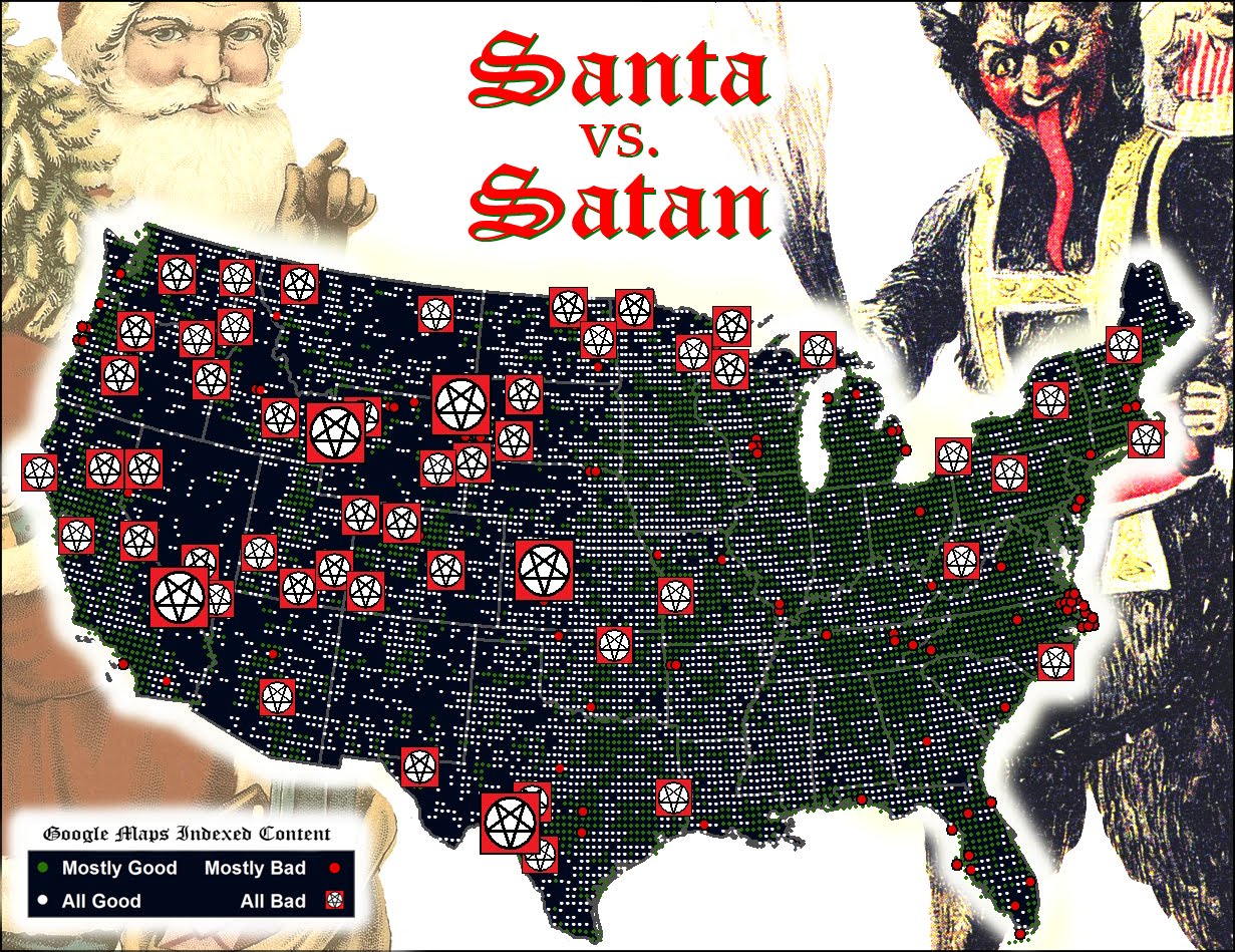
Prof. Griffin downloaded the grid map data from Floatingsheep’s keyword search and then aggregated and visualized it to produce his masterpiece. See below for Floatingsheep’s write-up on Duane’s map.

Our third entry comes from Duane Griffin [1] with a map that we’re quite frankly really creeped out by. I made sure my laptop was closed last night so it couldn’t escape.


Duane outlines his method as, “I aggregated all of the Satan/Lucifer/zombies/etc. as Team Satan, aggregated all the religious and holiday categories and everything else as Team Santa (including fatman and robot santa), and mapped them Fox-style to hype up the threat. The “Mostly” category is based on the team ratio.” The result is a road map of “badness”. While Las Vegas comes as no surprise, who knew that Wyoming was so Satan-ridden? And I’m going to think twice before heading out to the middle of Kansas. Duane simply notes that it “Looks as if the Forces of Evil are winning the West and making inroads into the eastern US.” Others (e.g., my mother) notes with some surprise that Washington D.C. shows up as mostly good which defies all expectations.

Happy holidays! And stay tuned for more posts.

[1] Other identifying information such as his role as a professor at Bucknell University has been withheld so he is not tainted by his admission of being a Floating Sheep reader. [2]

[2] Oops.

Categories
Crisis-Mapping Events/Calendar General GIS GIS in Political Science Slideshow Videos

Where 2.0

The 2011 Where 2.0 conference is wrapping up today in Santa Clara, CA.  Over the course of the week, many of the presentations have been streamed live over the conference website. I’m including a few YouTube videos for some of noteworthy presentations.

Jack Dangermond – CEO and founder of Esri: “Living Maps – Making Collective Geographic Information a Reality”

httpv://www.youtube.com/watch?v=vIbGwY3aG0g&p=0B2FEB8AACD826BE


Blaise Agüera y Arcas, Architect of Bing Maps and MSN at Microsoft:  “Read/Write World”

httpv://www.youtube.com/watch?v=4X9u4JG9H6E&p=0B2FEB8AACD826BE


Ben Fry – principal of Fathom: “Mapping: From Interesting to Insightful to Irrelevant” (coming soon)


Patrick Meier, Director of Crisis Mapping & New Media for Ushahidi: “May the Crowd Be With You: The Future of Crisis Mapping for Disaster Response”

httpv://www.youtube.com/watch?v=M_NguESRZ4g&p=0B2FEB8AACD826BE


Dennis Crowley, Co-founder, foursquare; and Robert Scoble, Managing Director, Rackspace: “Future Location: Scoble & Dens”

httpv://www.youtube.com/watch?v=TpTDGeLiFnc&p=0B2FEB8AACD826BE


John Barratt, self-described “Geo, twitter & weather web hacker”:  “Who, What, Where, When: Creating New Maps from Geo-tweets”

httpv://www.youtube.com/watch?v=ey_m0F_b-Vw&p=0B2FEB8AACD826BE


Sylvain Carle, CEO & co-founder @ Needium: “Locking Yourself Out in London (and Tweeting about it)

httpv://www.youtube.com/watch?v=Gvcs4H_A0Wc&feature=autoplay&list=PL0B2FEB8AACD826BE&index=16&playnext=1


Categories
General GIS GIS in Psychology Map Apps Slideshow

Mapping happiness

New social media mapping sites are popping up all over the place these days – whether it’s crisis-mapping sites like Sinsai.info or this new ‘happiness’ map from PhD student Alex Davies.

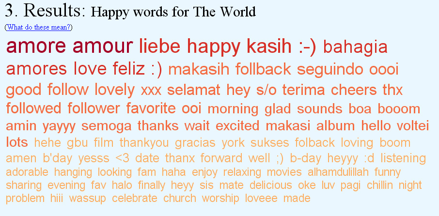
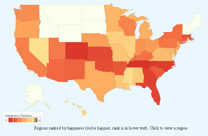
Davies, a PhD student at the University of Cambridge’s Computational and Biological Learning Lab, created a statistical model to analyze the sentiment (happy or sad) of Tweets from around the world.  In Davies’ model, individual words within Tweets were correlated with happiness or sadness, then used to predict the overall sentiment of the Tweet. Tweets were geo-tagged and summarized by area to calculate a composite ‘happiness’ ranking for states within the U.S. and for countries worldwide. The results are presented on Davies’ website in an interactive web map app. Raw data from the Tweets is presented alongside the maps to give viewers a sense of which Tweet words were correlated with happiness or sadness.  See below for maps of US happiness and world happiness – and an image showing some of the worldwide ‘happy’ words.

Happiness map of the United States:


Happiness map of the world:

Happy words for the world:


Categories
General GIS GIS in Art

Map Your Music Memories

The Grammys and Music Is Life, Life is Music have launched  a new mobile app that allows you to tag locations on a map with a music marker – could be the club you’re going to see a show at later this weekend, the place you heard a song for the first time, or any other music-related comment or memory.

From the Grammys blog:

“You can share your tag by posting to your Facebook profile or Twitter account. The app integrates with Flickr and Foursquare data by highlighting concert venues via Foursquare, and promoting Flickr photo data of GRAMMY-related artists and venues.

As more users tag the map, you’re able to view what music inspires others at any given location, such as your neighborhood, a popular venue or your favorite travel destination. I’d argue the coolest part about the app is that several featured artists will be using the app and their tags are featured on the map by a special marker. For example, by filtering the map for music artists, you can see several tags and notes posted by Katy Perry. The Recording Academy says more artists will be featured within the app as we get closer to the 53rd GRAMMY Awards.”

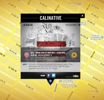
Here’s one of JayZ’s music memories: