Categories
Data General GIS GIS in Art GIS in Computer Science Slideshow Videos

Phone-call cartography

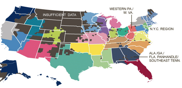
Here’s a link to an interesting NYT story, “Phone-call cartography,”  on mapping connectedness via data points from mobile phone calls.  The accompanying map was produced by M.I.T.’s SENSEable City Lab using the origin and end point locations for cellphone traffic within the U.S. in July of last year.

Phone-call cartography video:

httpv://www.youtube.com/watch?v=eFKZnbIAboI

Phone-call cartography map:
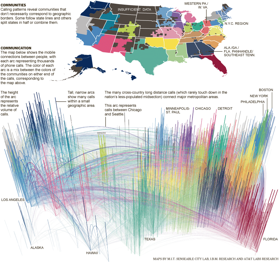
 

The “Phone-call cartography” map project is just the latest in a long series of projects the SENSEable City Lab has done using cellphone data to explore the idea of connectedness.  In 2008, the group produced a map installation called “New York Time Exchange” for the NYC MoMA’s ‘Design and the Elastic Mind’ exhibition. The installation featured wall-sized maps displaying nearly real-time data on cellphone calls with origins and/or destinations in the New York City area. See this Newsweek article or this NYT article for more information about the “New York Time Exchange” exhibit and how SENSEable’s research is informing our understanding of globalization, the digital divide and other measures of connectedness.

Click here to read an article about SENSEable’s use of real-time cell phone data to analyze the economic impact of New York City’s 2008 ‘Waterfalls’ exhibit in New York Harbor.
Categories
General GIS GIS in Geography GIS in Sociology Map Apps Slideshow

The 12 States of America

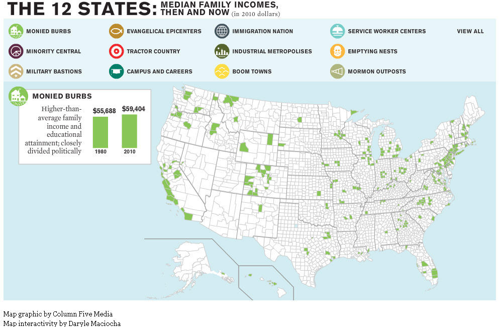
The website for The Atlantic magazine has an interesting new map graphic visualizing the ways in which income inequality has fractured the nation over the past 30 years.  The graphic breaks the nation into 12 different ‘states’ – monied burbs, minority central, military bastions, evangelical epicenters, tractor country, campuses and careers, immigration nation, industrial metropolises, boom towns, service worker centers, emptying nests and mormon outposts – based on a variety of different demographic characteristics.

For example, the Boom Town state is defined as relatively wealthy U.S. counties that saw rapid growth and increasing minority populations prior to the last recession. Whereas Monied Burbs have higher than average family income and educational attainment and are closely divided politically.

See map samples for the Boom Town and Monied Burb states below. Click here to see the interactive map graphic on The Atlantic’s website. Thanks to Ben Marsh for the heads up about this graphic!


Categories
Crisis-Mapping Environment General GIS GIS in Political Science Slideshow Videos

NOAA visualizations of Japanese earthquake and tsunami

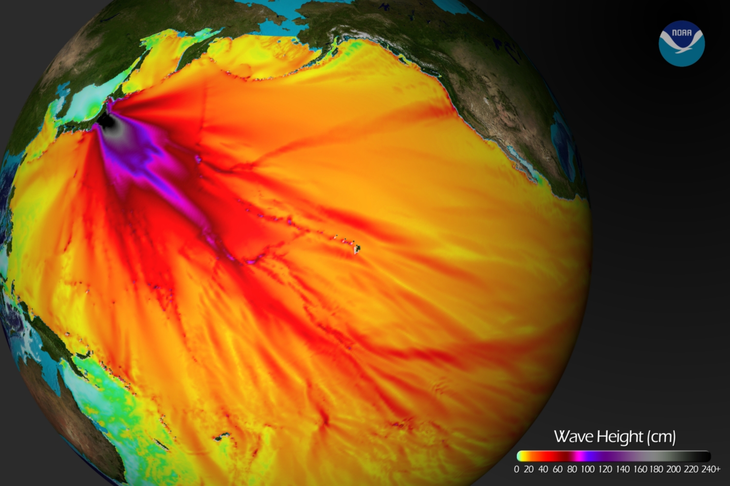
Below is a tsunami wave height model that shows the Pacific-wide impact of the event. The model was created by the NOAA Environmental Visualization Lab:

Description from NOAA:

Model runs from the Center for Tsunami Research at the NOAA Pacific Marine Environmental Laboratory show the expected wave heights of the tsunami as it travels across the Pacific basin. The largest wave heights are expected near the earthquake epicenter, off Japan. The wave will decrease in height as it travels across the deep Pacific but grow taller as it nears coastal areas. In general, as the energy of the wave decreases with distance, the near shore heights will also decrease (e.g., coastal Hawaii will not expect heights of that encountered in coastal Japan).The second image shows the depth of the Pacific Ocean floor. Notice the similarity between areas of low wave height and deeper areas of the ocean.

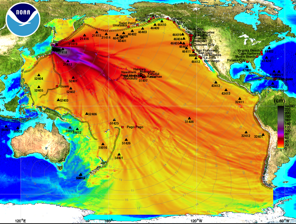
Below is an image visualizing the maximum amplitude plot for the tsunami wave.

Click here on the NOAA Center for Tsunami Research home page to download a Google Earth KMZ file with the maximum amplitude plot data shown in the visualization above.

And finally, a video showing the propagation of the tsunami wave.

httpv://www.youtube.com/watch?v=PBZGH3yieLc

From the NOAA Center for Tsunami Research:

Propagation of the March 11, 2011 Honshu tsunami was computed with the NOAA forecast method using MOST model with the tsunami source inferred from DART® data. From the NOAA Center for Tsunami Research, located at NOAA PMEL in Seattle, WA. See http://nctr.pmel.noaa.gov/honshu20110311


Categories
Crisis-Mapping General GIS GIS in Political Science Slideshow

Visualizing Japan crisis map inputs

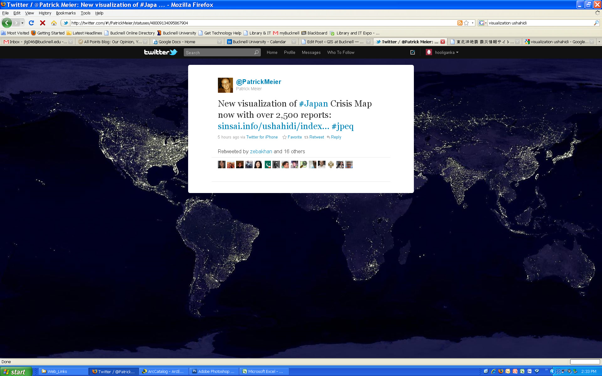
Here’s a new visualization that shows the locations worldwide that are submitting reports to the Ushahidi Japan Crisis Map. Click on the map to see full size image.


Categories
Crisis-Mapping General GIS GIS in Political Science Slideshow

Japanese earthquake – disaster/response maps

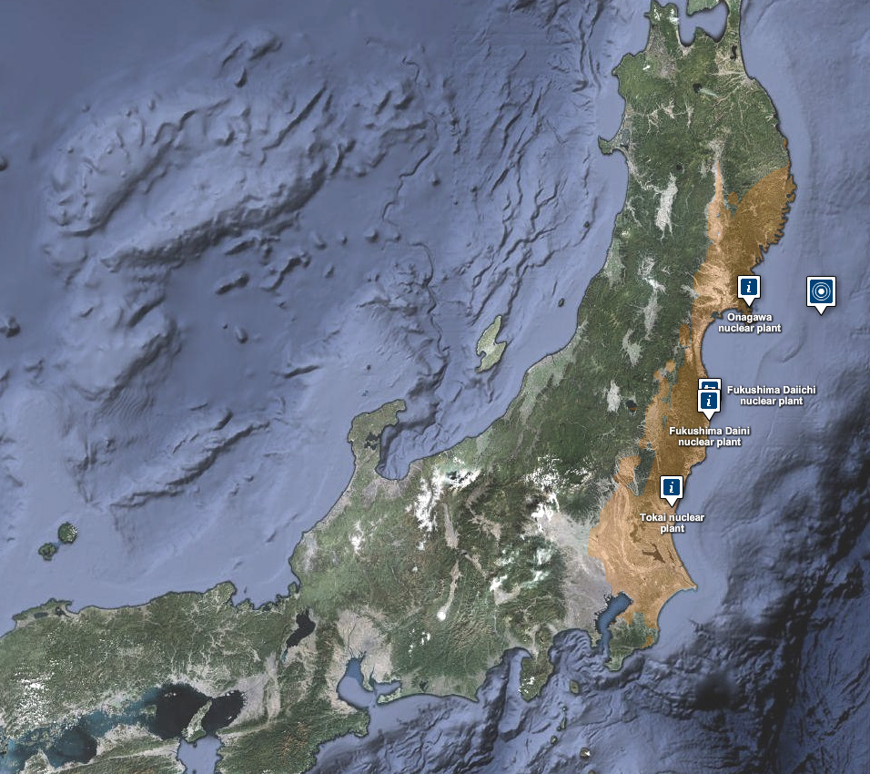
Here are some links to maps and map apps related to the Japanese earthquake and tsunami.  I’ll add more as they are released.

  • JapanQuakeMap, an animated, time-lapse visualization of the earthquake and its aftershocks created by Paul Nicholls, developer of the Christchurch Quake Map website.  From the website:
    The Japan Quake Map on this website pesents a time-lapse visualisation of the Sendai earthquake and its aftershocks, primarily to help those outside the affected area understand what the people of Japan are experiencing. It plots earthquake data from USGS on a map using the Google Maps API, with the size of the circle denoting the magnitude (the higher the magnitude, the larger the circle) and the colour showing the focal depth (see the legend below the map).
  • Click here to view the main page for Ushahidi’s Japan crisis mapping tool (in Japanese). Click here to view the Big Map. These pages use the Ushiadi platform to collect and display crowdsourced info (SMS, e-mail, Twitter, Flickr, YouTube, etc.). About the Ushahidi site:

Anyone on the ground can text in the location of a trapped person, and these locations are then collected on a map. You can also text in where to find aid, a pop-up hospital or a precarious building that should be avoided.  Good.is

  • Also from Ushahidi, a Radiation Map that uses the Crowdmap platform.  The radiation map is in both Russian and English and has other language options available.
  • Map of seismic activity in the 7 days leading up to the earthquake – from MapLarge (note: as of Wed. March 16th the MapLarge site is down – too much traffic?)
  • What is crisis mapping and how does it work? Click here to read Patrick Meier’s answer to that. Meier is the Director of Crisis Mapping at Ushahidi and co-founder of the International Network of Crisis Mappers.