Categories
Crisis-Mapping General GIS GIS in Political Science Slideshow

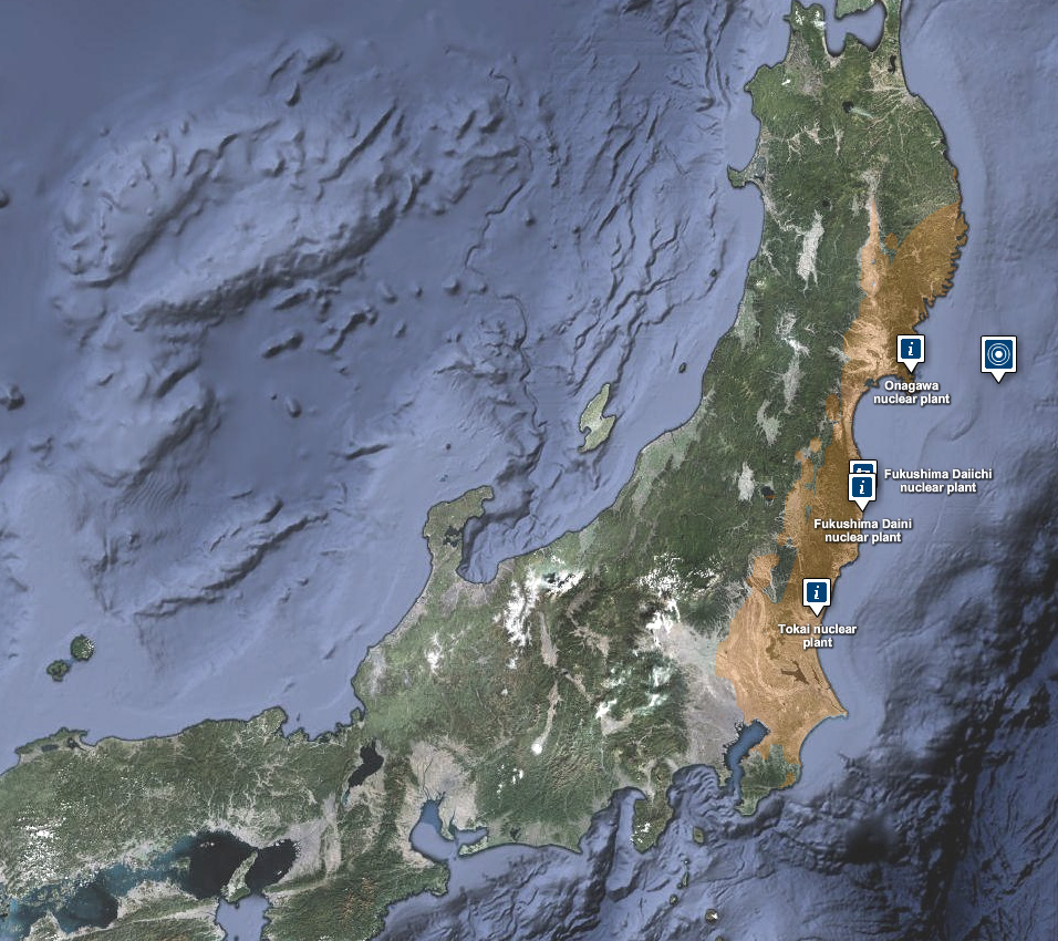
Japanese earthquake – disaster/response maps

Here are some links to maps and map apps related to the Japanese earthquake and tsunami.  I’ll add more as they are released.

  • JapanQuakeMap, an animated, time-lapse visualization of the earthquake and its aftershocks created by Paul Nicholls, developer of the Christchurch Quake Map website.  From the website:
    The Japan Quake Map on this website pesents a time-lapse visualisation of the Sendai earthquake and its aftershocks, primarily to help those outside the affected area understand what the people of Japan are experiencing. It plots earthquake data from USGS on a map using the Google Maps API, with the size of the circle denoting the magnitude (the higher the magnitude, the larger the circle) and the colour showing the focal depth (see the legend below the map).
  • Click here to view the main page for Ushahidi’s Japan crisis mapping tool (in Japanese). Click here to view the Big Map. These pages use the Ushiadi platform to collect and display crowdsourced info (SMS, e-mail, Twitter, Flickr, YouTube, etc.). About the Ushahidi site:

Anyone on the ground can text in the location of a trapped person, and these locations are then collected on a map. You can also text in where to find aid, a pop-up hospital or a precarious building that should be avoided.  Good.is

  • Also from Ushahidi, a Radiation Map that uses the Crowdmap platform.  The radiation map is in both Russian and English and has other language options available.
  • Map of seismic activity in the 7 days leading up to the earthquake – from MapLarge (note: as of Wed. March 16th the MapLarge site is down – too much traffic?)
  • What is crisis mapping and how does it work? Click here to read Patrick Meier’s answer to that. Meier is the Director of Crisis Mapping at Ushahidi and co-founder of the International Network of Crisis Mappers. 

Categories
Bucknell/Local Interest Data Environment General GIS Map Apps Slideshow

ChesapeakeView

Maurie Kelly and her team at PASDA (part of the Penn State Institute of Energy and the Environment) have just released ChesapeakeView, a website that provides free access to remotely sensed data about the Chesapeake Bay region. The website currently holds 263 datasets related to the Chesapeake Bay region – including remotely sensed data as well as habitat, land use, biodiversity, wildlife distribution, historical aerial photos, agricultural imagery, digital coastline images and other types of environmental data related to the region.

“No simple place existed to find remote sensing information about land use, habitat changes and biodiversity,” said Maurie Caitlin Kelly, director of informatics, Penn State Institutes of Energy and the Environment. “Researchers could spend days searching to find whatever data might be available.”

The data interface for ChesapeakeView will look familiar to anyone who has used PASDA’s website.  There are options for downloading the data via FTP, using an internet based data viewer/map tool or streaming it directly into your ArcMap session. ChesapeakeView is part of the AmericaView initiative.

Categories
Crisis-Mapping General GIS GIS in Political Science Map Apps Slideshow

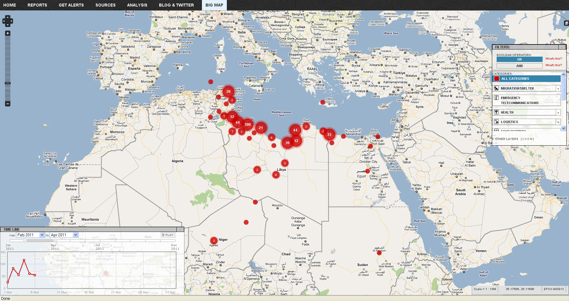
Libya crisis map

Click here to check out the new Libya Crisis Map.  Courtesy of Adena Schutzberg over at AllPointsBlog:

OCHA, UNOSAT and NetHope have been collaborating with the Volunteer Technical Community (VTC) specifically CrisisMappers, Crisis Commons, Open Street Map, and the Google Crisis Response Team over the past week.

The CrisisMappers Standby Task Force has been undertaking a mapping of social media, news reports and official situation reports from within Libya and along the borders at the request of OCHA. The Task Force is also aiding in the collection and mapping of 3W information for the response. UNOSAT is kindly hosting the Common Operational Datasets to be used during the emergency. Interaction with these groups is being coordinated by OCHA’s Information Services Section.

The public version of this map does not include personal identifiers and does not include descriptions for the reports mapped. This restriction is for security reasons. All information included on this map is derived from information that is already publicly available online


Categories
Bucknell/Local Interest Environment General GIS Map Apps Videos

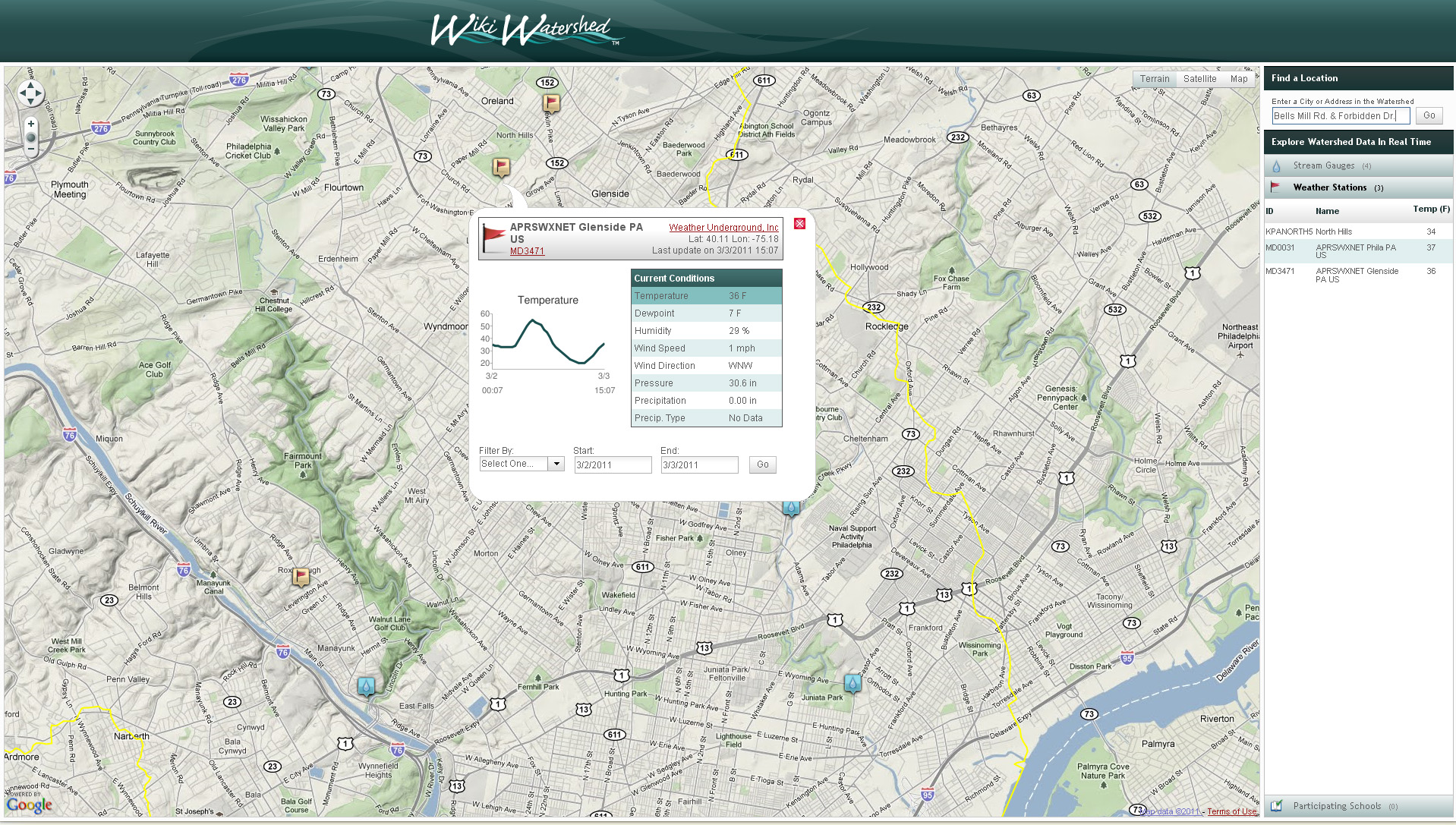
WikiWatershed – Model My Watershed

WikiWatershed is another exciting project under development by the team at Azavea.  The project – a collaboration between the Stroud Water Research CenterAzavea, University of Pennsylvania’s Cartographic Modeling Lab and Millersville University –  features a suite of web-based mapping and analysis tools designed for use by students and concerned citizens in sharing information about the streams, rivers and natural resources in their watersheds.  The first component of WikiWatershed to be released is the Model My Watershed tool which allows for web-based modeling of stormwater:

This game-like simulaton will enable students to modify underlying environmental conditions and simulate how these changes to the ecosystem affect the hydrologic cycle in their local watersheds …[and will] will use the latest version of Azavea’s DecisionTree geoprocessing framework to provide high performance, scalable modeling capabilities.

From the Stroud Water Research Center website:

When fully developed, [WikiWatershed] will leverage open source software and will function as an open collaborative resource for the community, enabling users to share geographically-tagged data, photos, videos, comments, educational curricula, simulation models and other tools on streams and rivers. As “Wiki” implies, content will be primarily contributed, enhanced and maintained by the user community. The WikiWatershed™ web portal will link a database of watershed information to geo-tagged visual content viewable on Google Maps®/Earth®, Flickr®, Panoramio®, YouTube®, etc.

Click here to explore the WikiWatershed mapping application.

Categories
Bucknell/Local Interest Digital Humanities General GIS GIS in History Map Apps Slideshow

PhillyHistory + augmented reality as a smartphone app

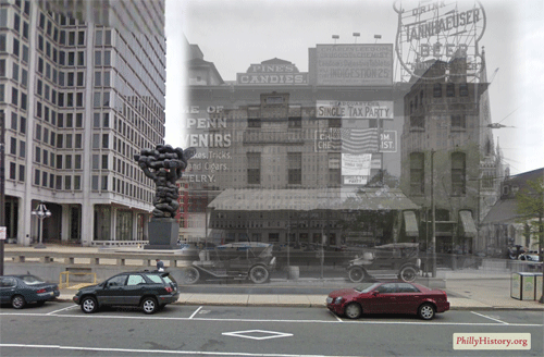
This is the first in a series of posts about several exciting new projects that my old friends and Philly GIS happy hour buddies are up to at Azavea.  The first is funded by an NEH Digital Humanities Start-Up Grant that was awarded to the Philadelphia Department of Records to create a smartphone app that will enable users to view historic photos from PhillyHistory.org draped over the current modern-day landscape.

If the research proved successful, users would be able to point their smartphones, using the camera view, at a building or other location and see historic images of that same location.  The photos would be accompanied by descriptive information from PhillyHistory.org with additional explanatory text provided by local historians.  This combination of technology and history could be a powerful tool for showing the lengthy and interesting history of Philadelphia.

Click here to read more about the project.  Azavea expects to make the app (for iPhones and phones running Android) available as a free download sometime in the next few months.  A white paper about the project will also be released this spring and could hopefully serve as both inspiration and a springboard for faculty and/or student projects at Bucknell (where we have a wealth of historical images and GIS data for Lewisburg). Click here to read a blog post from Azavea Atlas about other examples of the use of augmented reality in cultural institutions.