Categories
Bucknell/Local Interest General GIS GIS Jobs, Internships, Scholarships & Grad Programs Slideshow

GIS Job Opportunities – Azavea

In previous posts, I’ve mentioned some of the cool projects that Azavea (a GIS consulting firm in Philly) is involved in.  Things like…

Well, here’s your chance to spend a summer working for them. Azavea recently announced a paid internship program for Summer 2012 – but you have to move fast to make the April 2nd application deadline.  Here’s the write-up with details and an application form from the Azavea Summer of Maps homepage.

We are pleased to announce the first Azavea Summer of Maps. Inspired by the Google Summer of Code, Summer of Maps is a program that offers stipends to student GIS analysts to perform geospatial data analysis for non-profit organizations. We are going to match up non-profit organizations that have spatial analysis needs with talented students of GIS analysis to implement projects over a three-month period during the summer.

 What’s in it for the students?

  • Work on a spatial analysis project that supports the social mission of a non-profit organization
  • Work with Azavea mentors to improve your GIS skills
  • Receive a monthly stipend
  • Gain work experience implementing a GIS project

Key dates:

Mar 21 – April 2 – Students submit proposals and applications

April 2 – 13 – Top candidates are interviewed in Philadelphia

April 16 – Azavea announces successful Summer of Maps fellows

May 14 – August 31 – Summer of Maps fellows work on spatial analysis projects


Categories
Bucknell/Local Interest General GIS Slideshow Sports Maps Uncategorized

Nate Silver maps college football geography

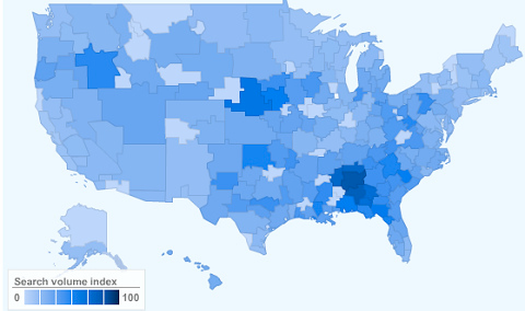
In a recent post on the New York Times’ Quad blog, Nate Silver tackles the geography of college football allegiances.  Silver – a noted statistician, blogger and election forecaster who is also credited with developing Major League Baseball’s sabermetric system for predicting player performance – used data from Google web searches and the CommonCensus Sports Map project to map college football team fan areas and then:

…use the results to shine a light on college football’s increasingly complicated realignment picture.

The premise of the study is this: take the 210 television media markets in the United States, figure out how many college football fans they have, and then allocate them between the 120 current Football Bowl Subdivision programs.

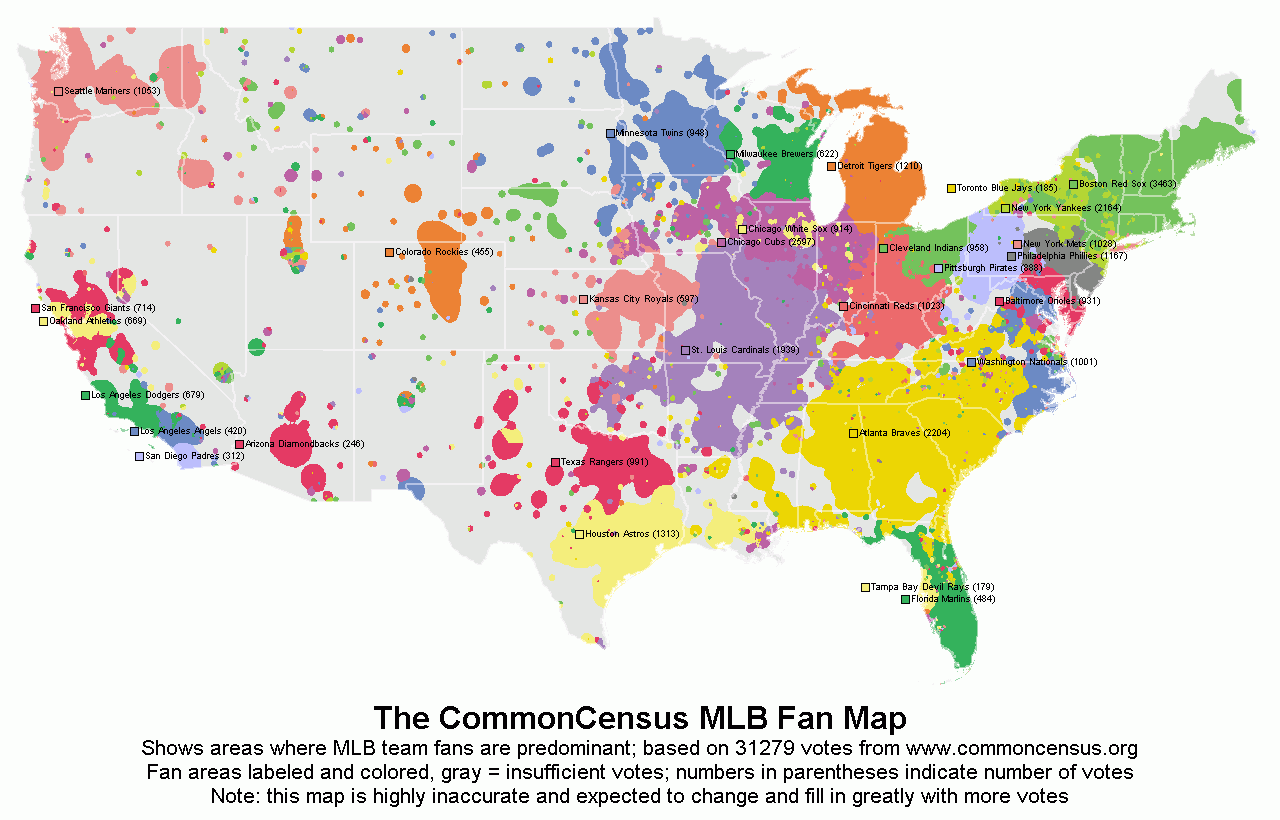
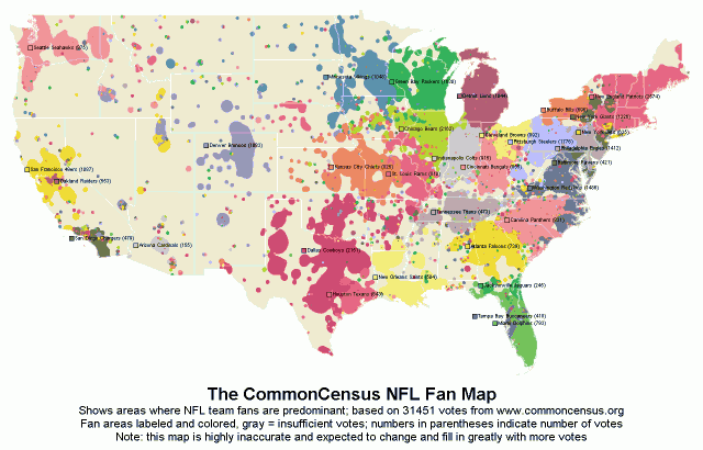
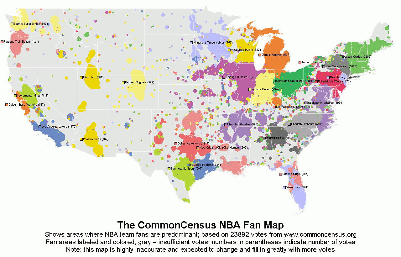
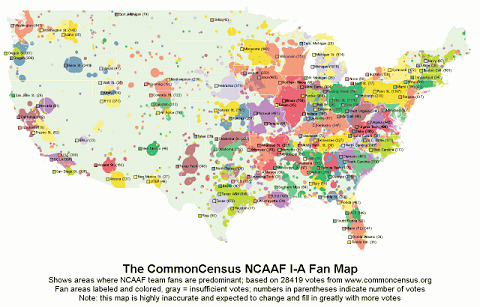
See below for images of some of the maps used in the analysis.  Also included below are CommonCensus fan maps for other sports. Click here for interactive versions of all of the CommonCensus maps (along with general info about the project). Click here to add your sports allegiances to the fan maps.

Map showing volume of Google searches for ‘college football’

Hotspot Statistics Map of NCAAF I-A Team Fan Areas

Hotspot Statistics Map of MLB Team Fan Areas

Hotspot Statistics Map of NFL Team Fan Areas


Hotspot Statistics Map of NBA Team Fan Areas


Categories
General GIS Map Apps Slideshow Videos

Google MapMaker released in U.S.

Earlier this week, Google released Google MapMaker in the U.S.  The tool, which enables users to add their own point, line and polygon features to the Google basemap (e.g. coffee shops, short-cuts across campus, soccer fields) has been available internationally since 2008 as a means for generating detailed local datasets for under-mapped areas.

The tools in the Google MapMaker interface are similar to those found in OpenStreetMap but the user-submitted data is not open source.  Nor are there any guarantees about accuracy.  Although Google runs algorithms on the back-end to review user-submitted data and provide some (very) minimal level of quality assurance it’s up to each of us to evaluate how good or bad all of this new data is.  Just remember – inaccuracies in data supplied by Google’s own staff have inflamed border disputes on a number of occassions in recent years (notably between Cambodia and Thailand; and between Nicaragua and Costa Rica).

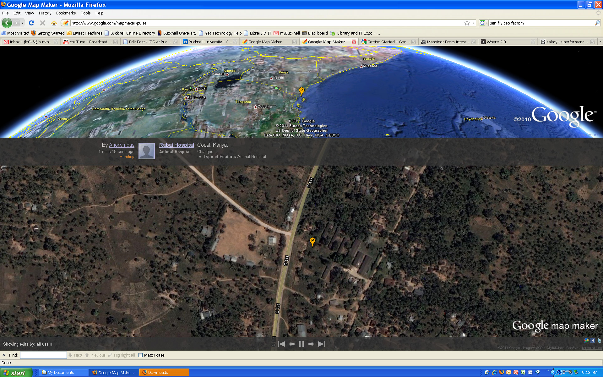
Click here to visit the Google MapMaker site. Or, click here to check out Google MapMaker Pulse – a totally addictive real-time feed showing user updates to MapMaker worldwide (see below for screenshots of updates provided by users in Kenya and Belarus). Here’s a link to an article from Wired.com on the new release.

And a video from Google advertising the new MapMaker tool:
httpv://www.youtube.com/watch?v=znCPgldRWTc&feature=player_embedded#at=16


Google MapMaker Pulse – User-generated edits from Kenya:


Google MapMaker Pulse – User-generated edits from Belarus:

Categories
General GIS GIS in Psychology Map Apps Slideshow

Sad maps at University of Florida

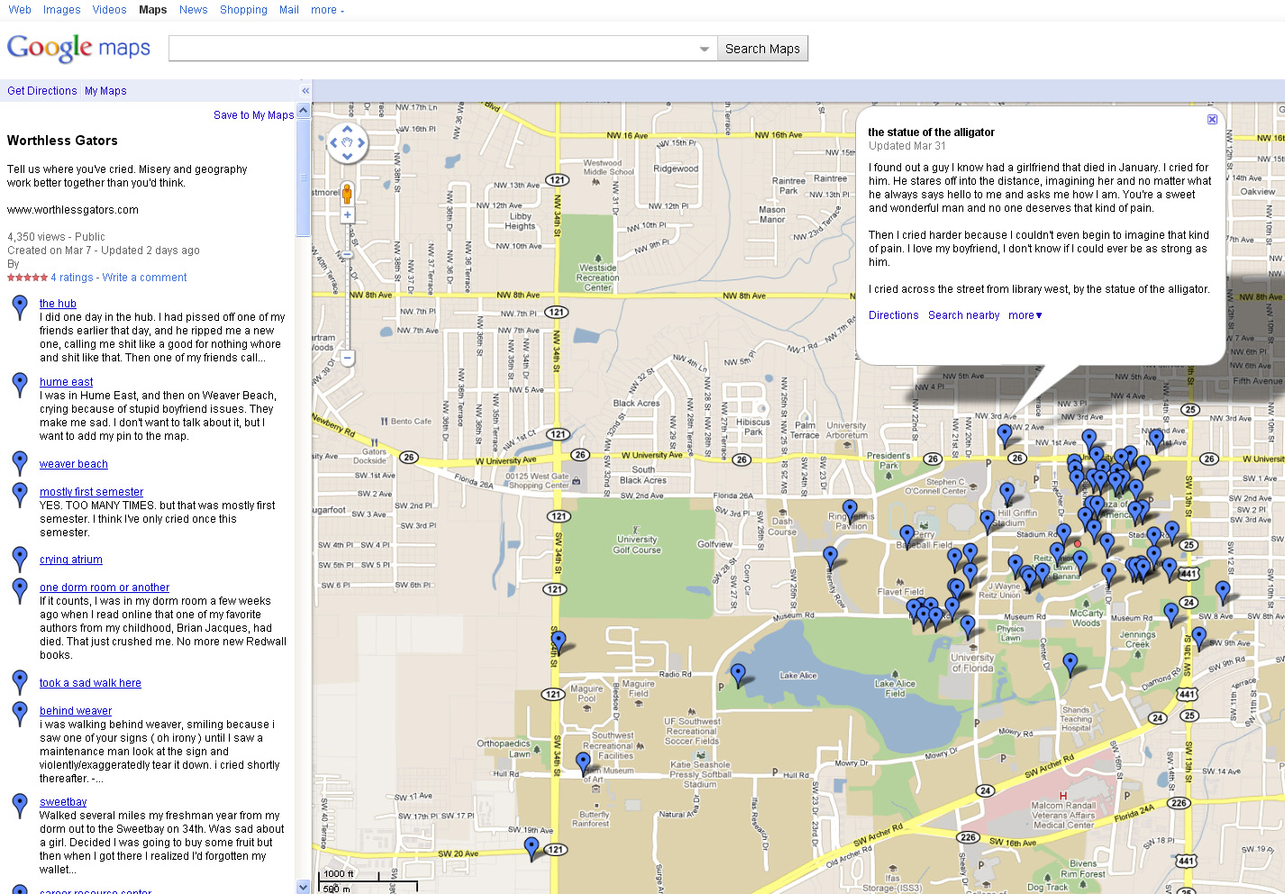
A few weeks ago I posted about Cambridge University PhD student Alex Davies’ project on mapping happiness.   Over at worthlessgators.com University of Florida student(?)  ”Sad Hector’ is doing the exact opposite – mapping sadness on University of Florida’s Gainesville campus.  Prompted to ‘tell us where you’ve cried,’ visitors to the site can fill out a short form (below) with the location and details of the crying incident and then see their entry added to the GoogleMaps ‘sad map.’

Created in early March, the site already has 60+ entries mapped. Crying locations run the gamut from the predictible (fraternity row, dorms) to the scenic (shores of Lake Alice, local parks) to the  unexpected (near the Florida Museum of Natural History Ogliocene Period display).  Parking garages seem to be a fairly popular crying location at U of F.  In addition to just noting the locations of crying on campus, the site also has a link to the U of F Counseling and Wellness Center for students who want to seek help.

Thanks to Kathleen for the heads up about this site!


Categories
Crisis-Mapping General GIS GIS in Political Science Slideshow

Japanese earthquake – disaster/response maps

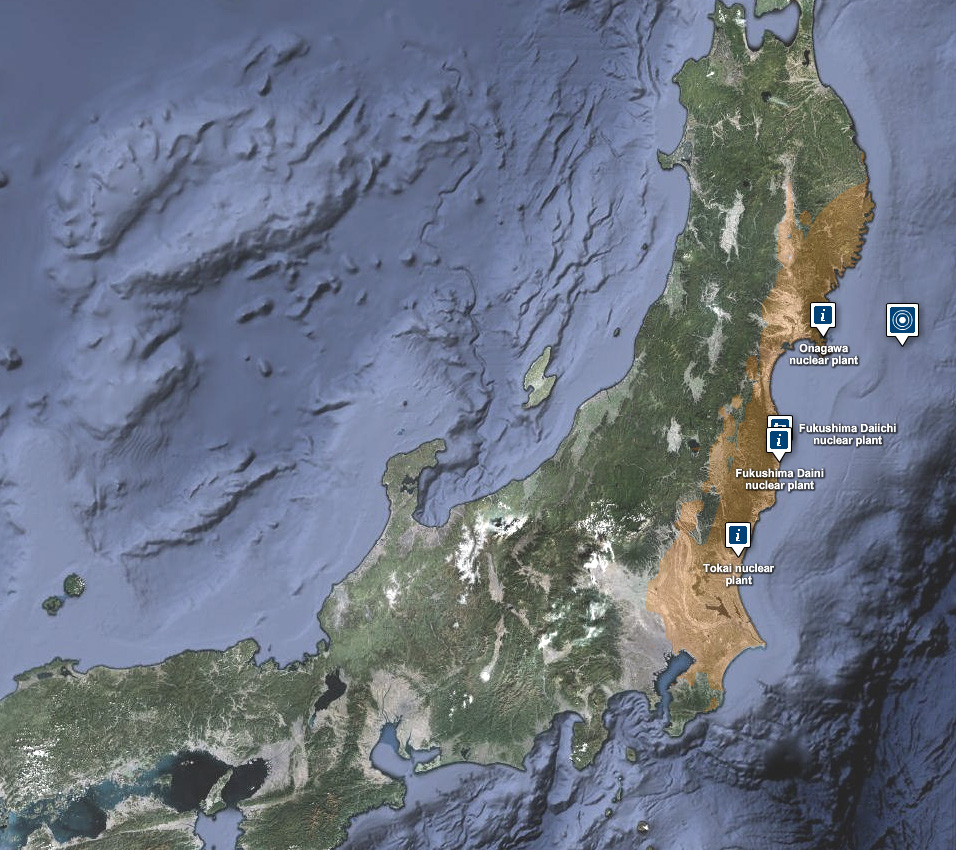
Here are some links to maps and map apps related to the Japanese earthquake and tsunami.  I’ll add more as they are released.

  • JapanQuakeMap, an animated, time-lapse visualization of the earthquake and its aftershocks created by Paul Nicholls, developer of the Christchurch Quake Map website.  From the website:
    The Japan Quake Map on this website pesents a time-lapse visualisation of the Sendai earthquake and its aftershocks, primarily to help those outside the affected area understand what the people of Japan are experiencing. It plots earthquake data from USGS on a map using the Google Maps API, with the size of the circle denoting the magnitude (the higher the magnitude, the larger the circle) and the colour showing the focal depth (see the legend below the map).
  • Click here to view the main page for Ushahidi’s Japan crisis mapping tool (in Japanese). Click here to view the Big Map. These pages use the Ushiadi platform to collect and display crowdsourced info (SMS, e-mail, Twitter, Flickr, YouTube, etc.). About the Ushahidi site:

Anyone on the ground can text in the location of a trapped person, and these locations are then collected on a map. You can also text in where to find aid, a pop-up hospital or a precarious building that should be avoided.  Good.is

  • Also from Ushahidi, a Radiation Map that uses the Crowdmap platform.  The radiation map is in both Russian and English and has other language options available.
  • Map of seismic activity in the 7 days leading up to the earthquake – from MapLarge (note: as of Wed. March 16th the MapLarge site is down – too much traffic?)
  • What is crisis mapping and how does it work? Click here to read Patrick Meier’s answer to that. Meier is the Director of Crisis Mapping at Ushahidi and co-founder of the International Network of Crisis Mappers.