Categories
Bucknell/Local Interest Data Environment General GIS GIS in Engineering GIS in Environmental Studies Slideshow

GIS in the Classroom: Civil & Environmental Engineering 432

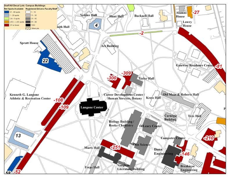
Last summer, Bucknell’s administration asked our GIS team to conduct an analysis of parking availability across campus.  The project was assigned to Dan Dougherty, Geography/History ’12 and is summarized in Dan’s guest post here. This spring, a team of four students in Prof. Michelle Oswald’s CENG 432 course, Sustainable Transportation Engineering, are picking up where Dan left off. The team – comprised of Meredith Menzel, Emily Liggett, Dennis Lee and Jordan Roder (all CENG majors from the class of 2012) – intends to add new data, extend the analysis and propose environmentally-friendly solutions to the parking shortages across campus. Says Menzel,

“We are planning on doing some of our own surveying to update these parking lot ratios and update the maps with any new parking lots, especially in relation to the current construction, the Bucknell South campus project, and the Master Plan.

We are also planning on surveying Bucknell students and staff to collect more information about who drives, walks, etc. to evaluate the parking demand which will help us propose new parking solutions. If some of these solutions involve physically redesigning the parking lots at Bucknell, we were planning on creating some new maps to present our solutions.”

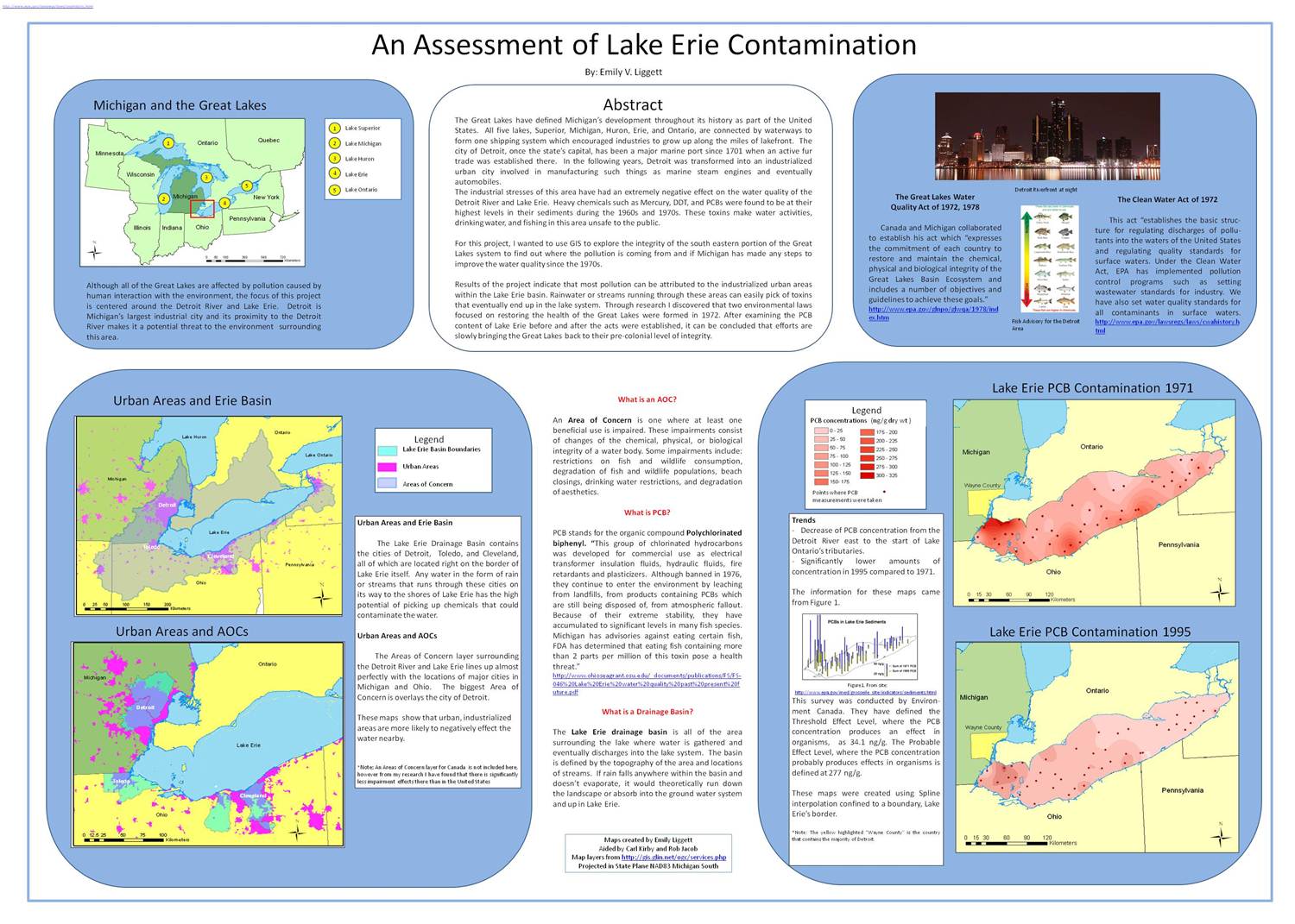
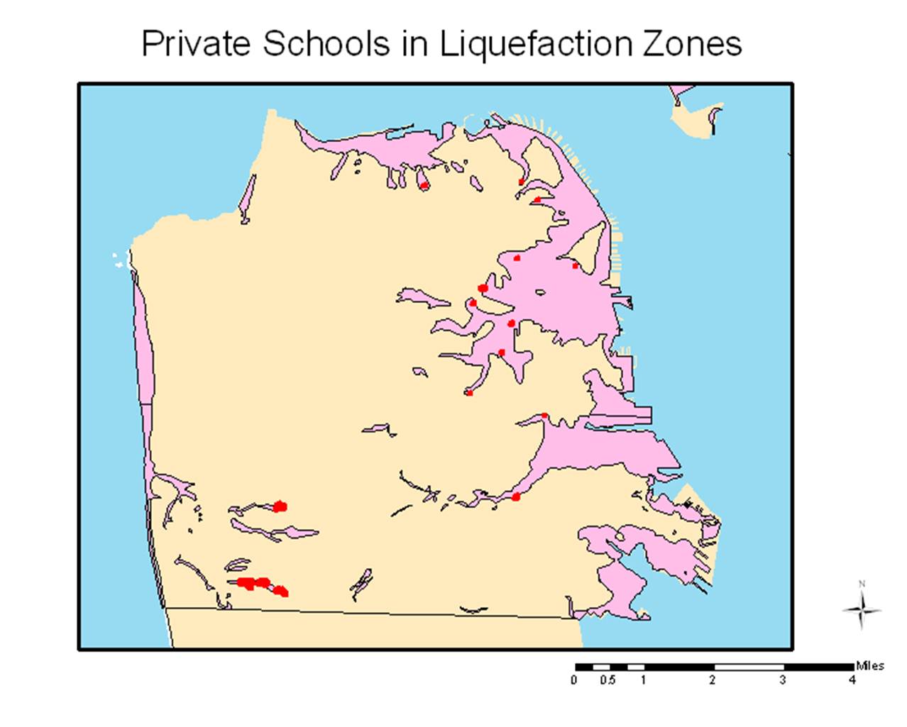
Incidentally, 3 of the 4 team members (Menzel, Liggett and Lee), are veterans of Prof. Carl Kirby’s GEOL230 class, Environmental GIS. Below are maps that each of the students produced for GEOL230 (click on the images to view them at full size). Stay tuned for updates for their work on the parking analysis.

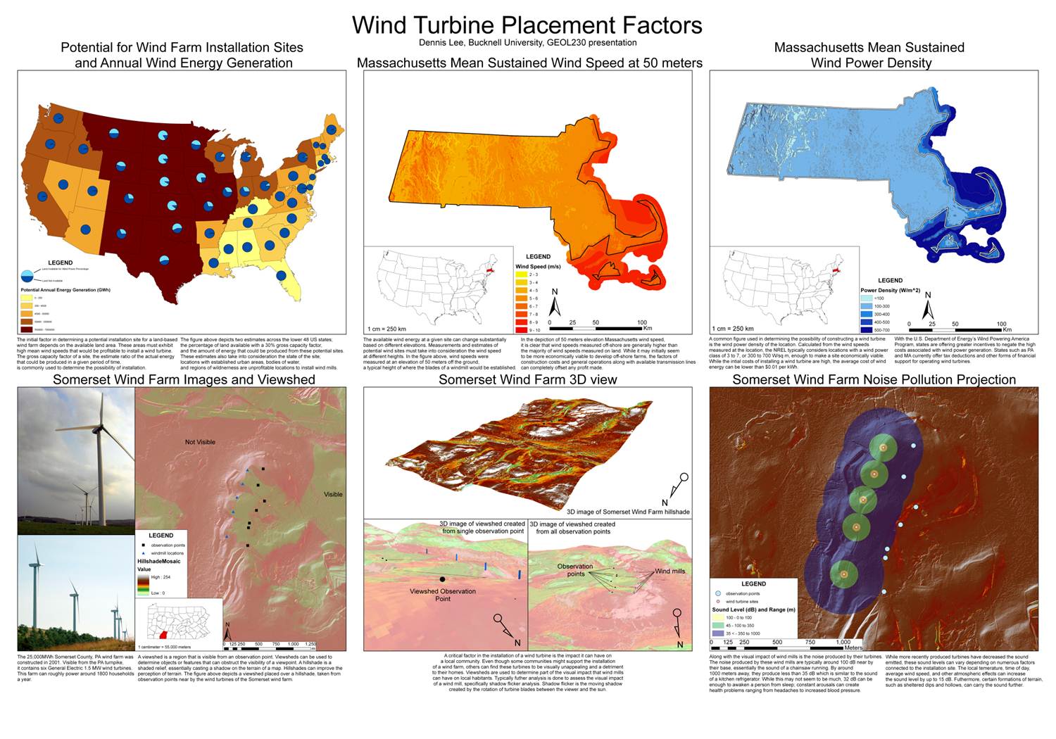
Dennis Lee’s poster from GEOL230
 Emily Liggett’s poster from GEOL230
A map from Meredith Menzel’s GEOL230 presentation


Categories
Bucknell/Local Interest General GIS Slideshow Sports Maps Uncategorized

Nate Silver maps college football geography

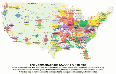
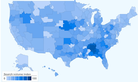
In a recent post on the New York Times’ Quad blog, Nate Silver tackles the geography of college football allegiances.  Silver – a noted statistician, blogger and election forecaster who is also credited with developing Major League Baseball’s sabermetric system for predicting player performance – used data from Google web searches and the CommonCensus Sports Map project to map college football team fan areas and then:

…use the results to shine a light on college football’s increasingly complicated realignment picture.

The premise of the study is this: take the 210 television media markets in the United States, figure out how many college football fans they have, and then allocate them between the 120 current Football Bowl Subdivision programs.

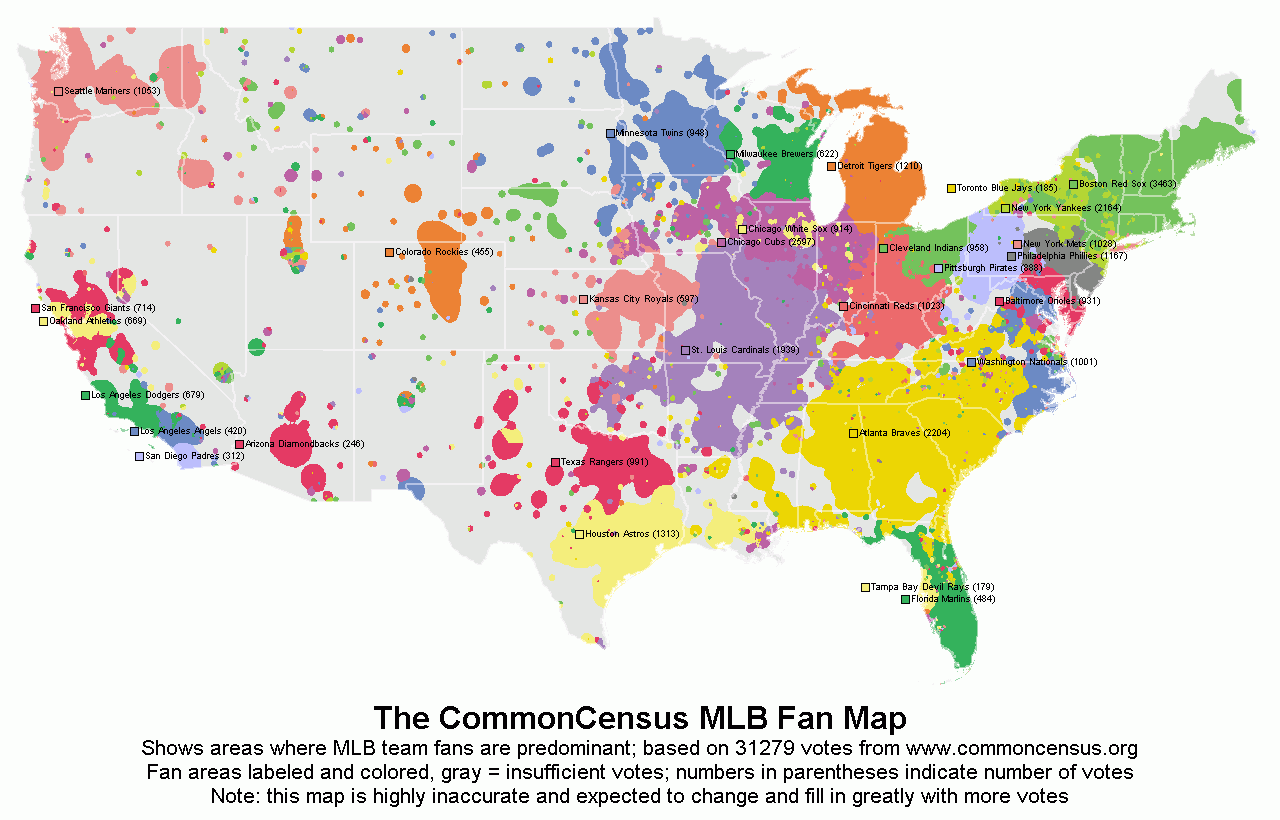
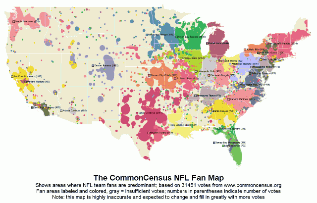
See below for images of some of the maps used in the analysis.  Also included below are CommonCensus fan maps for other sports. Click here for interactive versions of all of the CommonCensus maps (along with general info about the project). Click here to add your sports allegiances to the fan maps.

Map showing volume of Google searches for ‘college football’

Hotspot Statistics Map of NCAAF I-A Team Fan Areas

Hotspot Statistics Map of MLB Team Fan Areas

Hotspot Statistics Map of NFL Team Fan Areas


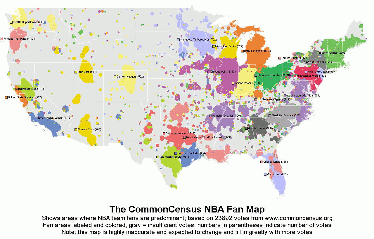
Hotspot Statistics Map of NBA Team Fan Areas


Categories
Data General GIS GIS in Environmental Studies GIS in Geography GIS in Humanities GIS in Political Science GIS in Public Health GIS in Sociology Map Apps Slideshow

3 global data visualization tools to use in your class

Last fall the World Bank launched a contest aimed at challenging web developers to create web-based tools using the data available through the World Bank’s Open Data Initiative. Click here to read an article from Programmable Web about the contest winners (excerpt below).

You can visualize nearly every indicator of economic, social and human development on StatPlanet World Bank, the winner of World Bank’s ambitious developer contest launched last October challenging new uses of the World Bank API. After voting from distinguished judges and the public, the organization announced the top three apps at an event in Washington, D.C., this afternoon.

StatPlanet is already a platform used by non-profits and other groups to map and visualize data. Its creator Frank van Cappelle said the application is aimed toward “evidence-based decision making.” For the World Bank contest, van Cappelle connected his platform to World Bank’s API. Where one of the challenges with World Bank’s data is how much of it there is, StatPlanet does a great job of helping users zero in on and visualize what interests them.

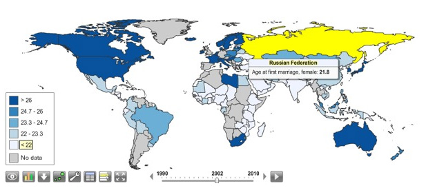
StatPlanet enables users to visualize global development indicators via customizeable maps and charts – and also provides a data download tool.  StatPlanet could be used in combination with WorldMapper and Gapminder – two other web-based global data visualization tools – for in-class demos and/or as a resource for student projects.  Click here to go to the StatPlanet main landing page or here to go directly to the tool.