Categories
Data General GIS GIS in Environmental Studies GIS in Geography GIS in Humanities GIS in Political Science GIS in Public Health GIS in Sociology Map Apps Slideshow

3 global data visualization tools to use in your class

Last fall the World Bank launched a contest aimed at challenging web developers to create web-based tools using the data available through the World Bank’s Open Data Initiative. Click here to read an article from Programmable Web about the contest winners (excerpt below).

You can visualize nearly every indicator of economic, social and human development on StatPlanet World Bank, the winner of World Bank’s ambitious developer contest launched last October challenging new uses of the World Bank API. After voting from distinguished judges and the public, the organization announced the top three apps at an event in Washington, D.C., this afternoon.

StatPlanet is already a platform used by non-profits and other groups to map and visualize data. Its creator Frank van Cappelle said the application is aimed toward “evidence-based decision making.” For the World Bank contest, van Cappelle connected his platform to World Bank’s API. Where one of the challenges with World Bank’s data is how much of it there is, StatPlanet does a great job of helping users zero in on and visualize what interests them.
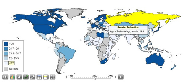
StatPlanet enables users to visualize global development indicators via customizeable maps and charts – and also provides a data download tool.  StatPlanet could be used in combination with WorldMapper and Gapminder – two other web-based global data visualization tools – for in-class demos and/or as a resource for student projects.  Click here to go to the StatPlanet main landing page or here to go directly to the tool.
Categories
Bucknell/Local Interest Data Digital Humanities Environment General GIS GIS in Biology GIS in Computer Science GIS in Engineering GIS in Environmental Studies GIS in Geography GIS in Geology GIS in History GIS in Humanities GIS in Psychology GIS in Sociology Map Apps Marcellus Shale Miller Run Restoration Project Slideshow

What we’re up to this summer (and why we’re not posting)

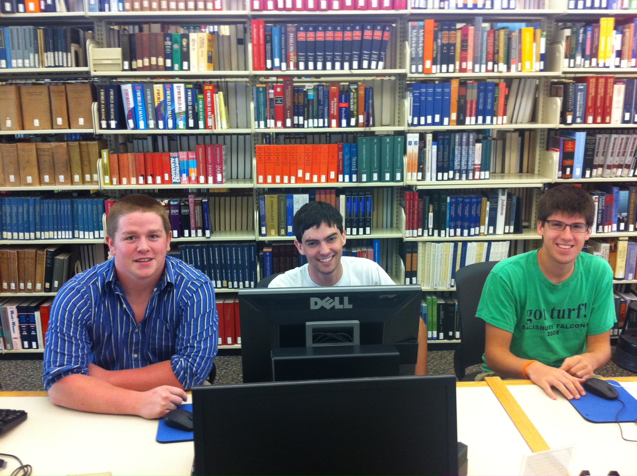
Thanks to the Mellon grant and a huge number of faculty teaching and research projects it’s been a very busy summer of GIS work at Bucknell.  Over the coming weeks I’ll write detailed posts about the work we’re doing on each of the projects.  If I’m really ambitious I might try to post some interviews with faculty and students – and some footage of the aerial drone flights that Nick Urban ’12 is doing. But for now here’s a short overview of who’s doing GIS work at Bucknell this summer and what we’re doing:

GIS Student Assistants:

  • Chad Lawlis, Environmental Studies ’11
  • Dan Dougherty, Geography/History ’12
  • Max Stiss, Geography/Anthropology ’12
  • Nick Urban, Computer Science ’12
  • Mike Grasso, Environmental Studies ’13
  • Robby Holler, Geography/International Relations ’13 (pictured below)
  • Darin Rockwell, Geography/Geology ’13 (pictured below)
  • Dan Ladd, Middlebury College ’14 (pictured below)

Key Projects:

  • Maps for Sudan field guide atlas to mammals
  • GPS data collection for Lewisburg Cemetary
  • GPS data collection for Miller Run restoration project
  • Aerial drone data collection for Miller Run restoration project
  • Lycoming County/Williamsport community asset mapping
  • Mapping toxic contamination from Marcellus Shale natural gas wells
  • Mapping locations of Marcellus Shale water withdrawl permits
  • Georeferencing & vectorizing 19th century economic maps of Vietnam
  • Georeferencing & vectorizing maps of environmental hazards and resources in Kyrgyzstan
  • Georeferencing & vectorizing 1868 Historic Atlas of Union & Snyder Counties
  • Data development for Stories of the Susquehanna project
  • Support for student research projects – including GPS’ing dumpster locations on campus for an analysis of campus waste and recycling, and updating Arboretum tree dataset with location info for newly planted and felled trees
  • Develop pilot web map apps for showcasing faculty research
  • Develop pilot web map apps for use in teaching
  • Implement backend IT infrastructure to support ArcGIS server
  • Maps for Bucknell admin purposes, including: analysis of parking shortages on campus; maps for task force report on campus climate; maps for SBDC report on services by county; arts festival map.


Categories
Bucknell/Local Interest Events/Calendar General GIS Map Apps Slideshow

Upcoming map competitions

Students – now that you are finished with your final GIS projects (you are finished, right?) why not submit them to one of these upcoming competitions. Bucknell students have won awards in other map competitions – let’s do it again:

1. 2011 National Council for Geographic Information (NCGE) Conference & Map Gallery:

The 2011 NCGE Map Gallery Committee invites you to submit a map for display during the 2011 Conference.  All GIS maps are welcome.  The maps will be judged by a panel of peers, with the exception of the People’s Choice Award, which will be voted on by the Conference attendees.  The Map Contest will feature two award categories and the winners will be announced at the closing session on Saturday, August 6, 2011.  Please review the minimum requirements and categories carefully when designing the content of your map entry.

Awards
Best Cartographic Design (Higher Ed., K-12 & People’s Choice) – Awarded to the map that artistically employs the elements of cartography without compromising use and functionality. Maps will be judged on fundamental cartographic principles including figure ground representations, visual hierarchy, color selection, typography, symbology, overall aesthetic appearance, etc.

Best Analysis (Higher Ed., K-12 & People’s Choice) – Awarded to the map that is best designed to display the results of spatial data analysis and presents the information in an unbiased way, allowing the viewer to extract their own conclusions, utilizing the map as a tool.

For guidelines & to submit maps, click here.

2. ESRI’s ‘Storytelling with Maps’ Competition.

Every map tells a story. Share your most interesting web map or mobile app in our Storytelling with Maps Contest. Entries will be judged on how well they make the subject matter interesting, understandable, and engaging. Web map and mobile app entries can be submitted April 29 – June 10, 2011. Prizes will be awarded for first, second, and third place in each category. Winners will be announced in July at the 2011 Esri International User Conference (Esri UC) in San Diego, California.

For guidelines and to submit web map or mobile apps, click here.

Categories
Bucknell/Local Interest Environment General GIS GIS in Biology Map Apps Slideshow

Stink bug mapping tool

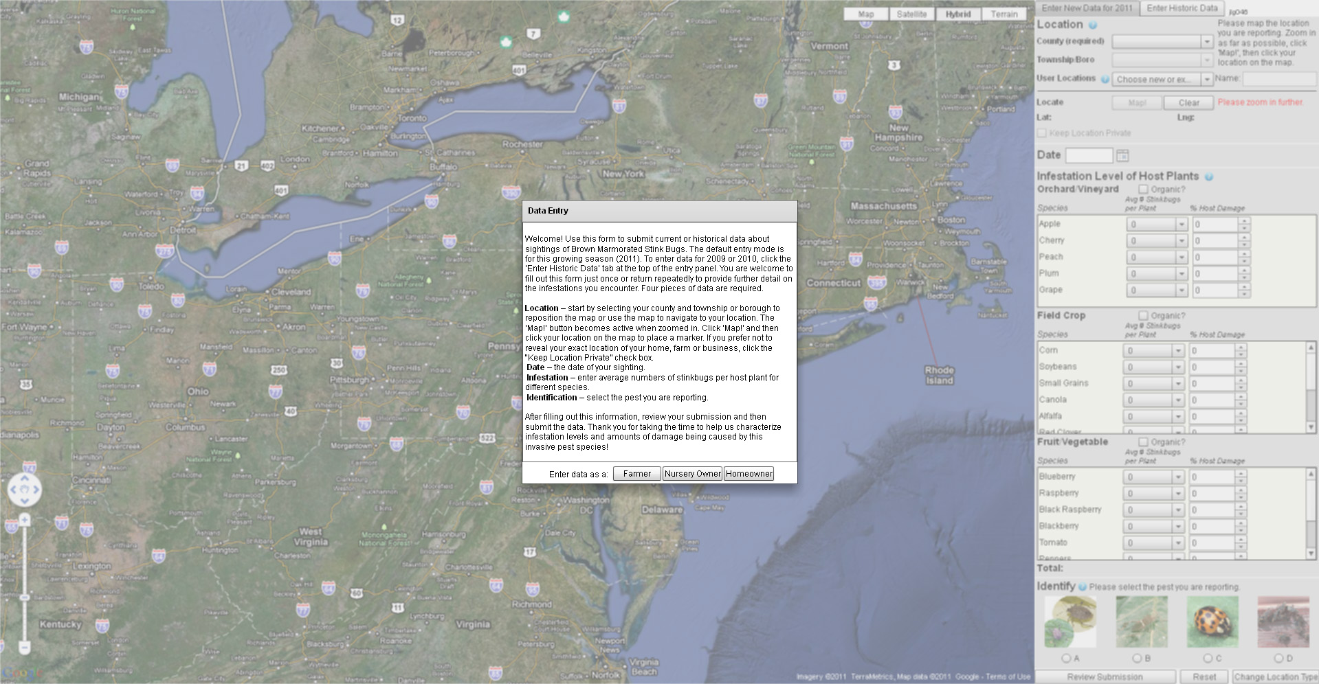
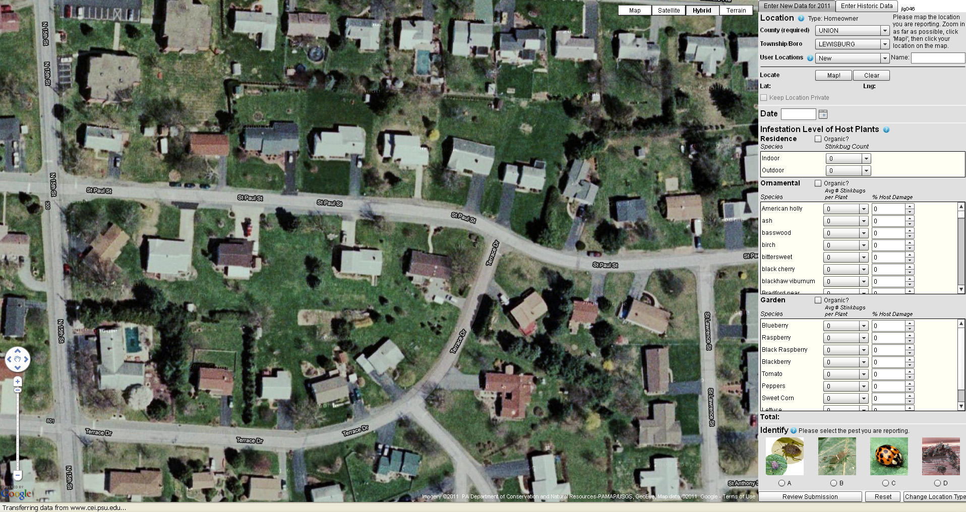
Penn State and the PA Department of Agriculture have just released a new web-based tool for mapping infestations of stink bugs across the state. The mapping tool collects and displays user-submitted data on stink bug sightings. After creating a login ID and passwords, users specify whether they are a farmer, nursery owner or homeowner and then identify their reporting location using either a Google Maps interface and/or a form to specify their county and municipality. Next, the user provides information on the level and type of infestation – including the number of stink bugs per type of tree, plant, and/or crop.

Read a story about the new website here. Click here to visit the Stink Bug website and map app. See below for some screenshots of the website and stink bug reporting interface.


Categories
Bucknell/Local Interest Digital Humanities General GIS GIS in Environmental Studies GIS in Geography GIS in History GIS in Humanities Map Apps Marcellus Shale Slideshow Videos

Uncovering the ‘Stories of the Susquehanna’ using GIS

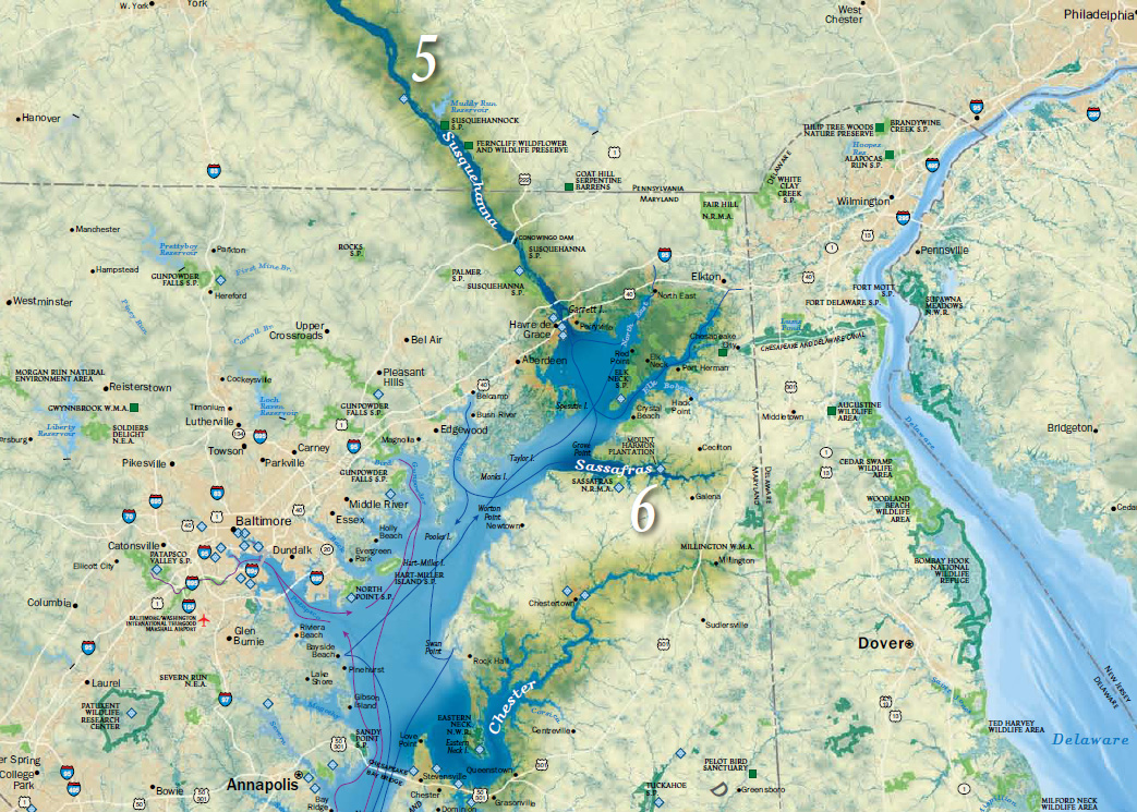
Bucknell faculty have long had an interest in grounding their research efforts locally – using the physical, cultural, historical and sociological landscapes of the Susquehanna Valley region as a living laboratory. The two videos below feature Prof. Katherine Faull and student Emily Bitely ’11 talking about the role of GIS in two such projects – the Stories of the Susquehanna, and the John Smith Trail Extension project (both multi-year, inter-disciplinary projects involving faculty from across the campus).

Katie Faull discussing her use of GIS for the John Smith Trail Extension and Stories of the Susquehanna project:
httpv://www.youtube.com/watch?v=j2eG2v8FnOA

Emily Bitely ’11 discussing her use of GIS for the same projects:
httpv://www.youtube.com/watch?v=1uPcaaqSzII

More about the John Smith Trail:

  • To learn more about the John Smith Trail, click here or here.
  • To view a National Geographic map detailing Captain John Smith’s voyage, click here.
  • To view a map of interpretive ‘smart’ buoys located in the river, click here.

More about the Stories of the Susquehanna project:

  • A pilot web mapping application featuring two of the ‘Stories of the Susquehanna’ is scheduled to launch this fall.  Stay tuned for more details.
  • Click here to read about the 2010 Susquehanna Valley Summer Writer’s Institute (SVSWI).  The SVSWI project is related to the Stories of the Susquehanna both in the type of local stories it explores and in its use of maps, audio, video, images and text to reflect on those stories in an interactive digital story-telling environment.
  • Click here to view the SVSWI’s interactive mapping application featuring students’ reflections on the impact of the Marcellus Shale gas boom on different populations in the Susquehanna Valley region.