Categories
General GIS GIS in Computer Science Map Apps Slideshow Videos

Your iPhone is Tracking You

O’Reilly Media published a story yesterday (on the penultimate day of its Where2.0 conference no less…)  describing Alasdair Allan and Pete Warden’s discovery of a hidden file on your iPhone and 3G iPad that keeps a running record of your device’s whereabouts. The file, part of the iOS4 release, records both latitude/longitude and timestamps – making it possible to create a detailed map of any and all movements you’ve made while having the iPhone or 3G iPad on your person.

There is a debate underway about both the significance of this finding as well as how new a ”discovery’ it is  (see links below). But I’m kinda on the same page as Alexis Madrigal from the Atlantic – as much as I’m a little disturbed by the idea of a secret log of my whereabouts, I’m also fascinated by the idea of playing around with the data my iPhone has recorded and I’m curious to see what kinds of visualizations could be created out of it. If you’re curious about this too, you can visit Pete Warden’s website to download a free, open source app that will map the data from your iPhone or iPad tracking file.  See below for some sample ‘heat maps’ that were created using the tracking data from various user’s iPhones. Click here to see a video from Pete Warden’s website showing animation of tracking data from Warden’s iphone mapped by location and timestamp.

Story from O’Reilly Media:
Got an iPhone or 3G iPad? Apple is recording your moves

Story from Alex Levinson’s Blog:
Three Major Issues with the Latest iPhone ‘Discovery’

Story from The Atlantic:
My Life According To The iPhone’s Secret Tracking Log

Story from Gizmodo:
iSpy Conspiracy: Your iPhone is Secretly Tracking Everywhere You’ve Been, All the Time

Story from zdnet.com
Your iPhone is Tracking You (And Has Been for Awhile)

Two O’Reilly media researchers, Alasdair Allan and Pete Warden, caused quite a stir yesterday when they published an article about a hidden file in iOS 4 that regularly records the position of your device. All iPhones running iOS 4.0 or later log your location to a file called “consolidated.db” (a plain SQL file) which contains latitude-longitude coordinates and a timestamp.

Story from The Guardian:
iPhone Tracking Prompts Privacy Fears

Security researchers have discovered that Apple‘s iPhone keeps track of where you go – and saves every detail of it to a secret file on the device which is then copied to the owner’s computer when the two are synchronised. The file contains the latitude and longitude of the phone’s recorded coordinates along with a timestamp, meaning that anyone who stole the phone or the computer could discover details about the owner’s movements using a simple program.For some phones, there could be almost a year’s worth of data stored, as the recording of data seems to have started with Apple’s iOS 4 update to the phone’s operating system, released in June 2010.

YouTube Video of Pete Warden and Alastair Allan discussing the iPhone tracker at Where2.0:

httpv://www.youtube.com/watch?v=GynEFV4hsA0&p=0B2FEB8AACD826BE

Sample ‘heat map’ of Alexis Madrigal’s movements (created from data in the iPhone tracker file):
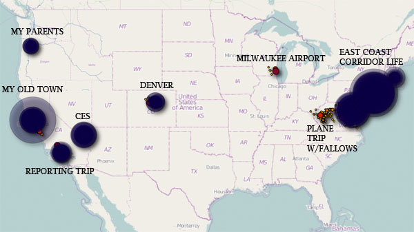
 

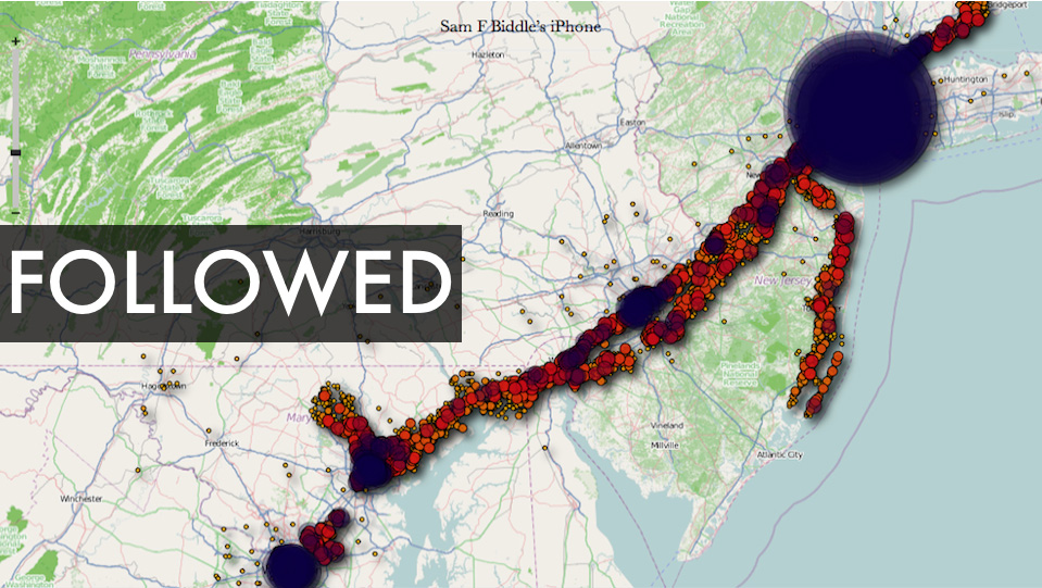
Sample ‘heat map’ from Sam Biddle’s iPhone:
 

Categories
General GIS Map Apps Slideshow Videos

Google MapMaker released in U.S.

Earlier this week, Google released Google MapMaker in the U.S.  The tool, which enables users to add their own point, line and polygon features to the Google basemap (e.g. coffee shops, short-cuts across campus, soccer fields) has been available internationally since 2008 as a means for generating detailed local datasets for under-mapped areas.

The tools in the Google MapMaker interface are similar to those found in OpenStreetMap but the user-submitted data is not open source.  Nor are there any guarantees about accuracy.  Although Google runs algorithms on the back-end to review user-submitted data and provide some (very) minimal level of quality assurance it’s up to each of us to evaluate how good or bad all of this new data is.  Just remember – inaccuracies in data supplied by Google’s own staff have inflamed border disputes on a number of occassions in recent years (notably between Cambodia and Thailand; and between Nicaragua and Costa Rica).

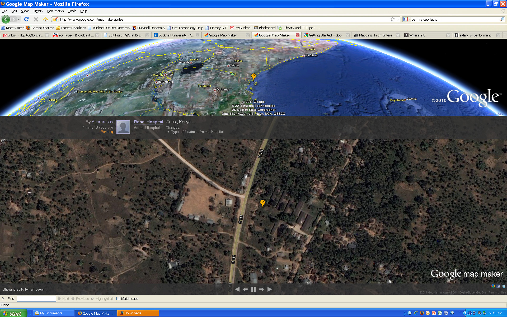
Click here to visit the Google MapMaker site. Or, click here to check out Google MapMaker Pulse – a totally addictive real-time feed showing user updates to MapMaker worldwide (see below for screenshots of updates provided by users in Kenya and Belarus). Here’s a link to an article from Wired.com on the new release.

And a video from Google advertising the new MapMaker tool:
httpv://www.youtube.com/watch?v=znCPgldRWTc&feature=player_embedded#at=16


Google MapMaker Pulse – User-generated edits from Kenya:


Google MapMaker Pulse – User-generated edits from Belarus:

Categories
General GIS GIS in Psychology Map Apps Slideshow

Sad maps at University of Florida

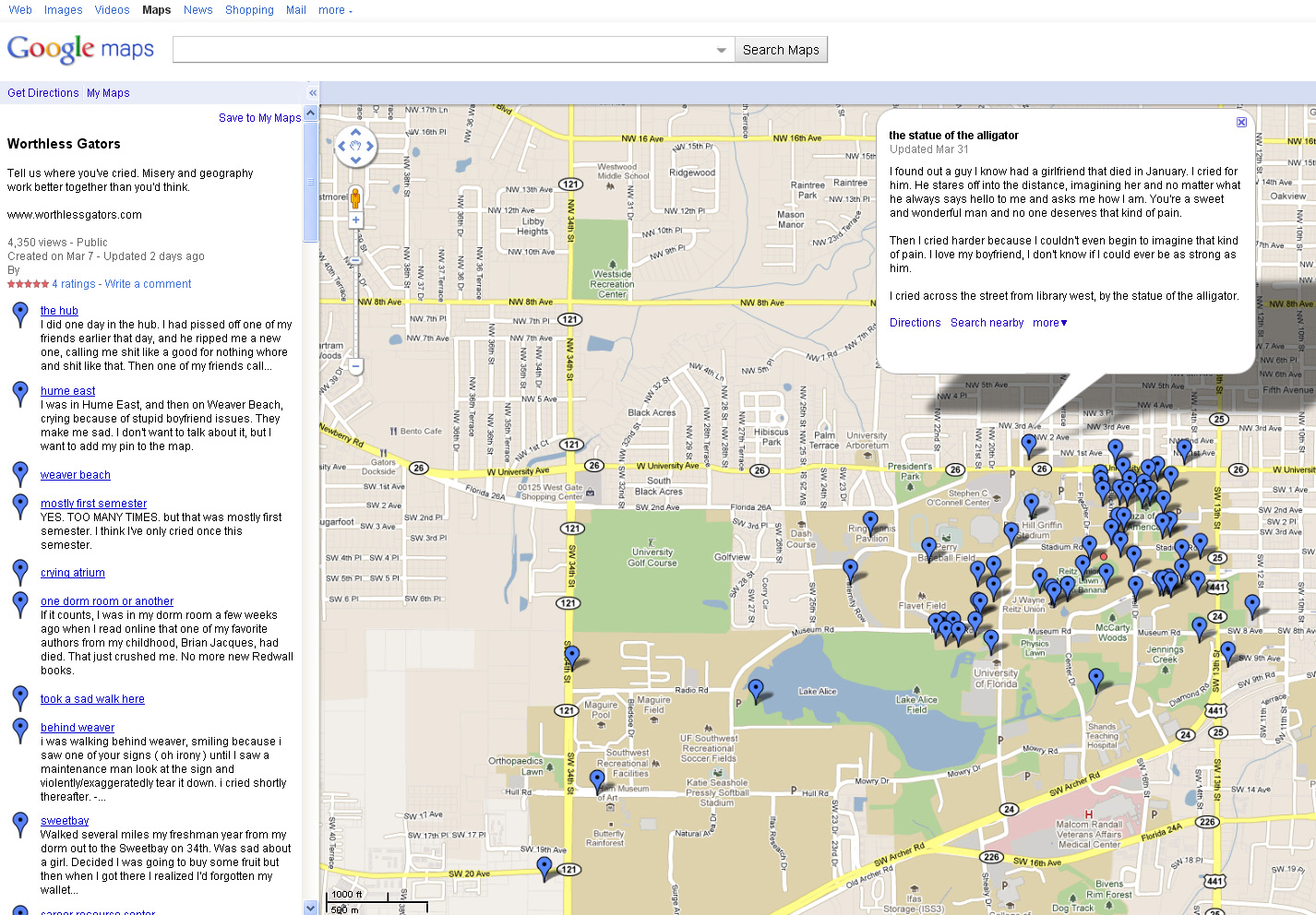
A few weeks ago I posted about Cambridge University PhD student Alex Davies’ project on mapping happiness.   Over at worthlessgators.com University of Florida student(?)  ”Sad Hector’ is doing the exact opposite – mapping sadness on University of Florida’s Gainesville campus.  Prompted to ‘tell us where you’ve cried,’ visitors to the site can fill out a short form (below) with the location and details of the crying incident and then see their entry added to the GoogleMaps ‘sad map.’

Created in early March, the site already has 60+ entries mapped. Crying locations run the gamut from the predictible (fraternity row, dorms) to the scenic (shores of Lake Alice, local parks) to the  unexpected (near the Florida Museum of Natural History Ogliocene Period display).  Parking garages seem to be a fairly popular crying location at U of F.  In addition to just noting the locations of crying on campus, the site also has a link to the U of F Counseling and Wellness Center for students who want to seek help.

Thanks to Kathleen for the heads up about this site!


Categories
General GIS GIS in Geography GIS in Sociology Map Apps Slideshow

The 12 States of America

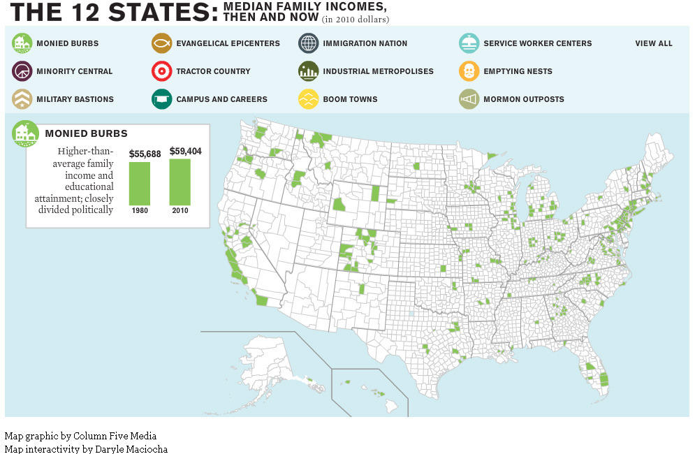
The website for The Atlantic magazine has an interesting new map graphic visualizing the ways in which income inequality has fractured the nation over the past 30 years.  The graphic breaks the nation into 12 different ‘states’ – monied burbs, minority central, military bastions, evangelical epicenters, tractor country, campuses and careers, immigration nation, industrial metropolises, boom towns, service worker centers, emptying nests and mormon outposts – based on a variety of different demographic characteristics.

For example, the Boom Town state is defined as relatively wealthy U.S. counties that saw rapid growth and increasing minority populations prior to the last recession. Whereas Monied Burbs have higher than average family income and educational attainment and are closely divided politically.

See map samples for the Boom Town and Monied Burb states below. Click here to see the interactive map graphic on The Atlantic’s website. Thanks to Ben Marsh for the heads up about this graphic!


Categories
Environment General GIS GIS in Environmental Studies GIS in Geography GIS in Sociology Map Apps Slideshow Videos

Go Philly! GIS helps improve access to healthy food in the city

Yesterday’s NY Times had an opinion piece praising Philadelphia’s efforts in recent years to improve access to healthy food for its most disadvantaged neighborhoods and citizens.  In ‘Go Philly!’, Mark Bittman describes the collaborative efforts of Philadelphia municipal government, the Commonwealth of PA and a whole host of local non-profits (including my former employer, the newly renamed  Greater Philadelphia Urban Affairs Coalition) in developing programs to bring supermarkets and healthy food options to under-served neighborhoods.

What he doesn’t describe is the critical role that GIS has played in bringing these programs to life.  See below for some background information and resources related to using GIS for improving access to healthy food.

1. Watch this short video (Ch. 3 of Episode 2 from Penn State’s Geospatial Revolution video series) to learn more about the role of GIS in Philadelphia’s ‘healthy food’ success story.

httpv://www.youtube.com/watch?v=RYzHcPHRhWQ

2. Read reports from the Food Trust and The Reinvestment Fund (TRF) describing their work in Philadelphia and other communities. Both organizations are Philadelphia-based non-profits that have been at the center of Philadelphia’s efforts to improve access to healthy food.

“The Grocery Gap: Who Has Access to Healthy Food and Why It Matters” – click here

Food Trust/TRF Report on the Fresh Food Financing Initiatives projects – click here

TRF’s resource page on food access – click here

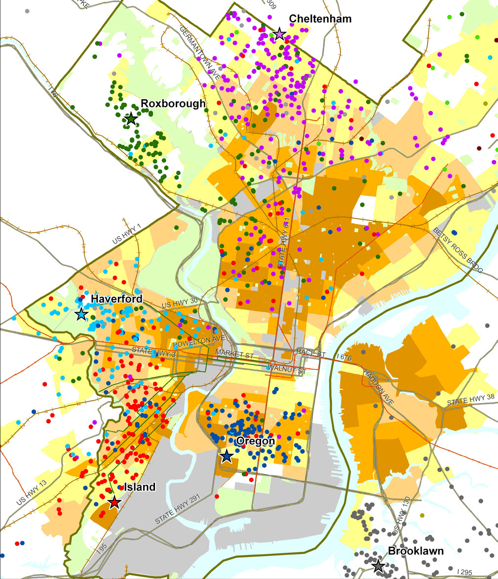
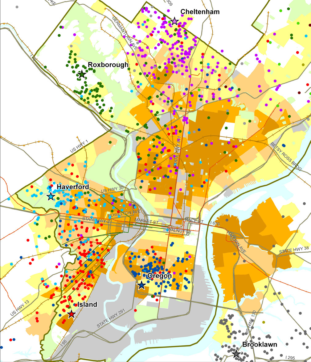
Sample map from Food Trust/TRF report on the Fresh Food Financing Initiative:

“Map 1: Residence of ShopRite Employees by Poverty Rate of Census Tract.  Each star on the map represents a Brown’s ShopRite store, with the location of the store’s employees illustrated by correspondingly colored dots.”


3. Watch a video created by TRF in collaboration with the Brookings Foundation to describe their use of GIS and findings in their  “Getting to Market” report on healthy foods initiatives across the U.S.

httpv://www.youtube.com/watch?v=Wp1w9s4kkHU


and/or explore the project website for “Getting to Market” – click here . The project site includes profiles of food access in major U.S. metropolitan areas.


4. Explore interactive web mapping applications featuring data on supermarket access:

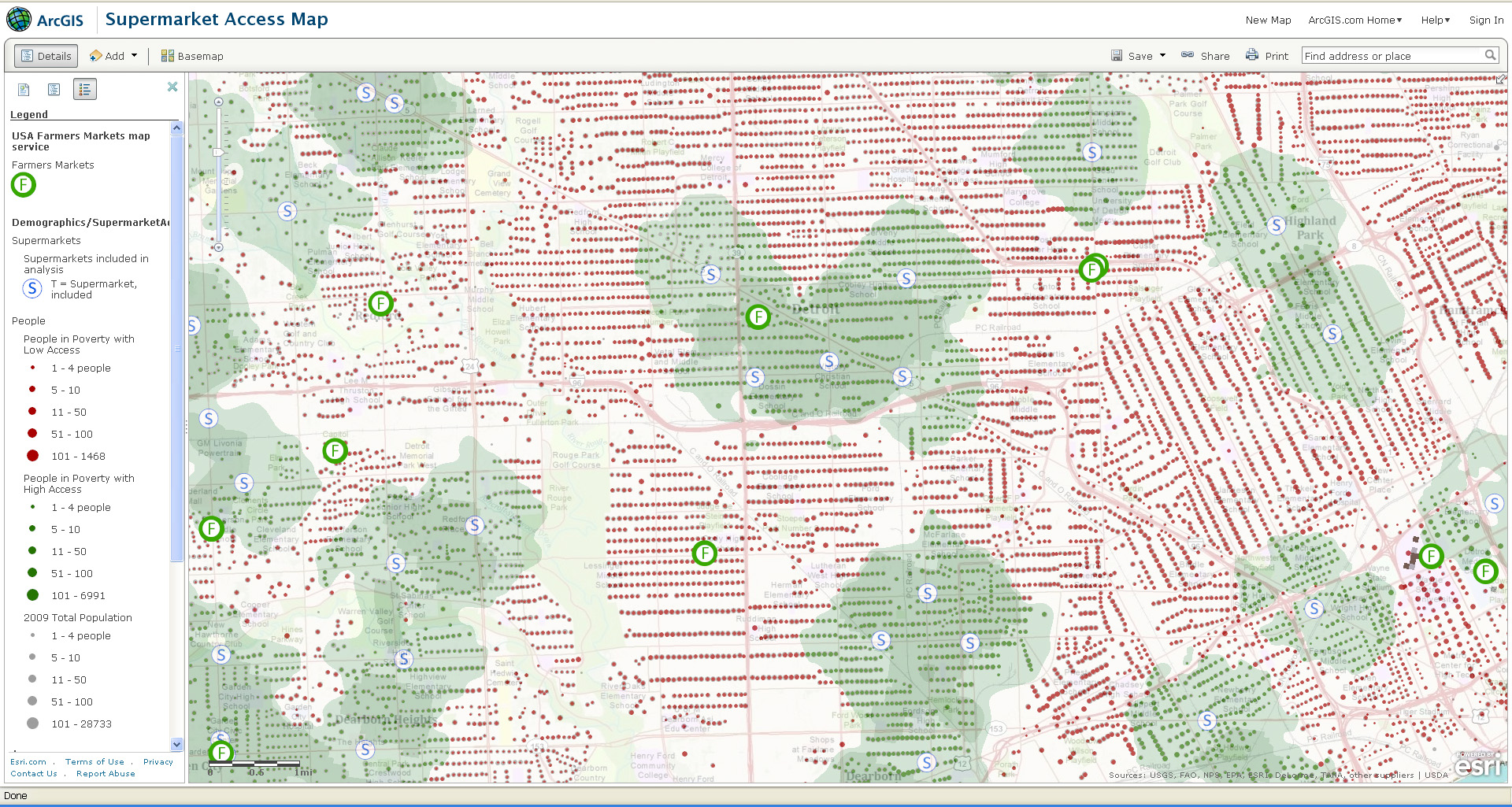
ESRI’s ArcGIS Online Supermarket Access Map – click here

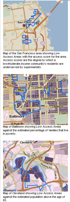
TRF’s PolicyMap Data on Supermarket Access – click here


Sample map from ESRI’s Supermarket Access Map:


Sample maps from TRF’s PolicyMap application: