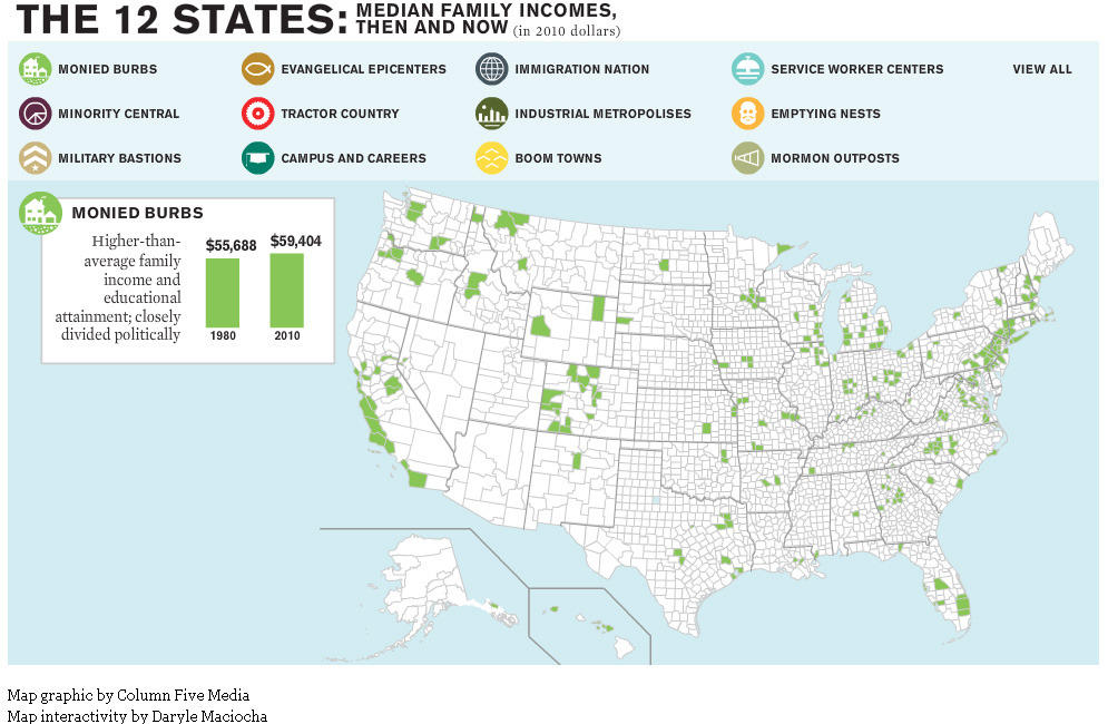
The website for The Atlantic magazine has an interesting new map graphic visualizing the ways in which income inequality has fractured the nation over the past 30 years. The graphic breaks the nation into 12 different ‘states’ – monied burbs, minority central, military bastions, evangelical epicenters, tractor country, campuses and careers, immigration nation, industrial metropolises, boom towns, service worker centers, emptying nests and mormon outposts – based on a variety of different demographic characteristics.
For example, the Boom Town state is defined as relatively wealthy U.S. counties that saw rapid growth and increasing minority populations prior to the last recession. Whereas Monied Burbs have higher than average family income and educational attainment and are closely divided politically.
See map samples for the Boom Town and Monied Burb states below. Click here to see the interactive map graphic on The Atlantic’s website. Thanks to Ben Marsh for the heads up about this graphic!

