Categories
Crisis-Mapping Events/Calendar General GIS GIS in Political Science Slideshow Videos

Where 2.0

The 2011 Where 2.0 conference is wrapping up today in Santa Clara, CA.  Over the course of the week, many of the presentations have been streamed live over the conference website. I’m including a few YouTube videos for some of noteworthy presentations.

Jack Dangermond – CEO and founder of Esri: “Living Maps – Making Collective Geographic Information a Reality”

httpv://www.youtube.com/watch?v=vIbGwY3aG0g&p=0B2FEB8AACD826BE


Blaise Agüera y Arcas, Architect of Bing Maps and MSN at Microsoft:  “Read/Write World”

httpv://www.youtube.com/watch?v=4X9u4JG9H6E&p=0B2FEB8AACD826BE


Ben Fry – principal of Fathom: “Mapping: From Interesting to Insightful to Irrelevant” (coming soon)


Patrick Meier, Director of Crisis Mapping & New Media for Ushahidi: “May the Crowd Be With You: The Future of Crisis Mapping for Disaster Response”

httpv://www.youtube.com/watch?v=M_NguESRZ4g&p=0B2FEB8AACD826BE


Dennis Crowley, Co-founder, foursquare; and Robert Scoble, Managing Director, Rackspace: “Future Location: Scoble & Dens”

httpv://www.youtube.com/watch?v=TpTDGeLiFnc&p=0B2FEB8AACD826BE


John Barratt, self-described “Geo, twitter & weather web hacker”:  “Who, What, Where, When: Creating New Maps from Geo-tweets”

httpv://www.youtube.com/watch?v=ey_m0F_b-Vw&p=0B2FEB8AACD826BE


Sylvain Carle, CEO & co-founder @ Needium: “Locking Yourself Out in London (and Tweeting about it)

httpv://www.youtube.com/watch?v=Gvcs4H_A0Wc&feature=autoplay&list=PL0B2FEB8AACD826BE&index=16&playnext=1


Categories
General GIS Map Apps Slideshow Videos

Google MapMaker released in U.S.

Earlier this week, Google released Google MapMaker in the U.S.  The tool, which enables users to add their own point, line and polygon features to the Google basemap (e.g. coffee shops, short-cuts across campus, soccer fields) has been available internationally since 2008 as a means for generating detailed local datasets for under-mapped areas.

The tools in the Google MapMaker interface are similar to those found in OpenStreetMap but the user-submitted data is not open source.  Nor are there any guarantees about accuracy.  Although Google runs algorithms on the back-end to review user-submitted data and provide some (very) minimal level of quality assurance it’s up to each of us to evaluate how good or bad all of this new data is.  Just remember – inaccuracies in data supplied by Google’s own staff have inflamed border disputes on a number of occassions in recent years (notably between Cambodia and Thailand; and between Nicaragua and Costa Rica).

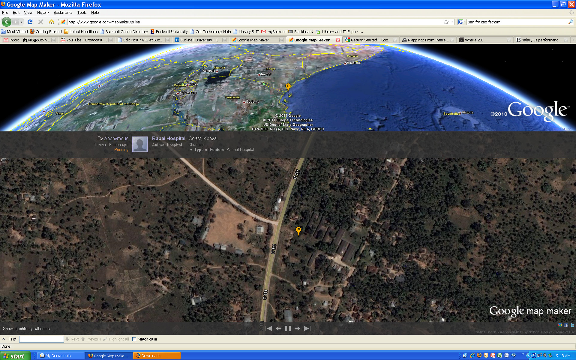
Click here to visit the Google MapMaker site. Or, click here to check out Google MapMaker Pulse – a totally addictive real-time feed showing user updates to MapMaker worldwide (see below for screenshots of updates provided by users in Kenya and Belarus). Here’s a link to an article from Wired.com on the new release.

And a video from Google advertising the new MapMaker tool:
httpv://www.youtube.com/watch?v=znCPgldRWTc&feature=player_embedded#at=16


Google MapMaker Pulse – User-generated edits from Kenya:


Google MapMaker Pulse – User-generated edits from Belarus:

Categories
Environment General GIS GIS in Environmental Studies GIS in Geography GIS in Sociology Map Apps Slideshow Videos

Go Philly! GIS helps improve access to healthy food in the city

Yesterday’s NY Times had an opinion piece praising Philadelphia’s efforts in recent years to improve access to healthy food for its most disadvantaged neighborhoods and citizens.  In ‘Go Philly!’, Mark Bittman describes the collaborative efforts of Philadelphia municipal government, the Commonwealth of PA and a whole host of local non-profits (including my former employer, the newly renamed  Greater Philadelphia Urban Affairs Coalition) in developing programs to bring supermarkets and healthy food options to under-served neighborhoods.

What he doesn’t describe is the critical role that GIS has played in bringing these programs to life.  See below for some background information and resources related to using GIS for improving access to healthy food.

1. Watch this short video (Ch. 3 of Episode 2 from Penn State’s Geospatial Revolution video series) to learn more about the role of GIS in Philadelphia’s ‘healthy food’ success story.

httpv://www.youtube.com/watch?v=RYzHcPHRhWQ

2. Read reports from the Food Trust and The Reinvestment Fund (TRF) describing their work in Philadelphia and other communities. Both organizations are Philadelphia-based non-profits that have been at the center of Philadelphia’s efforts to improve access to healthy food.

“The Grocery Gap: Who Has Access to Healthy Food and Why It Matters” – click here

Food Trust/TRF Report on the Fresh Food Financing Initiatives projects – click here

TRF’s resource page on food access – click here

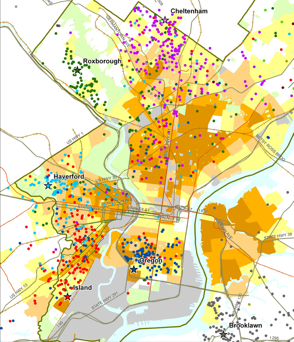
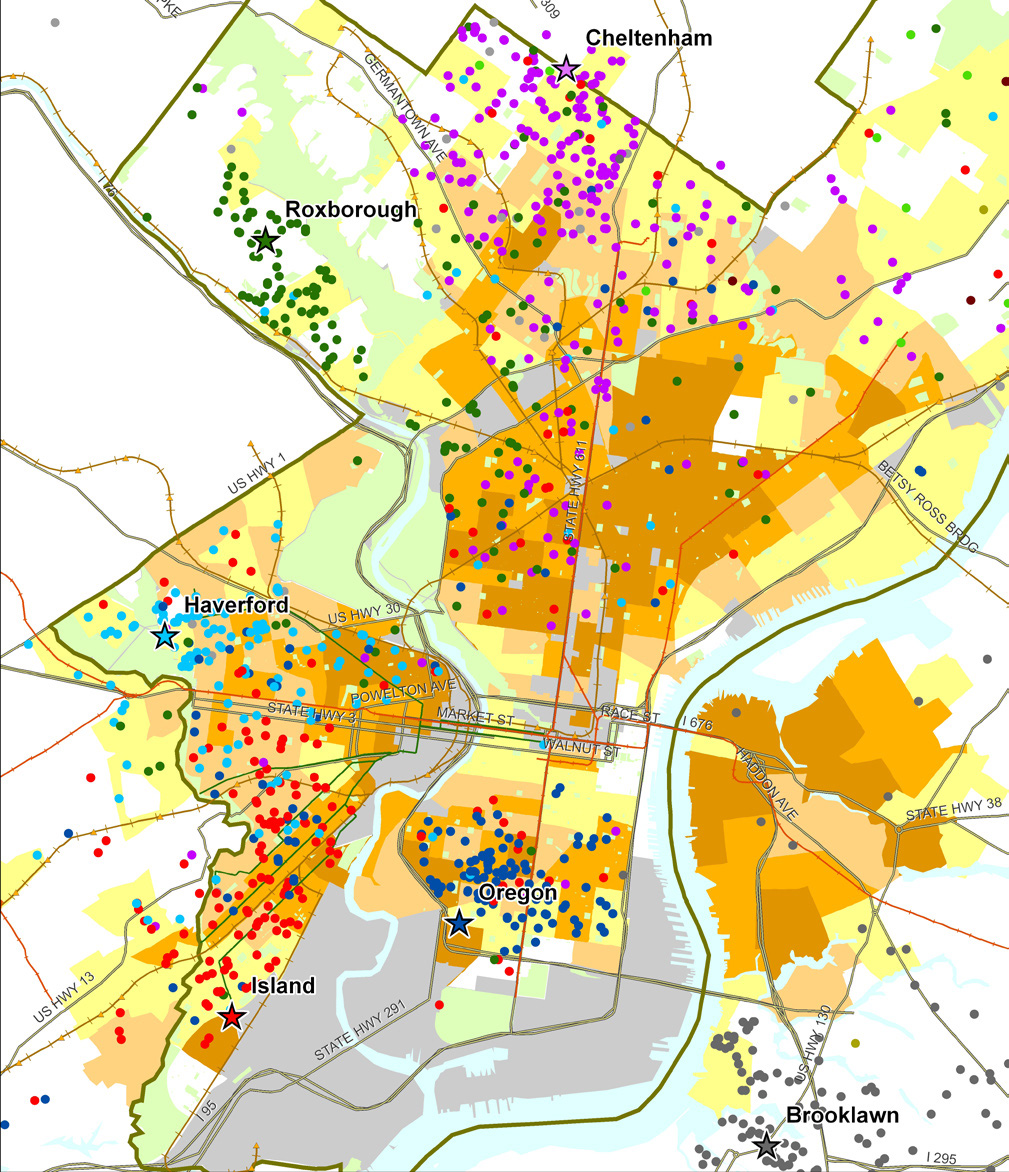
Sample map from Food Trust/TRF report on the Fresh Food Financing Initiative:

“Map 1: Residence of ShopRite Employees by Poverty Rate of Census Tract.  Each star on the map represents a Brown’s ShopRite store, with the location of the store’s employees illustrated by correspondingly colored dots.”


3. Watch a video created by TRF in collaboration with the Brookings Foundation to describe their use of GIS and findings in their  “Getting to Market” report on healthy foods initiatives across the U.S.

httpv://www.youtube.com/watch?v=Wp1w9s4kkHU


and/or explore the project website for “Getting to Market” – click here . The project site includes profiles of food access in major U.S. metropolitan areas.


4. Explore interactive web mapping applications featuring data on supermarket access:

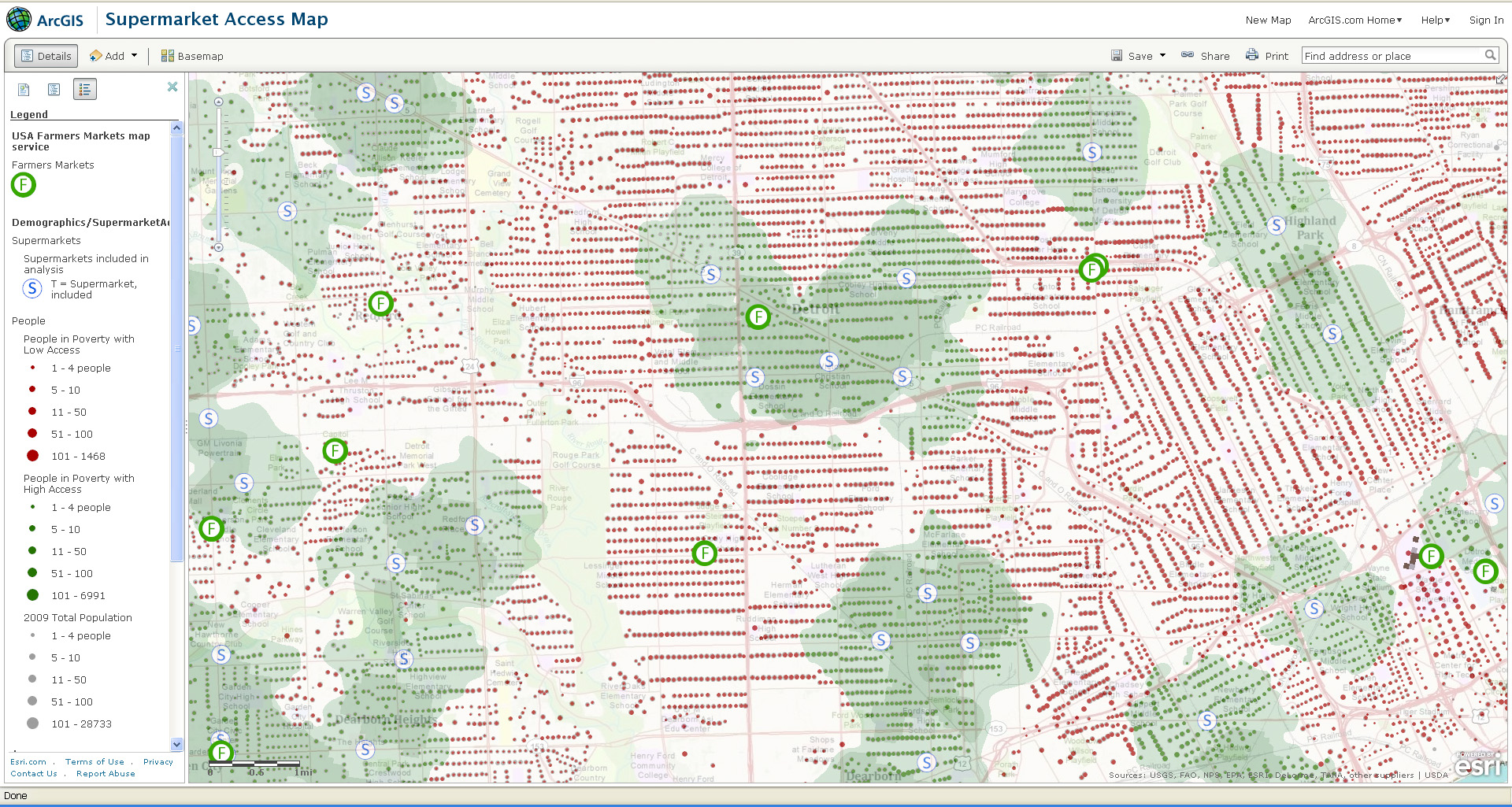
ESRI’s ArcGIS Online Supermarket Access Map – click here

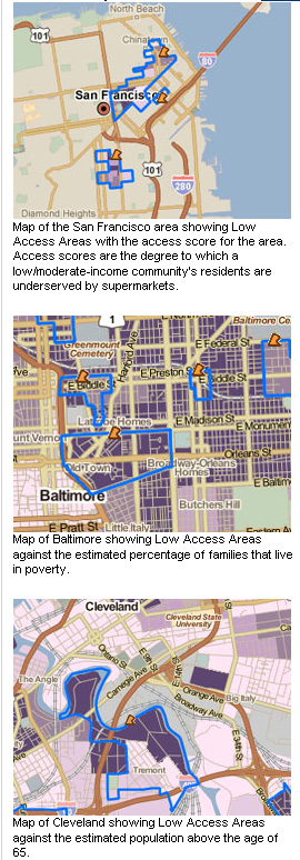
TRF’s PolicyMap Data on Supermarket Access – click here


Sample map from ESRI’s Supermarket Access Map:


Sample maps from TRF’s PolicyMap application:


Categories
Crisis-Mapping Environment General GIS GIS in Political Science Slideshow Videos

NOAA visualizations of Japanese earthquake and tsunami

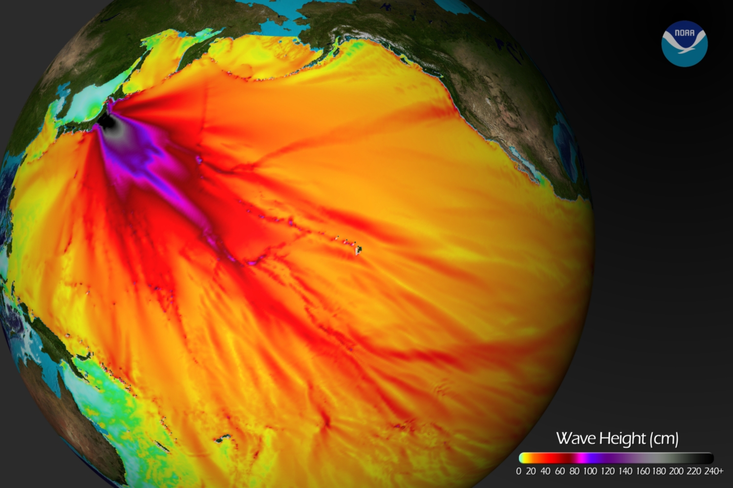
Below is a tsunami wave height model that shows the Pacific-wide impact of the event. The model was created by the NOAA Environmental Visualization Lab:

Description from NOAA:

Model runs from the Center for Tsunami Research at the NOAA Pacific Marine Environmental Laboratory show the expected wave heights of the tsunami as it travels across the Pacific basin. The largest wave heights are expected near the earthquake epicenter, off Japan. The wave will decrease in height as it travels across the deep Pacific but grow taller as it nears coastal areas. In general, as the energy of the wave decreases with distance, the near shore heights will also decrease (e.g., coastal Hawaii will not expect heights of that encountered in coastal Japan).The second image shows the depth of the Pacific Ocean floor. Notice the similarity between areas of low wave height and deeper areas of the ocean.

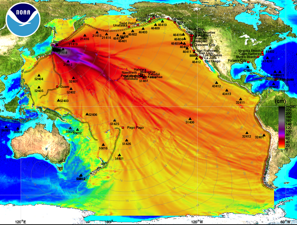
Below is an image visualizing the maximum amplitude plot for the tsunami wave.

Click here on the NOAA Center for Tsunami Research home page to download a Google Earth KMZ file with the maximum amplitude plot data shown in the visualization above.

And finally, a video showing the propagation of the tsunami wave.

httpv://www.youtube.com/watch?v=PBZGH3yieLc

From the NOAA Center for Tsunami Research:

Propagation of the March 11, 2011 Honshu tsunami was computed with the NOAA forecast method using MOST model with the tsunami source inferred from DART® data. From the NOAA Center for Tsunami Research, located at NOAA PMEL in Seattle, WA. See http://nctr.pmel.noaa.gov/honshu20110311


Categories
Crisis-Mapping General GIS GIS in Political Science Videos

Libyan Revolution – view the map

The NY Times has an interactive map graphic on the crisis in Libya. The series of maps traces the development of the rebellion and unrest from February 16th to present.  The basemap data shown in the NYT interactive map graphic was provided by LeadDog Consulting. Given the unrest in Libya, LeadDog has been updating the street maps daily as they receive updated information. Click here for a detailed street map of Tripoli and here for a detailed street map of Benghazi.

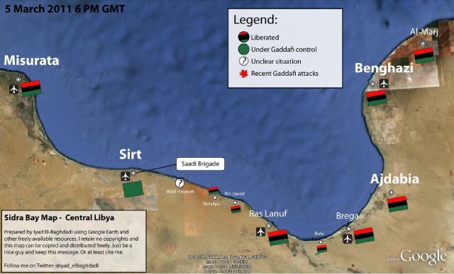
On the same topic, the NY Times 6th floor blog has a post about what may or may not be the Libyan opposition’s new website – which features news, announcements, video and a ‘Map of the Revolution.’ From the 6th Floor blog post:

Libya’s opposition seems to have surfaced online. NTCLibya.org was registered as a domain on March 6 for the Libyan Interim Transitional National Council. Among the tabs across the top of the site’s English-language home page are some you rarely see: Allegiances,  Map of Revolution. A WhoIs search turned up Identity Protect as the administrator. This is a British company that manages domains while concealing the identity of the actual owner. So there has been a fair amount of Twitter chatter (#libya, #feb17) about whether the thing is legit. The council’s Twitter handle is @LibyanTNC. There hasn’t been a Twitter post for hours, and before that there were many to the effect of “hold on, i’m having trouble getting the site up.” And the site is indeed slow and only semifunctional. Which rather suggests it’s the real deal. The domain is registered until 2013. A little pessimistic?

‘Map of the Revolution’ – East Coast of Libya:


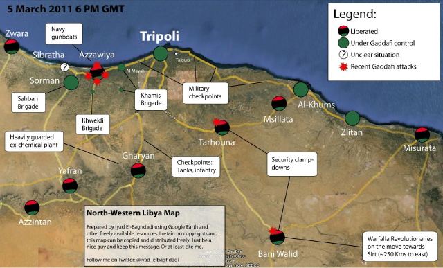
‘Map of the Revolution’ -West Coast of Libya: