Categories
Bucknell/Local Interest Data GIS in Engineering GIS in Environmental Studies GIS in Geology Slideshow

GIS in education – EPA grant and campus mapping

Notes on two interesting stories about GIS in education. Thanks to Adena Schutzberg’s All Points Blog for the heads up about the stories.

1. Texas State University’s Center for GIScience was recently awarded 500K grant from EPA to use GIS for modelling/mapping air pollution-exposure-health effects:
The U.S. Environmental Protection Agency’s Science to Achieve Results (USEPA-STAR) program has awarded a grant of nearly $500,000 to The Texas Center for Geographic Information Science in the Department of Geography at Texas State.

The grant will support a project entitled “Air Pollution-Exposure-Health Effects Indicators: Mining Massive Geographically Referenced Environmental Health Data to Identify Risk Factors for Birth Defects.”The three-year project will develop air pollution exposure assessment methods, visual geospatial data mining tools, and epidemiological analysis procedures to define new air pollution-exposure-health effect indicators that cover three components of the hazards-exposure-health effects-intervention paradigm.

San Marcos Local News

Click here to see more EPA STAR Research Grant Announcements.  The EPA STAR grants are just one of the types of research grants available through the US EPA National Center for Environmental Research.   Click here for an overview of the Center’s research and fellowship opportunities.  Check the Bucknell GIS Calendar (featured on the main page of the GIS blog) this fall for deadlines for student grant applications for the EPA GRO fellowships – awarded each year to undergraduate students in environmentally related fields of study.  From the EPA Fellowships web page:

Eligible students will receive support for their junior and senior years of undergraduate study and for an internship at an EPA facility during the summer between their junior and senior years. The fellowship provides up to $19,700 per year of academic support and up to $9,500 of internship support for the three-month summer period, for a total of up to $48,900 for the two year period.

2.   Grad students at Utah State University are collecting high resolution imagery of their campus using a small blimp.

Soaring above the Quad on Tuesday afternoon, a white blimp controlled by Utah State University graduate students was almost hard to spot against the Cache Valley’s overcast sky.The only object that was clearly visible was a black digital camera, snapping one picture every five seconds, providing color georeferenced aerial photography of the entire Quad in UTM (metric) coordinates.

The students were conducting a lab by running a blimp survey for Joseph M. Wheaton’s geographic information systems class. The objective: To provide aerial imagery of the entire Quad. The 1,000-plus pictures the blimp provides them with will be used to make an image that can fit “on top of” the images on Google map, said Bryan Watt, a USU graduate student in the class.

Herald Journal

Could we do this at Bucknell? Twice in the last month I’ve had faculty (half-jokingly) suggest that we rent a plane to do a data collection fly-over of Lewisburg. Forget the plane, let’s figure out how to get our hands on a blimp!
Categories
Crisis-Mapping General GIS GIS in Political Science Slideshow

Japanese earthquake – disaster/response maps

Here are some links to maps and map apps related to the Japanese earthquake and tsunami.  I’ll add more as they are released.

  • JapanQuakeMap, an animated, time-lapse visualization of the earthquake and its aftershocks created by Paul Nicholls, developer of the Christchurch Quake Map website.  From the website:
    The Japan Quake Map on this website pesents a time-lapse visualisation of the Sendai earthquake and its aftershocks, primarily to help those outside the affected area understand what the people of Japan are experiencing. It plots earthquake data from USGS on a map using the Google Maps API, with the size of the circle denoting the magnitude (the higher the magnitude, the larger the circle) and the colour showing the focal depth (see the legend below the map).
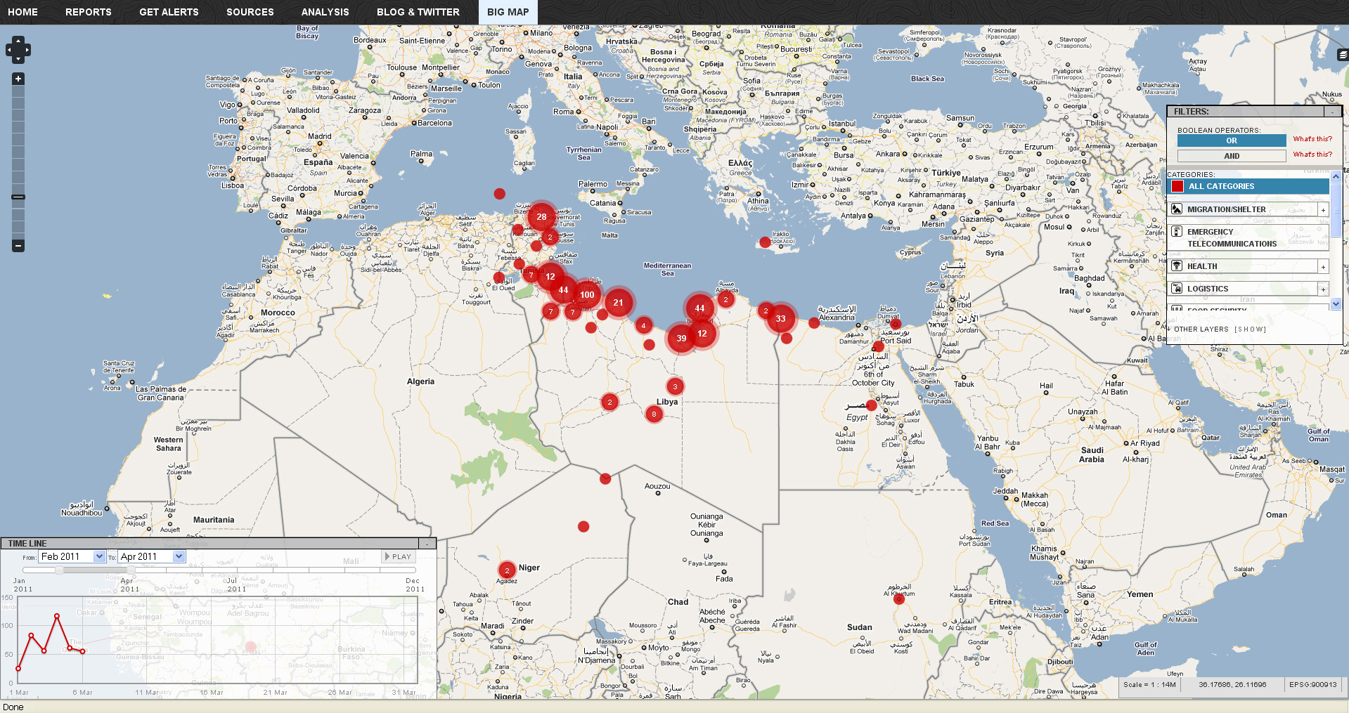
  • Click here to view the main page for Ushahidi’s Japan crisis mapping tool (in Japanese). Click here to view the Big Map. These pages use the Ushiadi platform to collect and display crowdsourced info (SMS, e-mail, Twitter, Flickr, YouTube, etc.). About the Ushahidi site:

Anyone on the ground can text in the location of a trapped person, and these locations are then collected on a map. You can also text in where to find aid, a pop-up hospital or a precarious building that should be avoided.  Good.is

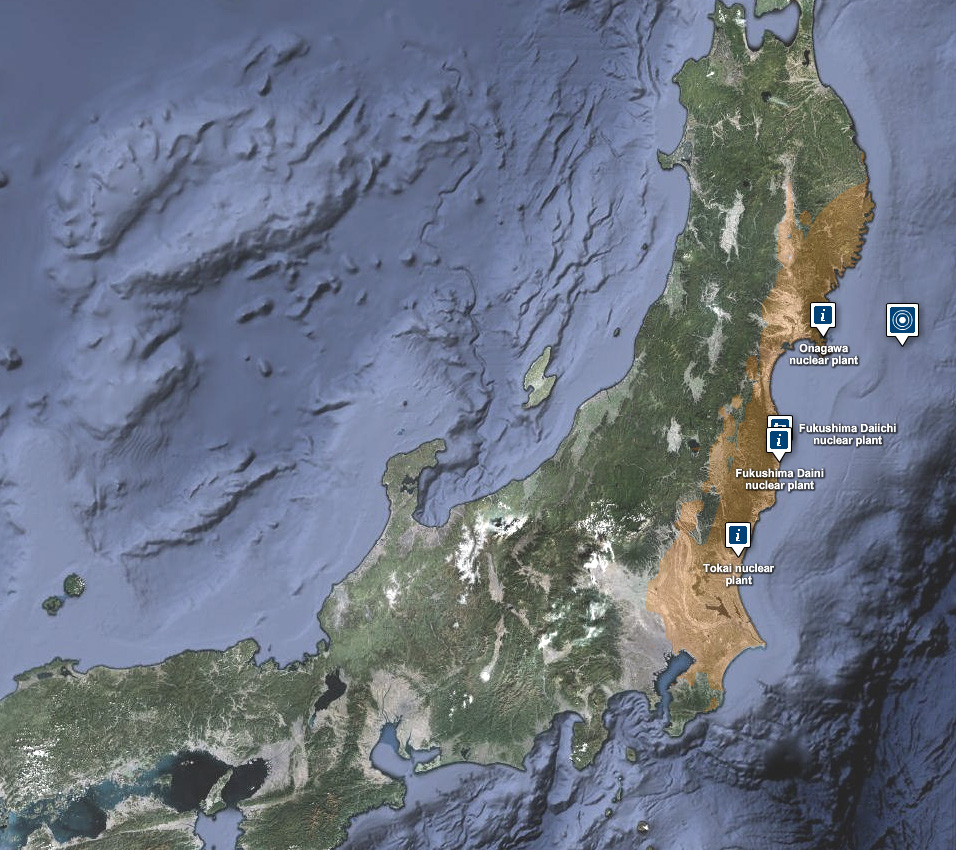
  • Also from Ushahidi, a Radiation Map that uses the Crowdmap platform.  The radiation map is in both Russian and English and has other language options available.
  • Map of seismic activity in the 7 days leading up to the earthquake – from MapLarge (note: as of Wed. March 16th the MapLarge site is down – too much traffic?)
  • What is crisis mapping and how does it work? Click here to read Patrick Meier’s answer to that. Meier is the Director of Crisis Mapping at Ushahidi and co-founder of the International Network of Crisis Mappers. 
Categories
Bucknell/Local Interest Events/Calendar GIS in Public Health Slideshow

Upcoming webinar: GIS and research innovations at Penn State’s GeoVISTA Center

Join me next Tuesday, March 22nd at 2pm for a webinar about GIS research innovations at Penn State’s GeoVISTA Center.  Directions Magazine is hosting the event.  Click here to register and participate on your own – or come by my office in 107a, Research Services, Bertrand Library to watch.  More info from the Directions Magazine ad for the event:

Join Dr. Alan MacEachren, Dr. Alex Klippel and Dr. Krzysztof Janowicz of Penn State’s GeoVISTA Center as they discuss cutting-edge research across the breadth of “GIScience from spatial cognition, through formal geo-information representation, to spatial analysis, cartography and visual analytics. The focus [of the Center] is on developing powerful human-centered methods and technologies that allow scientists and decision makers to solve scientific, social, and environmental problems through computer-supported, visually-enabled analysis of the growing wealth of geospatial data.”

The research projects presented will have real-world ramifications for GIS practitioners whose work involves synthesizing large quantities of data and presenting information in a useful form.

During this webinar, you will learn:
• How academic research in geovisualization and visual analytics is applied in public health and crisis management
• How human factors, such as spatial thinking and cognition, impact the design and development of GIS tools
• How research in the Semantic Geospatial Web, sensor networks, and mobile computing will advance the integration of information

Who Should Attend
This webinar is appropriate for anyone interested in how GIScience research affects the geospatial technology of the near future.


Categories
Crisis-Mapping General GIS GIS in Political Science Videos

Libyan Revolution – view the map

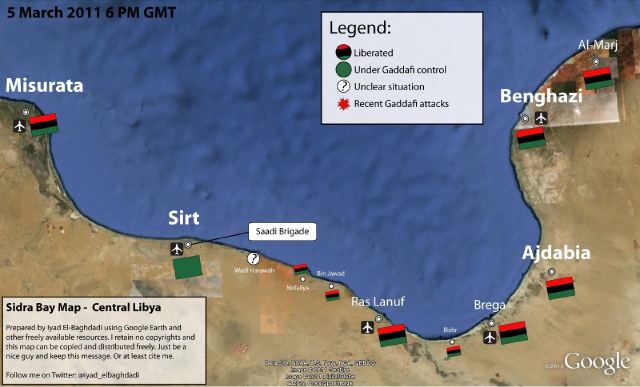
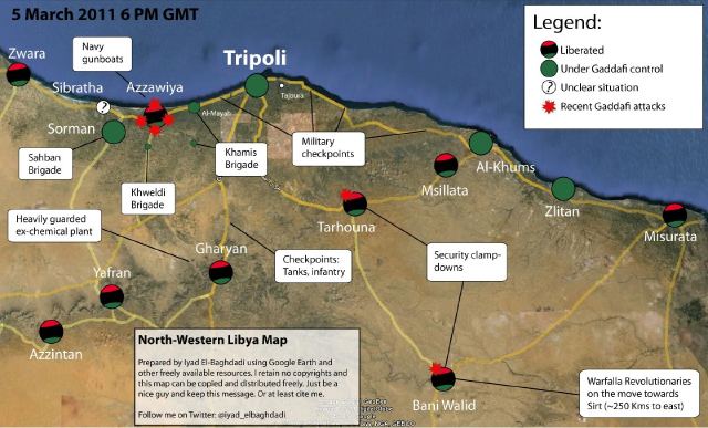
The NY Times has an interactive map graphic on the crisis in Libya. The series of maps traces the development of the rebellion and unrest from February 16th to present.  The basemap data shown in the NYT interactive map graphic was provided by LeadDog Consulting. Given the unrest in Libya, LeadDog has been updating the street maps daily as they receive updated information. Click here for a detailed street map of Tripoli and here for a detailed street map of Benghazi.

On the same topic, the NY Times 6th floor blog has a post about what may or may not be the Libyan opposition’s new website – which features news, announcements, video and a ‘Map of the Revolution.’ From the 6th Floor blog post:

Libya’s opposition seems to have surfaced online. NTCLibya.org was registered as a domain on March 6 for the Libyan Interim Transitional National Council. Among the tabs across the top of the site’s English-language home page are some you rarely see: Allegiances,  Map of Revolution. A WhoIs search turned up Identity Protect as the administrator. This is a British company that manages domains while concealing the identity of the actual owner. So there has been a fair amount of Twitter chatter (#libya, #feb17) about whether the thing is legit. The council’s Twitter handle is @LibyanTNC. There hasn’t been a Twitter post for hours, and before that there were many to the effect of “hold on, i’m having trouble getting the site up.” And the site is indeed slow and only semifunctional. Which rather suggests it’s the real deal. The domain is registered until 2013. A little pessimistic?

‘Map of the Revolution’ – East Coast of Libya:


‘Map of the Revolution’ -West Coast of Libya:

Categories
Crisis-Mapping General GIS GIS in Political Science Map Apps Slideshow

Libya crisis map

Click here to check out the new Libya Crisis Map.  Courtesy of Adena Schutzberg over at AllPointsBlog:

OCHA, UNOSAT and NetHope have been collaborating with the Volunteer Technical Community (VTC) specifically CrisisMappers, Crisis Commons, Open Street Map, and the Google Crisis Response Team over the past week.

The CrisisMappers Standby Task Force has been undertaking a mapping of social media, news reports and official situation reports from within Libya and along the borders at the request of OCHA. The Task Force is also aiding in the collection and mapping of 3W information for the response. UNOSAT is kindly hosting the Common Operational Datasets to be used during the emergency. Interaction with these groups is being coordinated by OCHA’s Information Services Section.

The public version of this map does not include personal identifiers and does not include descriptions for the reports mapped. This restriction is for security reasons. All information included on this map is derived from information that is already publicly available online