Categories
Environment General GIS GIS in Environmental Studies GIS in Geography GIS in Sociology Map Apps Slideshow Videos

Go Philly! GIS helps improve access to healthy food in the city

Yesterday’s NY Times had an opinion piece praising Philadelphia’s efforts in recent years to improve access to healthy food for its most disadvantaged neighborhoods and citizens.  In ‘Go Philly!’, Mark Bittman describes the collaborative efforts of Philadelphia municipal government, the Commonwealth of PA and a whole host of local non-profits (including my former employer, the newly renamed  Greater Philadelphia Urban Affairs Coalition) in developing programs to bring supermarkets and healthy food options to under-served neighborhoods.

What he doesn’t describe is the critical role that GIS has played in bringing these programs to life.  See below for some background information and resources related to using GIS for improving access to healthy food.

1. Watch this short video (Ch. 3 of Episode 2 from Penn State’s Geospatial Revolution video series) to learn more about the role of GIS in Philadelphia’s ‘healthy food’ success story.

httpv://www.youtube.com/watch?v=RYzHcPHRhWQ

2. Read reports from the Food Trust and The Reinvestment Fund (TRF) describing their work in Philadelphia and other communities. Both organizations are Philadelphia-based non-profits that have been at the center of Philadelphia’s efforts to improve access to healthy food.

“The Grocery Gap: Who Has Access to Healthy Food and Why It Matters” – click here

Food Trust/TRF Report on the Fresh Food Financing Initiatives projects – click here

TRF’s resource page on food access – click here

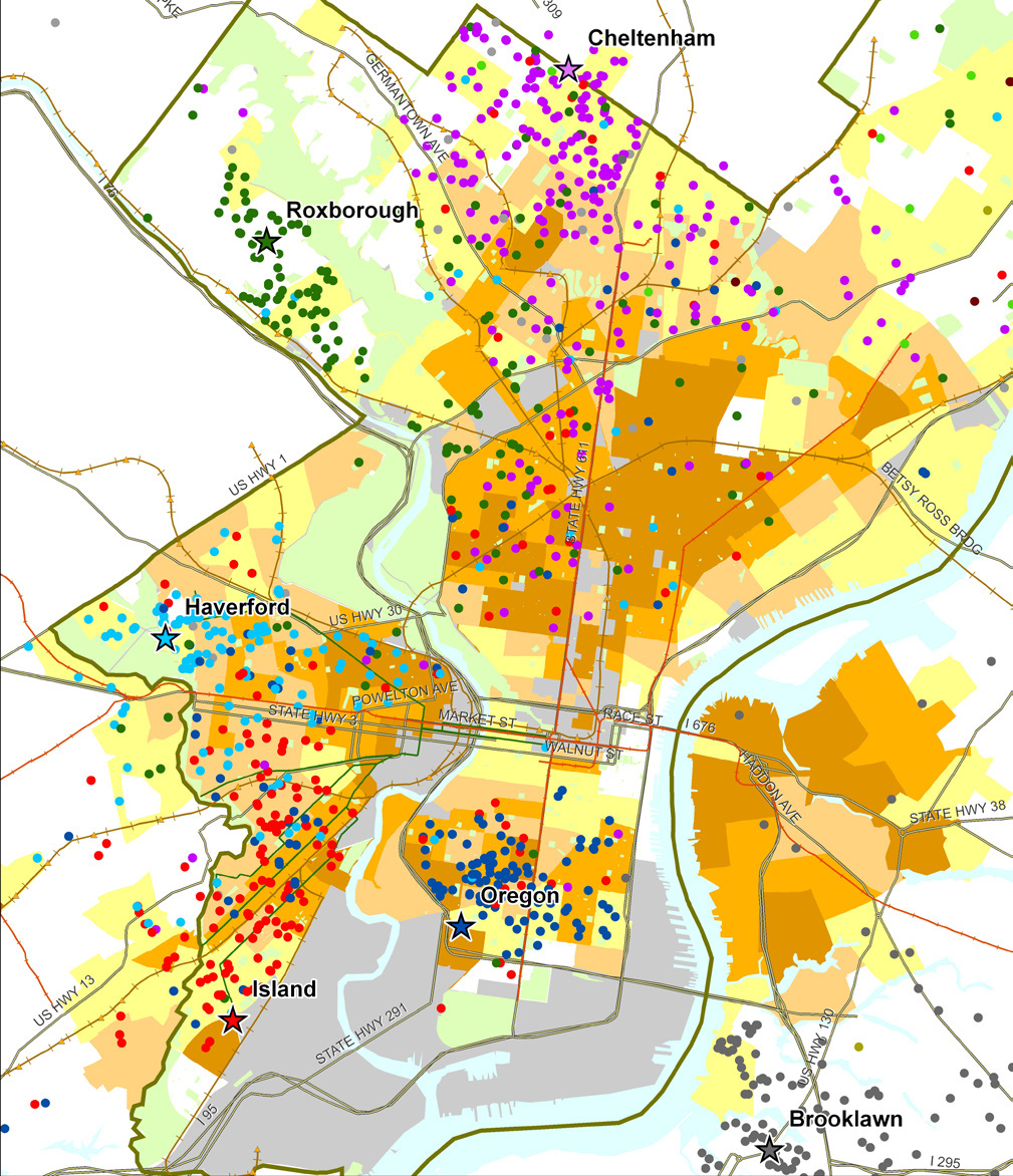
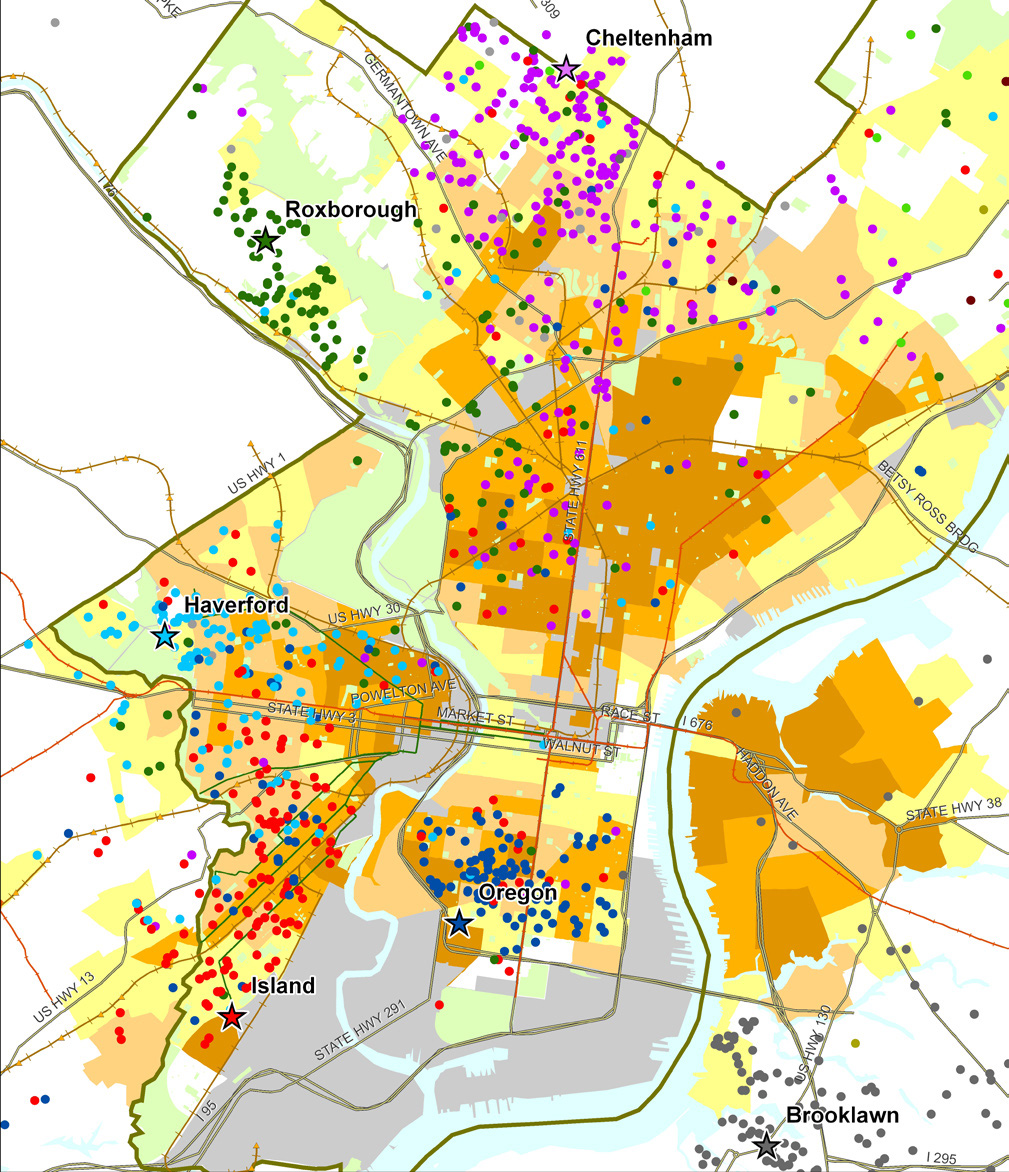
Sample map from Food Trust/TRF report on the Fresh Food Financing Initiative:

“Map 1: Residence of ShopRite Employees by Poverty Rate of Census Tract.  Each star on the map represents a Brown’s ShopRite store, with the location of the store’s employees illustrated by correspondingly colored dots.”
 

3. Watch a video created by TRF in collaboration with the Brookings Foundation to describe their use of GIS and findings in their  “Getting to Market” report on healthy foods initiatives across the U.S.

httpv://www.youtube.com/watch?v=Wp1w9s4kkHU


and/or explore the project website for “Getting to Market” – click here . The project site includes profiles of food access in major U.S. metropolitan areas.


4. Explore interactive web mapping applications featuring data on supermarket access:

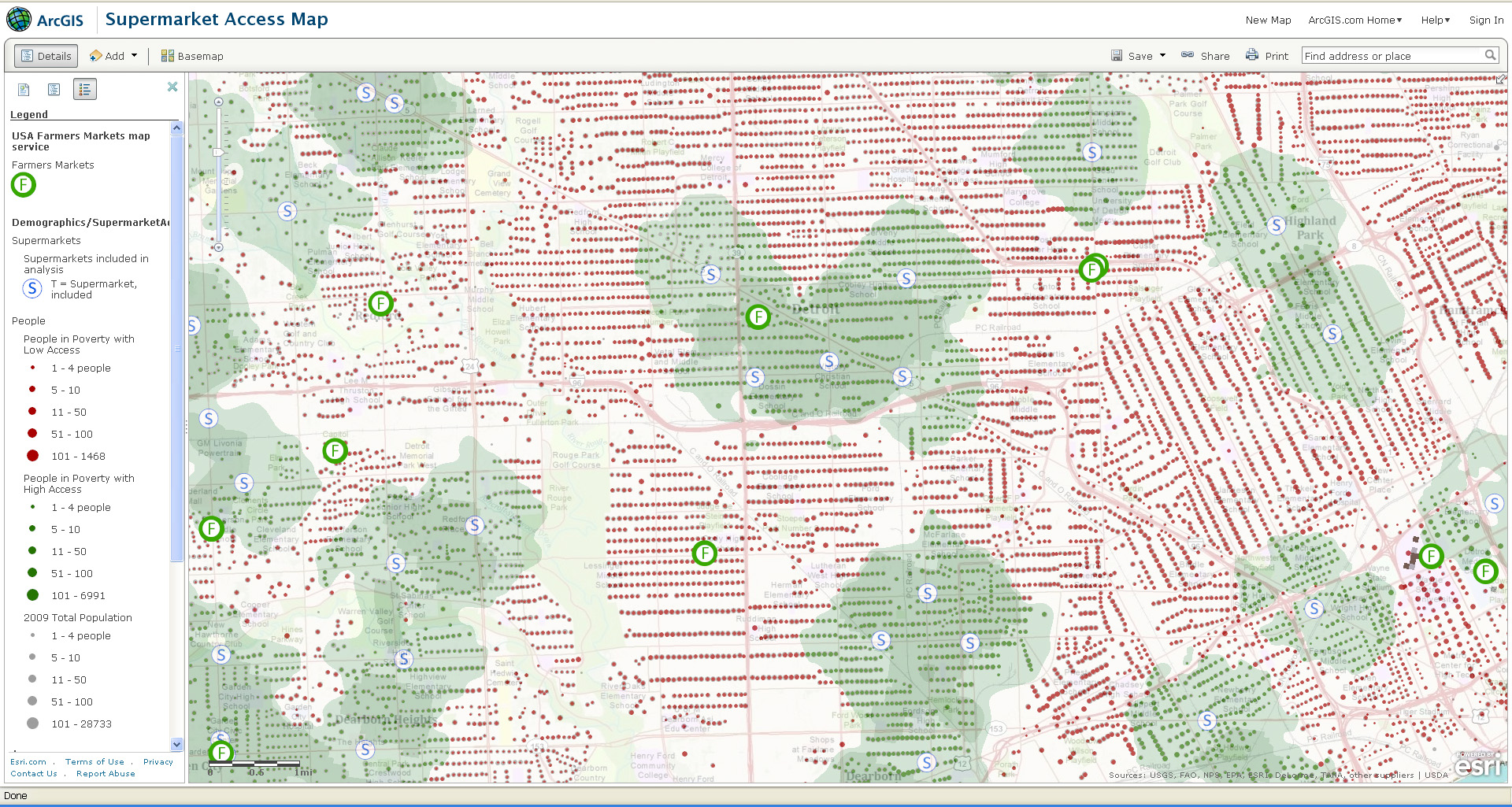
ESRI’s ArcGIS Online Supermarket Access Map – click here

TRF’s PolicyMap Data on Supermarket Access – click here


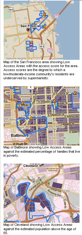
Sample map from ESRI’s Supermarket Access Map:
 

Sample maps from TRF’s PolicyMap application:
 

Categories
General GIS GIS in Psychology Map Apps Slideshow

Mapping happiness

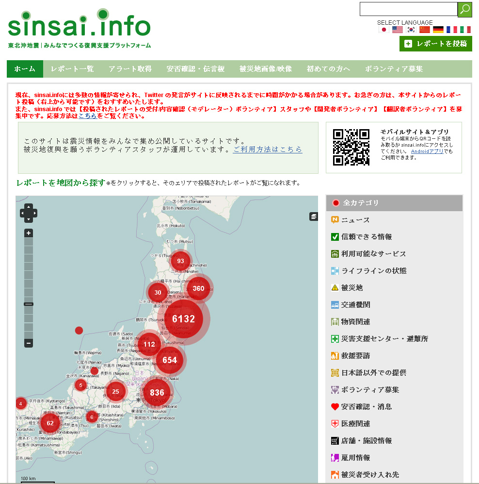
New social media mapping sites are popping up all over the place these days – whether it’s crisis-mapping sites like Sinsai.info or this new ‘happiness’ map from PhD student Alex Davies.

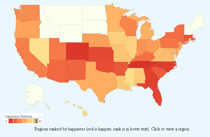
Davies, a PhD student at the University of Cambridge’s Computational and Biological Learning Lab, created a statistical model to analyze the sentiment (happy or sad) of Tweets from around the world.  In Davies’ model, individual words within Tweets were correlated with happiness or sadness, then used to predict the overall sentiment of the Tweet. Tweets were geo-tagged and summarized by area to calculate a composite ‘happiness’ ranking for states within the U.S. and for countries worldwide. The results are presented on Davies’ website in an interactive web map app. Raw data from the Tweets is presented alongside the maps to give viewers a sense of which Tweet words were correlated with happiness or sadness.  See below for maps of US happiness and world happiness – and an image showing some of the worldwide ‘happy’ words.

Happiness map of the United States:


Happiness map of the world:

Happy words for the world:


Categories
Crisis-Mapping General GIS GIS in Political Science Map Apps Slideshow

NPR Story on Crisis Mapping in Japan

Last week NPR ran a story on crisis mapping in Japan – focusing on the open-source, citizen-driven Sinsai.info website. Here’s the description from the NPR website:

Open source software called Ushahidi allows people to add and update information to maps that anyone with an Internet connection can access. In Tokyo, a crew of volunteers is using the software to map everything — from health services to the location of emergency aid workers — in Japan’s hardest hit areas. Patrick Meier, director of the crisis mapping segment of Ushahidi, says that because of the robust Internet infrastructure in Japan and tech-savvy citizenry, online crisis mapping is being utilized to its fullest potential.

Click here to hear the NPR audio clip. Thanks to Deb for the heads up about this story!

Categories
Crisis-Mapping Environment General GIS GIS in Political Science Slideshow Videos

NOAA visualizations of Japanese earthquake and tsunami

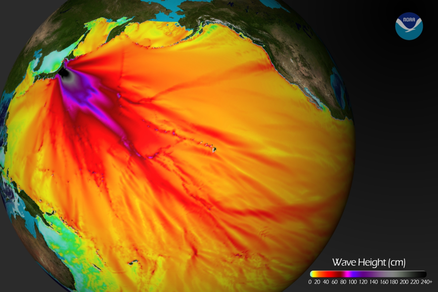
Below is a tsunami wave height model that shows the Pacific-wide impact of the event. The model was created by the NOAA Environmental Visualization Lab:

Description from NOAA:

Model runs from the Center for Tsunami Research at the NOAA Pacific Marine Environmental Laboratory show the expected wave heights of the tsunami as it travels across the Pacific basin. The largest wave heights are expected near the earthquake epicenter, off Japan. The wave will decrease in height as it travels across the deep Pacific but grow taller as it nears coastal areas. In general, as the energy of the wave decreases with distance, the near shore heights will also decrease (e.g., coastal Hawaii will not expect heights of that encountered in coastal Japan).The second image shows the depth of the Pacific Ocean floor. Notice the similarity between areas of low wave height and deeper areas of the ocean.

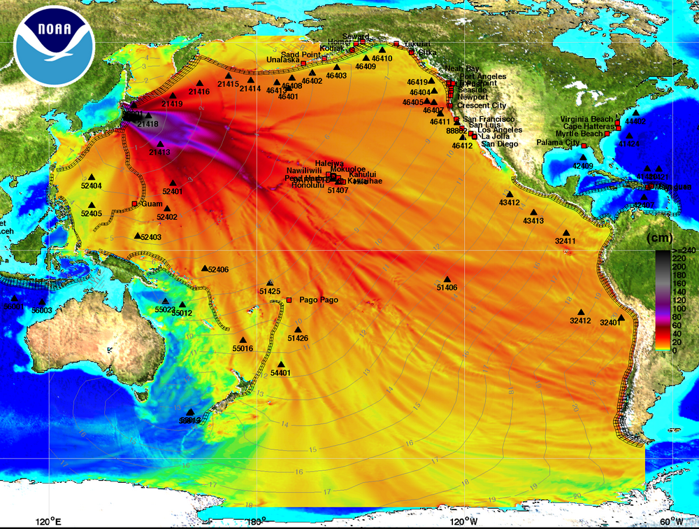
Below is an image visualizing the maximum amplitude plot for the tsunami wave.

Click here on the NOAA Center for Tsunami Research home page to download a Google Earth KMZ file with the maximum amplitude plot data shown in the visualization above.

And finally, a video showing the propagation of the tsunami wave.

httpv://www.youtube.com/watch?v=PBZGH3yieLc

From the NOAA Center for Tsunami Research:

Propagation of the March 11, 2011 Honshu tsunami was computed with the NOAA forecast method using MOST model with the tsunami source inferred from DART® data. From the NOAA Center for Tsunami Research, located at NOAA PMEL in Seattle, WA. See http://nctr.pmel.noaa.gov/honshu20110311


Categories
Crisis-Mapping General GIS GIS in Political Science Slideshow

Visualizing Japan crisis map inputs

Here’s a new visualization that shows the locations worldwide that are submitting reports to the Ushahidi Japan Crisis Map. Click on the map to see full size image.