Categories
Bucknell/Local Interest Digital Humanities General GIS Slideshow

Reading a map

A few weeks ago, Bucknell hosted Kansas State University geographer/cartographer Margaret Pearce for a presentation on map visualization and cartographic design.  Dr. Pearce is a geographer who works on cartographic representation of cultural and historical geographies, especially Indigenous geographies.   Much of her presentation focused on communication between the cartographer and the map reader – particularly on the need for an active/engaged map reader.

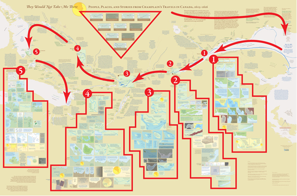
Pearce mentioned that she has had people compliment her on her maps by saying that they really had to “sit down” with the map to read and understand it. As Pearce put it, you probably wouldn’t compliment the author of an article or book that way…. yet often times maps get only a passing glance instead of a full, attentive reading.  During her presentation, Pearce walked the audience through a careful reading of  “They Would Not Take Me There” – a map that she made with co-collaborator Michael Hermann to illustrate the travels of Samuel de Champlain as he explored Canada between 1603 and 1616.  She discussed her use of Native place names, quotes from Champlain’s travel journals, historic fonts and cartographic techniques in shaping the map into a narrative in its own right – one that is a starting point for a discussion rather than a mere summary of Champlain’s travels through Canada.

From Pearce and Hermann’s introduction to the map on the University of Maine’s Canadian-American Center website:

At one level, Champlain’s explorations have been extensively documented and mapped by scholars focusing on the locations and dates of Champlain’s arrivals and departures. But these maps are silent with regard to the Indigenous geographies through which Champlain moved and upon which he relied for the success of his own explorations and mappings. Also, they fail to convey the human experiences which shape the emotional geographies of his journals.

From an article on the map that was published in Cartographic Perspectives, Number 66, Fall 2010:

The project began with a single map of the hydrography from the Gaspe Peninsula to the Georgian Bay, which was the extent of Champlain’s exploration of Canada along the St. Lawrence and Ottawa Rivers. But the cartographic challenge evolved into more than mapping Champlain’s exploration routes; the mapping of his experience became both the design question and quest. Champlain’s own travel narrative
became the primary design element, with his words placed among the geography he described. These quotes were selected to bring the reader into the landscape of the map, including, but not limited to, observations of the physical landscape. His interactions and conflicts with Natives and Europeans also were stories that needed to be mapped. This concept of mapping stories and interactions became the primary focus.


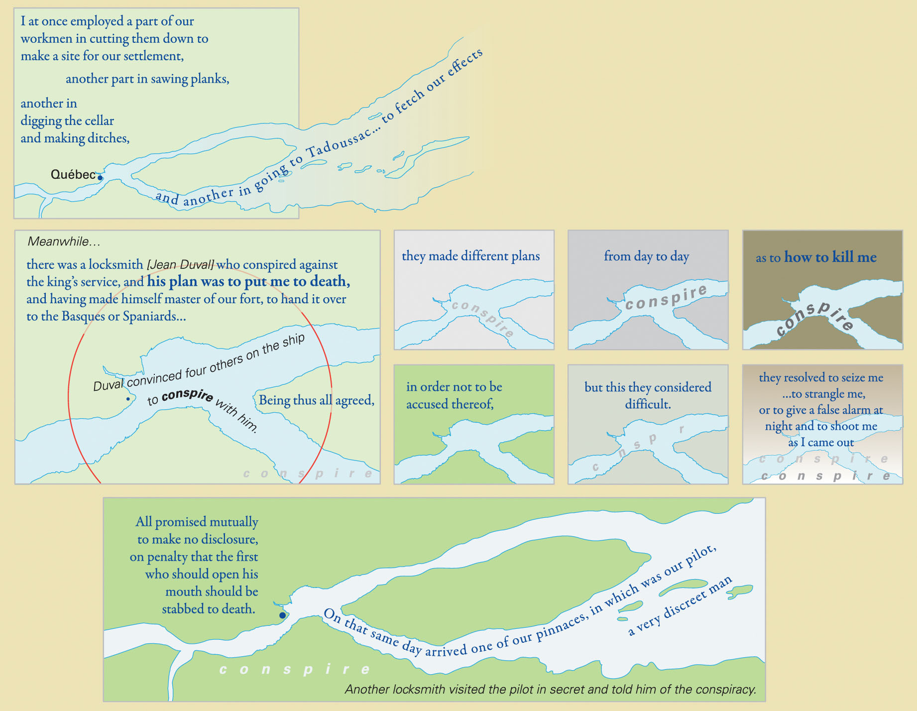
An example of the use of Native place names and historic fonts:
 

An image of the full map – no full-size digital file available (but soon I’ll have one in my office if you want to see it):
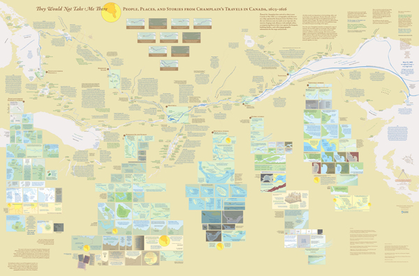
 

Diagram presenting one way to group information and read the map for the first time:
Categories
Bucknell/Local Interest Digital Humanities General GIS GIS in History Map Apps Slideshow

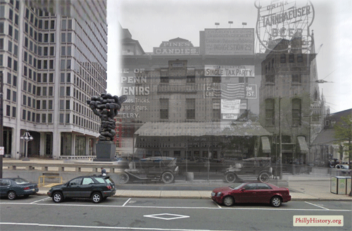
PhillyHistory + augmented reality as a smartphone app

This is the first in a series of posts about several exciting new projects that my old friends and Philly GIS happy hour buddies are up to at Azavea.  The first is funded by an NEH Digital Humanities Start-Up Grant that was awarded to the Philadelphia Department of Records to create a smartphone app that will enable users to view historic photos from PhillyHistory.org draped over the current modern-day landscape.

If the research proved successful, users would be able to point their smartphones, using the camera view, at a building or other location and see historic images of that same location.  The photos would be accompanied by descriptive information from PhillyHistory.org with additional explanatory text provided by local historians.  This combination of technology and history could be a powerful tool for showing the lengthy and interesting history of Philadelphia.

Click here to read more about the project.  Azavea expects to make the app (for iPhones and phones running Android) available as a free download sometime in the next few months.  A white paper about the project will also be released this spring and could hopefully serve as both inspiration and a springboard for faculty and/or student projects at Bucknell (where we have a wealth of historical images and GIS data for Lewisburg). Click here to read a blog post from Azavea Atlas about other examples of the use of augmented reality in cultural institutions.

Categories
Bucknell/Local Interest Digital Humanities Events/Calendar General GIS

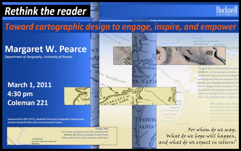
Reminder: Margaret Pearce cartography presentation tomorrow, Tues. 3/1

Margaret Pearce, University of Kansas Dept. of Geography, will present a lecture, “Rethink the Reader: Toward Cartographic Design to Engage, Inspire, and Empower” tomorrow (Tues. 3/1) at 4:30 in 221 Coleman Hall.

Dr. Pearce works on cartographic representation of cultural and historical geographies, especially indigenous geographies. Her work stems from, as she describes it, “a love of map design as both a tool for exploring geographical information as well as expressive form for communicating complex geographical ideas, especially ideas about place and experience.” Her work is inspired and influenced by emerging ideas in critical cartography, affective technologies, and Indigenous Studies. She has published in journals such as Cartography and Geographic Information Science, American Indian Culture & Research Journal, and Cartographic Perspectives and has authored a book, Exploring Human Geography with Maps.

Sponsored by L&IT, the Geography Department, and the Bucknell Environmental Center.

Categories
Bucknell/Local Interest Crisis-Mapping Digital Humanities General GIS GIS in Environmental Studies GIS in Geography GIS in History GIS in Humanities GIS in Political Science GIS in Public Health GIS in Sociology Map Apps Slideshow

How big is it really?

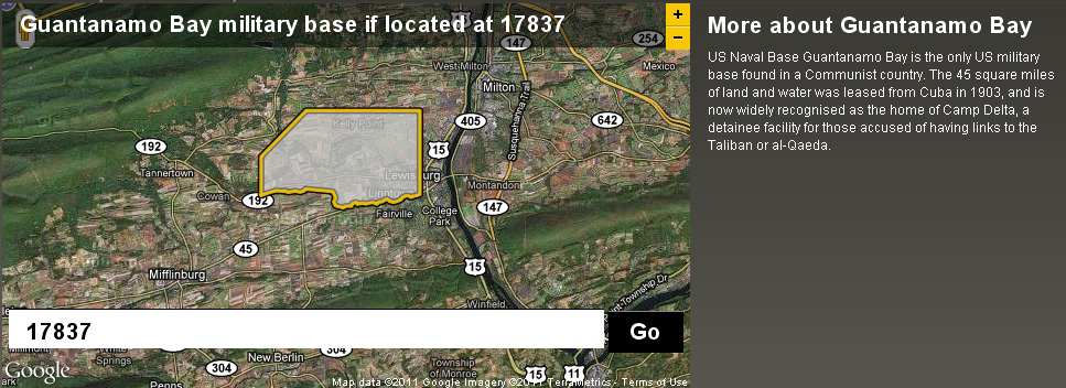
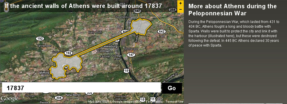
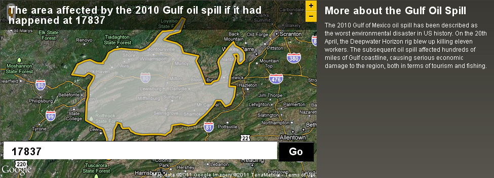
Back in December I posted about an NPR story about map scale.  I got so excited about the baseball on the moon map that I neglected to point out the other really interesting link from the story – to the BBC Dimensions website.  Dimensions (or, ‘howbigisitreally’) has a tool that lets you plug in any zip code or location and then choose from a list of events, places or things that you want to superimpose onto your area. See below for a map showing the area that the Guantanamo Bay Naval base would occupy if it was located in Lewisburg. I’ve also included maps showing what the ancient walls of Athens and the Gulf oil spill would look like if superimposed over the Lewisburg area. The Dimensions website has numerous places, events and things to choose from in making your map, including: the war on terror, ancient worlds, the industrial age, space, environmental disasters, depths, cities in history and more.

Categories
Bucknell/Local Interest Digital Humanities General GIS GIS in History GIS in Humanities Slideshow Videos

Digital Gazetteer of the Song Dynasty

There are a million reasons I can think of for wanting to be in Santa Barbara, CA this week but one of them is that I’d love to attend UC Santa Barbara’s ‘Think Spatial’ forum. This week’s presentation features Ruth Mostern from UC Merced discussing her use of Google Earth for teaching undergraduate history courses. In Mostern’s upper division history course about the Silk Road, students read travel narratives and then use Google Earth to create digital atlases about their travelers’ journeys.  Here’s a short video that showcases some of her students’ work:

httpv://www.youtube.com/watch?v=_7I2BJBrLAU

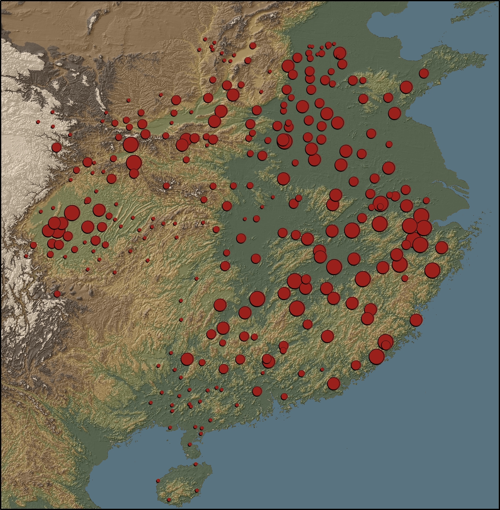
Mostern also makes extensive use of GIS in her research and is co-author of the Digital Gazetteer of the Song Dynasty. The website includes maps and downloadable data for counties and prefectures of the Song Dynasty. A sample map from the gazetteer is shown below.

“This map depicts the ratio of cantons to counties based on the data in the Song history. There is no county-level population data for the Song. The number of cantons in a county is the best proxy for its population. Red areas have a large number of cantons, and blue areas have a small number.”