Categories
Bucknell/Local Interest General GIS GIS in Geography Slideshow Videos

More web tools for helping students understand scale

In previous posts here, here and here I’ve mentioned different resources that can be useful in helping students understand scale.  Joseph Kerski, ESRI’s Education Curriculum Development Manager, recently posted to one of the GIS in higher ed listserves about some new web-based tools for teaching students about scale.

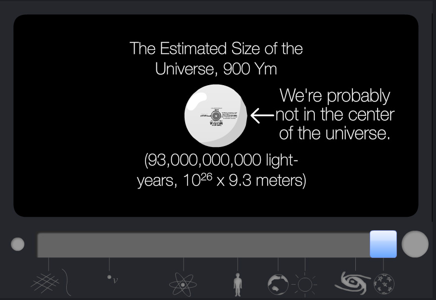
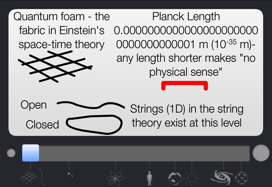
One of the websites, Scale of the Universe (created by Primaxstudio.com), features an interactive graphic that enables users to toggle a slider bar to zoom out from quantum to galactic scales while viewing where a variety of objects and measurements (quarks, bacteria, ostrich eggs, Redwood Trees, Marathon distance, planets, a light year)  fall along that spectrum.

Min                                                                                                   Mid
Max

Max

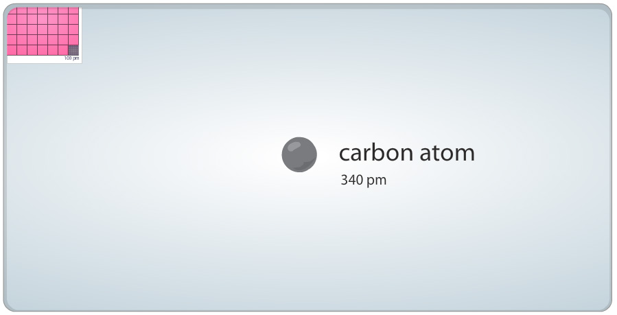
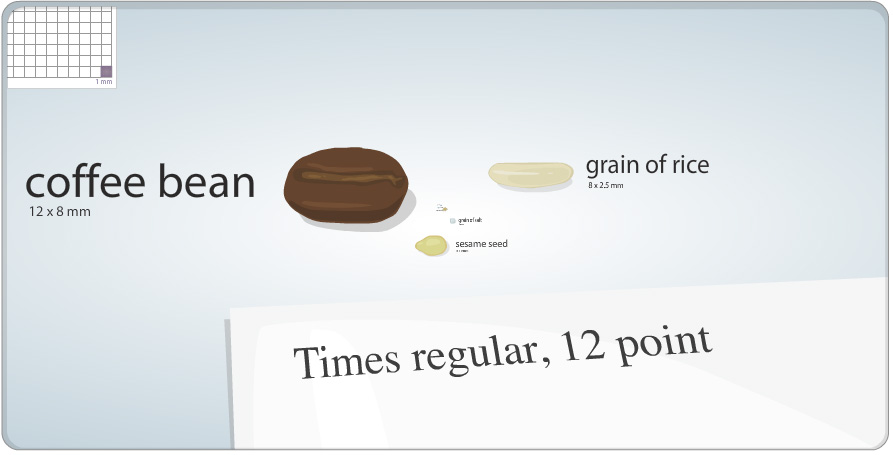
The other site, Cell Size and Scale (from the Genetics Science Learning Center at the University of Utah), uses the same slider bar device but starts with a 1 square millimeter cell size, a coffee bean and 12 pt Times font and then zooms in – passing an X chromosome, Baker’s yeast, hemoglobin and glucose on the way – until it eventually reaches the size of a carbon atom.
 

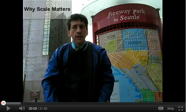
Joseph also shared a link to a movie he created, entitled “Why Scale Matters,” that illustrates concepts related to scale in geography:

httpv://youtu.be/blF0fXMCFZU


Categories
Bucknell/Local Interest Data Environment General GIS Slideshow

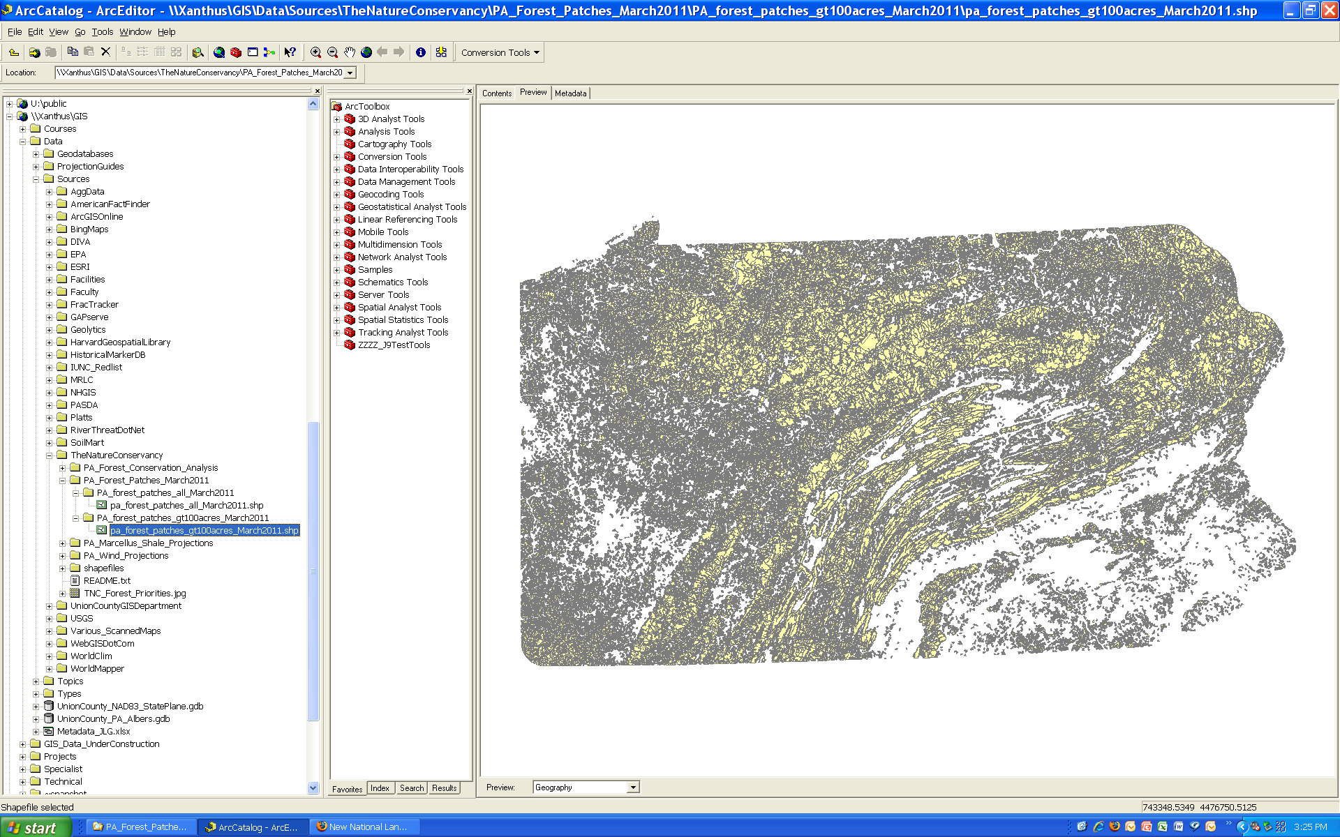
New data available on Pennsylvania forest patches

New data on Pennsylvania forest patches is available on Xanthus.  The datasets were created by the Pennsylvania chapter of The Nature Conservancy (TNC). The forest patches were delineated using the new 2006 NLCD data (also available on Xanthus).  The TNC defines forest patches as “contiguous areas of natural cover bound by any linear fragmenting feature (roads, railroads, rights-of-way) or non-forest edge.”

Two files are available – (1) forest patches for all of Pennsylvania; and (2) forest patches greater than 100 acres in size.  One important caveat to keep in mind is that the  dataset is intended for analyzing patterns of forest cover and forest patch sizes at a relatively small scale (e.g. state or regional as opposed to small sections of a particular forest or locality).  The NLCD land cover data from which the forest patches were derived is relatively coarse in resolution – so the forest patch boundaries are approximations and not intended for use in applications where exact measurements are needed.

Please contact me if you need to get access to the Xanthus data folder.

Categories
General GIS GIS in Geography Slideshow

More about scale: the true size of Africa

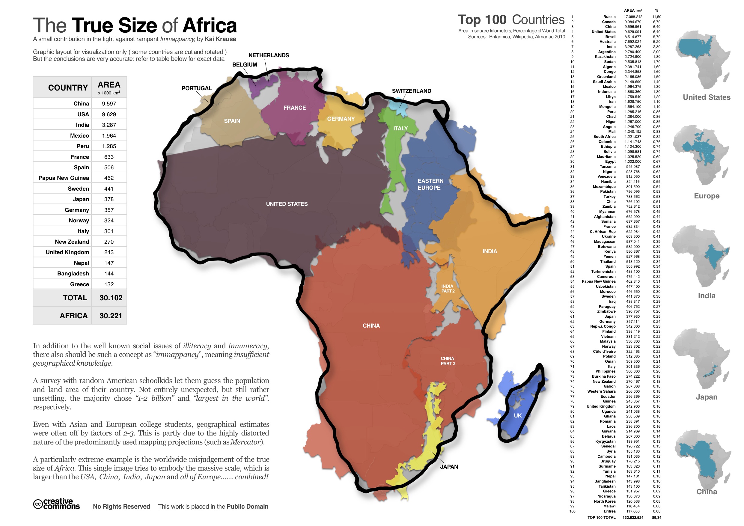
Here’s another in a series (see here and here) of interesting maps that address scale. Created by Kai Krause, the map aims to show the true size of Africa by visualizing all of the countries and regions that could fit inside the continent – including the U.S., China, India, Japan and all of Europe.  Krause calls the map “a small contribution in the fight against rampant immapancy” – or insufficient geographical knowledge.

Categories
Bucknell/Local Interest Crisis-Mapping Digital Humanities General GIS GIS in Environmental Studies GIS in Geography GIS in History GIS in Humanities GIS in Political Science GIS in Public Health GIS in Sociology Map Apps Slideshow

How big is it really?

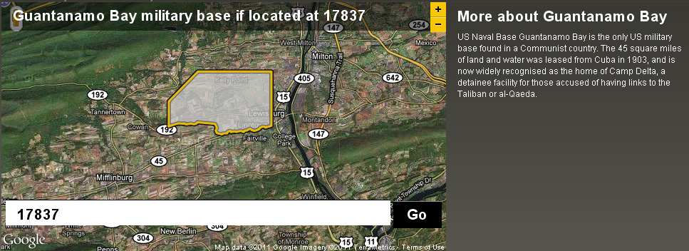
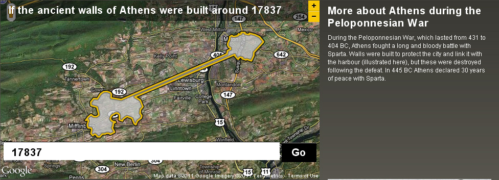
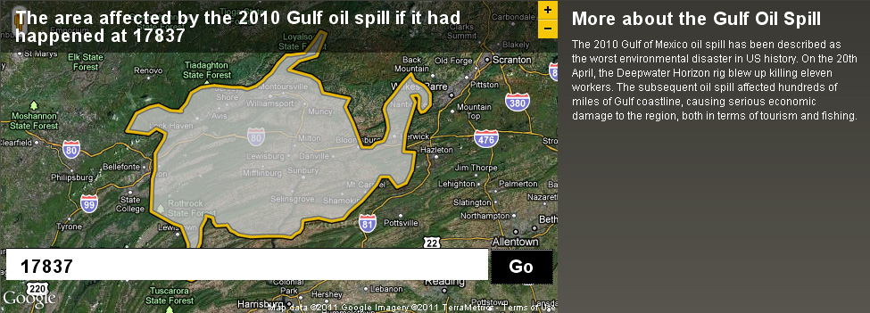
Back in December I posted about an NPR story about map scale.  I got so excited about the baseball on the moon map that I neglected to point out the other really interesting link from the story – to the BBC Dimensions website.  Dimensions (or, ‘howbigisitreally’) has a tool that lets you plug in any zip code or location and then choose from a list of events, places or things that you want to superimpose onto your area. See below for a map showing the area that the Guantanamo Bay Naval base would occupy if it was located in Lewisburg. I’ve also included maps showing what the ancient walls of Athens and the Gulf oil spill would look like if superimposed over the Lewisburg area. The Dimensions website has numerous places, events and things to choose from in making your map, including: the war on terror, ancient worlds, the industrial age, space, environmental disasters, depths, cities in history and more.

Categories
General GIS GIS in Geography Slideshow

Baseball on the moon? Not such a giant leap.

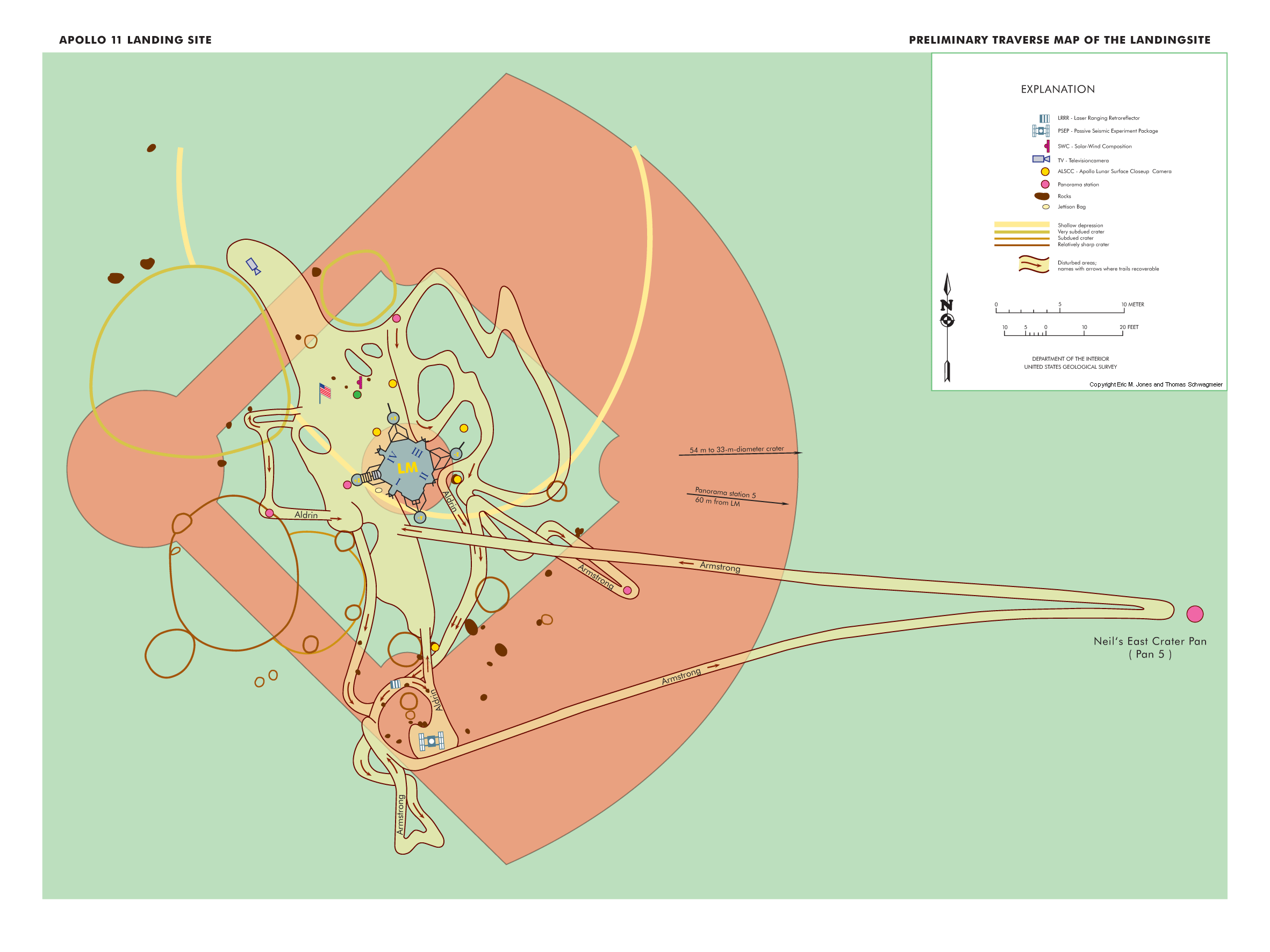
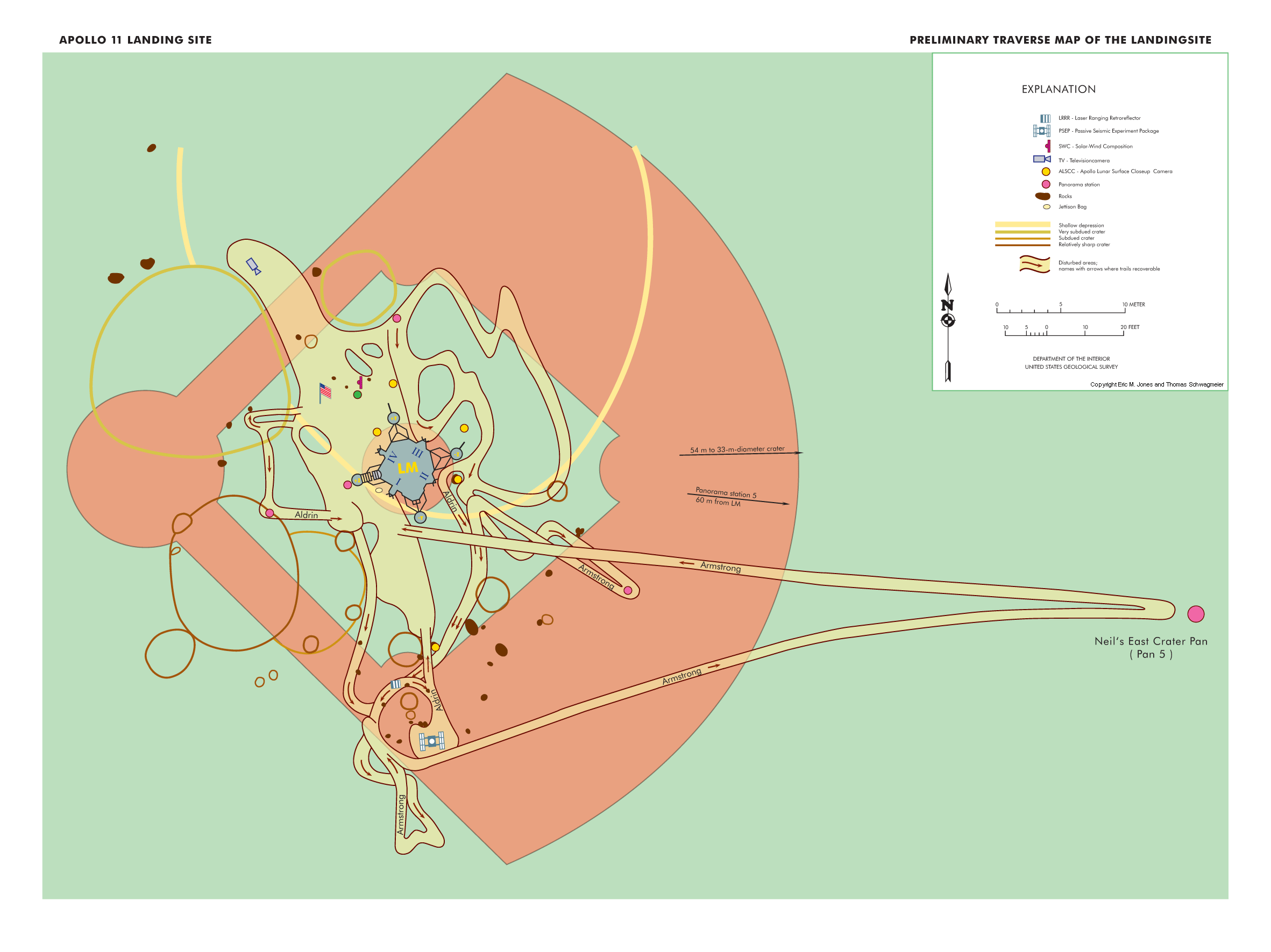
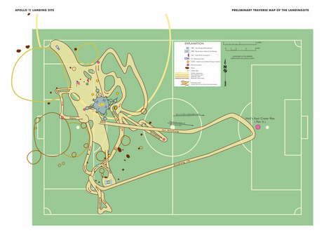
Here’s a link to an interesting NPR story about scale.  It highlights a new map from Frank Jacobs (from the Strange Maps blog) that superimposes a map of Neil Armstrong and Buzz Aldrin’s 1969 moon walks onto a baseball field to better convey the scale involved.  Jacobs’ map is actually a re-make of a NASA map that superimposed the moon walk route onto a soccer field (see below).