Guest post by Dan Dougherty, Geography/History ’12
The GIS team here at Bucknell worked on numerous projects throughout the summer. The first of these major projects was the mapping of mammal species ranges in the Sudan. The project began as a request from Biology Professor DeeAnn Reeder, who was interested in adding species maps to the newest, upcoming edition of her publication. The objectives were twofold: make maps which clearly show the range of each species of interest superimposed over political delineations, and make an additional map showing the current political situation in the Sudan, independent of species ranges. Professor Reeder requested range maps for over 300 mammal species, which included large mammals, small mammals, and even bats. The maps do not necessarily show precisely where an animal could be found, however. Instead, the maps show where an animal might potentially be found, under ideal conditions. Human presence throughout the region reduces their numbers and often means that they cannot live in certain areas, even if those areas are favorable in all other aspects.
The species maps were limited to black & white due to publishing constraints. Overcoming this limitation was a particularly difficult cartographic challenge, but hopefully the end result displays the map information clearly and sensibly.
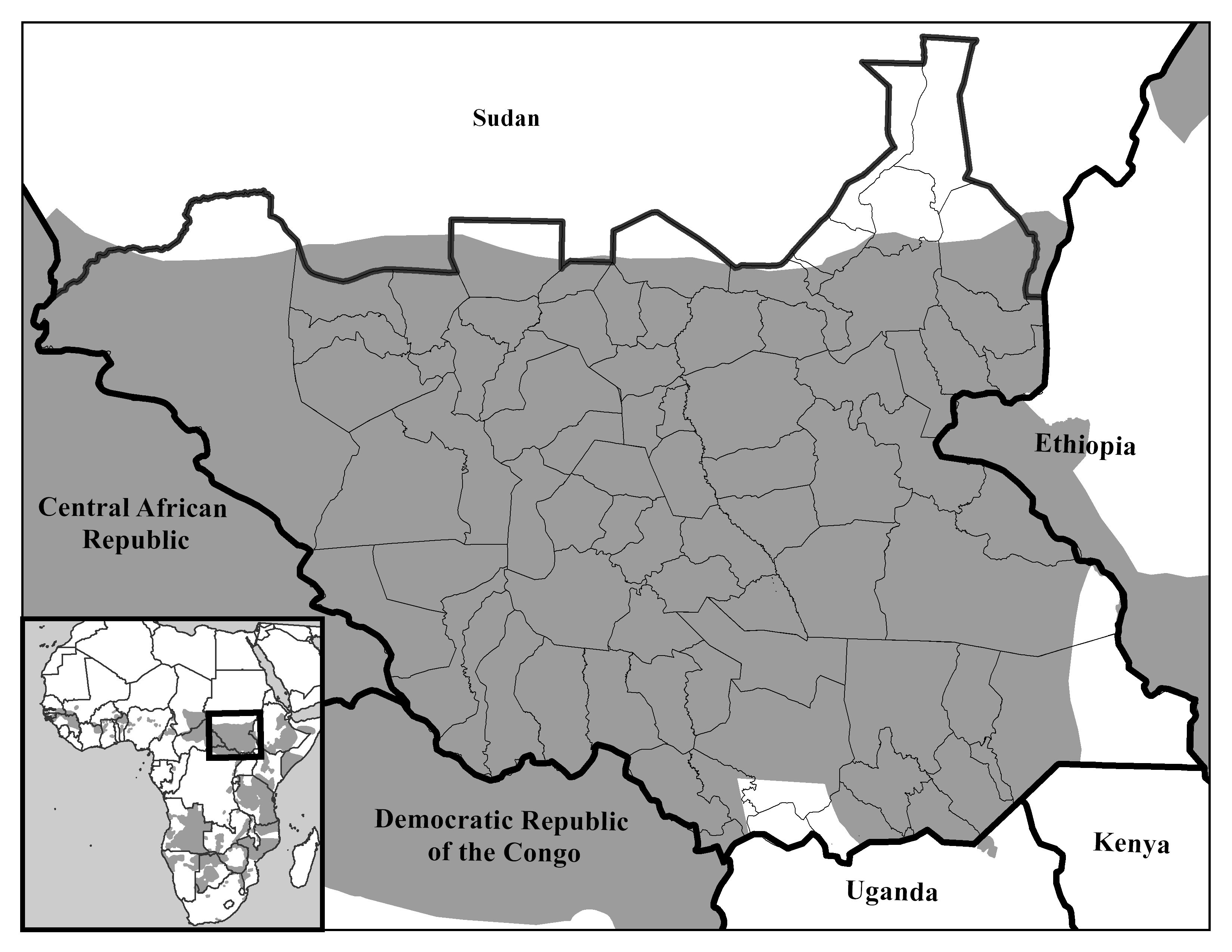
Data was collected primarily from the International Union for the Conservation of Nature (IUCN) and the United Nations. The IUCN provides a comprehensive shapefile containing species range data for over 50,000 mammals. By querying the shapefile, it was possible to isolate the individual species ranges to be mapped; the queried shapefile was then exported. Political data was gathered from the United Nations Sudan Information Gateway. The regional political data was slightly modified using a clipping extent. An extent rectangle was drawn in Central Africa, encompassing all of Sudan and small portions of the surrounding states. All political data outside the extent was removed from the map after running the clip tool.
Showing species ranges in a political context was especially important to us. On July 9, 2011, South Sudan formally seceded from the rest of Sudan. So while the species maps on a basic level show the species ranges, they also provide a base for further analysis. What will be the effect of this newly formed political boundary on the livelihoods of the innumerable resident animal species, who are not constrained to arbitrary political borders? Specifically, the maps raise some questions about the effect of differing political, cultural, and social attitudes on habitat sustainability and conservation efforts. Furthermore, the potential for resulting conflict over natural resources and regional hegemony in the aftermath of the split might also carry significant consequences for the animal species. In addition, the maps also seek to illustrate the immense biodiversity of the region.