Categories
Bucknell/Local Interest Events/Calendar General GIS Slideshow

2011 Student Paper Competition – URISA

June 6th is the deadline for submitting papers to the 2011 URISA Student Paper Competition.  The competition is open to all grad students and any undergraduates with 12 or more credit hours. Read below for some general information and guidelines. Click here for details:

The objective of the Competition is to challenge students to demonstrate the development and effective use of Geographic Information Systems in both their field of study and in the community.  The following types of papers are encouraged:

  • Comprehensive literature review on a geographic information science, spatial technologies and their application.
  • Application of spatial statistics.
  • Application of an implemented geographic information system or other spatial technology and its demonstrable impact on a public or private sector organization.
  • Treatment and development of geographic information systems, spatial technologies and theory.

Theses will not be accepted. A summary paper based on a thesis or research performed while completing a thesis, is acceptable.



Categories
Crisis-Mapping Events/Calendar General GIS GIS in Political Science Slideshow Videos

Where 2.0

The 2011 Where 2.0 conference is wrapping up today in Santa Clara, CA.  Over the course of the week, many of the presentations have been streamed live over the conference website. I’m including a few YouTube videos for some of noteworthy presentations.

Jack Dangermond – CEO and founder of Esri: “Living Maps – Making Collective Geographic Information a Reality”

httpv://www.youtube.com/watch?v=vIbGwY3aG0g&p=0B2FEB8AACD826BE


Blaise Agüera y Arcas, Architect of Bing Maps and MSN at Microsoft:  “Read/Write World”

httpv://www.youtube.com/watch?v=4X9u4JG9H6E&p=0B2FEB8AACD826BE


Ben Fry – principal of Fathom: “Mapping: From Interesting to Insightful to Irrelevant” (coming soon)


Patrick Meier, Director of Crisis Mapping & New Media for Ushahidi: “May the Crowd Be With You: The Future of Crisis Mapping for Disaster Response”

httpv://www.youtube.com/watch?v=M_NguESRZ4g&p=0B2FEB8AACD826BE


Dennis Crowley, Co-founder, foursquare; and Robert Scoble, Managing Director, Rackspace: “Future Location: Scoble & Dens”

httpv://www.youtube.com/watch?v=TpTDGeLiFnc&p=0B2FEB8AACD826BE


John Barratt, self-described “Geo, twitter & weather web hacker”:  “Who, What, Where, When: Creating New Maps from Geo-tweets”

httpv://www.youtube.com/watch?v=ey_m0F_b-Vw&p=0B2FEB8AACD826BE


Sylvain Carle, CEO & co-founder @ Needium: “Locking Yourself Out in London (and Tweeting about it)

httpv://www.youtube.com/watch?v=Gvcs4H_A0Wc&feature=autoplay&list=PL0B2FEB8AACD826BE&index=16&playnext=1


Categories
General GIS Map Apps Slideshow Videos

Google MapMaker released in U.S.

Earlier this week, Google released Google MapMaker in the U.S.  The tool, which enables users to add their own point, line and polygon features to the Google basemap (e.g. coffee shops, short-cuts across campus, soccer fields) has been available internationally since 2008 as a means for generating detailed local datasets for under-mapped areas.

The tools in the Google MapMaker interface are similar to those found in OpenStreetMap but the user-submitted data is not open source.  Nor are there any guarantees about accuracy.  Although Google runs algorithms on the back-end to review user-submitted data and provide some (very) minimal level of quality assurance it’s up to each of us to evaluate how good or bad all of this new data is.  Just remember – inaccuracies in data supplied by Google’s own staff have inflamed border disputes on a number of occassions in recent years (notably between Cambodia and Thailand; and between Nicaragua and Costa Rica).

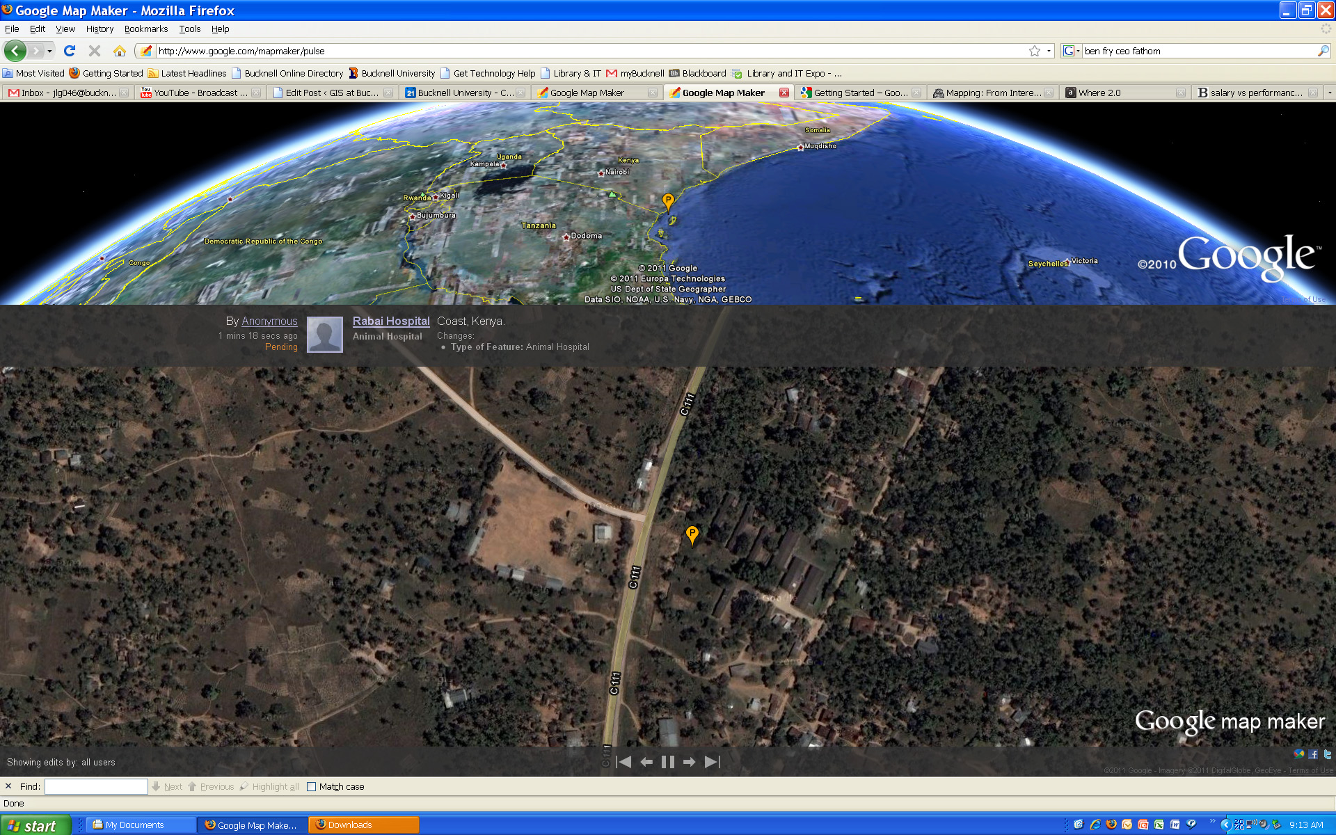
Click here to visit the Google MapMaker site. Or, click here to check out Google MapMaker Pulse – a totally addictive real-time feed showing user updates to MapMaker worldwide (see below for screenshots of updates provided by users in Kenya and Belarus). Here’s a link to an article from Wired.com on the new release.

And a video from Google advertising the new MapMaker tool:
httpv://www.youtube.com/watch?v=znCPgldRWTc&feature=player_embedded#at=16


Google MapMaker Pulse – User-generated edits from Kenya:


Google MapMaker Pulse – User-generated edits from Belarus:

Categories
General GIS GIS in Psychology Map Apps Slideshow

Sad maps at University of Florida

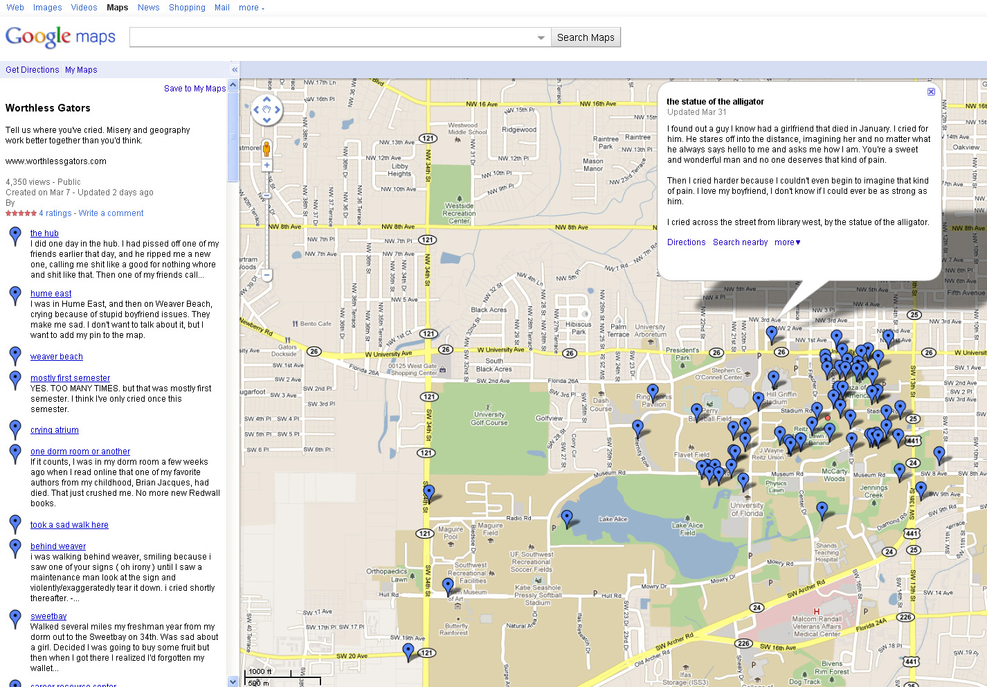
A few weeks ago I posted about Cambridge University PhD student Alex Davies’ project on mapping happiness.   Over at worthlessgators.com University of Florida student(?)  ”Sad Hector’ is doing the exact opposite – mapping sadness on University of Florida’s Gainesville campus.  Prompted to ‘tell us where you’ve cried,’ visitors to the site can fill out a short form (below) with the location and details of the crying incident and then see their entry added to the GoogleMaps ‘sad map.’

Created in early March, the site already has 60+ entries mapped. Crying locations run the gamut from the predictible (fraternity row, dorms) to the scenic (shores of Lake Alice, local parks) to the  unexpected (near the Florida Museum of Natural History Ogliocene Period display).  Parking garages seem to be a fairly popular crying location at U of F.  In addition to just noting the locations of crying on campus, the site also has a link to the U of F Counseling and Wellness Center for students who want to seek help.

Thanks to Kathleen for the heads up about this site!


Categories
General GIS GIS in Geography GIS in Sociology Map Apps Slideshow

The 12 States of America

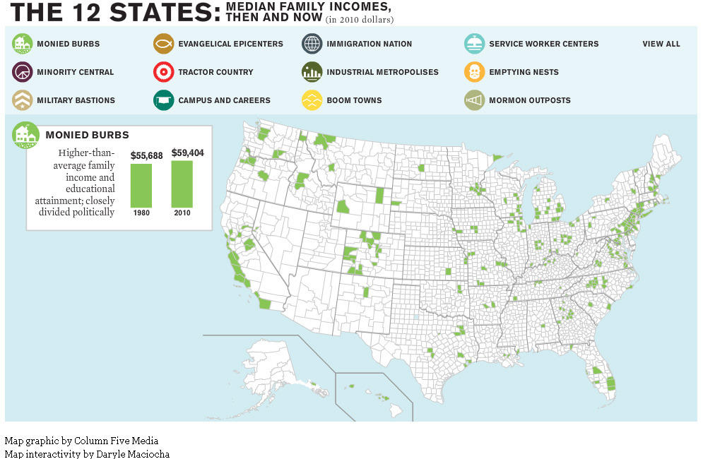
The website for The Atlantic magazine has an interesting new map graphic visualizing the ways in which income inequality has fractured the nation over the past 30 years.  The graphic breaks the nation into 12 different ‘states’ – monied burbs, minority central, military bastions, evangelical epicenters, tractor country, campuses and careers, immigration nation, industrial metropolises, boom towns, service worker centers, emptying nests and mormon outposts – based on a variety of different demographic characteristics.

For example, the Boom Town state is defined as relatively wealthy U.S. counties that saw rapid growth and increasing minority populations prior to the last recession. Whereas Monied Burbs have higher than average family income and educational attainment and are closely divided politically.

See map samples for the Boom Town and Monied Burb states below. Click here to see the interactive map graphic on The Atlantic’s website. Thanks to Ben Marsh for the heads up about this graphic!