Categories
Bucknell/Local Interest Data Environment General GIS GIS in Engineering GIS in Environmental Studies GIS in Geography GIS in Geology Miller Run Restoration Project Slideshow

Miller Run Restoration: The Details

Guest post by Michael Grasso, Environmental Studies ’13 and Dan Ladd, Middlebury College ’14

The G.I.S. team started the Miller Run Restoration Project at Abby Lane in and around an oat field adjacent to the driving range at the Bucknell golf course. We spent the majority of the first day becoming accustomed to the equipment. Some of us took continuous topographical measurements with the mobile RTK-OPUS GPS unit and the others used the theodolite Total Station to collect coordinate and elevation data at the culverts in the area. Culverts are concrete or corrugated steel structures jutting out of the ground where drainage pipes release water. There were 5 culverts in this first area we worked on. The water these culverts expel is polluted and travels at a high velocity which unnaturally increases the flow of the stream, disturbing the ecosystem. That problem will hopefully be alleviated (if not solved) by the creation of the wetlands at the culmination of the Restoration Project.

Actually using the equipment to get measurements is fairly simple. The aspect that we spent the most time learning was setting up the equipment and getting it ready to record data. On that first day it took us 30-45 minutes to set up the Total Station, but now it takes us only 5-10 minutes. To prepare the equipment, we first set up the theodolite tripod directly over a point marked with a nail in the ground. Then, using a bubble level, we adjust the tripod to make it as level as we can. When we put the theodolite on the tripod, we can achieve a more accurate measure by using a level that’s part of the theodolite. Once the equipment is as level as possible, we look through an eyepiece located on the theodolite which has a mirror that is angled directly at the ground with a cross hair in the view. We are able adjust the theodolite to position the cross hair at the middle of the nail. We are then ready to begin syncing the equipment. This process is time consuming because when we look through the eyepiece more often than not we cannot adjust the theodolite enough to get it directly over the nail, so we have to go back to step one and reposition and re-level the tripod.

After the first day of week one at Abby lane, we began the real work. That was the week of the heat wave when temperatures were 95+ everyday, so we agreed to meet at the geology building to get the equipment at 7am (an hour earlier than we usually meet) to try to beat the heat. The rest of the week was spent collecting elevation and coordinate data. After the second day we had taken all the continuous topographic measurements we could before the farmer harvests his crops, so we focused on taking cross sections of the stream. The stream bed was almost completely dry at this point, so we had two people collecting measurements and two up ahead looking for the stream bed and pushing the vegetation out of the way so it was easier to see. Thursday and Friday of that week the part of the stream we were collecting data from was in an area of very thick vegetation that towered over us. We were given machetes and sickles to clear a path along the stream bed so we could record data. Professor Duane Griffin pointed out certain plants we should avoid hacking because they were native and would be included in the vegetation that will be added to the wetlands. A large majority of the plants we cut down were Japanese knotweed–an invasive species that chokes out most other vegetation in the area. There were at least 3 different significant stream beds in this area, so we did a lot of hacking and searching.

Once we finished taking cross sections and stream profile points at Abby Lane, we moved across the driving range to the other side of Smoketown road and began collecting data in front of the Sunflower daycare building. It was much easier to get points there because there was little vegetation and flowing water. As we moved downstream towards the mods, however, the vegetation became much thicker than it was over by Abby Lane, so we contacted facilities and asked them to clear the brush. There were large areas covered with poison ivy so the school wanted to minimize the amount of contact between us and the vegetation. After facilities cleared paths for us, and if weather permitted, we collected continuous topographic and stream profile data, and took cross sections every 2-3 meters on Miller Run right in front of the mods.We also recorded dense continuous topographic data for the area between the mods and the stream (near where the solar panels are). This is an area of interest to the Miller Run restoration committee as this is a proposed area for a possible wetland.

Currently we are waiting for the farmer to harvest so we can finish collecting data by Abby Lane. Once we finish the data we collected will be combined and merged into a Digital Elevation Model (DEM) that can be used by Geologists, Geographers, Biologists and Environmental Scientists to figure out flow models, habitat zones and decide where to place wetlands.



Categories
Bucknell/Local Interest Digital Humanities Environment General GIS GIS in History GIS in Humanities Slideshow

Georeferencing Historic Maps of Susquehanna Valley Region

Guest Post by Robby Holler, Geography/International Relations ’13

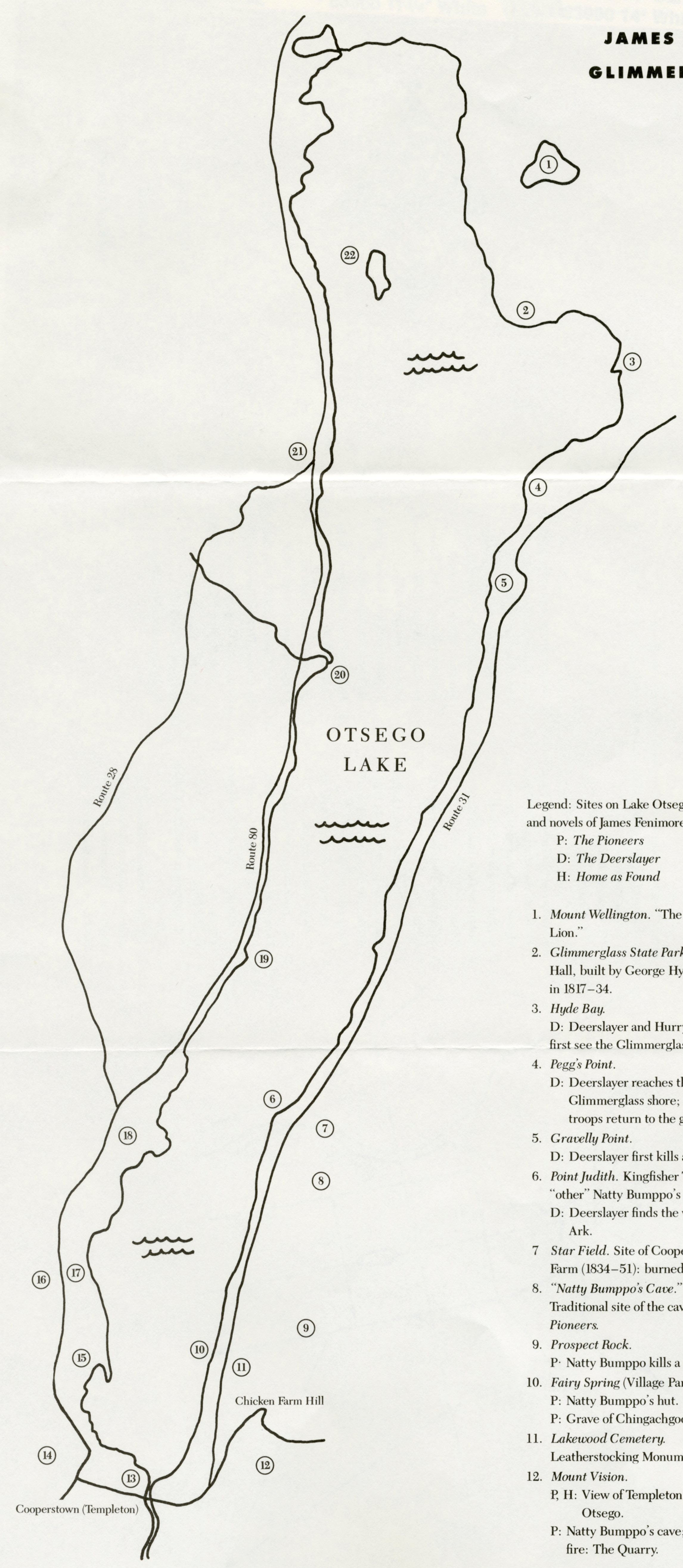
During the past two months, I’ve spent time working with other GIS interns with many of their projects.  Much of my time, though, has been spent on two projects: georeferencing an 1868 atlas of central Pennsylvania and georeferencing and vectorizing a map of Lake Otsego.  Both of these projects tie in closely to the Susquehanna River Valley and are part of the Stories of the Susquehanna program.

Most of the GIS student assistants pitched in to help with the 1868 atlas.  Together we georeferenced over 30 maps of central Pennsylvania.  To do this, we scanned pages from the atlas, clipped them to include only the maps, and then used stream, state road, and local road shapefiles to georeference them.  Most roads on the county maps correspond to still existing state roads.  The local presence of this project struck me as I drove down 522 a few days after georeferencing Middleburg, Beaver Springs, and Beavertown.  It was interesting to drive down highways I had mapped and recognize all the local cross streets.

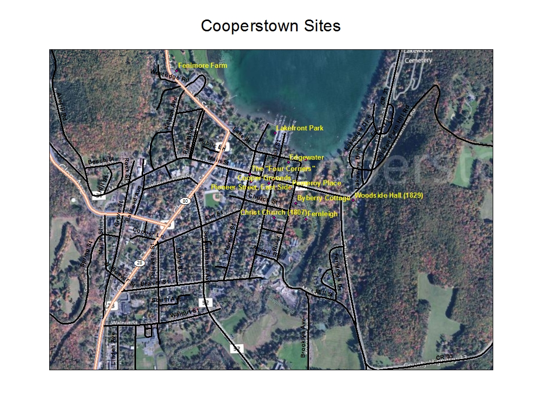
Lake Otsego is located in Otsego County, New York, and is known for three things: Cooperstown (the location of the Major League Baseball Hall of Fame, the headwaters ofthe Susquehanna, and the setting for James Fenimore Cooper’s novels, most notably Last of the Mohicans).  It is these last two facts that interest Alf Siewers, Professor of English.  He gave me a pamphlet titled “James Fenimore Cooper’s Otsego County” and asked me to vectorize the two maps on it.  One map focused on Cooperstown and the other on the whole lake.  Both displayed points important to Cooper and his family, or featured in his literature.  I georeferenced the lake image and then recorded all the points on the map by creating a new shapefile.  To vectorize Coopersburg, I didn’t need to georeference the given map.  I just used roads and local landmarks on a basefile to correctly place points in a new shapefile.  I edited the tables for each new shapefile to add information about every point, including names and known literary references from Cooper’s novels.  Finally, I created an exported final maps with BingMap hybrid basefiles, street layers, a transparent rectified original map, and my new shapefiles.


Categories
Bucknell/Local Interest Data Environment General GIS GIS in Computer Science GIS in Engineering GIS in Environmental Studies GIS in Geography GIS in Geology Miller Run Restoration Project Slideshow Videos

Video footage from Flying Bison test run

On July 26th, Nick Urban and the summer 2011 GIS team conducted a test flight of the Flying Bison. See video to learn more about the Miller Run Restoration Project and to see footage captured by the drone during its flight.

Thanks to Lindsay Coffee and Erin Murphy for their work on shooting & editing the video footage.

video platform video management video solutions video player

Categories
Bucknell/Local Interest Environment General GIS GIS in Geology Marcellus Shale Slideshow

Mapping Marcellus Shale Flowback Water Chemistry

Guest post by Darin Rockwell, Geography/Geology ’13

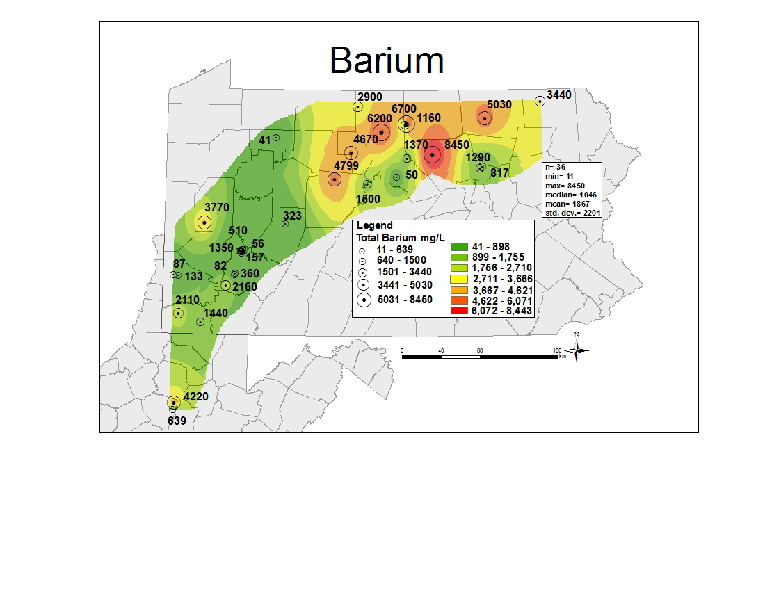
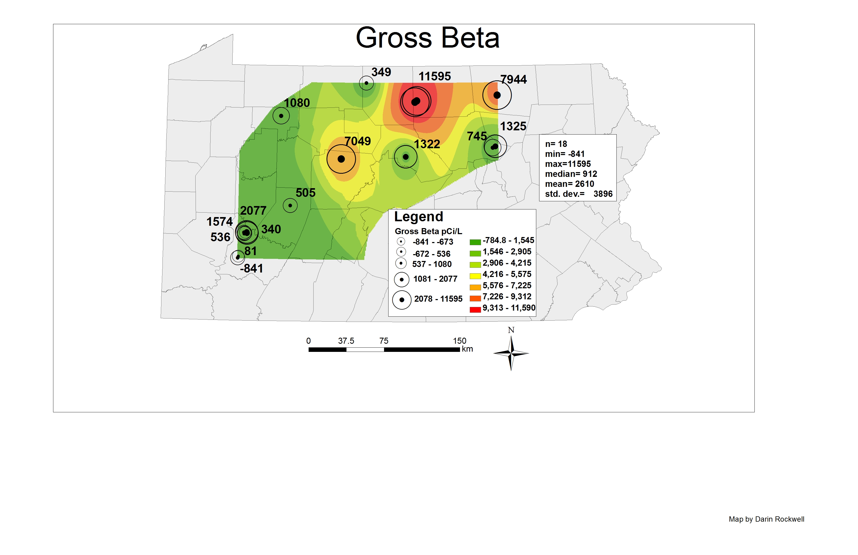
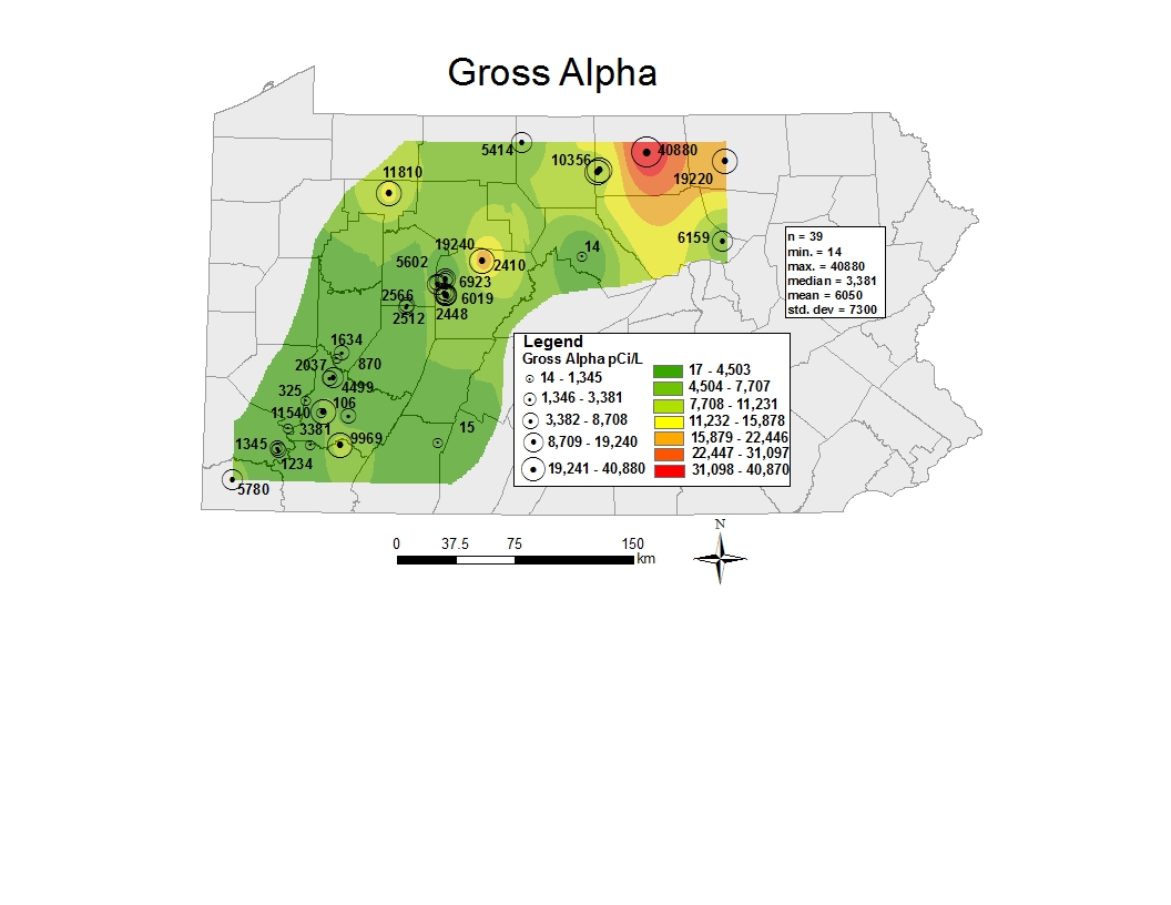
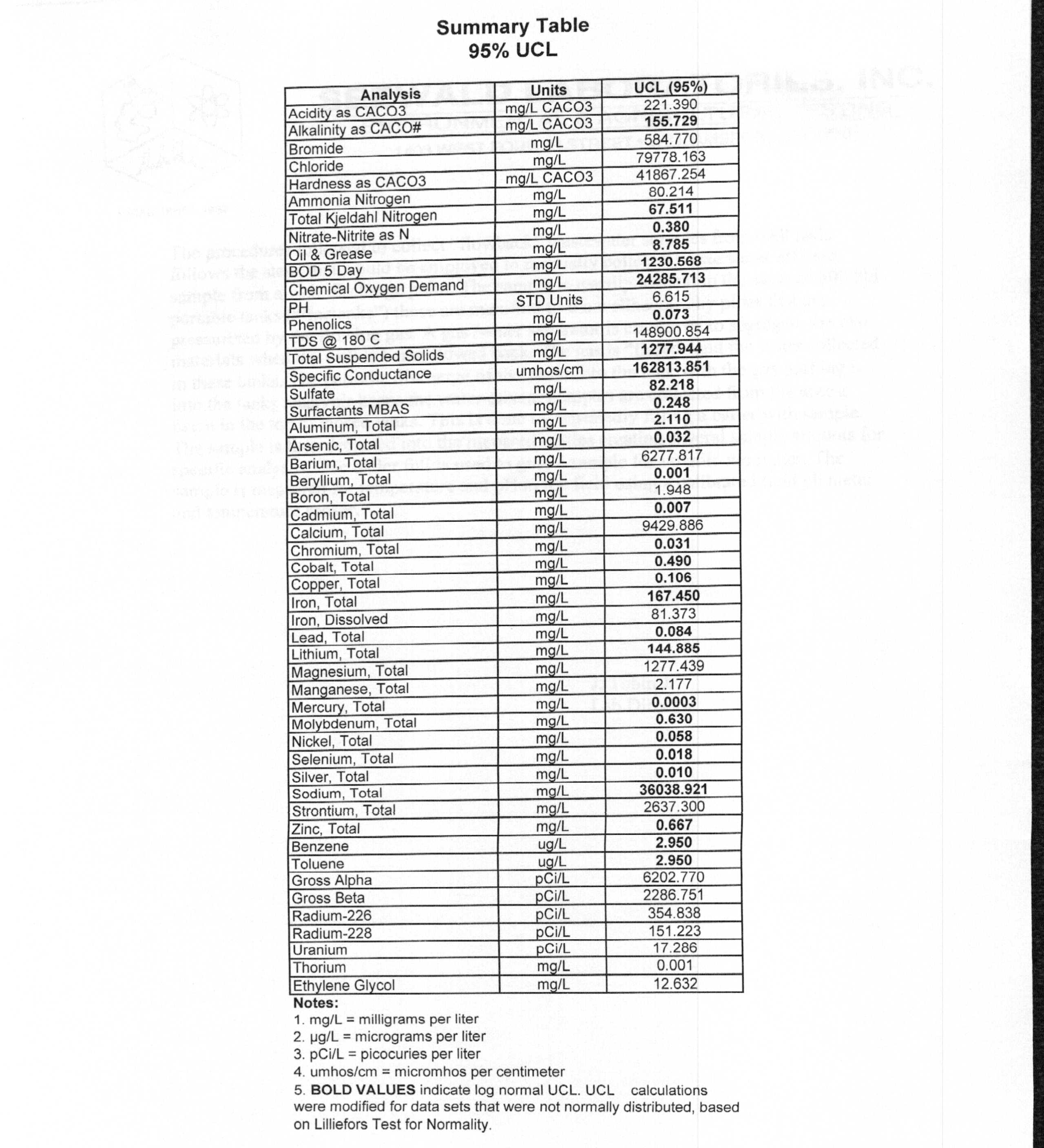
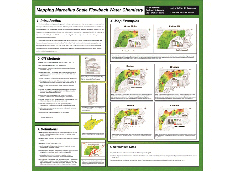
The Marcellus Shale natural gas extraction process is undergoing rapid development, which raises many environmental questions. This project studies the chemistry of flowback water[1]. High salinity levels, radioactive elements, and toxic trace metals are   found at very high concentrations in the flowback water. However, the concentrations of the measured parameters vary spatially. Professor Kirby and his students previously gathered data on flowback water and compiled the information into a spreadsheet.


My role in this project was to:

  1) compile additional data

  2) check all data for accuracy and missing information

  3) create maps that showed the spatial distribution of the selected parameters.


Project data includes well pad location, company name, permit numbers, date of drilling, and selected chemical parameter data from several sources. Sources include data from 26R forms[2] and a New York Times article. Data were transferred from Excel™ into ArcMap™. Data was narrowed down to only 90 day production data. 90 day production data is used due to the comparison of the 26R form analysis dates and spud dates[3]. The date differences seemed to mostly fall around 90 days. Latitude and longitude coordinates were retrieved from data on the Department of Environmental Protection website. For some data, coordinates were unavailable to retrieve. Therefore, I georeferenced[4] points using ArcGis in order to gain xy coordinates. Each parameter is mapped to its own extent in which data is available.

I experimented with various layouts to produce maps following good cartographic principles. Final maps include contour maps, which were calculated using Inverse Distance Weighted Interpolation[5], overlaid with graduated symbols[6] for values of nine parameters; Gross Alpha radiation, Gross Beta radiation, radium-226, radium-228, barium, strontium, sodium, and calcium.  A final poster, 26R forms, and a few  other sample maps are shown at the bottom of this blog post. It is important to note that the parameters are strictly from flowback water from the Marcellus Shale natural gas extraction process and the levels are not necessarily drinking water levels; the values are before treatment.   

Guest Post Darin Rockwell, Geology & Geography Bucknell ’13

______________________________________________________________________________________________________________________________________________________________________

[1] Flowback Water: Water that returns to the surface at the well head after fracking

[2] 26R forms: A form that each company is mandated to be sent to DEP annually that includes a chemical analysis of the residual waste produced at a site

 [3] Spud Dates: The start of drilling on a well

[4] Georeferenced: Defining spatial reference by location in terms of projections and coordinate systems

[5] Inverse Distance Weighted Interpolation: predicting unknown values using the known values at certain locations using arcGIS

[6] Graduated Symbols: A way to represent data that includes proportionate symbols according to break values in the data


Categories
Bucknell/Local Interest Environment General GIS GIS in Biology Slideshow

Mapping Species Ranges in the Sudan

Guest post by Dan Dougherty, Geography/History ’12

The GIS team here at Bucknell worked on numerous projects throughout the summer. The first of these major projects was the mapping of mammal species ranges in the Sudan. The project began as a request from Biology Professor DeeAnn Reeder, who was interested in adding species maps to the newest, upcoming edition of her publication. The objectives were twofold: make maps which clearly show the range of each species of interest superimposed over political delineations, and make an additional map showing the current political situation in the Sudan, independent of species ranges. Professor Reeder requested range maps for over 300 mammal species, which included large mammals, small mammals, and even bats. The maps do not necessarily show precisely where an animal could be found, however. Instead, the maps show where an animal might potentially be found, under ideal conditions. Human presence throughout the region reduces their numbers and often means that they cannot live in certain areas, even if those areas are favorable in all other aspects.

The species maps were limited to black & white due to publishing constraints. Overcoming this limitation was a particularly difficult cartographic challenge, but hopefully the end result displays the map information clearly and sensibly.

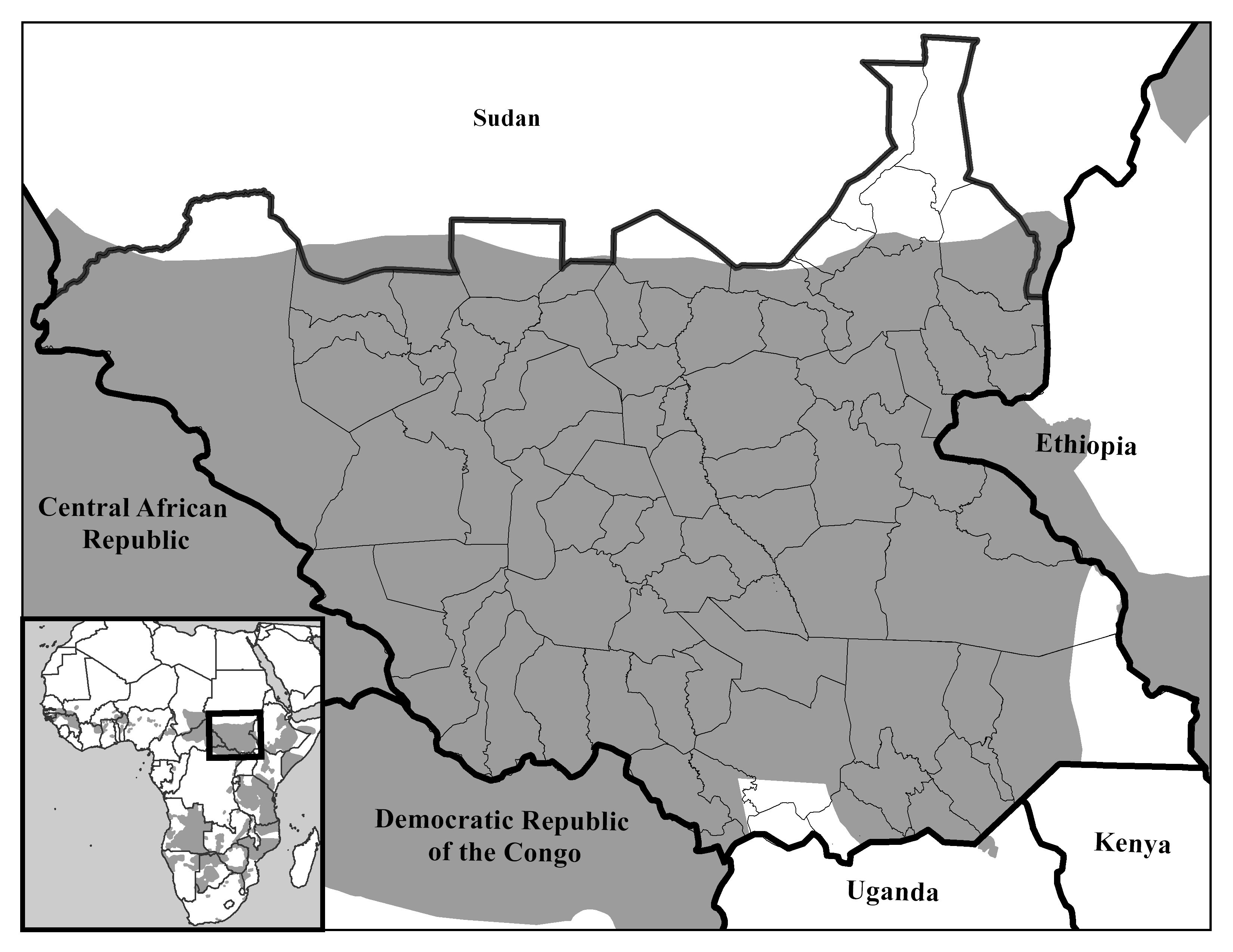
P. leo
This map shows the potential species range of the lion (gray shading)

Data was collected primarily from the International Union for the Conservation of Nature (IUCN) and the United Nations. The IUCN provides a comprehensive shapefile containing species range data for over 50,000 mammals. By querying the shapefile, it was possible to isolate the individual species ranges to be mapped; the queried shapefile was then exported. Political data was gathered from the United Nations Sudan Information Gateway. The regional political data was slightly modified using a clipping extent. An extent rectangle was drawn in Central Africa, encompassing all of Sudan and small portions of the surrounding states. All political data outside the extent was removed from the map after running the clip tool.

Showing species ranges in a political context was especially important to us. On July 9, 2011, South Sudan formally seceded from the rest of Sudan. So while the species maps on a basic level show the species ranges, they also provide a base for further analysis. What will be the effect of this newly formed political boundary on the livelihoods of the innumerable resident animal species, who are not constrained to arbitrary political borders? Specifically, the maps raise some questions about the effect of differing political, cultural, and social attitudes on habitat sustainability and conservation efforts. Furthermore, the potential for resulting conflict over natural resources and regional hegemony in the aftermath of the split might also carry significant consequences for the animal species. In addition, the maps also seek to illustrate the immense biodiversity of the region.