Categories
Digital Humanities General GIS GIS in History Slideshow

Using G.I.S. to Visualize Historical Landscapes

Guest post by Michael Grasso, Environmental Studes 13′

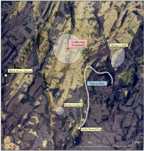
Geographic Information Systems can be used recreate a landscape that no longer exists. Historians can use this technology to help explain confusing, or even previously unexplainable, events that took place in the past. For example, General Robert E. Lee issued a series of orders (Pickett’s Charge) that directly caused the Confederates to lose the battle of Gettysburg and inevitably the Civil War. If anyone stood today where General Lee stood that fateful day they would be able to clearly see the fortified, superior Union force waiting for the charge – and wonder why Gen. Lee made the decision that he did. However, the landscape has dramatically changed in the 150 years since the Civil War.  Using historical maps and other documentation, geographers and historian were able to re-create the landscape that General Lee saw and to determine that – from his position 150 years ago -one could not see the eastern end of the battle field where Union forces were amassing.

This is a link to an article explaining how G.I.S. was used to answer questions be recreating historical landscapes such as the Battle of Gettysburg, the 1930s dust bowl, and the Salem Witchcraft Trials.

Categories
Crisis-Mapping Environment General GIS GIS in Political Science Slideshow

Using G.I.S. to Help Analyze and Visualize Disasters

Guest post by Michael Grasso, Environmental Studies ’13

G.I.S. has an extremely large variety of applications. With G.I.S. one could map an area affected by a natural disaster in order to analyze the extent of the damage, the value of the property damaged, and how different areas were affected differently. G.I.S. can even be used just to help someone visualize the totality of the damage that occurred.

One such disaster that has been mapped was the F5 tornado that ravaged Joplin, Missouri on May 23, 2011. There are many different maps that are available to the public that can used for different applications.

This link is a google map created using G.I.S. that one could use to assess what property was damaged or completely destroyed. It also labels different areas based on an average amount of damage as well as marking where the tornado begins, changes in intensity and direction, and when it dissipates.


This link is primarily to help someone visualize the affects of the tornado. This map was created using G.I.S. and is basically a before and after picture where you can zoom into different areas.
http://gis.wustl.edu/Joplin.HTML


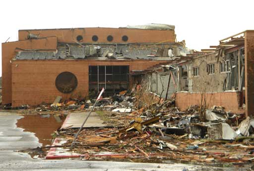
This is a picture of the Joplin High School after the tornado’s destruction


Categories
Bucknell/Local Interest Data Environment General GIS GIS in Engineering GIS in Environmental Studies GIS in Geography GIS in Geology Miller Run Restoration Project Slideshow

Miller Run Restoration: The Details

Guest post by Michael Grasso, Environmental Studies ’13 and Dan Ladd, Middlebury College ’14

The G.I.S. team started the Miller Run Restoration Project at Abby Lane in and around an oat field adjacent to the driving range at the Bucknell golf course. We spent the majority of the first day becoming accustomed to the equipment. Some of us took continuous topographical measurements with the mobile RTK-OPUS GPS unit and the others used the theodolite Total Station to collect coordinate and elevation data at the culverts in the area. Culverts are concrete or corrugated steel structures jutting out of the ground where drainage pipes release water. There were 5 culverts in this first area we worked on. The water these culverts expel is polluted and travels at a high velocity which unnaturally increases the flow of the stream, disturbing the ecosystem. That problem will hopefully be alleviated (if not solved) by the creation of the wetlands at the culmination of the Restoration Project.

Actually using the equipment to get measurements is fairly simple. The aspect that we spent the most time learning was setting up the equipment and getting it ready to record data. On that first day it took us 30-45 minutes to set up the Total Station, but now it takes us only 5-10 minutes. To prepare the equipment, we first set up the theodolite tripod directly over a point marked with a nail in the ground. Then, using a bubble level, we adjust the tripod to make it as level as we can. When we put the theodolite on the tripod, we can achieve a more accurate measure by using a level that’s part of the theodolite. Once the equipment is as level as possible, we look through an eyepiece located on the theodolite which has a mirror that is angled directly at the ground with a cross hair in the view. We are able adjust the theodolite to position the cross hair at the middle of the nail. We are then ready to begin syncing the equipment. This process is time consuming because when we look through the eyepiece more often than not we cannot adjust the theodolite enough to get it directly over the nail, so we have to go back to step one and reposition and re-level the tripod.

After the first day of week one at Abby lane, we began the real work. That was the week of the heat wave when temperatures were 95+ everyday, so we agreed to meet at the geology building to get the equipment at 7am (an hour earlier than we usually meet) to try to beat the heat. The rest of the week was spent collecting elevation and coordinate data. After the second day we had taken all the continuous topographic measurements we could before the farmer harvests his crops, so we focused on taking cross sections of the stream. The stream bed was almost completely dry at this point, so we had two people collecting measurements and two up ahead looking for the stream bed and pushing the vegetation out of the way so it was easier to see. Thursday and Friday of that week the part of the stream we were collecting data from was in an area of very thick vegetation that towered over us. We were given machetes and sickles to clear a path along the stream bed so we could record data. Professor Duane Griffin pointed out certain plants we should avoid hacking because they were native and would be included in the vegetation that will be added to the wetlands. A large majority of the plants we cut down were Japanese knotweed–an invasive species that chokes out most other vegetation in the area. There were at least 3 different significant stream beds in this area, so we did a lot of hacking and searching.

Once we finished taking cross sections and stream profile points at Abby Lane, we moved across the driving range to the other side of Smoketown road and began collecting data in front of the Sunflower daycare building. It was much easier to get points there because there was little vegetation and flowing water. As we moved downstream towards the mods, however, the vegetation became much thicker than it was over by Abby Lane, so we contacted facilities and asked them to clear the brush. There were large areas covered with poison ivy so the school wanted to minimize the amount of contact between us and the vegetation. After facilities cleared paths for us, and if weather permitted, we collected continuous topographic and stream profile data, and took cross sections every 2-3 meters on Miller Run right in front of the mods.We also recorded dense continuous topographic data for the area between the mods and the stream (near where the solar panels are). This is an area of interest to the Miller Run restoration committee as this is a proposed area for a possible wetland.

Currently we are waiting for the farmer to harvest so we can finish collecting data by Abby Lane. Once we finish the data we collected will be combined and merged into a Digital Elevation Model (DEM) that can be used by Geologists, Geographers, Biologists and Environmental Scientists to figure out flow models, habitat zones and decide where to place wetlands.


Categories
Bucknell/Local Interest Digital Humanities Environment General GIS GIS in History GIS in Humanities Slideshow

Georeferencing Historic Maps of Susquehanna Valley Region

Guest Post by Robby Holler, Geography/International Relations ’13

During the past two months, I’ve spent time working with other GIS interns with many of their projects.  Much of my time, though, has been spent on two projects: georeferencing an 1868 atlas of central Pennsylvania and georeferencing and vectorizing a map of Lake Otsego.  Both of these projects tie in closely to the Susquehanna River Valley and are part of the Stories of the Susquehanna program.

Most of the GIS student assistants pitched in to help with the 1868 atlas.  Together we georeferenced over 30 maps of central Pennsylvania.  To do this, we scanned pages from the atlas, clipped them to include only the maps, and then used stream, state road, and local road shapefiles to georeference them.  Most roads on the county maps correspond to still existing state roads.  The local presence of this project struck me as I drove down 522 a few days after georeferencing Middleburg, Beaver Springs, and Beavertown.  It was interesting to drive down highways I had mapped and recognize all the local cross streets.

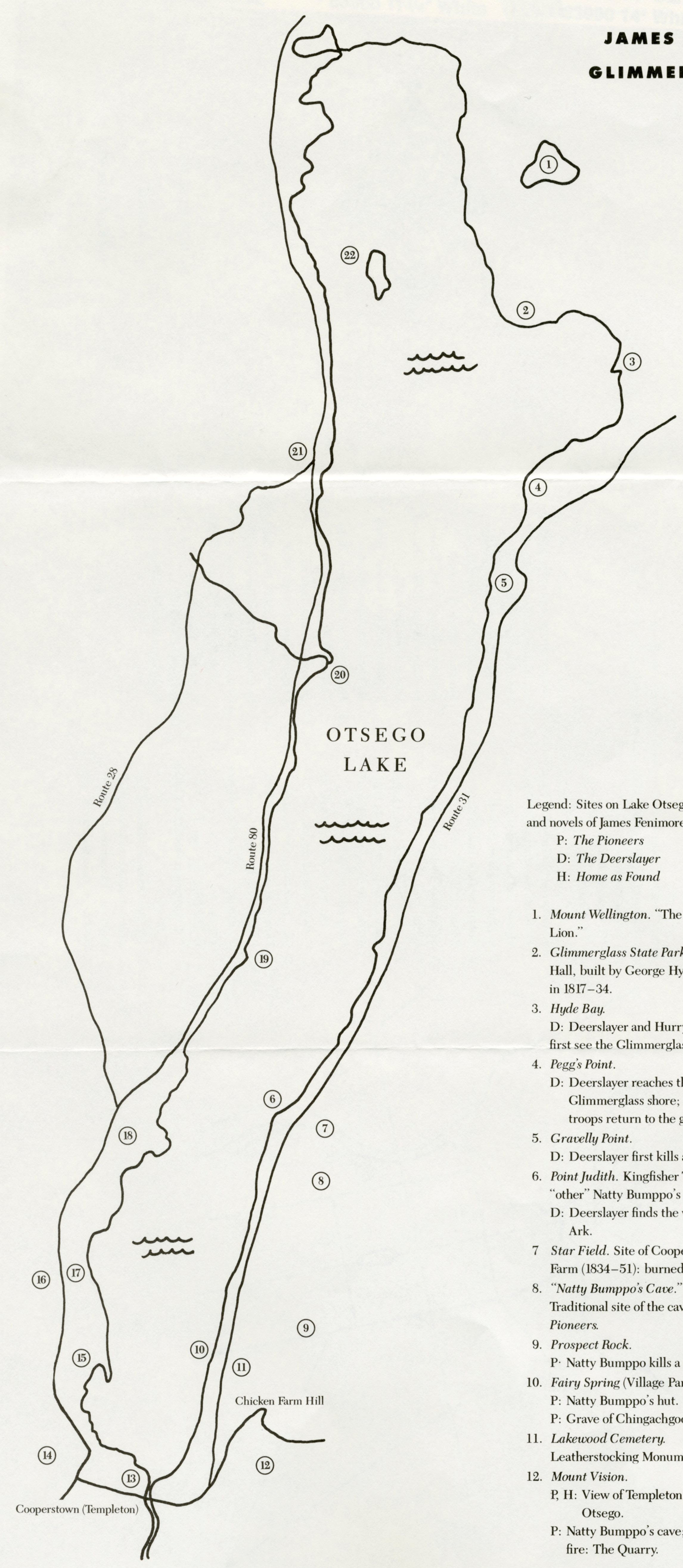
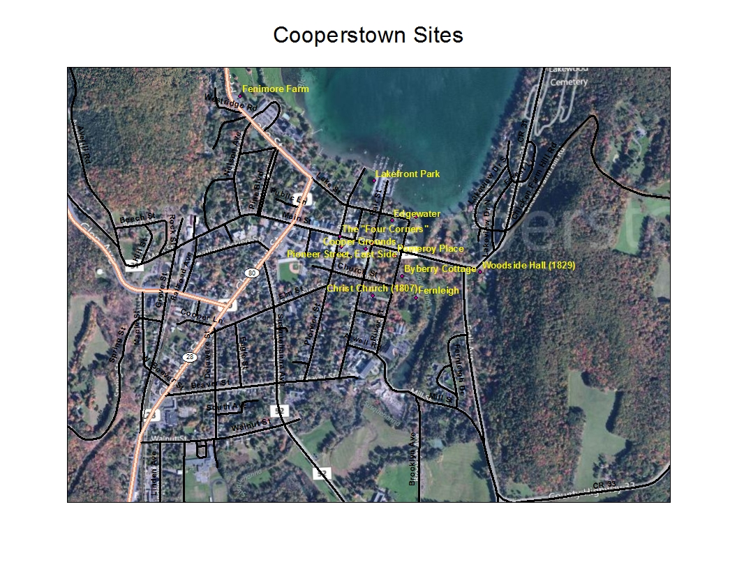
Lake Otsego is located in Otsego County, New York, and is known for three things: Cooperstown (the location of the Major League Baseball Hall of Fame, the headwaters ofthe Susquehanna, and the setting for James Fenimore Cooper’s novels, most notably Last of the Mohicans).  It is these last two facts that interest Alf Siewers, Professor of English.  He gave me a pamphlet titled “James Fenimore Cooper’s Otsego County” and asked me to vectorize the two maps on it.  One map focused on Cooperstown and the other on the whole lake.  Both displayed points important to Cooper and his family, or featured in his literature.  I georeferenced the lake image and then recorded all the points on the map by creating a new shapefile.  To vectorize Coopersburg, I didn’t need to georeference the given map.  I just used roads and local landmarks on a basefile to correctly place points in a new shapefile.  I edited the tables for each new shapefile to add information about every point, including names and known literary references from Cooper’s novels.  Finally, I created an exported final maps with BingMap hybrid basefiles, street layers, a transparent rectified original map, and my new shapefiles.


Categories
Bucknell/Local Interest Environment General GIS Slideshow

Georeferencing and Vectorizing Potential Environmental Hazards in Kyrgyzstan

Guest post by Mike Grasso, Environmental Studies ’13

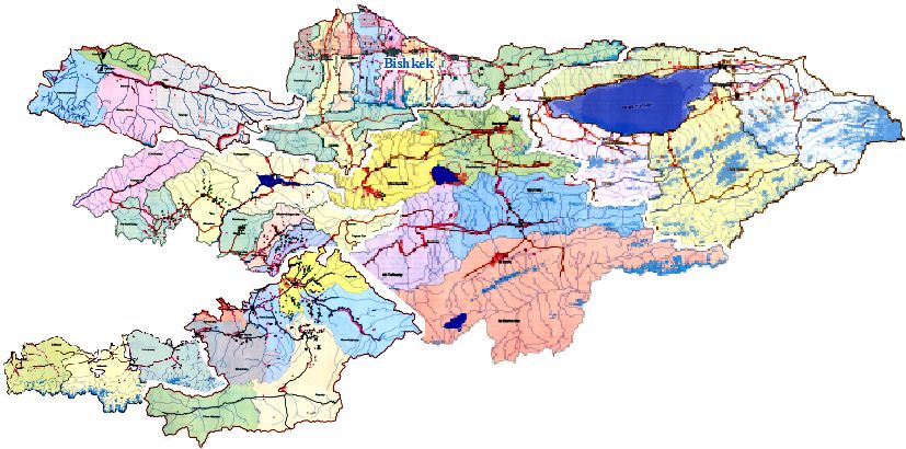
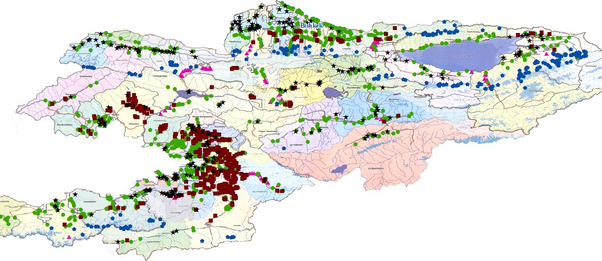
Amanda Wooden is in preparation for the publication of a book entitled Another Way of Saying Enough: Environmental Protest & Conflict in Kyrgyzstan. The book explores the environmental disputes taking place in Kyrgyzstan. Professor Wooden wanted to utilize a number of maps of Kyrgyzstan found in a 2006 atlas to analyze the spatial relationship between between localized issues of public concern, the distribution of collective action addressing these concerns, and the proximity to potential hazards. These maps of Kyrgyzstan, however, are not as accurate as current 2011 maps.

The G.I.S. team’s job was to georeference and vectorize these maps. The first step was to scan the maps from the atlas so that they could be accessed online. The electronic copies were then downloaded into ArcMap as raster data. A base map downloaded from the GADM database of Global Administrative Areas was already added into ArcMap, so the atlas maps had to be scaled down to be the same size as the base map. Then the maps were aligned as best as possible so that the georeferencing could begin. W e looked for outstanding, unique geographical features (ie. large lakes, peninsulas, rivers, etc.) and then added control points. Control points come in pairs and are the georeferencing tools that do the stretching and adjusting. The first point is placed on the distinguishable feature on the incorrect map and the second point is placed on the same feature on the correct map. The incorrect map will automatically shift after selecting the second point. Each section usually takes three to six pairs of points to correct them.

After georeferencing, the map legend points were vectorized. Vectorization is the process of taking raster data and converting it to vector data. In order to do this, we zoomed in on the map and panned through the entire map clicking on every legend point on the map, assigning a different shape to each different environmental hazard. Some of the map legend points that were vectorized are flooding-prone areas, rock-fall prone areas, avalanche ar eas near roads, and mudflow and floods hazard. The map legend points were vectorized because vector data is able to be edited and used to run spatial analysis queries. For example, with the m

ap legend points as vector data, we could select a point on the map that could represent anything (a city, town, ski resort, etc.) and run a location query to find out how many potential avalanche risk site there are within a 5 mile radius of that point.