Categories
Bucknell/Local Interest General GIS Slideshow

Me, Myself and G.I.S

Guest post by Max Stiss, Geography/Anthropology ’12

Greetings!

I’d like to start my blog post off introducing myself first and secondly, explaining some of the work I’ve been fortunate to work on this summer.

My name is Maxwell Stiss, but for those who know me, I go by Max. I grew up, and lived in Miami until I was about 10 and moved to Toronto, Ontario where I graduated from high school, and still spend a lot of my time on breaks and vacation. So you must be asking already, “Max, why do we need to know any of this about you? I’m just trying to read about G.I.S work going on at Bucknell, this isn’t a myspace blog.” Well yes, you’re right; however, my G.I.S story starts in Toronto.

My first geography course in 9th grade was led by an enthusiastic Italian teacher named, John Nicolucci. Mr. Nicolucci, as we called him, had been working with Arcview 3 and ESRI’s previous versions of the software for quite some time, and realized the growing nature of the field. Thinking it would be wise to expose his students to ArcView and some of its vast functionality, I soon learned that the nature of the work in a G.I.S was widespread across many disciplines, and most importantly, it was outright AWESOME. By the time I graduated Crescent, I had 4 years of G.I.S experience under my belt and still felt like I had only skimmed the surface with ArcView and ArcMap.

Onto Bucknell: As course selection rolled around the end of my first semester, I noticed that Duane Griffin held an Intro to G.I.S (204) course. Eager to enroll in a subject that had interested me so wildly in high school, I emailed Duane and told him some of my history using G.I.S. Duane was more than willing to reserve a seat for me in his course, excited that he could work with a student that had experience using G.I.S. Duane explained to me that the use of G.I.S was limited at Bucknell, and that in his 204 course, students only enrolled in the course to fulfill a requirement, and hardly ever out of pure interest.

By the time the course came to a close, I had furthered my knowledge of the ArcMap software and the expansive capabilities of a G.I.S. As I had done in my high school G.I.S course, for my final project I was graded on creating a G.I.S project that demonstrated my capabilities with the software, utilizing as much G.I.S as possible. My project proposed a high-speed rail route through the north eastern states of the U.S (PA,NY,NJ,CT,MA) and used G.I.S to show how travel times would be reduced using a cost-weighted analysis tool in G.I.S. Although the project scope was ambitious, Duane and I never did come to a close on the project, but we had realized one thing: we needed more G.I.S at Bucknell.

By the end of that school year, the Library and IT division at Bucknell had decided to create a brand new position – G.I.S. specialist – to help students and faculty integrate GIS into their teaching and research.  Janine Glathar was hired and started in July of 2009 and since then, we haven’t looked back. Hooked? Read more on my next blog.
Categories
Bucknell/Local Interest Environment General GIS GIS in Biology Slideshow

Mapping Species Ranges in the Sudan

Guest post by Dan Dougherty, Geography/History ’12

The GIS team here at Bucknell worked on numerous projects throughout the summer. The first of these major projects was the mapping of mammal species ranges in the Sudan. The project began as a request from Biology Professor DeeAnn Reeder, who was interested in adding species maps to the newest, upcoming edition of her publication. The objectives were twofold: make maps which clearly show the range of each species of interest superimposed over political delineations, and make an additional map showing the current political situation in the Sudan, independent of species ranges. Professor Reeder requested range maps for over 300 mammal species, which included large mammals, small mammals, and even bats. The maps do not necessarily show precisely where an animal could be found, however. Instead, the maps show where an animal might potentially be found, under ideal conditions. Human presence throughout the region reduces their numbers and often means that they cannot live in certain areas, even if those areas are favorable in all other aspects.

The species maps were limited to black & white due to publishing constraints. Overcoming this limitation was a particularly difficult cartographic challenge, but hopefully the end result displays the map information clearly and sensibly.

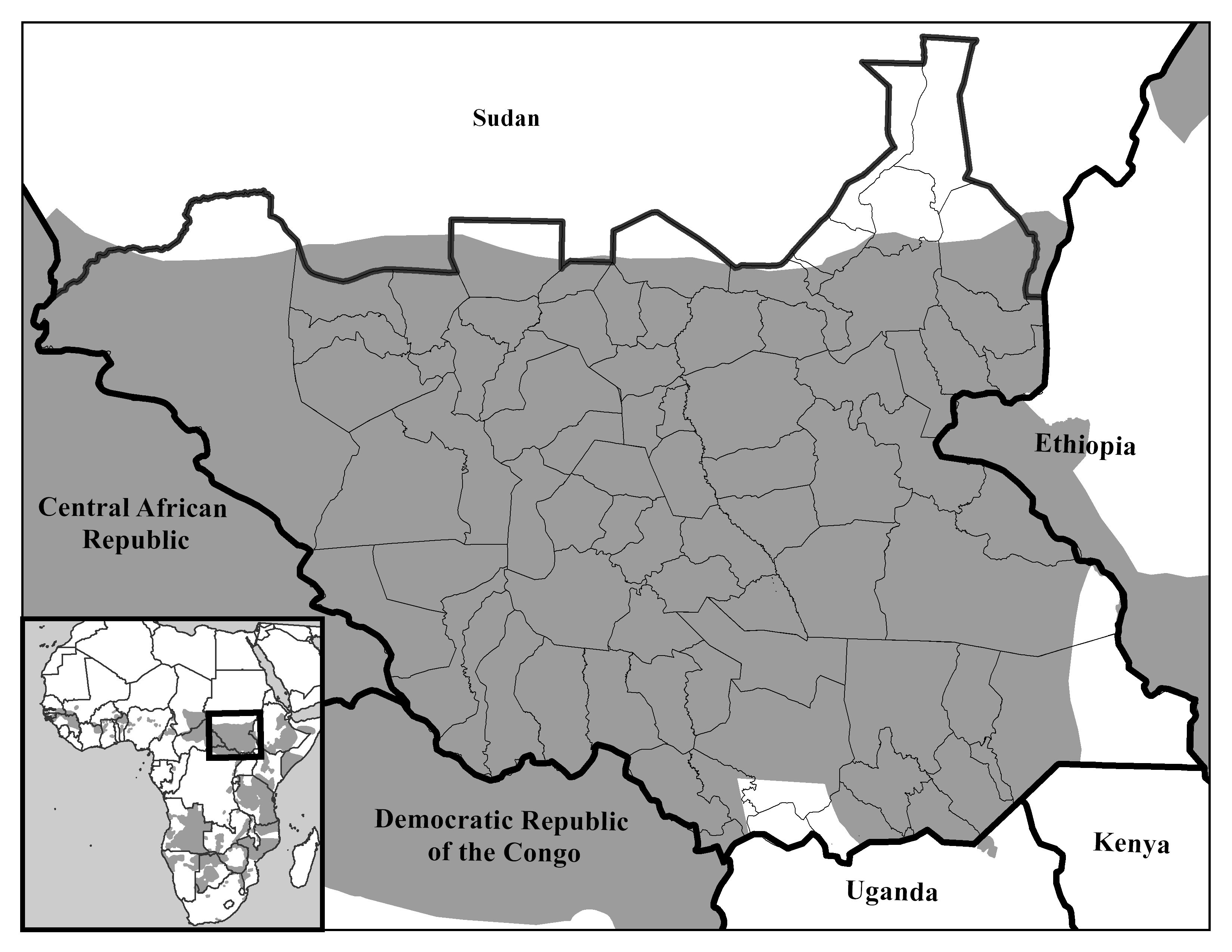
P. leo
This map shows the potential species range of the lion (gray shading)

Data was collected primarily from the International Union for the Conservation of Nature (IUCN) and the United Nations. The IUCN provides a comprehensive shapefile containing species range data for over 50,000 mammals. By querying the shapefile, it was possible to isolate the individual species ranges to be mapped; the queried shapefile was then exported. Political data was gathered from the United Nations Sudan Information Gateway. The regional political data was slightly modified using a clipping extent. An extent rectangle was drawn in Central Africa, encompassing all of Sudan and small portions of the surrounding states. All political data outside the extent was removed from the map after running the clip tool.

Showing species ranges in a political context was especially important to us. On July 9, 2011, South Sudan formally seceded from the rest of Sudan. So while the species maps on a basic level show the species ranges, they also provide a base for further analysis. What will be the effect of this newly formed political boundary on the livelihoods of the innumerable resident animal species, who are not constrained to arbitrary political borders? Specifically, the maps raise some questions about the effect of differing political, cultural, and social attitudes on habitat sustainability and conservation efforts. Furthermore, the potential for resulting conflict over natural resources and regional hegemony in the aftermath of the split might also carry significant consequences for the animal species. In addition, the maps also seek to illustrate the immense biodiversity of the region.

Categories
Bucknell/Local Interest Environment General GIS Slideshow

Georeferencing and Vectorizing Potential Environmental Hazards in Kyrgyzstan

Guest post by Mike Grasso, Environmental Studies ’13

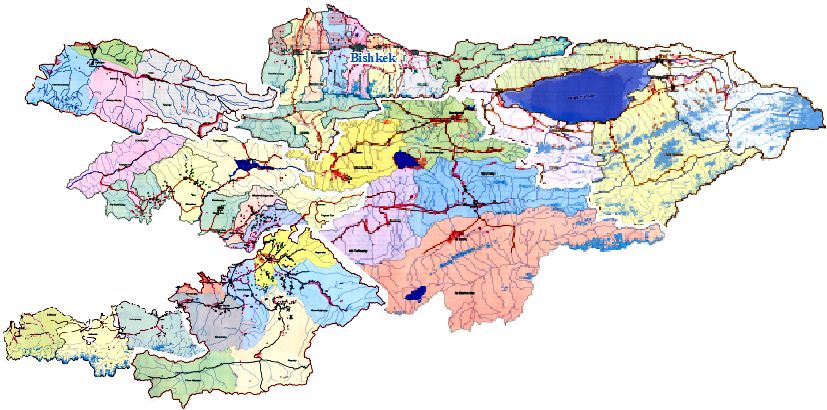
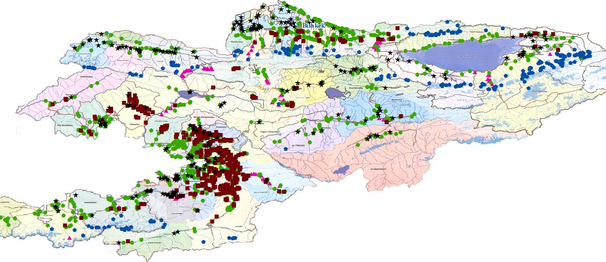
Amanda Wooden is in preparation for the publication of a book entitled Another Way of Saying Enough: Environmental Protest & Conflict in Kyrgyzstan. The book explores the environmental disputes taking place in Kyrgyzstan. Professor Wooden wanted to utilize a number of maps of Kyrgyzstan found in a 2006 atlas to analyze the spatial relationship between between localized issues of public concern, the distribution of collective action addressing these concerns, and the proximity to potential hazards. These maps of Kyrgyzstan, however, are not as accurate as current 2011 maps.

The G.I.S. team’s job was to georeference and vectorize these maps. The first step was to scan the maps from the atlas so that they could be accessed online. The electronic copies were then downloaded into ArcMap as raster data. A base map downloaded from the GADM database of Global Administrative Areas was already added into ArcMap, so the atlas maps had to be scaled down to be the same size as the base map. Then the maps were aligned as best as possible so that the georeferencing could begin. W e looked for outstanding, unique geographical features (ie. large lakes, peninsulas, rivers, etc.) and then added control points. Control points come in pairs and are the georeferencing tools that do the stretching and adjusting. The first point is placed on the distinguishable feature on the incorrect map and the second point is placed on the same feature on the correct map. The incorrect map will automatically shift after selecting the second point. Each section usually takes three to six pairs of points to correct them.

After georeferencing, the map legend points were vectorized. Vectorization is the process of taking raster data and converting it to vector data. In order to do this, we zoomed in on the map and panned through the entire map clicking on every legend point on the map, assigning a different shape to each different environmental hazard. Some of the map legend points that were vectorized are flooding-prone areas, rock-fall prone areas, avalanche ar eas near roads, and mudflow and floods hazard. The map legend points were vectorized because vector data is able to be edited and used to run spatial analysis queries. For example, with the m

ap legend points as vector data, we could select a point on the map that could represent anything (a city, town, ski resort, etc.) and run a location query to find out how many potential avalanche risk site there are within a 5 mile radius of that point.

Categories
Bucknell/Local Interest Environment Events/Calendar General GIS Slideshow

GIS posters at Sigma Xi summer research symposium

Come to the Sigma Xi summer research symposium on Wednesday, July 27th from 2-4pm at the Langone Center’s Terrace room to check out posters by student researchers.  There will be a variety of posters that feature GIS as a research methodology and/or visualization tool – including posters about the Flying Bison drone, community asset mapping, georeferencing historic maps, Marcellus Shale research, recycling & waste at Bucknell and other topics.

Categories
Bucknell/Local Interest Data Environment General GIS GIS in Engineering GIS in Environmental Studies GIS in Geography GIS in Geology Miller Run Restoration Project Slideshow Videos

Week 1 – Miller Run data collection

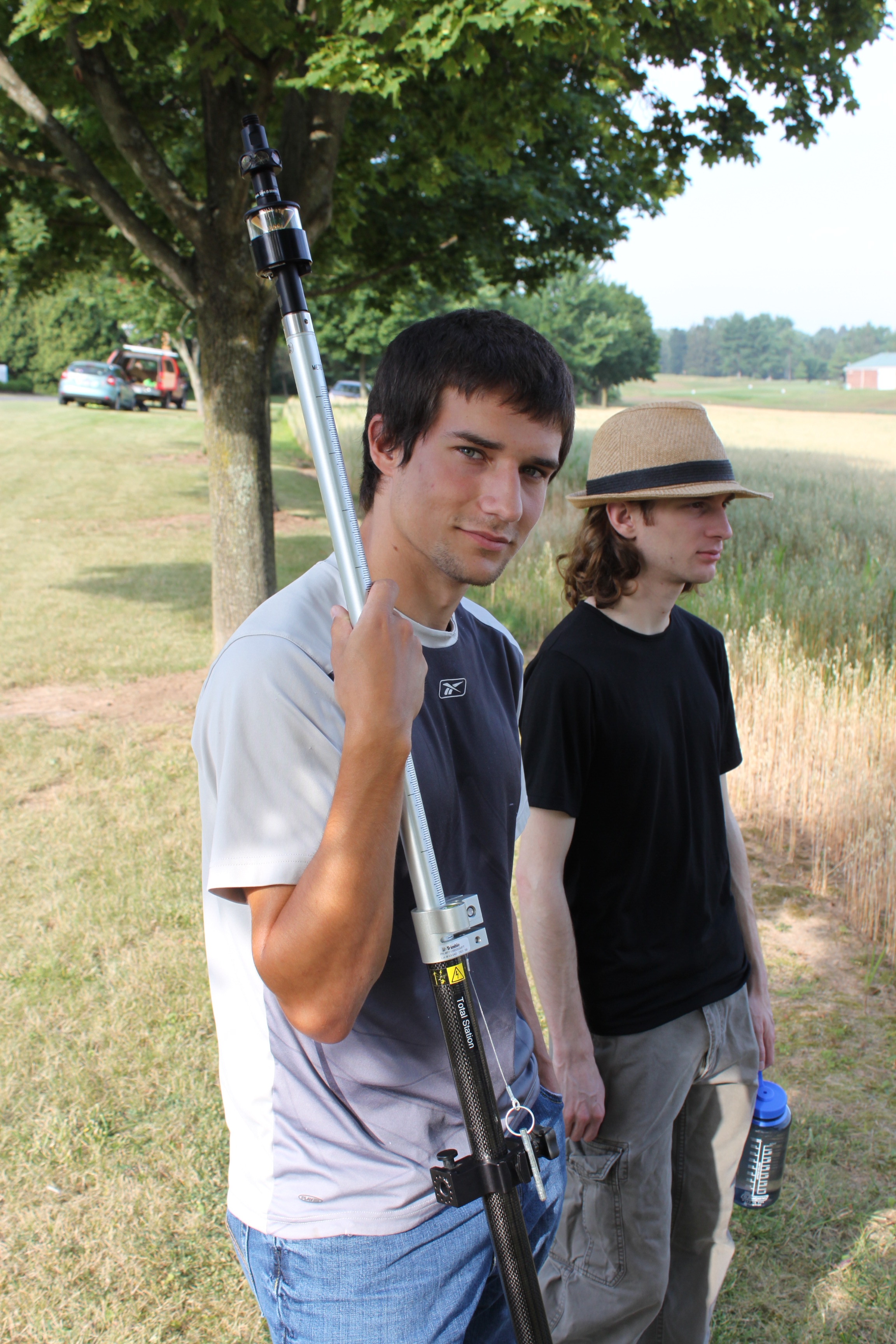
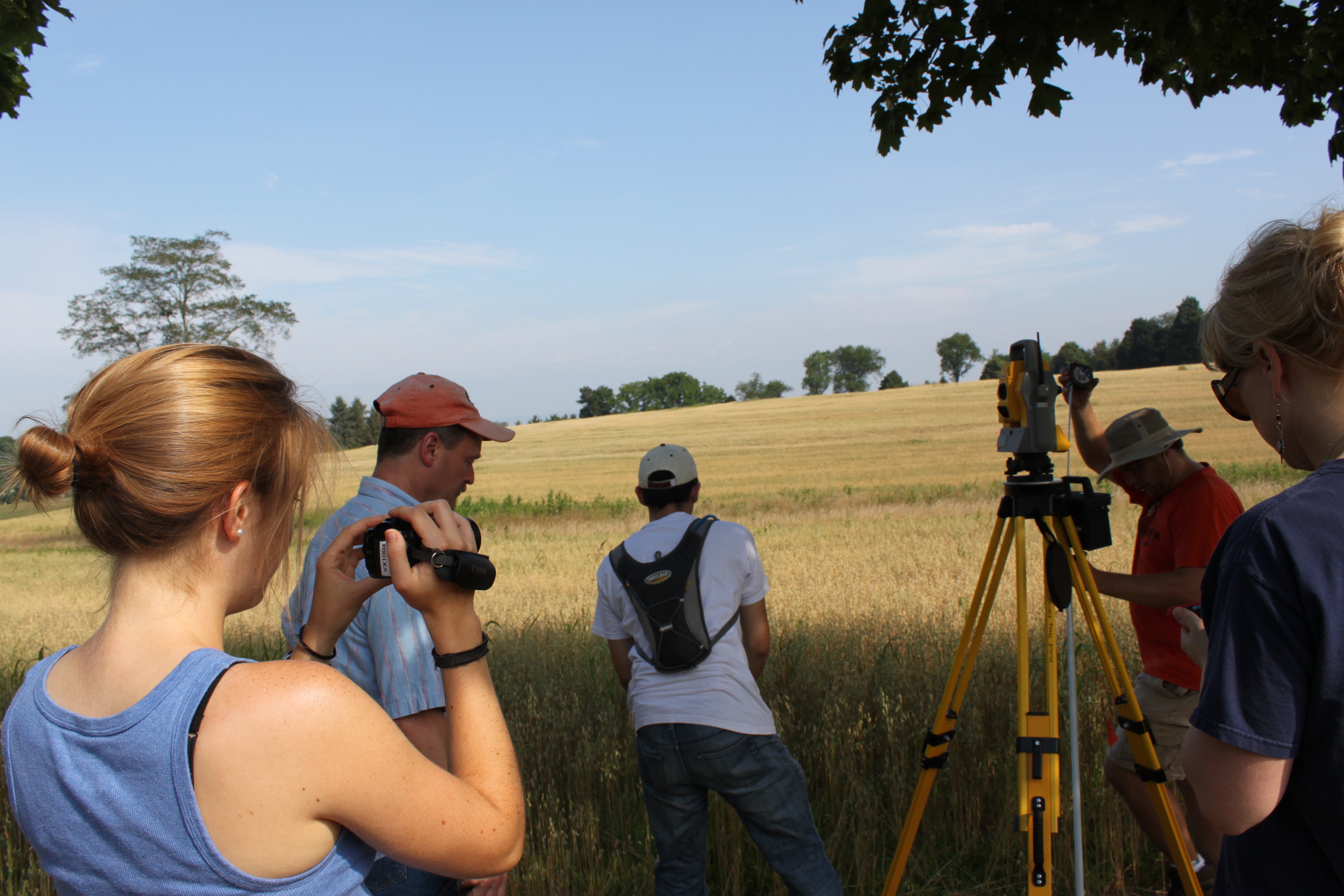
If you’ve driven past the golf course this week you might have noticed some students traipsing around in the underbrush near the driving range and Sunflower day care.  The students are part of Bucknell’s GIS team and they have been collecting high resolution elevation data for the Miller Run restoration project. The students will be out there for another 2-3 weeks (+ or – a week depending on when the oat crop gets harvested – yes, really!). Here’s a short video to describe the work they’re doing. Thanks to Lindsay Coffee, a student video assistant, for taking the footage and producing the clip.

httpv://www.youtube.com/watch?v=-ZzANov_8gA


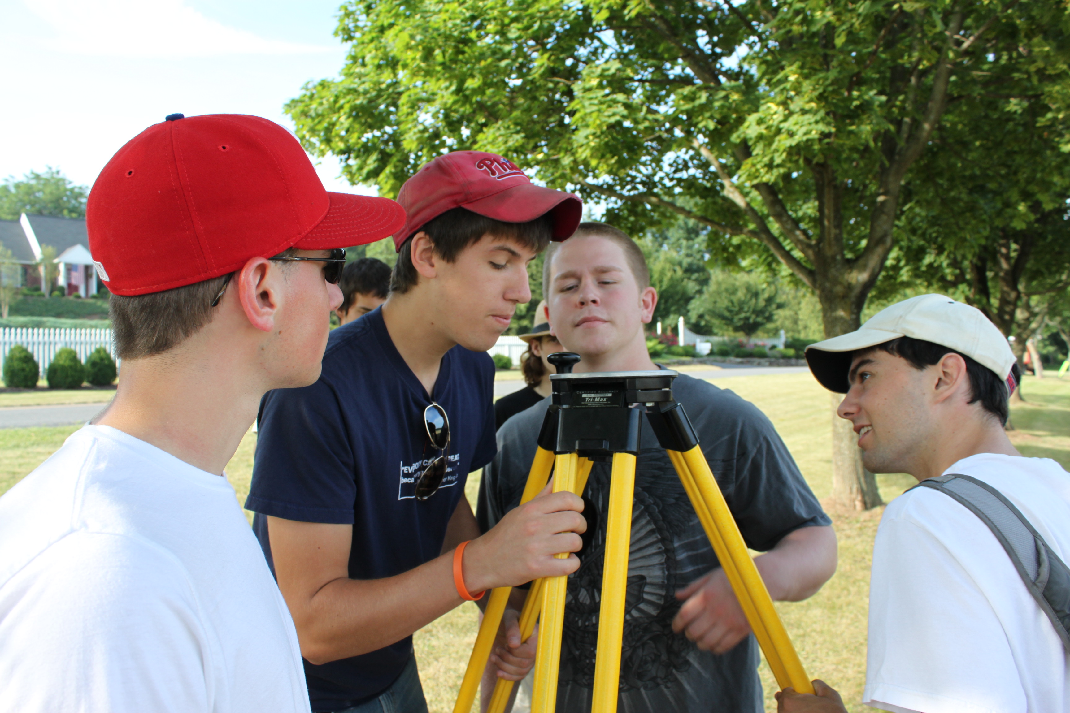
Day 1 – Leveling (and then re-leveling, and re-re-leveling, etc.)


Day 1:80K dollars worth of equipment in the field… but couldn’t start till we tracked down a $2.99 tape measure


Day 1: ‘WALL-E’ looking for ‘EVE’

Day 1: Mike holding ‘EVE’


Day 1:Darin with the GPS