On July 26th, Nick Urban and the summer 2011 GIS team conducted a test flight of the Flying Bison. See video to learn more about the Miller Run Restoration Project and to see footage captured by the drone during its flight.
Thanks to Lindsay Coffee and Erin Murphy for their work on shooting & editing the video footage.
Guest post by Darin Rockwell, Geography/Geology ’13
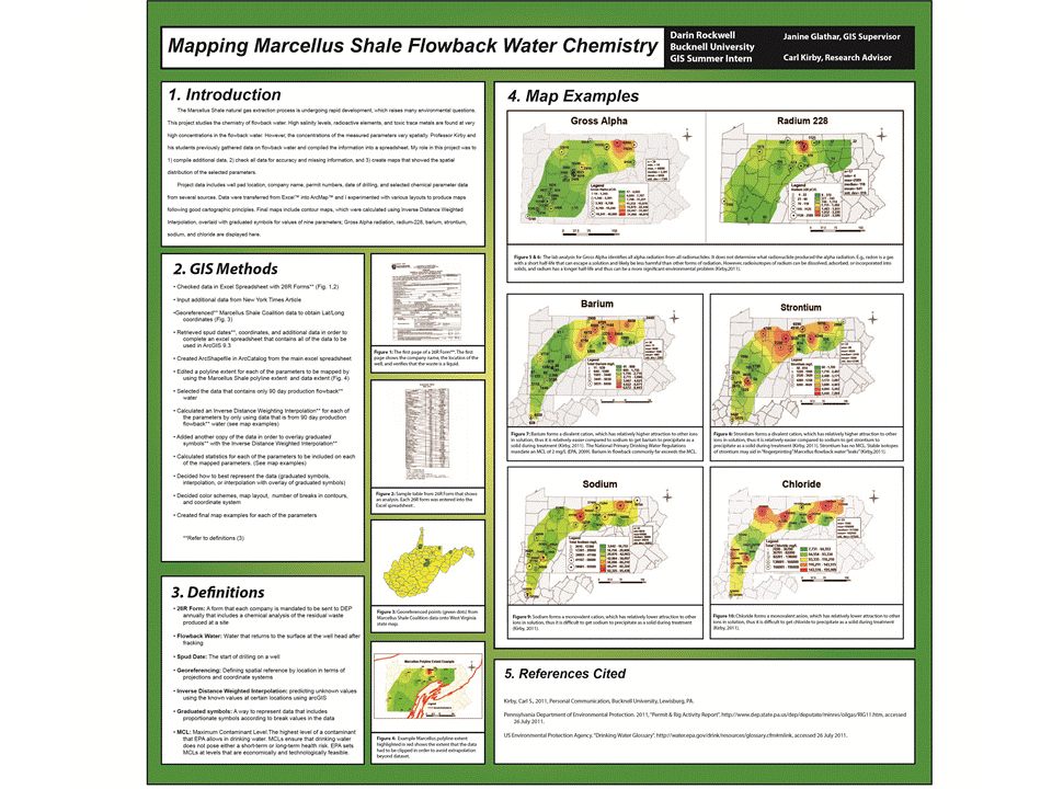
The Marcellus Shale natural gas extraction process is undergoing rapid development, which raises many environmental questions. This project studies the chemistry of flowback water[1]. High salinity levels, radioactive elements, and toxic trace metals are found at very high concentrations in the flowback water. However, the concentrations of the measured parameters vary spatially. Professor Kirby and his students previously gathered data on flowback water and compiled the information into a spreadsheet.
My role in this project was to:
1) compile additional data
2) check all data for accuracy and missing information
3) create maps that showed the spatial distribution of the selected parameters.
Project data includes well pad location, company name, permit numbers, date of drilling, and selected chemical parameter data from several sources. Sources include data from 26R forms[2] and a New York Times article. Data were transferred from Excel™ into ArcMap™. Data was narrowed down to only 90 day production data. 90 day production data is used due to the comparison of the 26R form analysis dates and spud dates[3]. The date differences seemed to mostly fall around 90 days. Latitude and longitude coordinates were retrieved from data on the Department of Environmental Protection website. For some data, coordinates were unavailable to retrieve. Therefore, I georeferenced[4] points using ArcGis in order to gain xy coordinates. Each parameter is mapped to its own extent in which data is available.
I experimented with various layouts to produce maps following good cartographic principles. Final maps include contour maps, which were calculated using Inverse Distance Weighted Interpolation[5], overlaid with graduated symbols[6] for values of nine parameters; Gross Alpha radiation, Gross Beta radiation, radium-226, radium-228, barium, strontium, sodium, and calcium. A final poster, 26R forms, and a few other sample maps are shown at the bottom of this blog post. It is important to note that the parameters are strictly from flowback water from the Marcellus Shale natural gas extraction process and the levels are not necessarily drinking water levels; the values are before treatment.
Guest Post Darin Rockwell, Geology & Geography Bucknell ’13
[1]Flowback Water: Water that returns to the surface at the well head after fracking
[2]26R forms: A form that each company is mandated to be sent to DEP annually that includes a chemical analysis of the residual waste produced at a site
[4]Georeferenced: Defining spatial reference by location in terms of projections and coordinate systems
[5]Inverse Distance Weighted Interpolation: predicting unknown values using the known values at certain locations using arcGIS
[6]Graduated Symbols: A way to represent data that includes proportionate symbols according to break values in the data
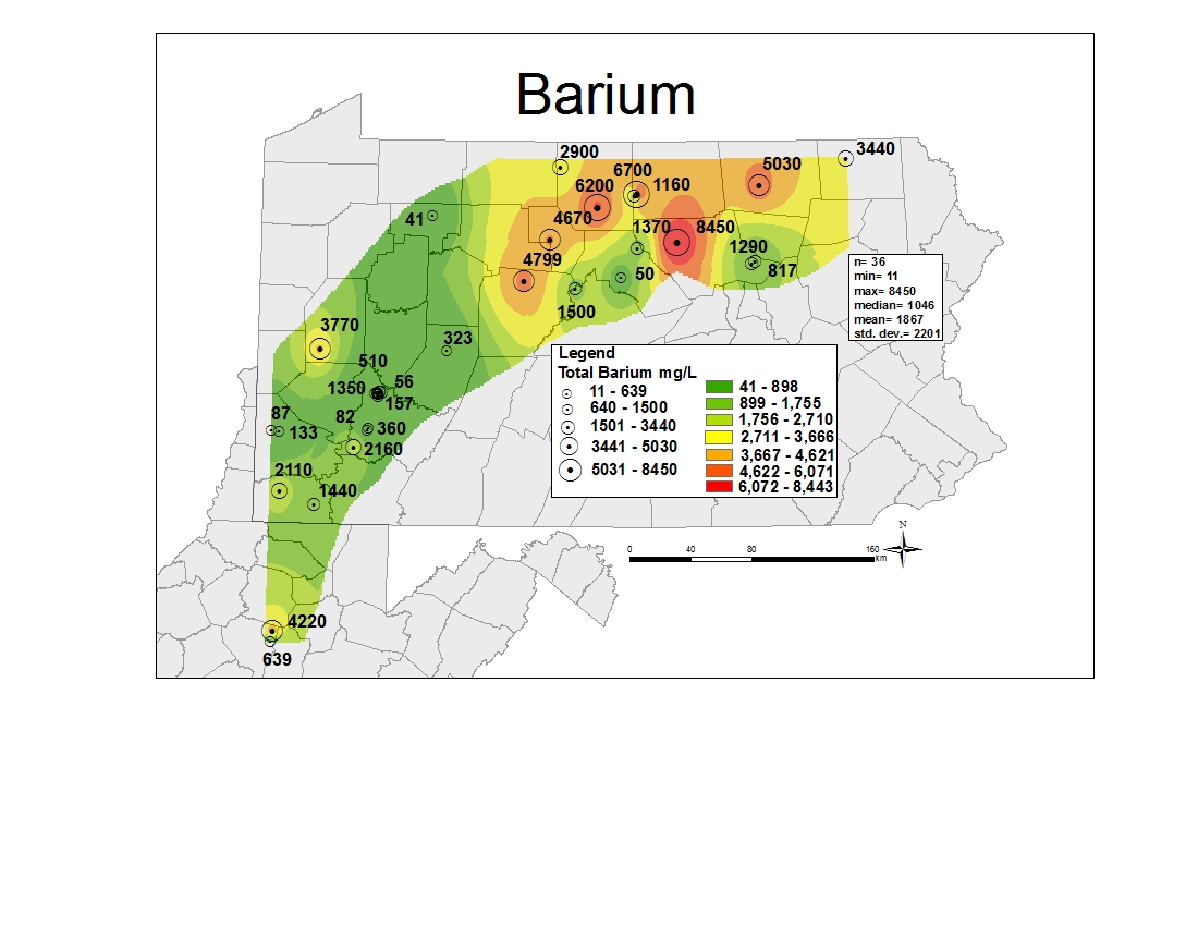
A sample map of Barium, created using ArcGis 9.3
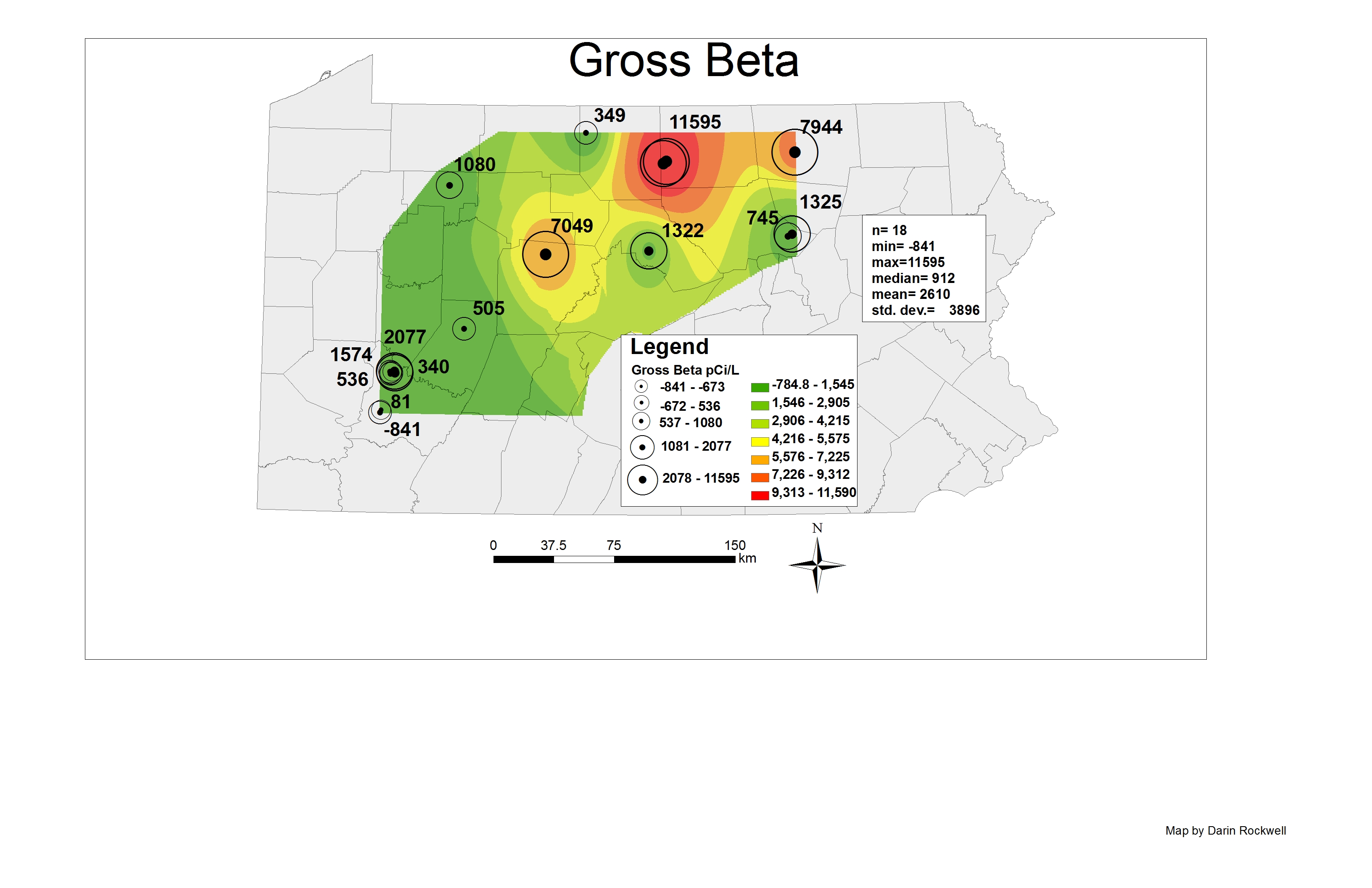
An example map of Gross Beta values. This image shows an interpolation overlaid with graduated symbols.
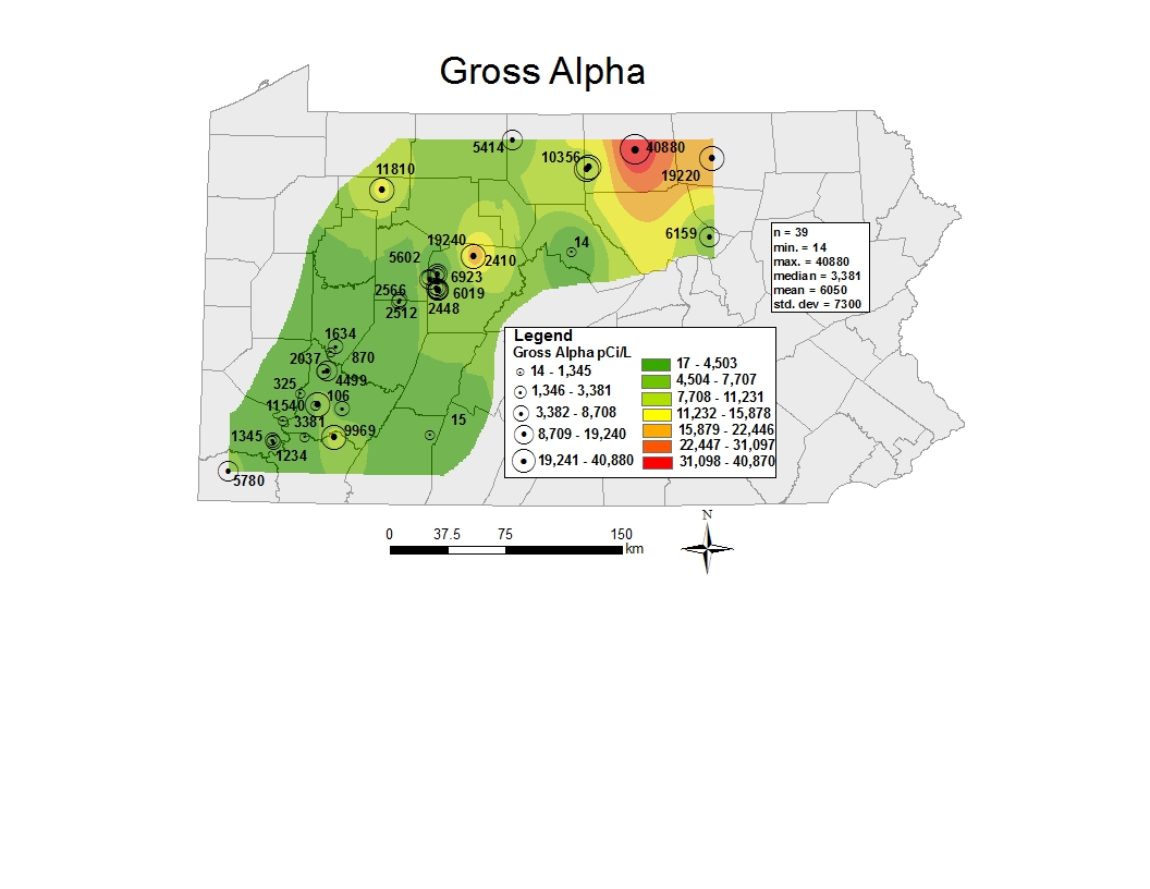
The lab analysis for Gross Alpha identifies all alpha radiation from all radionuclides. It does not determine what radionuclide produced the alpha radiation (Kirby,2011).
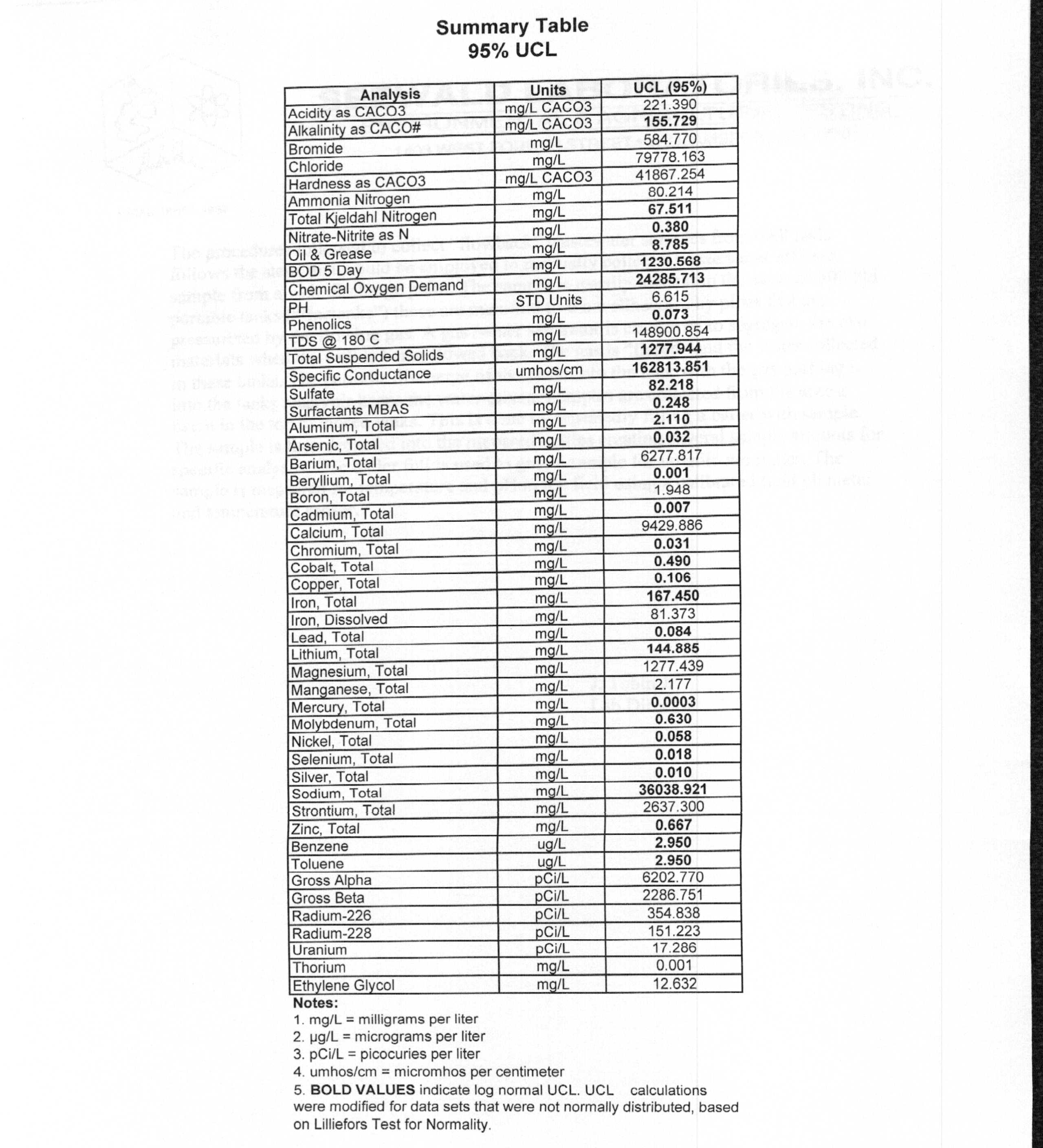
This image shows a chemical analysis by a company that is transcribed onto a 26R form. The values produced in maps are directly from a form like this image.
This image shows an example of what a 26R form looks like that is used in the project.
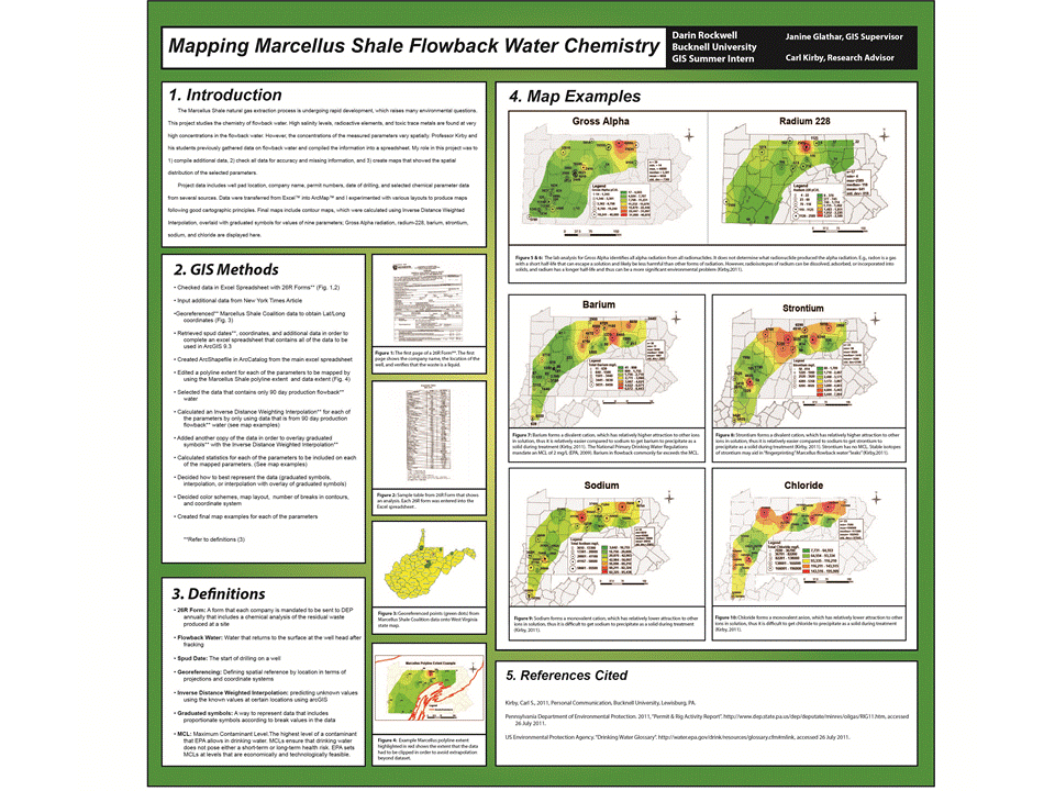
Final Poster of Marcellus Shale flowback water chemistry
Guest post by Dan Dougherty, Geography/History ’12
The GIS team did not only work on projects for faculty and staff members. Bucknell’s Administration was also interested in several mapping projects. Some are highlighted below:
Bucknell Parking
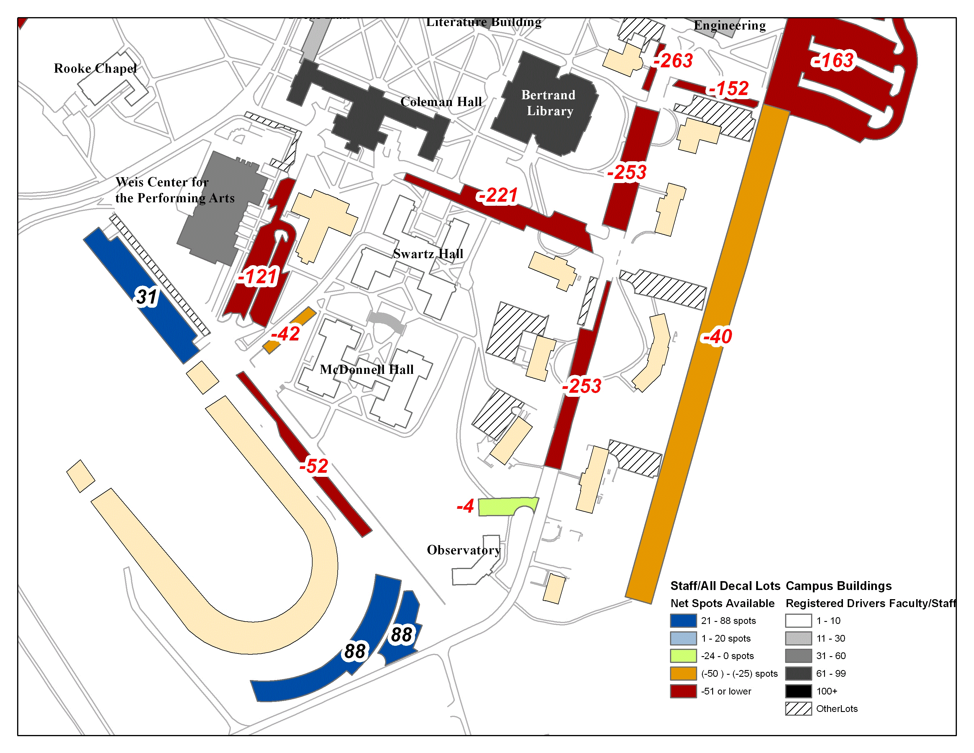
The continued growth of the University, coupled with limited space available for small scale expansion projects, has created a significant amount of vehicular congestion on campus. The amount of cars present has resulted in an increasing dearth in parking spaces. In order to analyze current trends and make recommendations for the future of parking on campus, Bucknell’s Administration asked for a series of GIS maps showing the current state of on-campus parking. The maps were produced in ArcMap 10, and the end result revealed that the parking situation in campus is much worse than expected. On any given day during the academic year, total lot capacity can be estimated at nearly 100%. A series of five maps were produced showing the entire campus; below are two of them.
Task Force on Campus Climate
Recent events on campus have encouraged the Administration to take a tougher stance against some of the negative behaviors associated with college social interaction. The Task Force on Campus Climate asked for GIS maps showing trends in reported incidents on campus. Since only a minority of events are reported to the Task Force, the map cannot be relied upon to provide the most up to date and accurate information, but nonetheless they provide a good starting point for future policy making regarding student safety on campus.
Bucknell SBDC
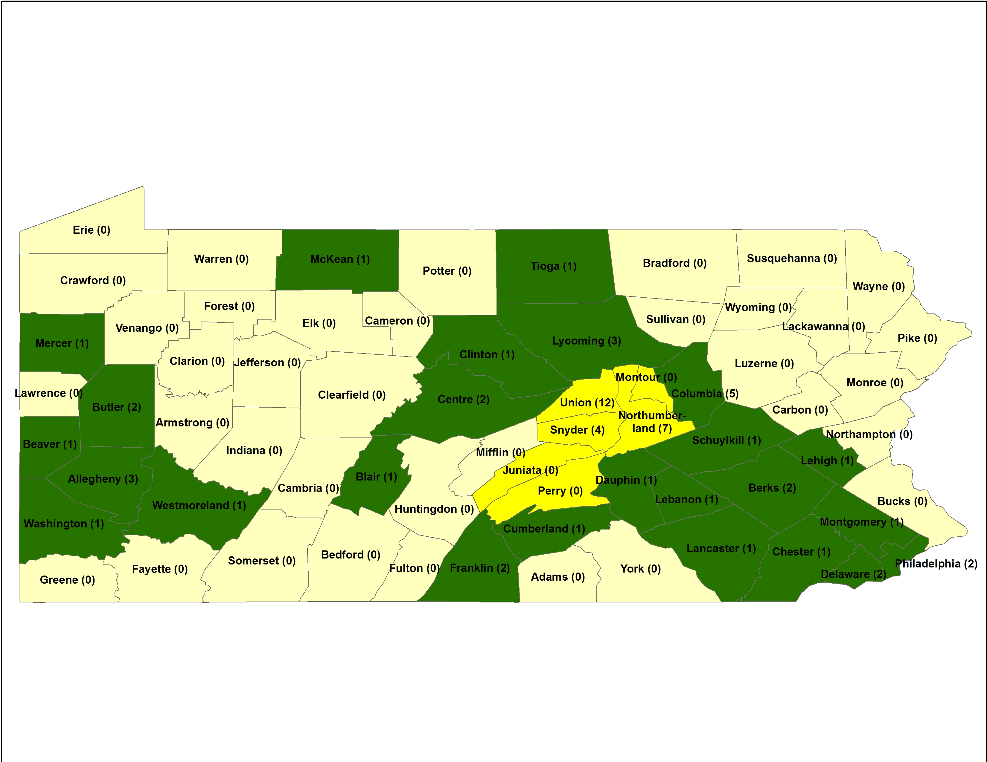
The Bucknell Small Business Development Center requested an update to a map which was made by a member of the GIS team during the previous summer. The Bucknell University SBDC helps business Start, Grow, and Prosper by providing entrepreneurs with the education, information and tools necessary to build successful businesses. Bucknell’s center is the first in the nation to be hosted by an engineering college and provides specialty Engineering Development Services throughout the Pennsylvania SBDC network. The map shows the number of Engineering Development Services (EDS) per county, with the symbology showing the regional grouping (yellow) and the the counties with affiliated EDS (green)
Guest post by Max Stiss, Geography/Anthropology ’12
Because of Janine’s workshops with faculty and her assistance around campus, faculty and students have been able to use G.I.S as a resource for diversifying their research and project work. Janine’s extensive background with G.I.S has paved a new avenue for a broadened learning experience at Bucknell. In only Janine’s second summer as our Specialist, she has brought on 8 summer students working around the clock on G.I.S projects for the university including faculty and students.
In addition to the work I’ve done this summer, I have been fortunate to be the T.A (Teachers Assistant) for Duane’s Intro to G.I.S course the past two years and once again this coming semester. Working with other students on the coursework and their project work has continued to expand my G.I.S horizons immensely. On and off throughout the year, I’ve met with students and faculty from many academic fields to assist in their project work or take on project work myself. The project experience I’ve had using G.I.S is invaluable and especially the work I’ve been doing this summer.
I’m going to branch this blog off from here contributing individual and shared blogs to the projects we have done here, this summer. Keep reading, please. These projects are really cool.
Guest post by Dan Dougherty, Geography/History ’12
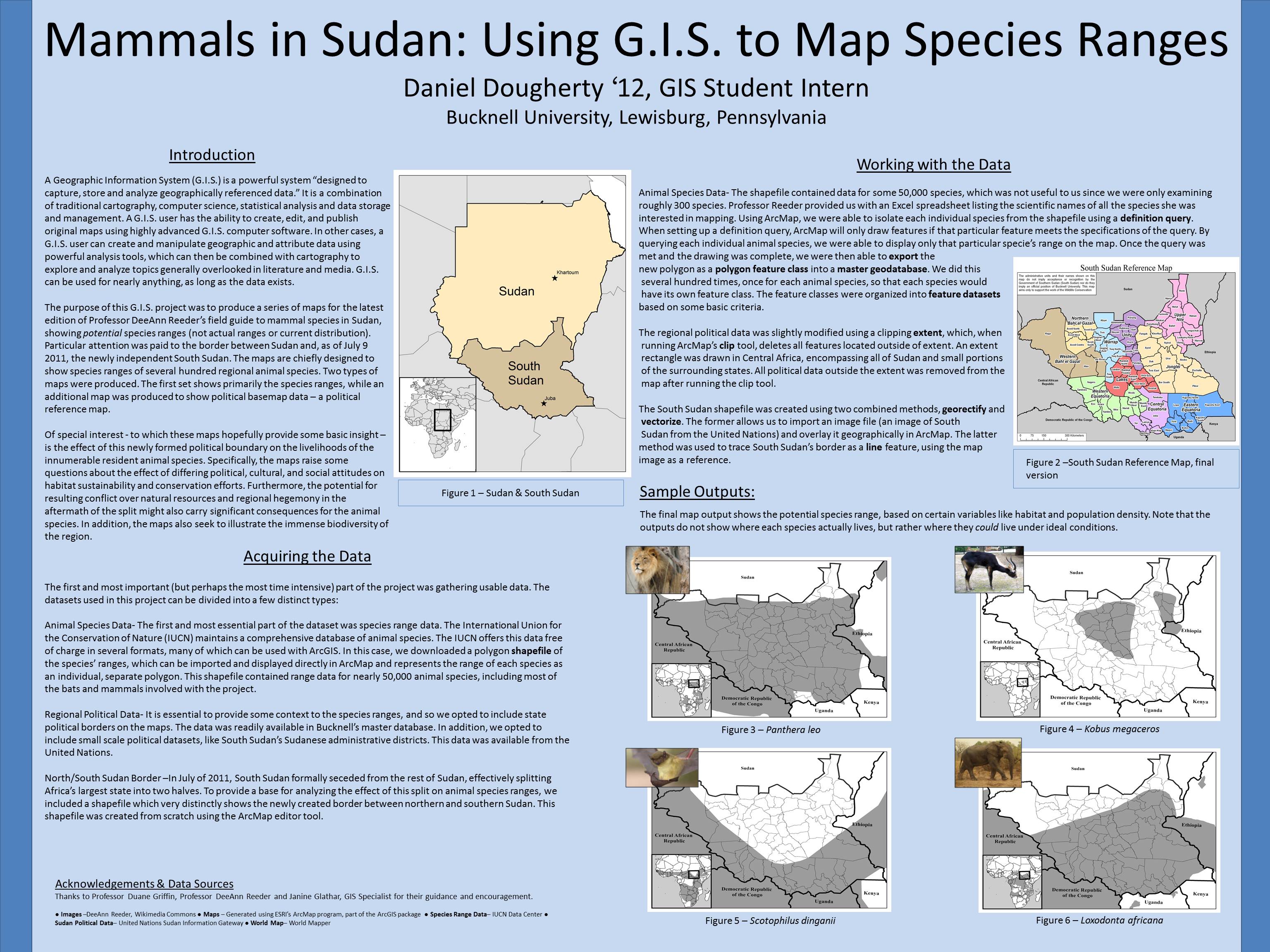
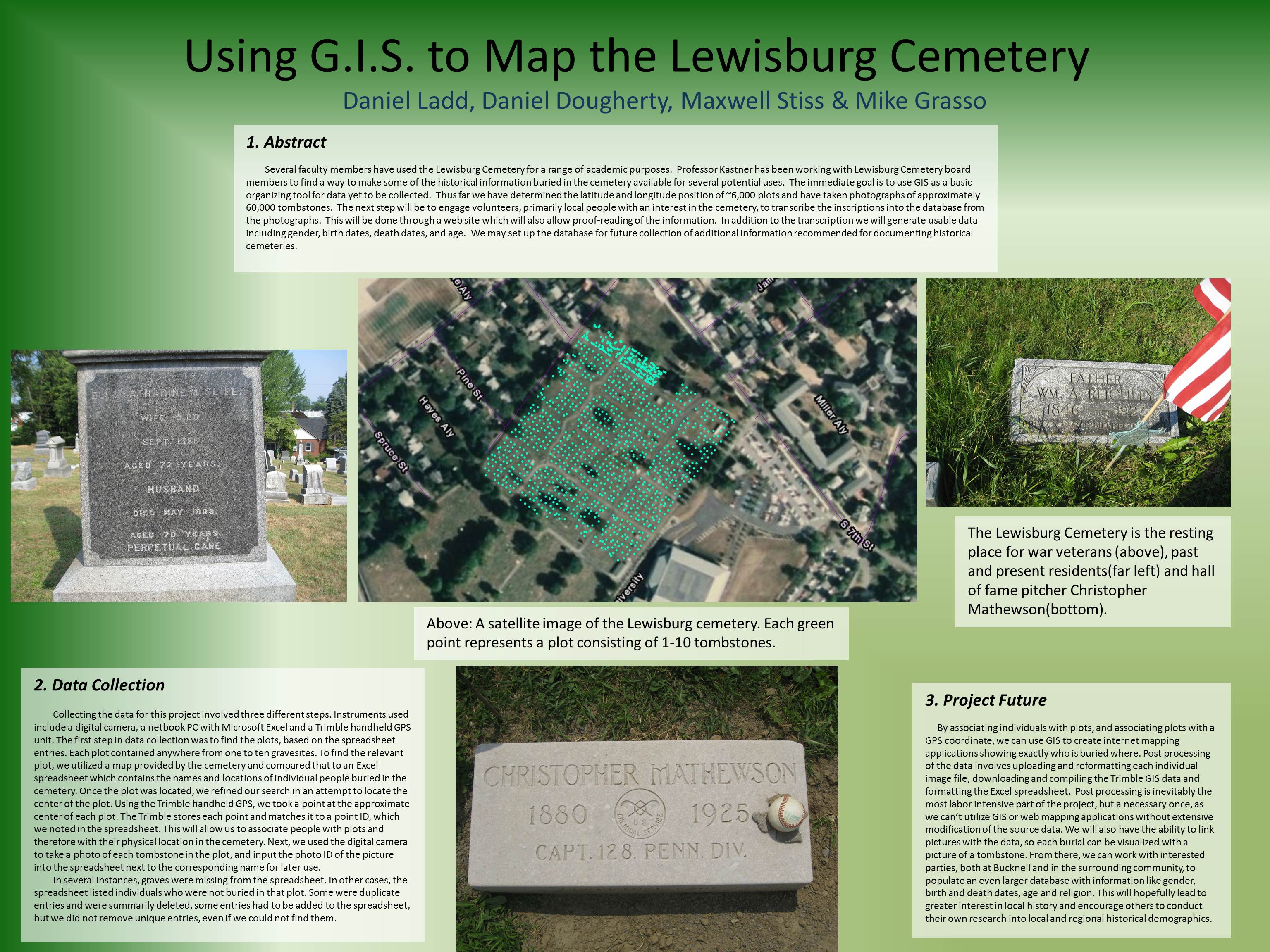
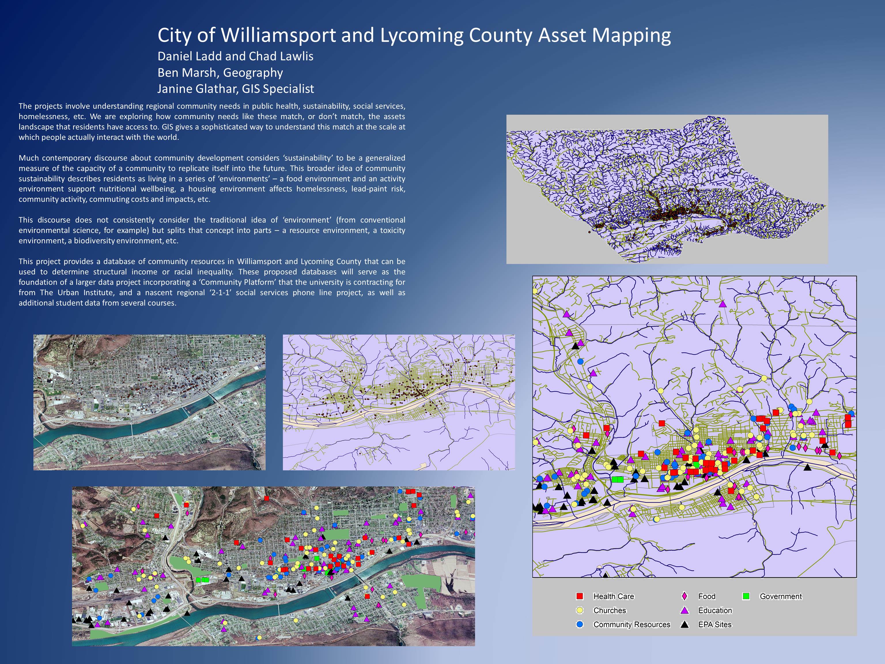
Bucknell’s summer GIS students recently got the opportunity to showcase their work at two separate poster symposiums. It helps to know a little bit about research/poster symposiums, for those who are unfamiliar. They are fairly straightforward. Participants set up their posters in a preassigned display location. Standing close by their posters, students field questions from interested attendees who wander the showcase, viewing posters of interest. The posters generally outline the basics of the research project first, before moving on to explain the more detailed aspects, like methodology and an analysis of the results. Space is limited so not everything can (and should!) be explained on the poster – and the student therefore must be prepared to answer fully any questions an attendee might ask. Many poster sessions are judged, with the winner awarded a prize (usually monetary). However, neither symposium the GIS students attended was judged.
GIS students attended their first symposium on Wednesday, July 27, 2011. The Sigma Xi Poster Session was held in Bucknell’s Terrace Room, located in the Elaine Langone Center. Approximately 50 students presented their work; six GIS students with eight separate posters were among them. Dozens of people turned out to view the posters, including Bucknell faculty, administrators, and members of the local community. Provost Mick Smeyer was among the attendees, and was so impressed with the quality and consistency of the work that he asked all attendees to repeat the session again in September for Bucknell’s President, John Bravman, and the Board of Trustees.
Students attended a second symposium on August 9, 2011 from 10am to 3pm. The First Annual Susquehanna Valley Undergraduate Research Symposium was held at the Geisinger Center for Health Research in Danville, Pennsylvania, about 30 minutes from Bucknell’s campus. Students from both Bucknell University and Bloomburg University were in attendance to showcase their summer research projects to their peers, interested academics, and Geisinger staff members. Bucknell’s GIS students contributed seven posters to the symposium, all of which received substantial praise and recognition.