Categories
Bucknell/Local Interest General GIS Slideshow Sports Maps Uncategorized

Nate Silver maps college football geography

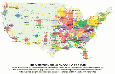
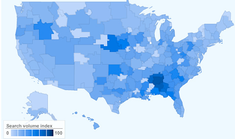
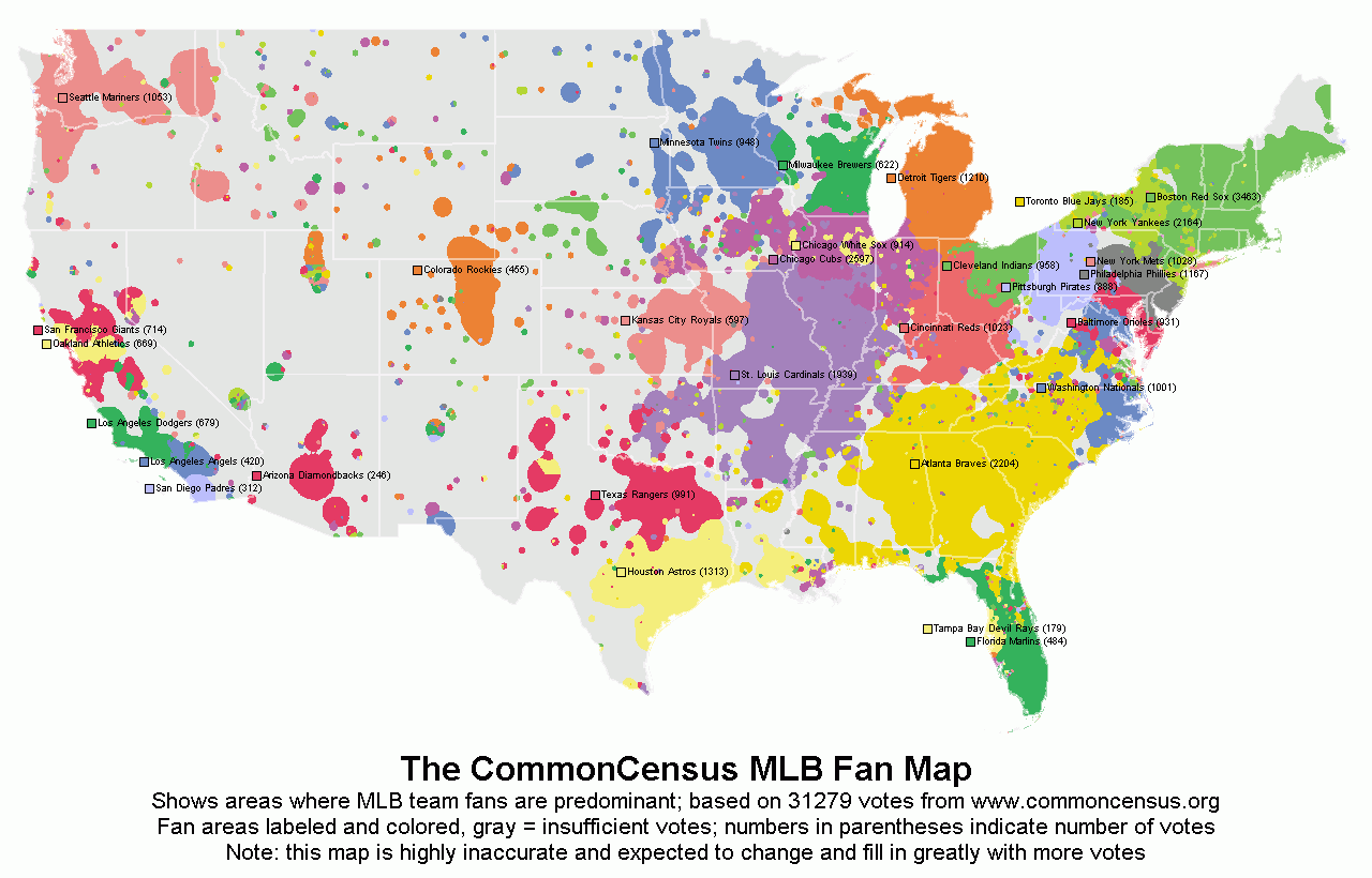
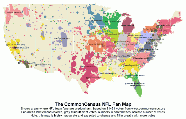
In a recent post on the New York Times’ Quad blog, Nate Silver tackles the geography of college football allegiances.  Silver – a noted statistician, blogger and election forecaster who is also credited with developing Major League Baseball’s sabermetric system for predicting player performance – used data from Google web searches and the CommonCensus Sports Map project to map college football team fan areas and then:

…use the results to shine a light on college football’s increasingly complicated realignment picture.

The premise of the study is this: take the 210 television media markets in the United States, figure out how many college football fans they have, and then allocate them between the 120 current Football Bowl Subdivision programs.

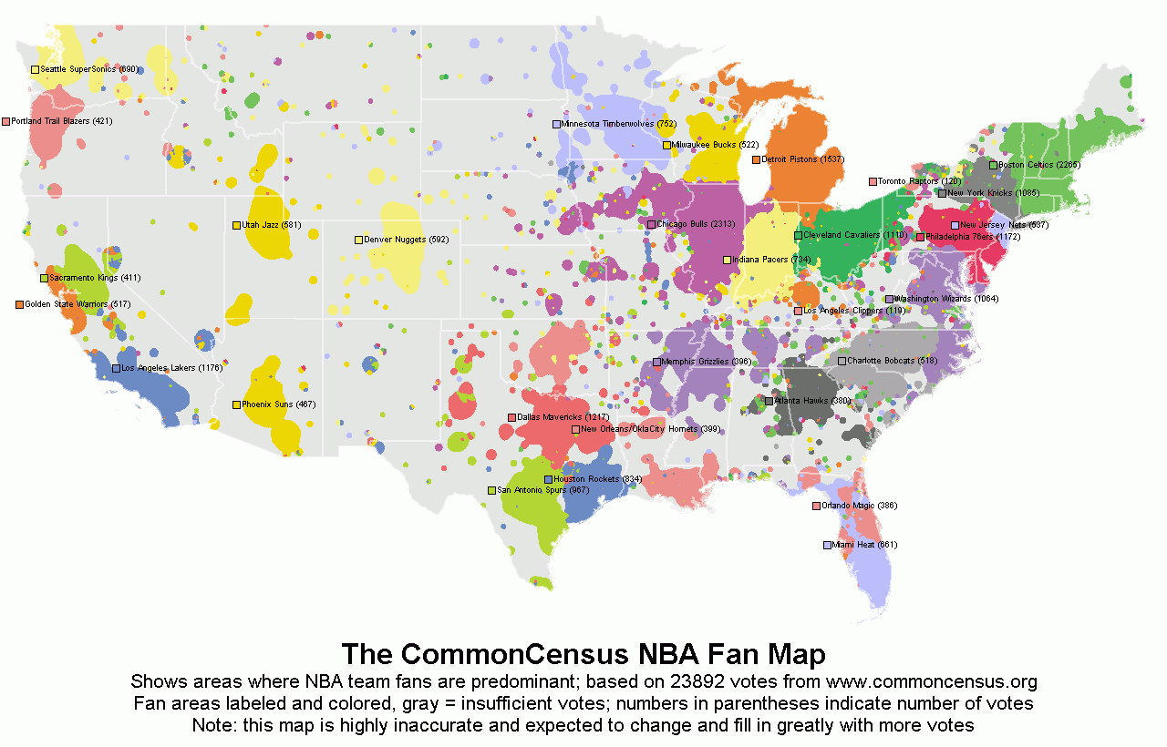
See below for images of some of the maps used in the analysis.  Also included below are CommonCensus fan maps for other sports. Click here for interactive versions of all of the CommonCensus maps (along with general info about the project). Click here to add your sports allegiances to the fan maps.

Map showing volume of Google searches for ‘college football’
Hotspot Statistics Map of NCAAF I-A Team Fan Areas
Hotspot Statistics Map of MLB Team Fan Areas
Hotspot Statistics Map of NFL Team Fan Areas

Hotspot Statistics Map of NBA Team Fan Areas

Categories
Bucknell/Local Interest General GIS GIS in Biology Slideshow

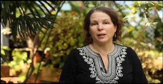
Interview with Biology Prof. DeeAnn Reeder about using GIS in teaching and research

Over the 2010-11 academic year, a team of GIS student assistants worked with Prof. DeeAnn Reeder to develop maps and GIS data for use in her teaching and research.

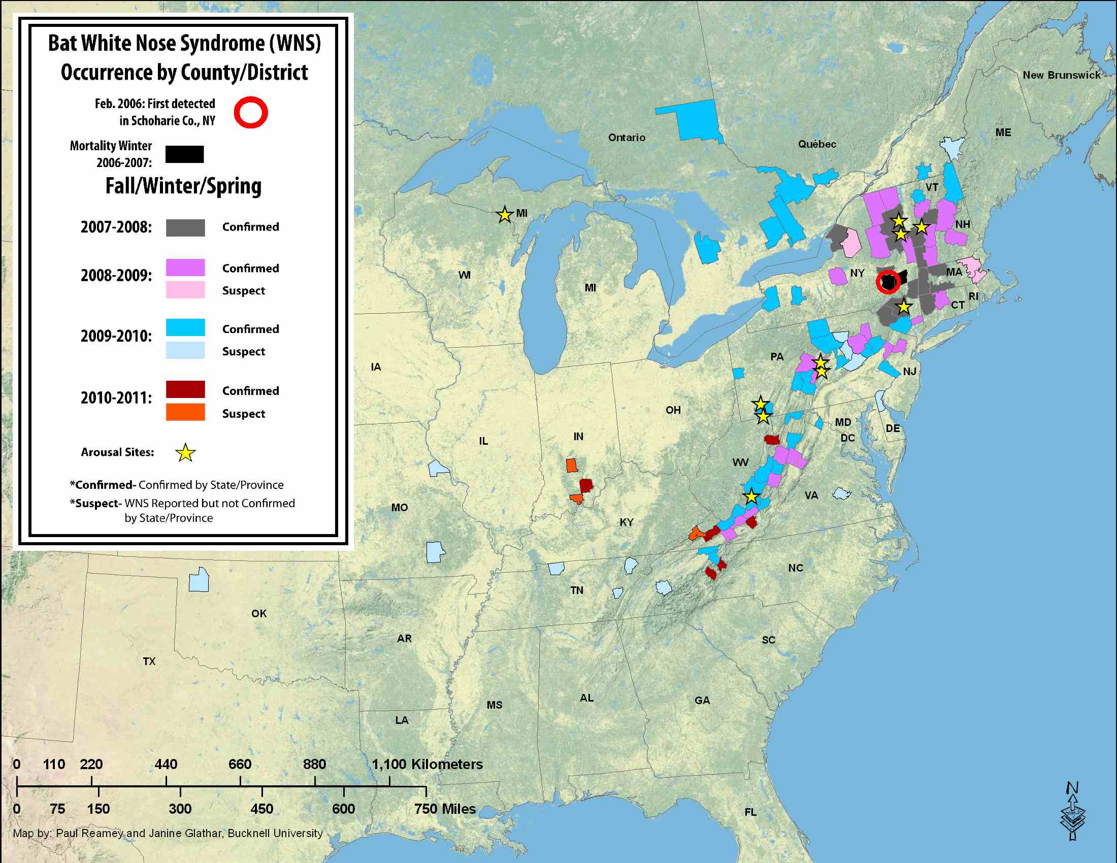
Ted Heitzman, ’12 and Paul Reamey, ’11 developed a series of maps and datasets for Prof. Reeder’s work on white-nose syndrome in bats.

Dan Dougherty, Geography/History ’12 and Mike Grasso, Environmental Studies ’13, worked with with Prof. Reeder and her research assistant Megan Vodzak, Biology ’08, on developing maps for a field guide atlas of mammals in Sudan.

Below is an interview* with Prof. Reeder about those two projects and her future plans for using GIS both in the field and in the classroom.

*One of these days I’ll wear a mic so that you can actually hear my questions.

video platform video management video solutions video player

Categories
Bucknell/Local Interest Environment Events/Calendar General GIS GIS in Environmental Studies GIS Jobs, Internships, Scholarships & Grad Programs Slideshow

$19,700/yr fellowship opportunity for sophomores

See below for information on an undergraduate fellowship opportunity from the EPA. Current sophomores can apply to receive up to $19,700 per academic year for their junior and senior years – along with a stipend for a summer internship.

Title: Fall 2012 EPA Greater Research Opportunities (GRO) Fellowships for Undergraduate Environmental Study
URL: http://www.epa.gov/ncer/rfa/2012/2012_gro_undergrad.html
Open Date: 08/22/2011  –  Close Date: 12/12/2011
Summary:  The U.S. Environmental Protection Agency (EPA), as part of its Greater Research Opportunities (GRO) Fellowships program, is offering Greater Research Opportunities (GRO) undergraduate fellowships for bachelor level students in environmental fields of study. The deadline for receipt of applications is December 12, 2011 4:00 PM ET for receipt of paper applications, and December 12, 2011, at 11:59:59 PM ET for submittal of electronic applications to Grants.gov. Subject to availability of funding, and other applicable considerations, the Agency plans to award approximately 40 new fellowships by July 30, 2012. Eligible students will receive support for their junior and senior years of undergraduate study and for an internship at an EPA facility during the summer of their junior year. The fellowship provides up to $19,700 per academic year of support and $9,500 of support for a three-month summer internship.

Applicable Category(s): Grant/Fellowship Announcements

Categories
Bucknell/Local Interest General GIS GIS in Women's Studies Map Apps Slideshow

Simple tool for creating KML-based thematic maps

As someone who has one foot in the ArcGIS world and another in the GoogleEarth/GoogleMaps world, I’m continually annoyed at how cumbersome it is to shuffle data back and forth between the two product lines.  I’ll skip the diatribe for now and instead just point out a cool new tool that I ran across last week when I was getting ready to talk to a Women’s Studies class that will be using GoogleMaps for a class project.

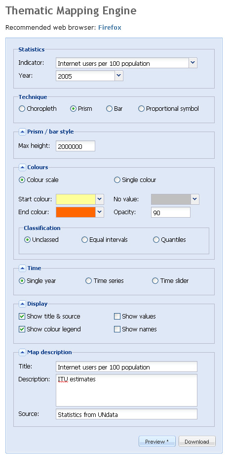
The website, thematicmapping.org, features a blog with tips and tricks for creating KML-based thematic maps. But more importantly, it provides a tool that you can use to create KML-based thematic maps for a variety of global data indicators. Although the selection of indicators is rather limited, thematicmapping.org also makes its API available so that you can create thematic maps from your own data sources.  Now if I just had a programmer at my beck and call…

Below is a screen shot of the Thematic Mapping Engine interface along with a snapshot of the resulting KML file


Categories
Data General GIS GIS in Environmental Studies GIS in Geography GIS in Humanities GIS in Political Science GIS in Public Health GIS in Sociology Map Apps Slideshow

3 global data visualization tools to use in your class

Last fall the World Bank launched a contest aimed at challenging web developers to create web-based tools using the data available through the World Bank’s Open Data Initiative. Click here to read an article from Programmable Web about the contest winners (excerpt below).

You can visualize nearly every indicator of economic, social and human development on StatPlanet World Bank, the winner of World Bank’s ambitious developer contest launched last October challenging new uses of the World Bank API. After voting from distinguished judges and the public, the organization announced the top three apps at an event in Washington, D.C., this afternoon.

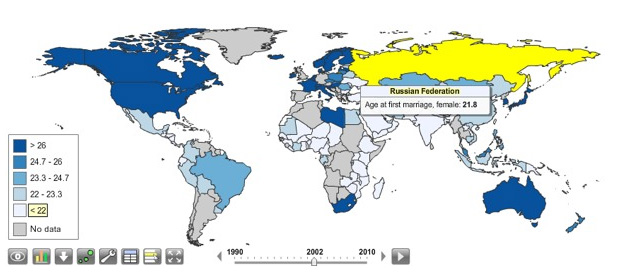
StatPlanet is already a platform used by non-profits and other groups to map and visualize data. Its creator Frank van Cappelle said the application is aimed toward “evidence-based decision making.” For the World Bank contest, van Cappelle connected his platform to World Bank’s API. Where one of the challenges with World Bank’s data is how much of it there is, StatPlanet does a great job of helping users zero in on and visualize what interests them.

StatPlanet enables users to visualize global development indicators via customizeable maps and charts – and also provides a data download tool.  StatPlanet could be used in combination with WorldMapper and Gapminder – two other web-based global data visualization tools – for in-class demos and/or as a resource for student projects.  Click here to go to the StatPlanet main landing page or here to go directly to the tool.