Categories
Crisis-Mapping General GIS GIS in Political Science Map Apps Slideshow

NPR Story on Crisis Mapping in Japan

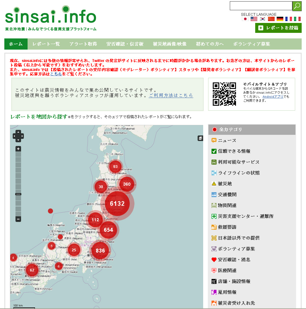
Last week NPR ran a story on crisis mapping in Japan – focusing on the open-source, citizen-driven Sinsai.info website. Here’s the description from the NPR website:

Open source software called Ushahidi allows people to add and update information to maps that anyone with an Internet connection can access. In Tokyo, a crew of volunteers is using the software to map everything — from health services to the location of emergency aid workers — in Japan’s hardest hit areas. Patrick Meier, director of the crisis mapping segment of Ushahidi, says that because of the robust Internet infrastructure in Japan and tech-savvy citizenry, online crisis mapping is being utilized to its fullest potential.

Click here to hear the NPR audio clip. Thanks to Deb for the heads up about this story!

Categories
Bucknell/Local Interest Data Digital Humanities Environment Events/Calendar General GIS Slideshow

Details on $520K Mellon grant for environmental studies, GIS integration

I posted a few weeks ago about the $520K grant awarded to Bucknell by the Mellon Foundation. Here are some additional details on how the grant money will be used to strengthen environmental studies and GIS integration across the university. From the Library & IT Matters newsletter:

  • Up to twelve faculty members will receive $400 to participate in either a 4-day (intro) or 2-day (advanced) summer GIS workshop. Click here for more details on the intro and advanced workshops.
  • Faculty members may submit requests to receive up to $1,000 to revise a course to include GIS ($5,000 total)
  • Four student researchers will be provided with summer research funding to conduct research projects involving GIS technology
  • Funds will be available to support consultants and student workers to create new maps or to develop new datasets for use by faculty in integrating GIS for their curriculum and courses
  • Additionally we have support to help with the acquisition of data which can only be obtained through purchasing data sets or through membership in consortia which provide access to proprietary datasets

Contact me by e-mail at janine.glathar@bucknell.edu or by phone at x. 1990 if you are interested in any of the options listed above.

Categories
Bucknell/Local Interest Data Environment General GIS Slideshow

New data available on Pennsylvania forest patches

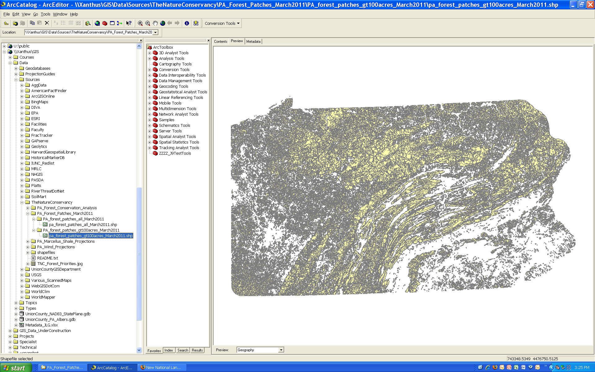
New data on Pennsylvania forest patches is available on Xanthus.  The datasets were created by the Pennsylvania chapter of The Nature Conservancy (TNC). The forest patches were delineated using the new 2006 NLCD data (also available on Xanthus).  The TNC defines forest patches as “contiguous areas of natural cover bound by any linear fragmenting feature (roads, railroads, rights-of-way) or non-forest edge.”

Two files are available – (1) forest patches for all of Pennsylvania; and (2) forest patches greater than 100 acres in size.  One important caveat to keep in mind is that the  dataset is intended for analyzing patterns of forest cover and forest patch sizes at a relatively small scale (e.g. state or regional as opposed to small sections of a particular forest or locality).  The NLCD land cover data from which the forest patches were derived is relatively coarse in resolution – so the forest patch boundaries are approximations and not intended for use in applications where exact measurements are needed.

Please contact me if you need to get access to the Xanthus data folder.

Categories
Bucknell/Local Interest General GIS Slideshow

Making a (good) map

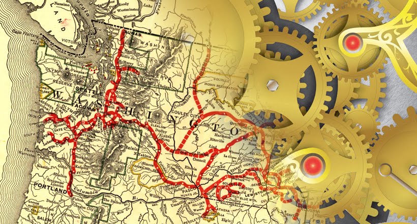
The previous post talked about Margaret Pearce’s call for an active, engaged map reader. Consider this post a call for cartography that’s good enough to keep the attention of those active, engaged map readers. There are tons of great blogs and websites out there that focus on cartographic design – from the high end conceptual approaches to map-making all the way through to the nuts and bolts of how to find and load different symbol sets. I’ll try to highlight a number of those in the coming weeks (it is poster season after all). For now, here’s a good blog to start with – Map Practical.

They had me at “classic mountain stamp” symbol sets.

From MapPractical’s blog description:

Welcome to Map Practical, where the cartography gets done. These are the cartographic trenches, the domain of greasy hands, busted knuckles, and sore mouse fingers. This is the home of techniques, tutorials, and tricks of all things map. Here’s how we do it; your job is to make it look good!

Categories
Bucknell/Local Interest Digital Humanities General GIS Slideshow

Reading a map

A few weeks ago, Bucknell hosted Kansas State University geographer/cartographer Margaret Pearce for a presentation on map visualization and cartographic design.  Dr. Pearce is a geographer who works on cartographic representation of cultural and historical geographies, especially Indigenous geographies.   Much of her presentation focused on communication between the cartographer and the map reader – particularly on the need for an active/engaged map reader.

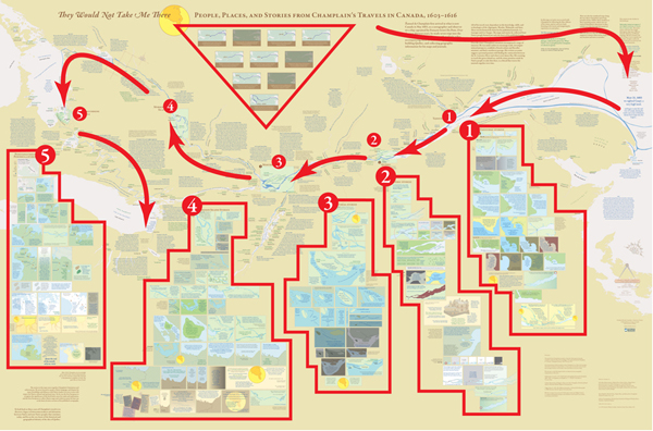
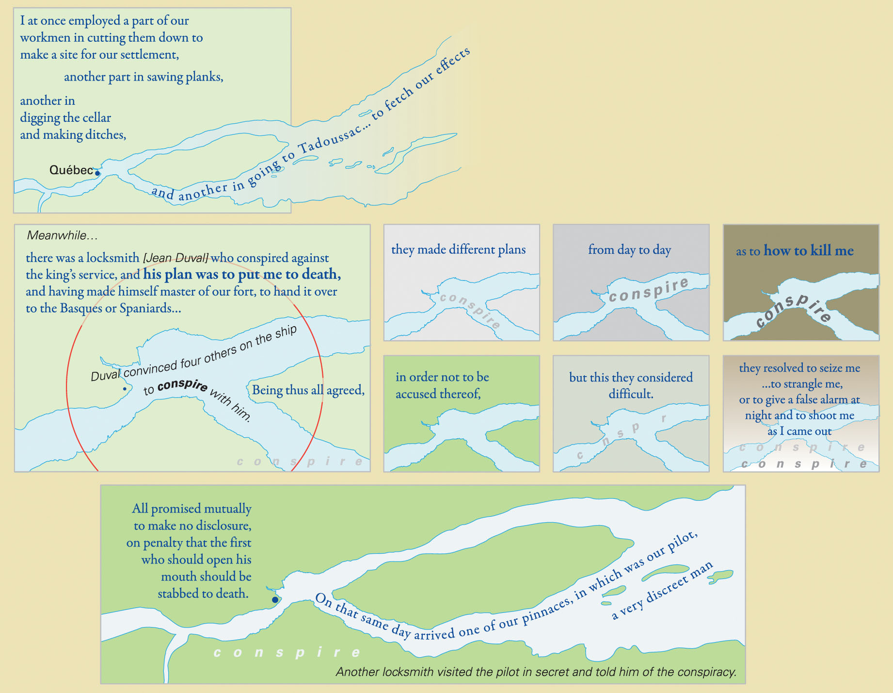
Pearce mentioned that she has had people compliment her on her maps by saying that they really had to “sit down” with the map to read and understand it. As Pearce put it, you probably wouldn’t compliment the author of an article or book that way…. yet often times maps get only a passing glance instead of a full, attentive reading.  During her presentation, Pearce walked the audience through a careful reading of  “They Would Not Take Me There” – a map that she made with co-collaborator Michael Hermann to illustrate the travels of Samuel de Champlain as he explored Canada between 1603 and 1616.  She discussed her use of Native place names, quotes from Champlain’s travel journals, historic fonts and cartographic techniques in shaping the map into a narrative in its own right – one that is a starting point for a discussion rather than a mere summary of Champlain’s travels through Canada.

From Pearce and Hermann’s introduction to the map on the University of Maine’s Canadian-American Center website:

At one level, Champlain’s explorations have been extensively documented and mapped by scholars focusing on the locations and dates of Champlain’s arrivals and departures. But these maps are silent with regard to the Indigenous geographies through which Champlain moved and upon which he relied for the success of his own explorations and mappings. Also, they fail to convey the human experiences which shape the emotional geographies of his journals.

From an article on the map that was published in Cartographic Perspectives, Number 66, Fall 2010:

The project began with a single map of the hydrography from the Gaspe Peninsula to the Georgian Bay, which was the extent of Champlain’s exploration of Canada along the St. Lawrence and Ottawa Rivers. But the cartographic challenge evolved into more than mapping Champlain’s exploration routes; the mapping of his experience became both the design question and quest. Champlain’s own travel narrative
became the primary design element, with his words placed among the geography he described. These quotes were selected to bring the reader into the landscape of the map, including, but not limited to, observations of the physical landscape. His interactions and conflicts with Natives and Europeans also were stories that needed to be mapped. This concept of mapping stories and interactions became the primary focus.


An example of the use of Native place names and historic fonts:
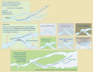
 

An image of the full map – no full-size digital file available (but soon I’ll have one in my office if you want to see it):
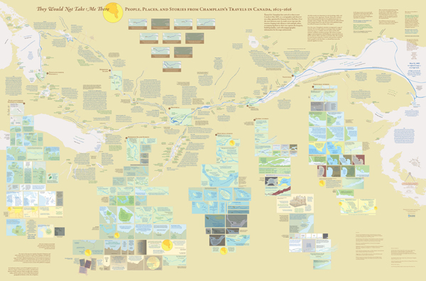
 

Diagram presenting one way to group information and read the map for the first time: