Categories
Bucknell/Local Interest Data General GIS Slideshow

Mapping Santa vs. Satan – Round 1

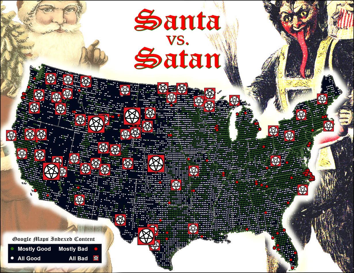
Thanks to Geography Professor Duane Griffin’s spooky ‘Santa vs. Satan’ map submission (deemed one of the ‘all-time greats’ – see below), Bucknell has scored a knock-out in round one of the Floatingsheep blog’s Christmas map contest.
The Floatingsheep blog – a favorite amongst mapping, visualization and social media enthusiasts – was founded two years ago by Dr. Matthew Zook (an Associate Professor at the University of Kentucky, USA) and Dr. Mark Graham (a Research Fellow at the Oxford Internet Institute, UK). The site is dedicated to:

“mapping and analyzing user generated Google Map placemarks… [to] provide a glimpse of what internet users (in the aggregate) think about particular places. Where are people posting placemarks about swine flu? Which places are considered to be “fun” by the collective intelligence of the Internet users?”

FloatingSheep uses a proprietary software program that conducts a worldwide search for Google Maps placemarks containing specific keywords . The software records the number of results generated for each keyword and creates a grid map where each cell indicates the number of hits returned for the Google Maps keyword search in that particular location.

After looking at Santa and reindeer in 2009 and the geography of local names for Santa in 2010, the Floatingsheep team has added a new twist to the Christmastime ‘naughty or nice’ debate by choosing a ‘Santa vs. Satan vs. Zombies’ theme for its 2011 Christmas map contest.  Floatingsheep did a search for 24 keywords related to Santa/Satan/Zombies to see, as Dr. Graham says “whether the places we live in are augmented by more Christmas-related information or more devilish/ghoulish-related information.”

Prof. Griffin downloaded the grid map data from Floatingsheep’s keyword search and then aggregated and visualized it to produce his masterpiece. See below for Floatingsheep’s write-up on Duane’s map.

Our third entry comes from Duane Griffin [1] with a map that we’re quite frankly really creeped out by. I made sure my laptop was closed last night so it couldn’t escape.


Duane outlines his method as, “I aggregated all of the Satan/Lucifer/zombies/etc. as Team Satan, aggregated all the religious and holiday categories and everything else as Team Santa (including fatman and robot santa), and mapped them Fox-style to hype up the threat. The “Mostly” category is based on the team ratio.” The result is a road map of “badness”. While Las Vegas comes as no surprise, who knew that Wyoming was so Satan-ridden? And I’m going to think twice before heading out to the middle of Kansas. Duane simply notes that it “Looks as if the Forces of Evil are winning the West and making inroads into the eastern US.” Others (e.g., my mother) notes with some surprise that Washington D.C. shows up as mostly good which defies all expectations.

Happy holidays! And stay tuned for more posts.

[1] Other identifying information such as his role as a professor at Bucknell University has been withheld so he is not tainted by his admission of being a Floating Sheep reader. [2]

[2] Oops.

Categories
Data General GIS GIS in Environmental Studies GIS in Geography GIS in Humanities GIS in Political Science GIS in Public Health GIS in Sociology Map Apps Slideshow

3 global data visualization tools to use in your class

Last fall the World Bank launched a contest aimed at challenging web developers to create web-based tools using the data available through the World Bank’s Open Data Initiative. Click here to read an article from Programmable Web about the contest winners (excerpt below).

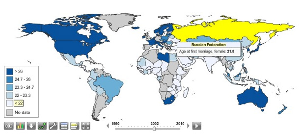
You can visualize nearly every indicator of economic, social and human development on StatPlanet World Bank, the winner of World Bank’s ambitious developer contest launched last October challenging new uses of the World Bank API. After voting from distinguished judges and the public, the organization announced the top three apps at an event in Washington, D.C., this afternoon.

StatPlanet is already a platform used by non-profits and other groups to map and visualize data. Its creator Frank van Cappelle said the application is aimed toward “evidence-based decision making.” For the World Bank contest, van Cappelle connected his platform to World Bank’s API. Where one of the challenges with World Bank’s data is how much of it there is, StatPlanet does a great job of helping users zero in on and visualize what interests them.

StatPlanet enables users to visualize global development indicators via customizeable maps and charts – and also provides a data download tool.  StatPlanet could be used in combination with WorldMapper and Gapminder – two other web-based global data visualization tools – for in-class demos and/or as a resource for student projects.  Click here to go to the StatPlanet main landing page or here to go directly to the tool.

Categories
Bucknell/Local Interest Data Environment Events/Calendar General GIS GIS in Computer Science GIS in Engineering GIS in Environmental Studies GIS in Geology Miller Run Restoration Project Slideshow

Physics Dept coffee talk on using the Flying Bison drone to collect aerial imagery

Come hear Nick Urban, Computer Science ’12, talk about designing, building and flying the remote-controlled Flying Bison drone. Nick will be presenting on Monday, 9/26 at noon (Olin 364) as part of the Physics department’s coffee talk series.  He’ll have the plane with him and will be showing some new video that will be captured by the drone in test flights he’s conducting this week.

Below are links to some previous blog posts about Nick’s Flying Bison and the Miller Run Restoration project that the drone collected data for.

1. Article by Julia Ferrante from Bucknell Communications office

2. A short video about the Miller Run Restoration project and the Flying Bison

3. An overview of the Miller Run Restoration project, including the role of the Flying Bison in collecting high resolution aerial imagery.

4. Some background on the spring 2011 competition that Nick flew the Flying Bison

Categories
Bucknell/Local Interest Data Environment General GIS GIS in Computer Science GIS in Engineering GIS in Environmental Studies GIS in Geology Miller Run Restoration Project Slideshow

Keystone Edge story about the Flying Bison

The online journal, Keystone Edge, recently picked up the story of Nick Urban and the Flying Bison drone.  Published by Issue Media Group, the Keystone Edge

… tells the story of the new economy in Pennsylvania–a narrative of creative people and businesses, new development, cool places to live, and the best places to work and play. Each Thursday, the Web site and weekly online magazine presents original stories, video and photography to tell that story, from Pittsburgh to Philly.

An excerpt from the story is included below. Check out the full story here.

Innovation & Job News – Bucknell student’s remote-controlled plane captures imagery to aid creek restoration – THURSDAY, SEPTEMBER 01, 2011

Remote-controlled cars and airplanes were a hobby of Nick Urban’s when he was a boy. That interest remained as he pursued a computer science degree atBucknell University, where he spent this summer building a remote-controlled plane that’s being used to map the landscape around a creek that runs through Bucknell’s campus and into the Susquehanna River. The plane, dubbed the “Flying Bison,” was built of foam, includes Geographic Information System technology and can navigate predetermined paths on autopilot. Digital still and video cameras were attached to the plane so it could capture images of the Miller Run Creek as it flew around the waterway.


Categories
Bucknell/Local Interest Data Environment General GIS GIS in Geography GIS in Psychology GIS in Public Health GIS in Sociology Slideshow

Williamsport and Lycoming County Asset Mapping

Guest post by Dan Ladd, Middlebury College ’14

One of the major projects the GIS team worked  on for much of the early part of the summer was mapping community assets in Williamsport and Lycoming County. This project was requested by Professors Ben Marsh (Geography) and Carl Milofsky (Sociology). Chad Lawlis (Environmental Studies ’11) and I worked on putting together the information for this project.

The project involved understanding regional community needs in public health, sustainability, social services, homelessness, etc. We explored how community needs like these match, or don’t match, the assets landscape that residents have access to. GIS gives a sophisticated way to understand this match at the scale at which people actuallyinteract with the world.

Much contemporary discourse about community development considers ‘sustainability’ to be ageneralized measure of the capacity of a community to replicate itself into the future. This broader idea of community sustainability describes residents as living in a series of ‘environments’ – a food environment and an activity environment support nutritional well-being, a housing environment affects homelessness, lead-paint risk, community activity, commuting costs and impacts, etc.

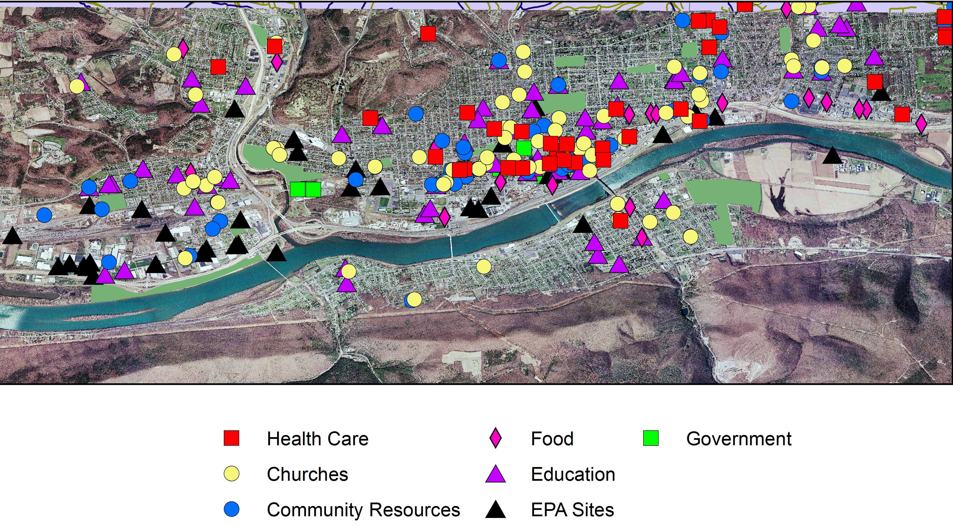
Data was collected on different Community Asset Classes (Churches, Healthcare providers, Food store, schools etc.). This information ranged from street address, contact information and a classification of what services each asset provided. These assets were then combined and mapped to give an idea of the spacial distribution of these assets.


Williamsport Community Assets

This project also serves as a template for future community asset data collection projects as the eventual goal is to expand this information to cover the Greater Central Susquehanna Valley. These proposed databases will serve as the foundation of a larger data project incorporating a ‘Community Platform’ that the university is contracting for from The Urban Institute and anascent regional ‘2-1-1’ social services phone line project.