Categories
Crisis-Mapping Environment General GIS GIS in Political Science Slideshow Videos

NOAA visualizations of Japanese earthquake and tsunami

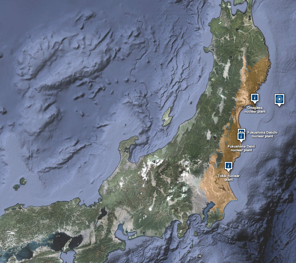
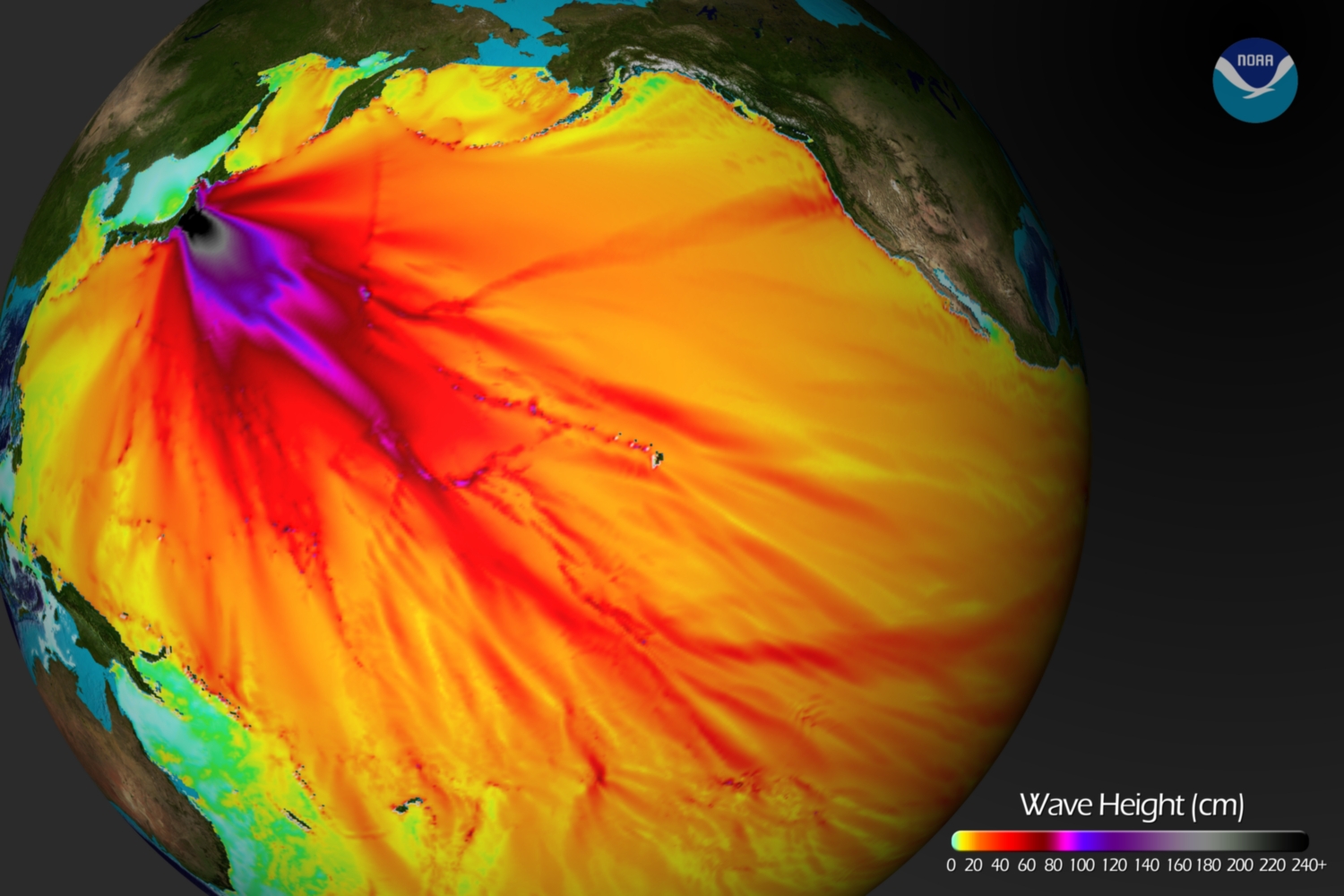
Below is a tsunami wave height model that shows the Pacific-wide impact of the event. The model was created by the NOAA Environmental Visualization Lab:
Description from NOAA:

Model runs from the Center for Tsunami Research at the NOAA Pacific Marine Environmental Laboratory show the expected wave heights of the tsunami as it travels across the Pacific basin. The largest wave heights are expected near the earthquake epicenter, off Japan. The wave will decrease in height as it travels across the deep Pacific but grow taller as it nears coastal areas. In general, as the energy of the wave decreases with distance, the near shore heights will also decrease (e.g., coastal Hawaii will not expect heights of that encountered in coastal Japan).The second image shows the depth of the Pacific Ocean floor. Notice the similarity between areas of low wave height and deeper areas of the ocean.

Below is an image visualizing the maximum amplitude plot for the tsunami wave.
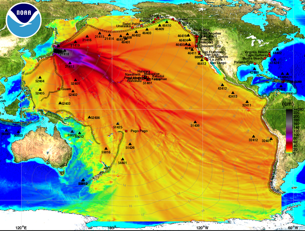
Click here on the NOAA Center for Tsunami Research home page to download a Google Earth KMZ file with the maximum amplitude plot data shown in the visualization above.

And finally, a video showing the propagation of the tsunami wave.

httpv://www.youtube.com/watch?v=PBZGH3yieLc

From the NOAA Center for Tsunami Research:

Propagation of the March 11, 2011 Honshu tsunami was computed with the NOAA forecast method using MOST model with the tsunami source inferred from DART® data. From the NOAA Center for Tsunami Research, located at NOAA PMEL in Seattle, WA. See http://nctr.pmel.noaa.gov/honshu20110311
 

Categories
Crisis-Mapping General GIS GIS in Political Science Slideshow

Visualizing Japan crisis map inputs

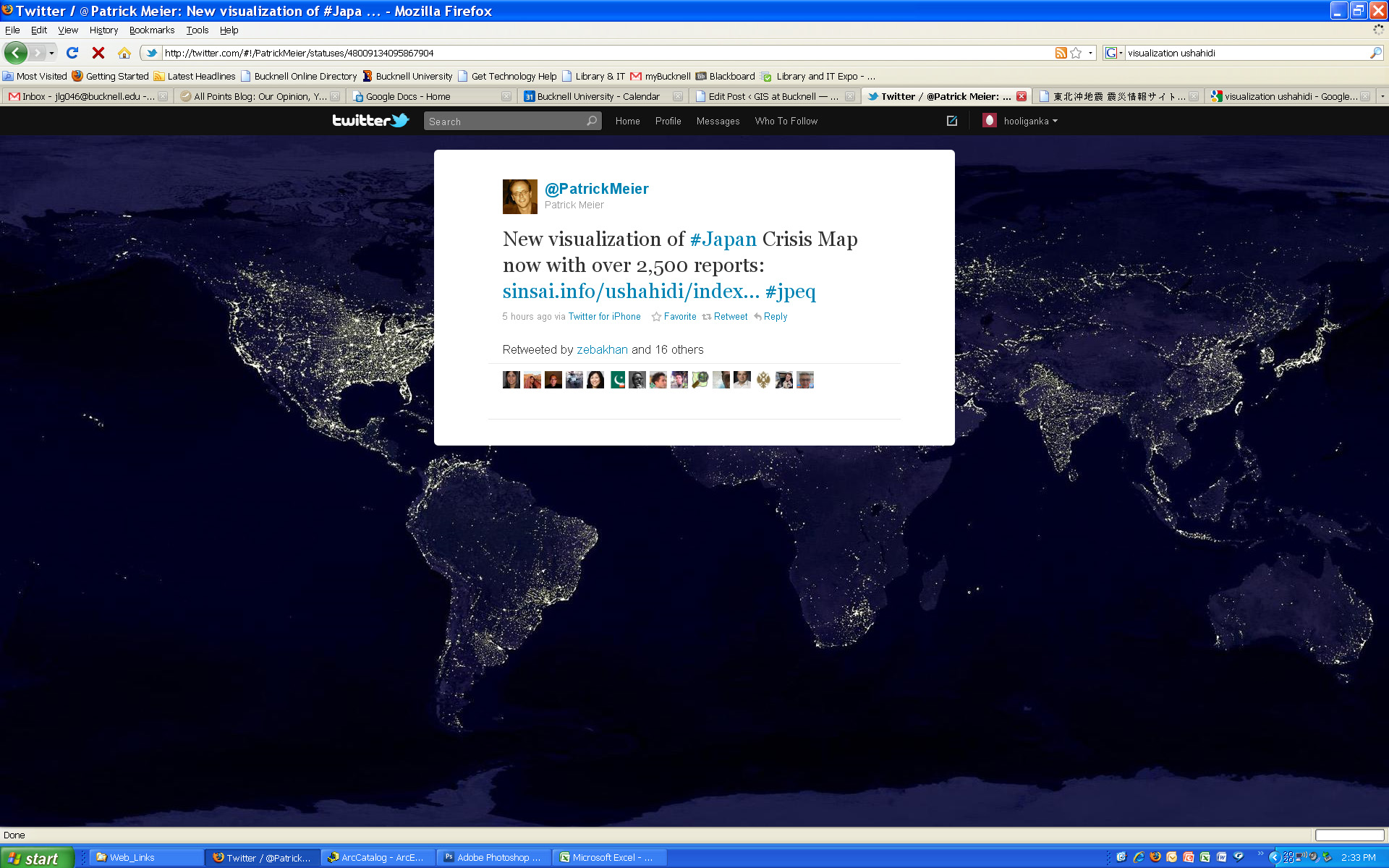
Here’s a new visualization that shows the locations worldwide that are submitting reports to the Ushahidi Japan Crisis Map. Click on the map to see full size image.


Categories
Crisis-Mapping General GIS GIS in Political Science Slideshow

Japanese earthquake – disaster/response maps

Here are some links to maps and map apps related to the Japanese earthquake and tsunami.  I’ll add more as they are released.

  • JapanQuakeMap, an animated, time-lapse visualization of the earthquake and its aftershocks created by Paul Nicholls, developer of the Christchurch Quake Map website.  From the website:
    The Japan Quake Map on this website pesents a time-lapse visualisation of the Sendai earthquake and its aftershocks, primarily to help those outside the affected area understand what the people of Japan are experiencing. It plots earthquake data from USGS on a map using the Google Maps API, with the size of the circle denoting the magnitude (the higher the magnitude, the larger the circle) and the colour showing the focal depth (see the legend below the map).
  • Click here to view the main page for Ushahidi’s Japan crisis mapping tool (in Japanese). Click here to view the Big Map. These pages use the Ushiadi platform to collect and display crowdsourced info (SMS, e-mail, Twitter, Flickr, YouTube, etc.). About the Ushahidi site:

Anyone on the ground can text in the location of a trapped person, and these locations are then collected on a map. You can also text in where to find aid, a pop-up hospital or a precarious building that should be avoided.  Good.is

  • Also from Ushahidi, a Radiation Map that uses the Crowdmap platform.  The radiation map is in both Russian and English and has other language options available.
  • Map of seismic activity in the 7 days leading up to the earthquake – from MapLarge (note: as of Wed. March 16th the MapLarge site is down – too much traffic?)
  • What is crisis mapping and how does it work? Click here to read Patrick Meier’s answer to that. Meier is the Director of Crisis Mapping at Ushahidi and co-founder of the International Network of Crisis Mappers. 
Categories
Crisis-Mapping General GIS GIS in Political Science Videos

Libyan Revolution – view the map

The NY Times has an interactive map graphic on the crisis in Libya. The series of maps traces the development of the rebellion and unrest from February 16th to present.  The basemap data shown in the NYT interactive map graphic was provided by LeadDog Consulting. Given the unrest in Libya, LeadDog has been updating the street maps daily as they receive updated information. Click here for a detailed street map of Tripoli and here for a detailed street map of Benghazi.

On the same topic, the NY Times 6th floor blog has a post about what may or may not be the Libyan opposition’s new website – which features news, announcements, video and a ‘Map of the Revolution.’ From the 6th Floor blog post:

Libya’s opposition seems to have surfaced online. NTCLibya.org was registered as a domain on March 6 for the Libyan Interim Transitional National Council. Among the tabs across the top of the site’s English-language home page are some you rarely see: Allegiances,  Map of Revolution. A WhoIs search turned up Identity Protect as the administrator. This is a British company that manages domains while concealing the identity of the actual owner. So there has been a fair amount of Twitter chatter (#libya, #feb17) about whether the thing is legit. The council’s Twitter handle is @LibyanTNC. There hasn’t been a Twitter post for hours, and before that there were many to the effect of “hold on, i’m having trouble getting the site up.” And the site is indeed slow and only semifunctional. Which rather suggests it’s the real deal. The domain is registered until 2013. A little pessimistic?

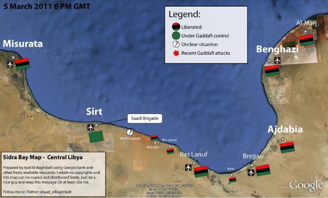
‘Map of the Revolution’ – East Coast of Libya:


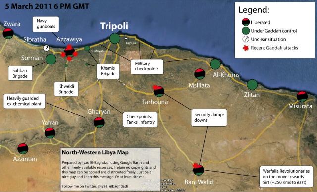
‘Map of the Revolution’ -West Coast of Libya:

Categories
Crisis-Mapping General GIS GIS in Political Science Map Apps Slideshow

Libya crisis map

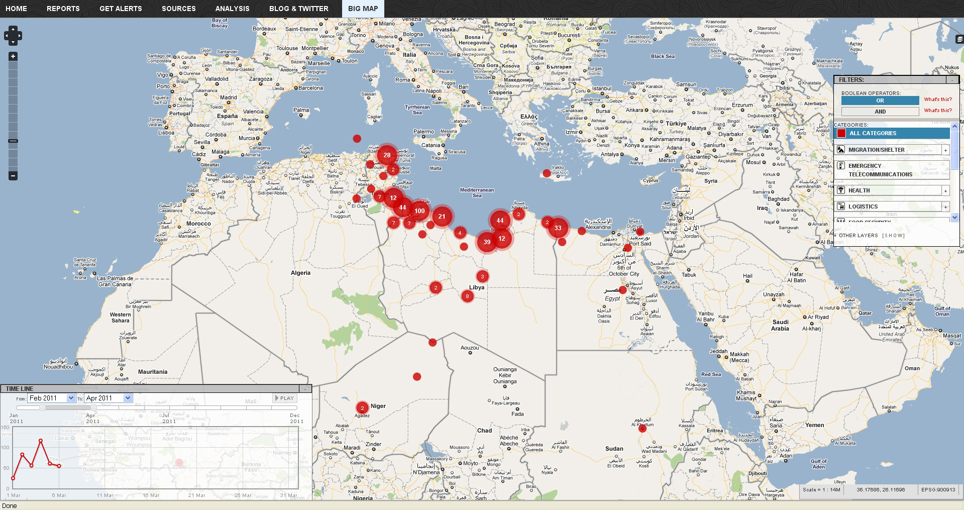
Click here to check out the new Libya Crisis Map.  Courtesy of Adena Schutzberg over at AllPointsBlog:

OCHA, UNOSAT and NetHope have been collaborating with the Volunteer Technical Community (VTC) specifically CrisisMappers, Crisis Commons, Open Street Map, and the Google Crisis Response Team over the past week.

The CrisisMappers Standby Task Force has been undertaking a mapping of social media, news reports and official situation reports from within Libya and along the borders at the request of OCHA. The Task Force is also aiding in the collection and mapping of 3W information for the response. UNOSAT is kindly hosting the Common Operational Datasets to be used during the emergency. Interaction with these groups is being coordinated by OCHA’s Information Services Section.

The public version of this map does not include personal identifiers and does not include descriptions for the reports mapped. This restriction is for security reasons. All information included on this map is derived from information that is already publicly available online