Categories
Bucknell/Local Interest General GIS Slideshow

Making a (good) map

The previous post talked about Margaret Pearce’s call for an active, engaged map reader. Consider this post a call for cartography that’s good enough to keep the attention of those active, engaged map readers. There are tons of great blogs and websites out there that focus on cartographic design – from the high end conceptual approaches to map-making all the way through to the nuts and bolts of how to find and load different symbol sets. I’ll try to highlight a number of those in the coming weeks (it is poster season after all). For now, here’s a good blog to start with – Map Practical.

They had me at “classic mountain stamp” symbol sets.

From MapPractical’s blog description:

Welcome to Map Practical, where the cartography gets done. These are the cartographic trenches, the domain of greasy hands, busted knuckles, and sore mouse fingers. This is the home of techniques, tutorials, and tricks of all things map. Here’s how we do it; your job is to make it look good!

Categories
Bucknell/Local Interest Digital Humanities General GIS Slideshow

Reading a map

A few weeks ago, Bucknell hosted Kansas State University geographer/cartographer Margaret Pearce for a presentation on map visualization and cartographic design.  Dr. Pearce is a geographer who works on cartographic representation of cultural and historical geographies, especially Indigenous geographies.   Much of her presentation focused on communication between the cartographer and the map reader – particularly on the need for an active/engaged map reader.

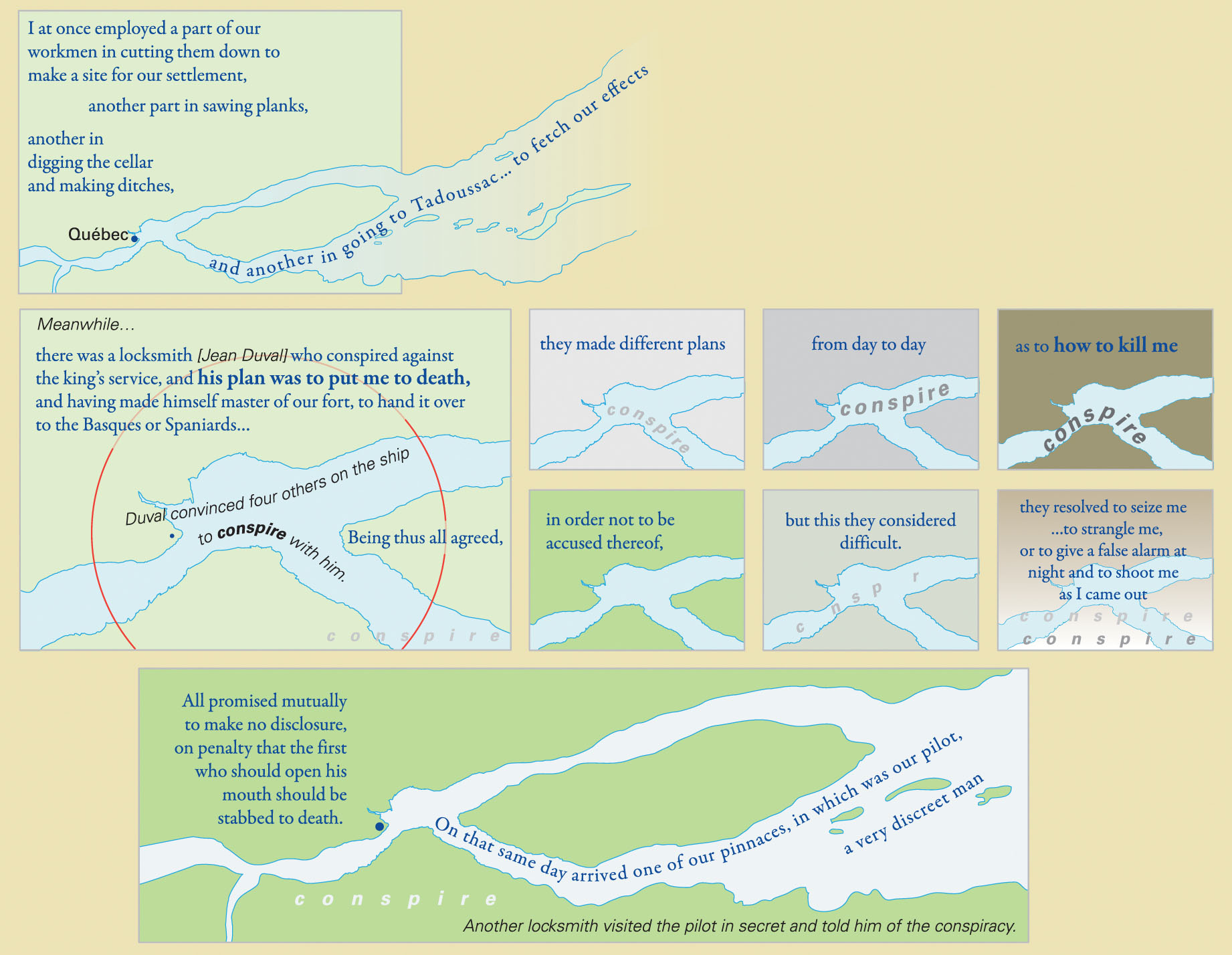
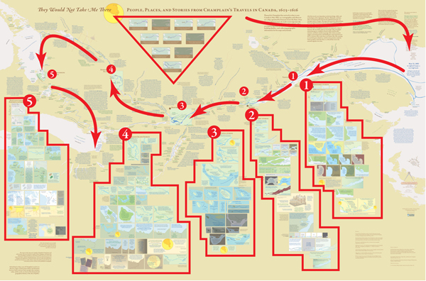
Pearce mentioned that she has had people compliment her on her maps by saying that they really had to “sit down” with the map to read and understand it. As Pearce put it, you probably wouldn’t compliment the author of an article or book that way…. yet often times maps get only a passing glance instead of a full, attentive reading.  During her presentation, Pearce walked the audience through a careful reading of  “They Would Not Take Me There” – a map that she made with co-collaborator Michael Hermann to illustrate the travels of Samuel de Champlain as he explored Canada between 1603 and 1616.  She discussed her use of Native place names, quotes from Champlain’s travel journals, historic fonts and cartographic techniques in shaping the map into a narrative in its own right – one that is a starting point for a discussion rather than a mere summary of Champlain’s travels through Canada.

From Pearce and Hermann’s introduction to the map on the University of Maine’s Canadian-American Center website:

At one level, Champlain’s explorations have been extensively documented and mapped by scholars focusing on the locations and dates of Champlain’s arrivals and departures. But these maps are silent with regard to the Indigenous geographies through which Champlain moved and upon which he relied for the success of his own explorations and mappings. Also, they fail to convey the human experiences which shape the emotional geographies of his journals.

From an article on the map that was published in Cartographic Perspectives, Number 66, Fall 2010:

The project began with a single map of the hydrography from the Gaspe Peninsula to the Georgian Bay, which was the extent of Champlain’s exploration of Canada along the St. Lawrence and Ottawa Rivers. But the cartographic challenge evolved into more than mapping Champlain’s exploration routes; the mapping of his experience became both the design question and quest. Champlain’s own travel narrative
became the primary design element, with his words placed among the geography he described. These quotes were selected to bring the reader into the landscape of the map, including, but not limited to, observations of the physical landscape. His interactions and conflicts with Natives and Europeans also were stories that needed to be mapped. This concept of mapping stories and interactions became the primary focus.


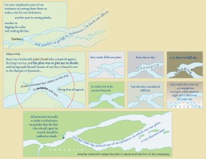
An example of the use of Native place names and historic fonts:
 

An image of the full map – no full-size digital file available (but soon I’ll have one in my office if you want to see it):
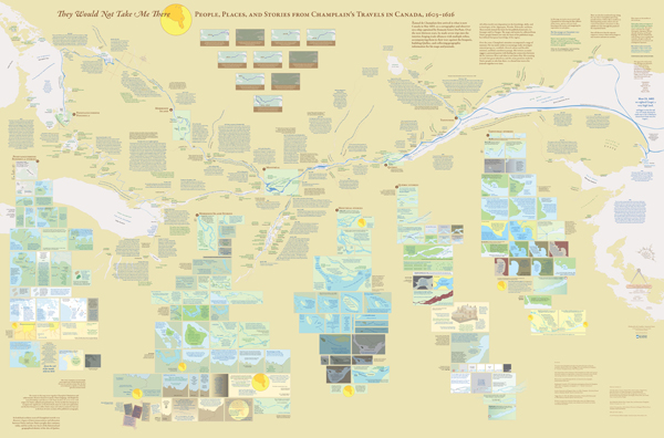
 

Diagram presenting one way to group information and read the map for the first time:
Categories
Bucknell/Local Interest Events/Calendar General GIS Slideshow

Call for faculty participation in LIT and Mellon-funded summer GIS workshops

Call for faculty participation in LIT and Mellon funded summer GIS Workshops

Two GIS workshops for faculty will be offered during Summer 2011.
* Introductory GIS workshop (4 days)
Monday, August 8th through Thursday, August 11th from 9am-1pm*
(lunch provided)

* Advanced GIS workshop (2 days)
Monday, August 15th through Tuesday, August 16th*
(lunch provided)

*Additional workshop dates (e.g. end of May/early June) may be added depending on faculty interest. If you are interested in attending, but can’t join us during the August workshop dates, please click on the link below to suggest alternate dates.

These grant supported workshops ($400 for each participant) will enable 12 faculty to engage in a hands-on GIS experience designed to be broadly useful to faculty, regardless of their specific disciplines and areas of research. To make the workshop experience more meaningful and relevant, both the introductory and advanced workshops will feature local data and topics of interest

If you are interested in participating, please click the link below to complete the GIS workshop interest form. Please note – there is a limit of 12 funded seats for the Summer 2011 GIS Workshops. Additional Mellon funded GIS workshop opportunities will be announced prior to summer 2012 and 2013 sessions.

Click here to access GIS workshop interest form.

Categories
Bucknell/Local Interest Events/Calendar General GIS Marcellus Shale Slideshow

TNC Presentation on Marcellus Shale – Monday, April 4 @ 4:30pm

What: Presentation by The Nature Conservancy on Marcellus Shale/PA Energy Impacts
When: Monday, April 4th at 4:30pm
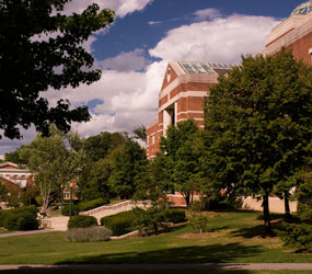
Where: Bertrand Library, Traditional Reading Room

Refreshments will be served.

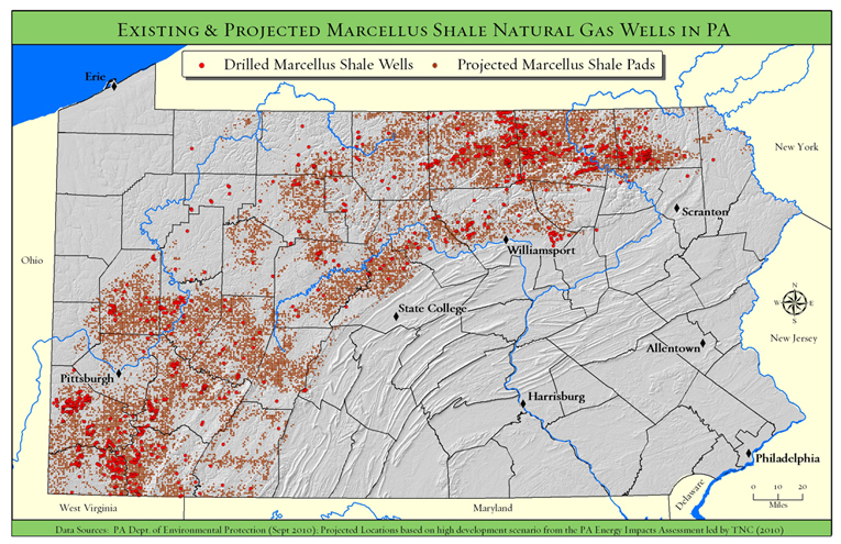
Come and hear Tamara Gagnolet, GIS Analyst and Conservation Data Manager for the Pennsylvania chapter of the Nature Conservancy, discuss her work in using GIS to analyze potential impacts of Marcellus Shale gas drilling in Pennsylvania. Ms. Gagnolet’s presentation will focus on how GIS and spatial analysis were used to project how much energy might be developed in PA during the next 20 years, where that development is more or less likely to occur and what types of strategies might need to be employed to mitigate potential habitat impacts.

Students are welcome and encouraged to attend.

Categories
Crisis-Mapping Environment General GIS GIS in Political Science Slideshow Videos

NOAA visualizations of Japanese earthquake and tsunami

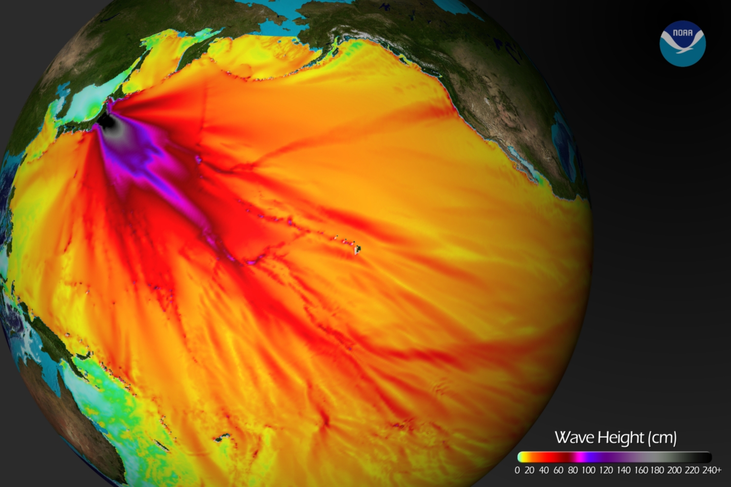
Below is a tsunami wave height model that shows the Pacific-wide impact of the event. The model was created by the NOAA Environmental Visualization Lab:

Description from NOAA:

Model runs from the Center for Tsunami Research at the NOAA Pacific Marine Environmental Laboratory show the expected wave heights of the tsunami as it travels across the Pacific basin. The largest wave heights are expected near the earthquake epicenter, off Japan. The wave will decrease in height as it travels across the deep Pacific but grow taller as it nears coastal areas. In general, as the energy of the wave decreases with distance, the near shore heights will also decrease (e.g., coastal Hawaii will not expect heights of that encountered in coastal Japan).The second image shows the depth of the Pacific Ocean floor. Notice the similarity between areas of low wave height and deeper areas of the ocean.

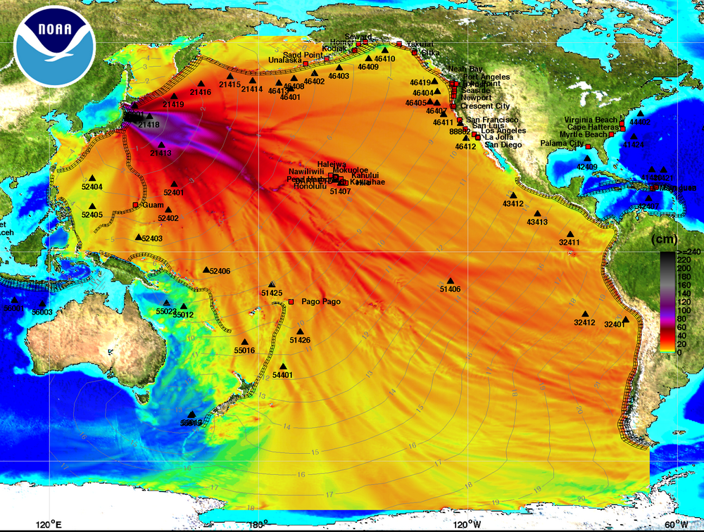
Below is an image visualizing the maximum amplitude plot for the tsunami wave.

Click here on the NOAA Center for Tsunami Research home page to download a Google Earth KMZ file with the maximum amplitude plot data shown in the visualization above.

And finally, a video showing the propagation of the tsunami wave.

httpv://www.youtube.com/watch?v=PBZGH3yieLc

From the NOAA Center for Tsunami Research:

Propagation of the March 11, 2011 Honshu tsunami was computed with the NOAA forecast method using MOST model with the tsunami source inferred from DART® data. From the NOAA Center for Tsunami Research, located at NOAA PMEL in Seattle, WA. See http://nctr.pmel.noaa.gov/honshu20110311