Categories
Bucknell/Local Interest Digital Humanities General GIS GIS in History Slideshow

Bucknell HGIS presentation at Yale

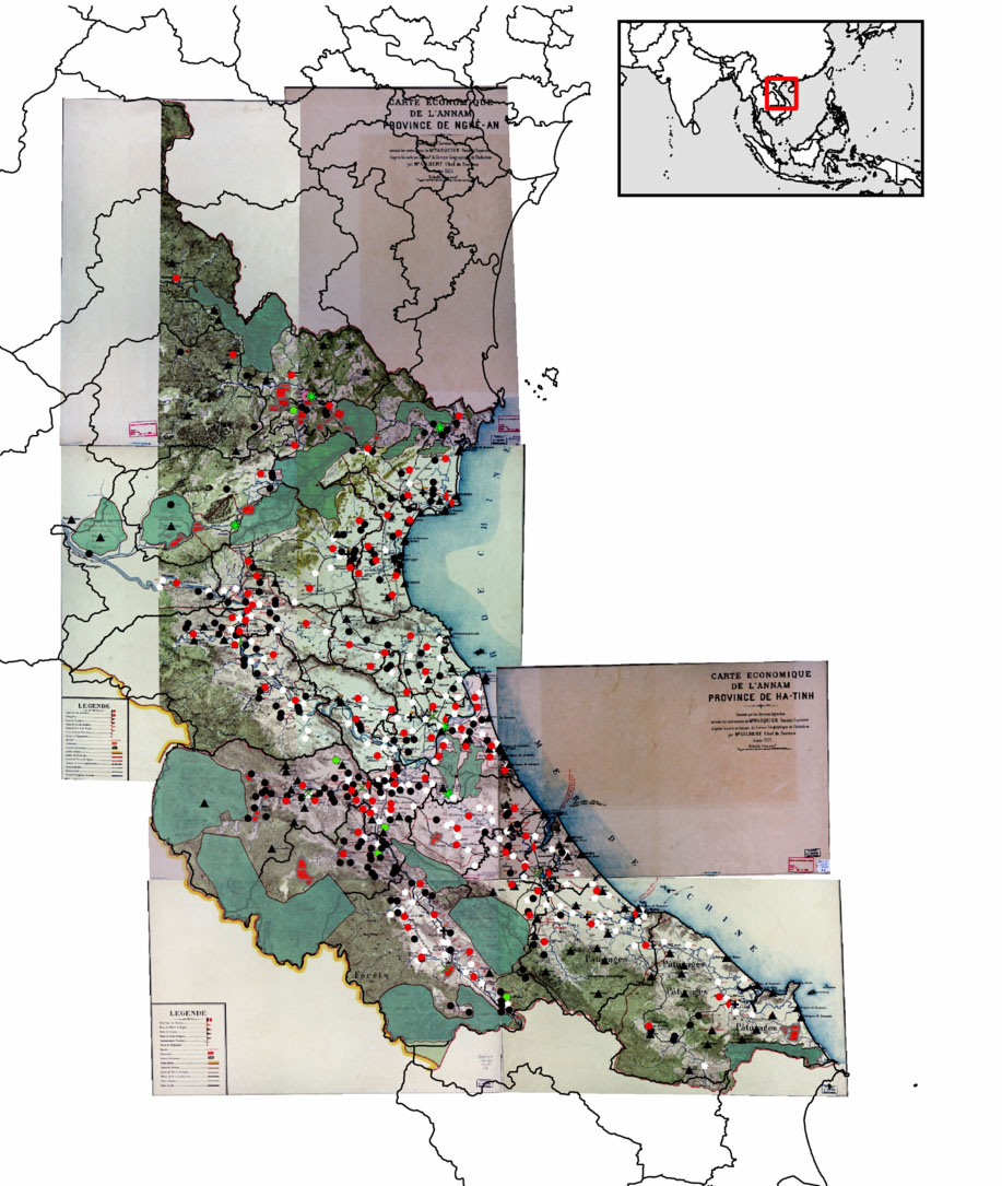
Over the last two and a half years, Bucknell History professor David Del Testa has been working – on his own and in collaboration with me and the GIS Student Assistants – on integrating GIS into his research on historical protest events in Vietnam.  Last October, Prof. Del Testa presented preliminary results from this work at UC Berkeley’s Center for Southeast Asia Studies. Click here to see a video of his presentation and to check out his H-GIS (historical GIS) blog Places, Spaces, Peoples, History.

On Wednesday, February 8th, Prof. Del Testa will be travelling to New Haven, CT to deliver another presentation of his work in progress. The presentation, called ‘Re-Evaluating Vietnam’s Nghe-Tinh Soviets (1930-31) using a Historical GIS,’ will be hosted by the Yale University Council for Southeast Asian Studies and is open to the public (in case you happen to be in the neighborhood… the talk will be held in Room 203, Luce Hall, 34 Hillhouse Avenue).

Here’s a link to the presentation announcement, along with an abstract:

“Reevaluating the Nghe-Tinh Soviets of 1930-1931 using a Historical GIS: Refining Some Preliminary Observations”
David Del Testa, Department of History, Bucknell University

The Nghe-Tinh Soviets of 1930-1931, a rebellion against colonial authority in north-central and central colonial Vietnam, has received extensive analysis by a variety of commentators and scholars, both Vietnamese and not. Most scholars, Vietnam and internationally, settled on some view of immiseration combined with the presence of pro-communist organizers as the motive forces for the rebellion, but a few have favored questions of political dissatisfaction and local empowerment as underlying motivations for revolt. Until recently, examining the rebellion on a gross scale in order to test either theory has proven difficult, with a surfeit of information but no easy way to process it in order to underwrite large-scale analyses. Del Testa is using a historical GIS (geographical information system) analysis, which blends statistics with digitized maps, in order to display correlations between factors, such as wealth, religion, and so on of those who rebelled in order to reexamine the Nghe-Tinh Soviets movement on a grand scale. His presentation will illustrate some initial findings as well as the techniques used.


Categories
Bucknell/Local Interest Data General GIS Slideshow

Mapping Santa vs. Satan – Round 1

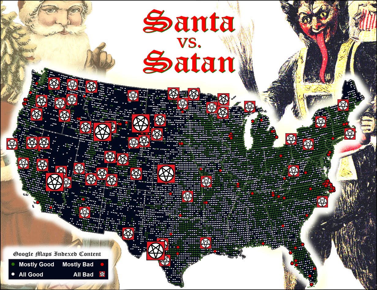
Thanks to Geography Professor Duane Griffin’s spooky ‘Santa vs. Satan’ map submission (deemed one of the ‘all-time greats’ – see below), Bucknell has scored a knock-out in round one of the Floatingsheep blog’s Christmas map contest.

The Floatingsheep blog – a favorite amongst mapping, visualization and social media enthusiasts – was founded two years ago by Dr. Matthew Zook (an Associate Professor at the University of Kentucky, USA) and Dr. Mark Graham (a Research Fellow at the Oxford Internet Institute, UK). The site is dedicated to:

“mapping and analyzing user generated Google Map placemarks… [to] provide a glimpse of what internet users (in the aggregate) think about particular places. Where are people posting placemarks about swine flu? Which places are considered to be “fun” by the collective intelligence of the Internet users?”

FloatingSheep uses a proprietary software program that conducts a worldwide search for Google Maps placemarks containing specific keywords . The software records the number of results generated for each keyword and creates a grid map where each cell indicates the number of hits returned for the Google Maps keyword search in that particular location.

After looking at Santa and reindeer in 2009 and the geography of local names for Santa in 2010, the Floatingsheep team has added a new twist to the Christmastime ‘naughty or nice’ debate by choosing a ‘Santa vs. Satan vs. Zombies’ theme for its 2011 Christmas map contest.  Floatingsheep did a search for 24 keywords related to Santa/Satan/Zombies to see, as Dr. Graham says “whether the places we live in are augmented by more Christmas-related information or more devilish/ghoulish-related information.”

Prof. Griffin downloaded the grid map data from Floatingsheep’s keyword search and then aggregated and visualized it to produce his masterpiece. See below for Floatingsheep’s write-up on Duane’s map.

Our third entry comes from Duane Griffin [1] with a map that we’re quite frankly really creeped out by. I made sure my laptop was closed last night so it couldn’t escape.


Duane outlines his method as, “I aggregated all of the Satan/Lucifer/zombies/etc. as Team Satan, aggregated all the religious and holiday categories and everything else as Team Santa (including fatman and robot santa), and mapped them Fox-style to hype up the threat. The “Mostly” category is based on the team ratio.” The result is a road map of “badness”. While Las Vegas comes as no surprise, who knew that Wyoming was so Satan-ridden? And I’m going to think twice before heading out to the middle of Kansas. Duane simply notes that it “Looks as if the Forces of Evil are winning the West and making inroads into the eastern US.” Others (e.g., my mother) notes with some surprise that Washington D.C. shows up as mostly good which defies all expectations.

Happy holidays! And stay tuned for more posts.

[1] Other identifying information such as his role as a professor at Bucknell University has been withheld so he is not tainted by his admission of being a Floating Sheep reader. [2]

[2] Oops.

Categories
Bucknell/Local Interest Slideshow

GIS in the classroom: Women’s Studies 233 – Sample Project ‘Mapping sexual content in advertising’

Guest post by Juanita Jeffrey, Economics/Women & Gender Studies, ’13

The map below was produced by the Women in the Media group for Prof. Nikki Taylor’s  “Global Feminism & Religion” class.  Our semester long research project was a transnational examination of women in the media represented in sexually exploitive advertising.  Our focus countries (Brazil, United States, China, Thailand, India and South Korea) are highlighted in the Google Earth map shown below. Placemarks are embedded in the map to show the contents of specific advertisements that ran in each country.


Sexual Content in Advertising

Google Earth Map

Categories
Bucknell/Local Interest Slideshow

GIS in the Classroom: Women’s Studies 233 – Sample Project ‘Women & Marriage’

The maps below were produced by the Women & Marriage  group for Prof. Nikki Taylor’s ”Global Feminism & Religion” class.  The group explored differences in marriage laws, norms and customs around the world and created maps in Google Earth to visualize countries according to four separate variables of interest: average age of marriage (men); average age of marriage (women); legal age of marriage (men); and legal age of marriage (women).  In examining the map data they found that the legal age of marriage for each country seems to set the standard for the actual ages at which men and women marry. For example, in the United States, the legal age of marriage for men and women is the same (18 years old) for both genders – and the difference in the average age of marriage for men (28 years old) and women (26 years old) is very small. By contrast, in Niger the legal age of marriage for men is 18 – but for women it is only 15.  The difference in the average age of marriage for men (25 years old) and women (17 years old)  is fairly large and could be explained in part by the difference in the legal age of marriage for each gender.

Map 1 – Average Age of Marriage for Men:

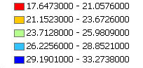
Legend

 Google Earth Map


Map 2 – Average Age of Marriage for Women:

Legend         Google Earth Map

Map 3 – Legal Age of Marriage for Men:

Legend

Google Earth Map


Map 4 – Legal Age of Marriage for Women:

Legend Google Earth Map

Categories
Bucknell/Local Interest General GIS Map Apps Slideshow

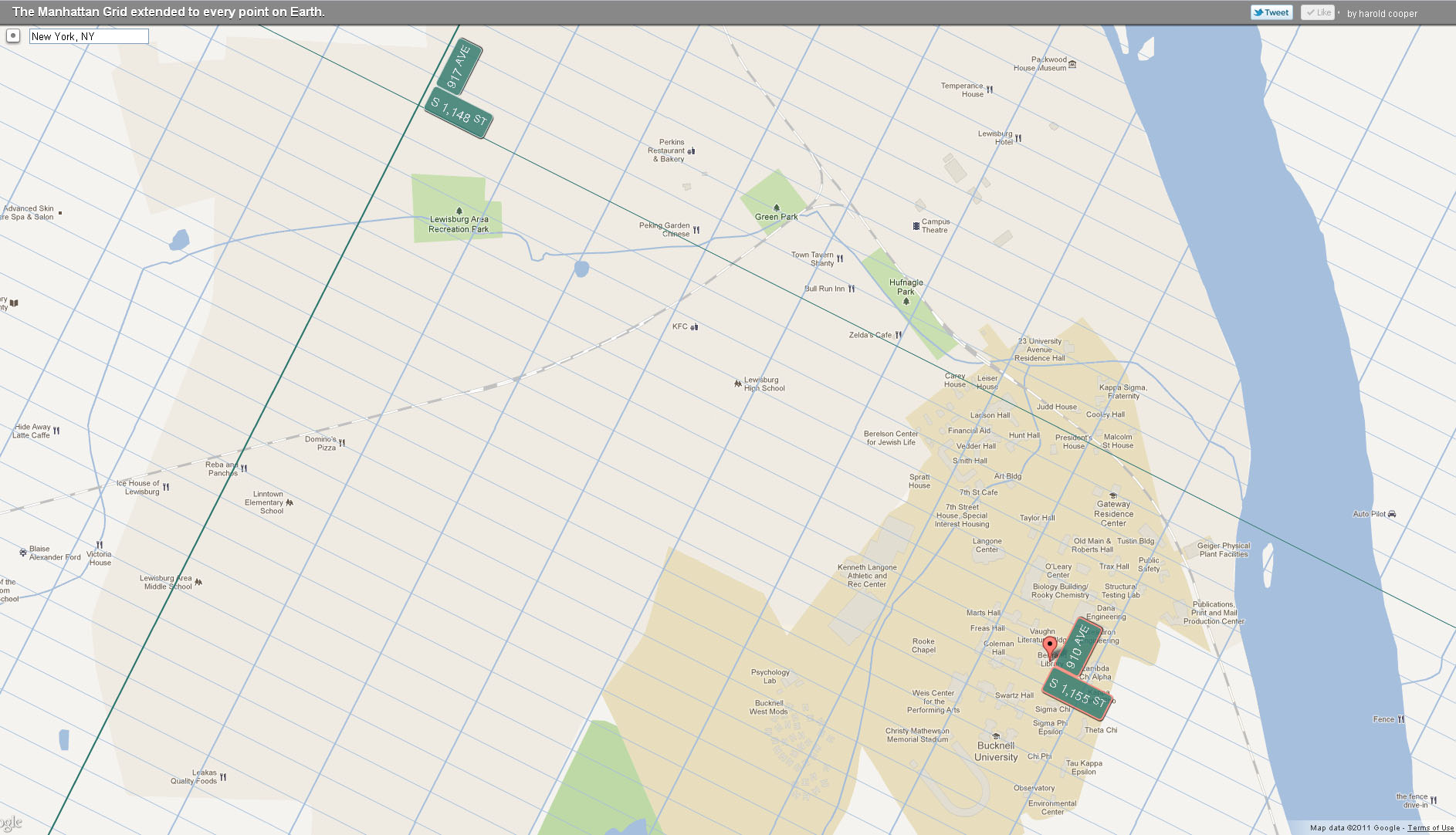
Bucknell’s campus in Central Park (way, way) West

Check out Harold Cooper’s ExtendNY map application to find out what your NYC address is – even if  you live in Topeka, KS or Vladivostok, Russia. More on the project from an article in yesterday’s Huffington Post:

Earlier this summer we marked the 200th anniversary of Manhattan’s grid plan, that easy-to-navigate layout of streets and avenues that gives us Manhattanhenge, drives Speed Levitch crazy, and might just be based off some ancient urban planning.

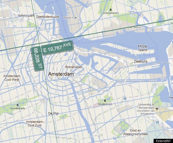
In celebration of that anniversary, Harold Cooper … has made this incredible interactive map that extends New York’s grid system to every single place on planet earth. San Francisco? Just walk West to 15,957th Avenue. London? Easy! Just take a stroll East to 10,896th Avenue on 63,708 Street.

The map allows you to scroll across the world, zooming in on different places to see where a walk way way East on 66,228th Street will take you (see photo below).

Click on the map below to see Bucknell”s NYC address.